Proven New Year's Day accessories email designs you can use
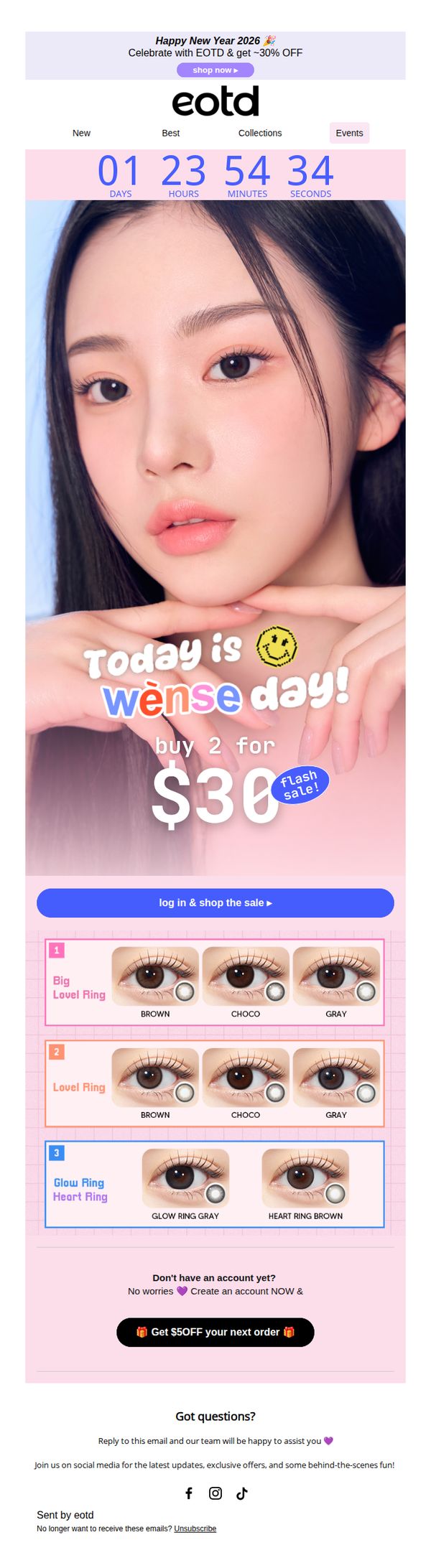

1. EOTD : FLASH SALE 🎉 It’s WENSE DAY! Buy 2 for $30 – 48H ONLY!
Objective
This email aims to drive immediate purchases by promoting a limited-time flash sale where customers can buy two products for $30, leveraging urgency with a countdown timer and playful branding around 'Wense Day' to boost engagement and conversions.
Why this works
The email brilliantly turns a simple sale into a branded event with 'Wense Day,' creating emotional resonance and memorability that transforms a transactional offer into a fun, shareable moment customers want to be part of.
How to implement
By placing a live countdown timer directly beneath the hero image, the campaign visually reinforces urgency without relying on text alone, making the time-sensitive nature of the offer instantly clear and psychologically compelling to scroll past.
Pro Tip
Add a small visual indicator or badge next to the 'log in & shop the sale' CTA to highlight that logging in unlocks the deal, reducing friction for new users who may not realize account creation is required to access the offer. • Include a micro-testimonial or social proof snippet near the product grid, such as 'Over 5,000 pairs sold this week!', to build trust and reduce hesitation during the high-pressure flash sale window.
2. Goldspot Pens: ⛄Top 5 Pens - January 2026
Objective
This email aims to engage pen enthusiasts by highlighting the top five pens of January 2026, while teasing upcoming February releases to drive immediate purchases and build anticipation for future drops. It also reinforces brand trust through social proof and customer service assurances.
Why this works
The email cleverly frames the top pens as a curated cultural moment, not just products, by tying them to literary inspiration, limited availability, and emotional storytelling, which elevates perceived value and urgency for collectors.
How to implement
By including a ‘sneak peek’ of February’s Lamy AL-Star Pine and Flamingo releases, the campaign strategically bridges current engagement with future desire, turning a monthly roundup into a serialized experience that keeps subscribers coming back.
Pro Tip
Add a countdown timer or limited-quantity badge next to the #5 Scribo pen to visually reinforce scarcity and urgency, since only 145 are left, this would convert passive interest into immediate action. • Reposition the ‘Shop Now >>’ CTA buttons to appear directly beneath each pen’s price and description, rather than offset to the side, to reduce friction and align with natural reading flow for mobile and desktop users.
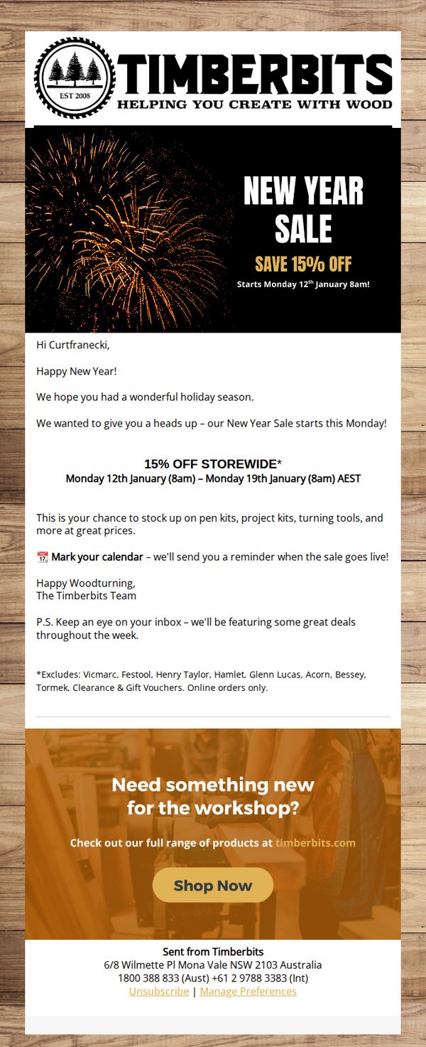
3. Timberbits: 🎉 New Year Sale Starts Monday - 15% Off Storewide!
Objective
The email aims to notify subscribers of an upcoming New Year sale offering 15% off storewide, encouraging them to plan ahead and return to the site when the sale launches. It also primes recipients for future deal alerts throughout the week to maintain engagement.
Why this works
The email opens with a warm, personalized greeting and holiday well-wishes, which builds rapport before jumping into the promotion, making the offer feel more like a gift than a sales pitch.
How to implement
By clearly stating the sale dates, exclusions, and reminder promise, the email reduces friction and builds trust, customers know exactly what to expect and when, which increases the likelihood of return visits.
Pro Tip
Add a countdown timer or visual progress bar in the hero section to create urgency and help users mentally prepare for the sale start time, increasing the chance they’ll return at 8am Monday. • Include a small product grid or featured item preview below the offer section to visually entice users with specific tools or kits they can save on, making the discount feel more tangible and actionable.
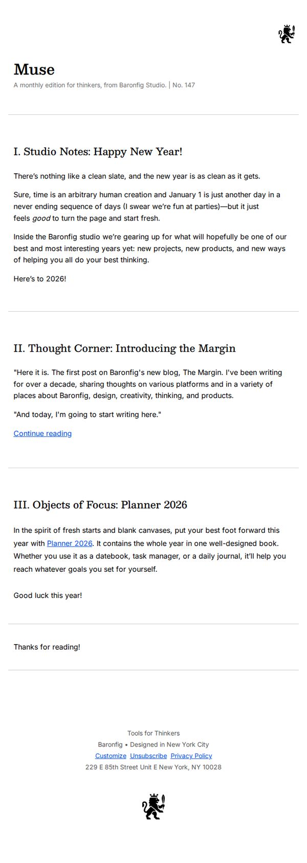
4. Baronfig - FR: Happy New Year (and something new)!
Objective
To celebrate the new year with subscribers while introducing Baronfig’s new blog, The Margin, and promoting the Planner 2026 as a tool for thoughtful goal-setting and productivity in the year ahead.
Why this works
The email frames the new year not as a generic reset but as a clean slate for thinkers, aligning emotionally with the brand’s audience while subtly positioning Baronfig as a partner in intentional living and creative productivity.
How to implement
Introducing the new blog through a personal, first-person voice builds authenticity and invites readers into the brand’s inner world, making the content feel like a conversation rather than a corporate announcement, which deepens reader investment.
Pro Tip
Add a secondary CTA button next to 'Continue reading' that links directly to the Planner 2026 product page, reducing friction for readers ready to purchase and aligning with the campaign’s promotional goal. • Include a brief visual teaser or thumbnail of the Planner 2026 within the 'Objects of Focus' section to increase product desirability and provide immediate context for readers unfamiliar with its design or layout.
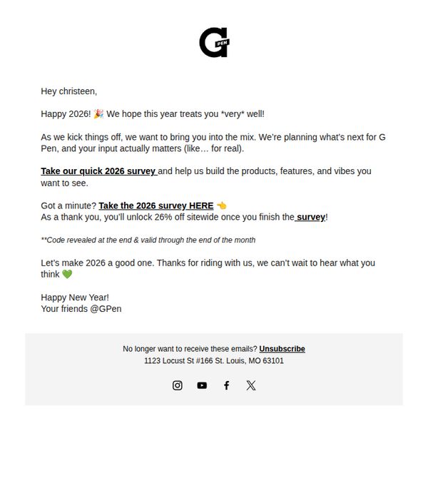
5. G Pen: Help us build what’s next 💚📝✨
Objective
The email aims to engage existing customers in co-creating G Pen’s 2026 product roadmap by completing a survey, while incentivizing participation with a 26% discount to drive immediate action and strengthen brand loyalty.
Why this works
G Pen brilliantly turns customer feedback into a collaborative product development experience, making users feel like valued insiders rather than passive buyers, a powerful emotional hook that boosts survey participation and brand affinity.
How to implement
The 26% discount is cleverly tied to survey completion and framed as a thank-you, not a sales tactic, which reduces perceived pressure and increases perceived value, a subtle but effective psychological nudge that aligns reward with action.
Pro Tip
Add a visual countdown timer or bold expiration note near the discount offer to create urgency, the current text says 'valid through the end of the month' but lacks visual emphasis, which may reduce conversion. • Include a brief testimonial or quote from a past survey participant who saw their idea implemented, to build social proof and reinforce that customer input truly shapes future products.
6. Safestyle: The Summer Essentials You Never Knew You Needed 🔥

Objective
This email aims to re-engage customers by showcasing essential summer gear that bridges work and weekend lifestyles, encouraging immediate purchases through compelling product storytelling and urgency-driven CTAs.
Why this works
The email brilliantly frames everyday gear as indispensable summer essentials by tying products to real-life scenarios like fishing, festivals, and worksites, making utility feel aspirational and urgent.
How to implement
By blending rugged functionality with lifestyle appeal, like polarized lenses for both tools and beach days, the campaign successfully positions safety gear as fashion-forward, expanding its emotional and practical relevance.
Pro Tip
Add a countdown timer or limited-availability tag near the 'SHOP NOW' buttons to amplify urgency, especially since the email references 'Summer Essentials' and '2026', implying time-sensitive relevance. • Include a short testimonial or user-generated photo beneath one of the product grid items to build social proof, since the email relies heavily on product features without third-party validation.
7. THE WORKBENCH: Your sign to slow down & make something special

Objective
This email aims to reconnect with customers after the holiday season by encouraging mindful creativity and personal storytelling through handmade jewelry. It gently guides recipients toward upcoming gifting occasions while showcasing the brand’s emotional, process-driven craftsmanship.
Why this works
The email opens with a warm, conversational tone that positions the brand as a thoughtful companion rather than a sales channel, inviting makers to slow down and reflect, a powerful emotional hook that aligns with the audience’s desire for meaningful creation.
How to implement
By weaving real customer stories into the layout, like the dog’s paw print ring, the brand transforms testimonials into intimate narratives that validate emotional investment, making the product feel less like merchandise and more like a vessel for personal memory and legacy.
Pro Tip
The CTA 'SHOP KITS' appears only once and is visually underwhelming; adding a second, more prominent CTA button near the top or after the customer story would reduce friction and better guide users toward conversion after emotional engagement. • The 'How We Bring Your Waxes To Life' section uses a cartoon illustration that feels disconnected from the brand’s otherwise elegant, tactile aesthetic; replacing it with a short video or real photo of the wax-to-metal process would strengthen authenticity and reinforce craftsmanship.
8. Baronfig - UK: Happy New Year (and something new)!
Objective
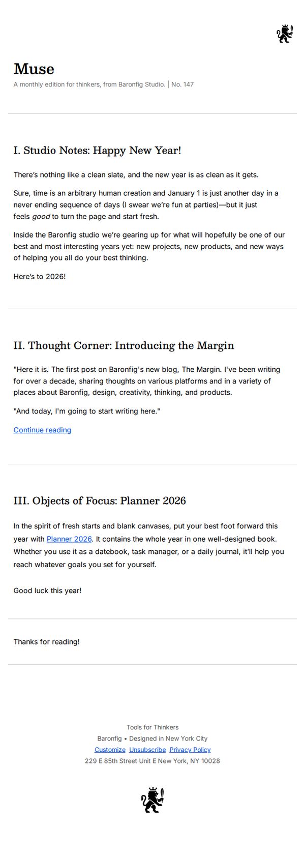
This email aims to warmly welcome the new year while subtly introducing Baronfig’s latest product, the Planner 2026, and launching their new blog, The Margin, to deepen engagement with their thoughtful, creative audience.
Why this works
The email opens with a reflective, human-centered tone that validates the emotional weight of a new year, making the reader feel understood before ever mentioning a product or promotion.
How to implement
By framing the Planner 2026 as a tool for 'fresh starts and blank canvases,' the campaign ties the product to a universal emotional desire for renewal, not just productivity or organization.
Pro Tip
Add a secondary CTA button or link directly beneath the Planner 2026 section that says 'Explore the Planner 2026' to reduce friction for readers ready to buy, rather than forcing them to scroll to the footer. • Include a small visual teaser or icon next to the 'Planner 2026' mention to create a subtle visual anchor, this would help break up text-heavy sections and draw attention to the product without disrupting the minimalist tone.
9. Beauty Forever: Yes! Everything 50% OFF For You 🔥

Objective
This email aims to drive immediate sales by highlighting a limited-time 50% off promotion on select wigs, while leveraging urgency with fast shipping and daily product limits to encourage quick purchasing decisions.
Why this works
The email masterfully combines urgency and value by pairing a bold 50% off headline with time-sensitive cues like 'Daily Limit: First 30 Only!' to create FOMO without overwhelming the reader with too many distractions.
How to implement
Each product tile includes a clear visual hierarchy, striking before/after imagery, prominent discount tags, and a bold 'Buy Now' button, which reduces friction and guides the eye directly to the conversion point with minimal cognitive load.
Pro Tip
Add a countdown timer near the hero section to visually reinforce the 48-hour delivery promise and daily product limit, which would amplify urgency and reduce hesitation among fence-sitting customers. • Include a short customer testimonial or star rating beneath 1–2 top-selling products to build social proof, especially for new visitors who may need reassurance before committing to a purchase.
10. Baboon To The Moon: THANK YOU FOR EVERYTHING 😭
Objective
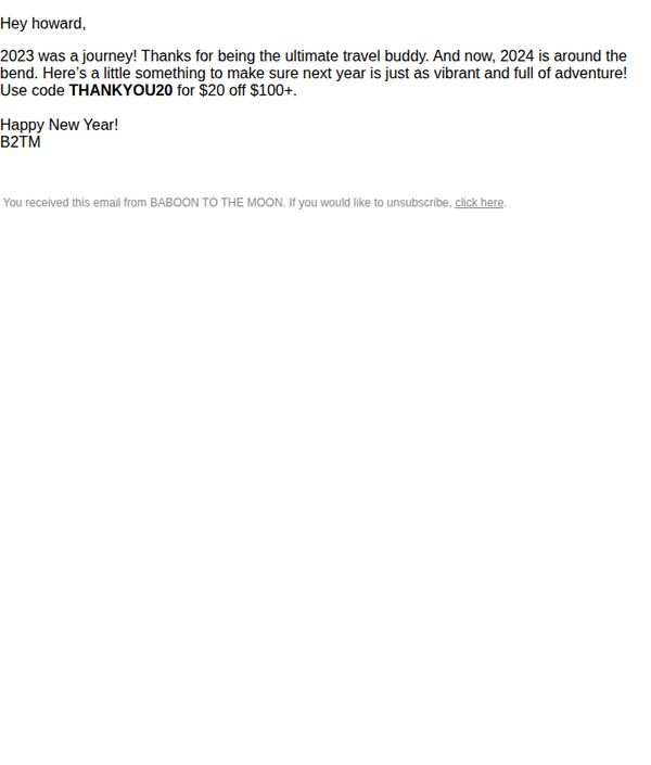
This email aims to express heartfelt gratitude to a loyal customer for their support in 2023 while incentivizing continued engagement in 2024 through a personalized discount offer, strengthening emotional connection and driving immediate purchase behavior.
Why this works
The email opens with a warm, personalized thank-you that frames the customer as a 'travel buddy,' instantly creating emotional resonance and transforming a transactional discount into a gesture of mutual adventure and shared history.
How to implement
By tying the discount code to a milestone year, 2023’s journey, it gives the promotion narrative weight, making the offer feel less like a sales tactic and more like a celebratory gift that honors the customer’s loyalty and past experiences.
Pro Tip
Add a visual hero section with a photo of a product or travel moment to break up the text-heavy layout and reinforce the 'travel buddy' theme, making the emotional message more immersive and memorable. • Include a clear expiration date for the discount code to create urgency, without it, the offer feels passive and may be ignored, reducing conversion potential despite the strong emotional hook.