Proven Peak Design accessories email designs you can use



1. Party On
Objective
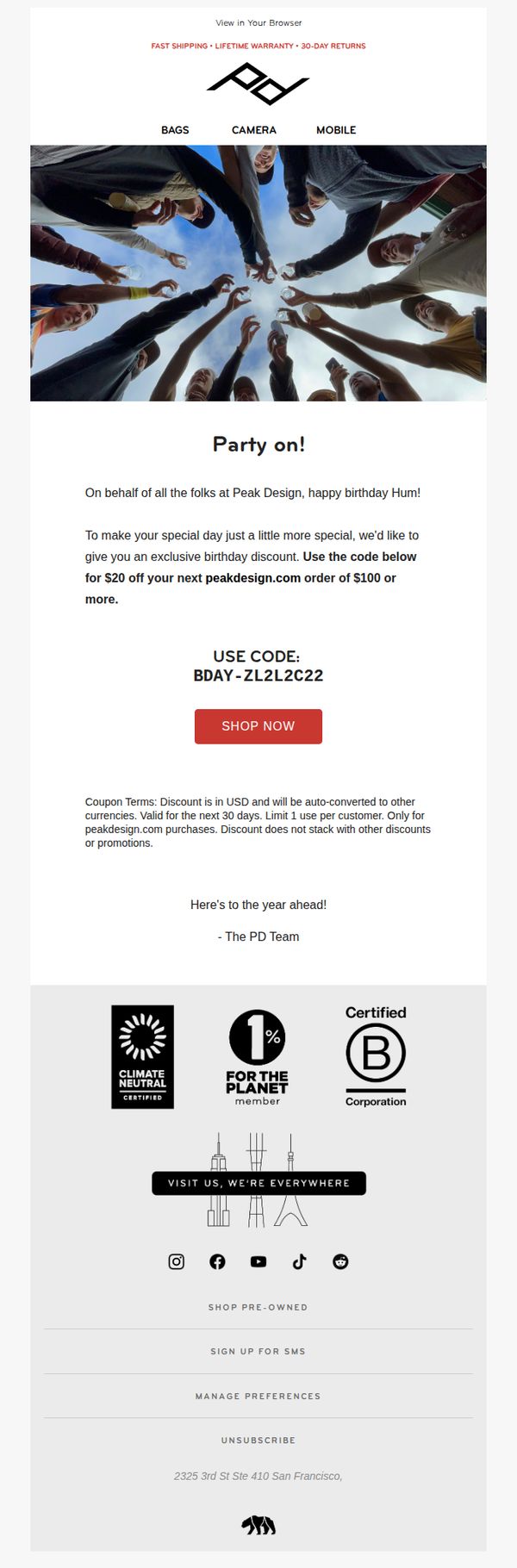
To celebrate the recipient’s birthday with a personalized discount, encouraging immediate purchase while reinforcing brand loyalty through a warm, community-driven tone that aligns with Peak Design’s values.
Why this works
The email opens with a joyful, human-centered image that instantly creates emotional resonance, making the recipient feel like part of a celebration rather than just a customer receiving a discount.
How to implement
By personalizing the offer with a unique code and tying it to the recipient’s birthday, Peak Design transforms a generic promotion into a memorable, emotionally rewarding moment that drives urgency without feeling pushy.
Pro Tip
Add a small countdown timer next to the coupon code to visually reinforce urgency and encourage immediate action, especially since the offer expires in 30 days, a detail currently buried in fine print. • Include a single product recommendation or bestseller below the CTA to reduce decision fatigue and guide the customer toward a high-converting item, increasing the likelihood of redemption.
2. 5️⃣0️⃣% off, in case ya missed it.
Objective
This email aims to re-engage potential backers by reminding them of a limited-time 50% discount on mobile gear and promoting the Micro Clutch launch, while driving urgency through a 24-hour countdown and exclusive in-person or live-streamed events.
Why this works
The email brilliantly leverages FOMO by anchoring the entire campaign around a 24-hour countdown, making the 50% discount feel urgent and exclusive rather than just another sale, which dramatically increases conversion pressure without sounding pushy.
How to implement
Instead of just listing features, the Micro Clutch section visually breaks down its engineering with annotated diagrams and real-world use cases, transforming a technical product into an emotionally resonant tool that solves specific photographer pain points like battery access and strap compatibility.
Pro Tip
The hero section’s ‘BACK NOW’ CTA is visually strong but lacks context, adding a micro-copy line like ‘Claim 50% Off Before Time Runs Out’ directly above the button would clarify the action’s value and reduce hesitation for first-time visitors. • The email buries the 31% Travel Tripod discount in the footer; relocating this offer higher, perhaps as a ‘Last Chance’ banner under the main hero, would better leverage price sensitivity and cross-sell to users already considering mobile gear.
3. Pixelate? 🟥🟨🟦🟩⬛️
Objective
This email aims to drive pre-orders for Peak Design’s new Everyday Case for Pixel 8 and 8 Pro by highlighting its color variety and compatibility features, while also cross-promoting iPhone 15 cases and discounting older models to clear inventory.
Why this works
The email brilliantly leverages color psychology by naming each case hue with evocative, nature-inspired names like Sun, Sage, and Redwood, making the product feel more personal and emotionally resonant rather than just a functional accessory.
How to implement
By immediately acknowledging non-Pixel users and redirecting them to iPhone 15 cases and older model discounts, the campaign avoids alienating a large segment of its audience and turns potential drop-offs into conversion opportunities with smart, inclusive messaging.
Pro Tip
The hero section’s CTA 'SHOP NOW' appears twice with identical styling and placement, creating visual redundancy; one should be removed or repositioned below the color grid to guide the eye naturally through the product options before prompting action. • The email lacks a clear visual hierarchy between the Pixel 8 case launch and the cross-sell offers; adding a subtle divider or contrasting background behind the iPhone 15/older model section would help users distinguish primary from secondary offers without confusion.
4. Want $7500 worth of gear?
Objective
To drive engagement and entries for a high-value photography gear giveaway tied to World Photography Day, while subtly reinforcing Peak Design’s brand presence among photography enthusiasts through co-branded partnerships.
Why this works
The email brilliantly leverages the emotional pull of a high-stakes giveaway by front-loading the prize value, $7,500 worth of gear, immediately capturing attention and making the entry feel like a once-in-a-lifetime opportunity for photography lovers.
How to implement
By featuring a visually compelling hero image of a photographer silhouetted against a cityscape at dusk, the campaign taps into aspirational storytelling, subtly aligning Peak Design’s products with the romantic, adventurous spirit of professional photography.
Pro Tip
The CTA 'GIMME THE GEAR' is punchy but could be more benefit-driven, consider rephrasing to 'Enter to Win $7,500 in Pro Gear' to reinforce the prize value directly in the action button and reduce ambiguity about the reward. • The 'Side Track' section, while visually engaging, distracts from the primary goal; consider relocating it below the CTA or replacing it with a social proof element like 'Over 10,000 photographers already entered' to maintain conversion momentum.
5. 🌶️ Cyber Monday: UNLOCKED 🥵
Objective
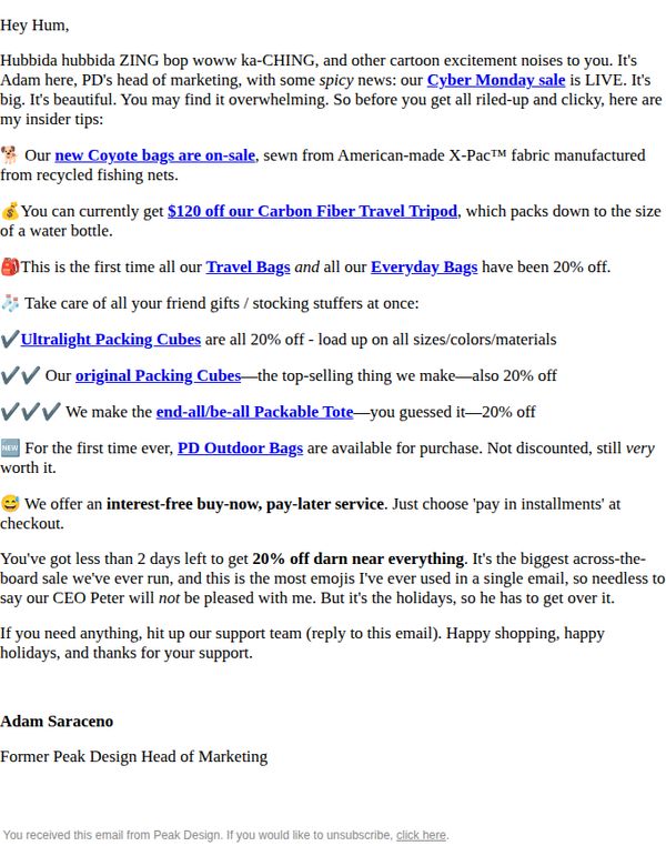
To drive immediate sales during Cyber Monday by highlighting time-sensitive discounts across multiple product lines while leveraging personal, enthusiastic messaging from the Head of Marketing to build trust and urgency.
Why this works
The email opens with a playful, high-energy tone that mirrors the excitement of Cyber Monday, making the reader feel like they’re getting insider access to a limited-time event rather than just another promotional blast.
How to implement
By listing specific product categories with clear discount percentages and unique selling points, like ‘packs down to the size of a water bottle’, the email turns generic sales into tangible, benefit-driven reasons to buy now.
Pro Tip
Add a visual countdown timer near the top of the email to reinforce urgency and reduce the cognitive load of calculating ‘less than 2 days left’, this would increase conversion by making time pressure more visceral. • Include a small product grid or thumbnail carousel beneath the offer section to visually showcase discounted items, helping users quickly identify what’s on sale without scrolling through text-heavy bullet points.
6. Sorry, Alice.

Objective
This email aims to re-engage a specific customer, Alice, by acknowledging her personal preferences while promoting back-to-school-themed products and a limited-time e-motorcycle collaboration. It blends humor, personalization, and practical offers to drive immediate purchases and reinforce brand loyalty.
Why this works
The email brilliantly opens with personalized humor, addressing the recipient by name and referencing a cultural figure to create immediate emotional resonance while subtly validating the customer’s unique taste.
How to implement
Each product is framed as a solution to a specific lifestyle need, whether commuting, organizing tech, or biking to class, making the pitch feel consultative rather than salesy, which builds trust and relevance for the reader.
Pro Tip
Add a countdown timer or deadline badge next to the 40% off e-motorcycle offer to visually reinforce urgency and encourage faster decision-making, especially since the discount is time-sensitive. • Include a brief customer testimonial or social proof near the product grid to validate the everyday usability of each bag, helping hesitant buyers overcome perceived risk and boosting conversion confidence.
7. An official statement on recent events.
Objective
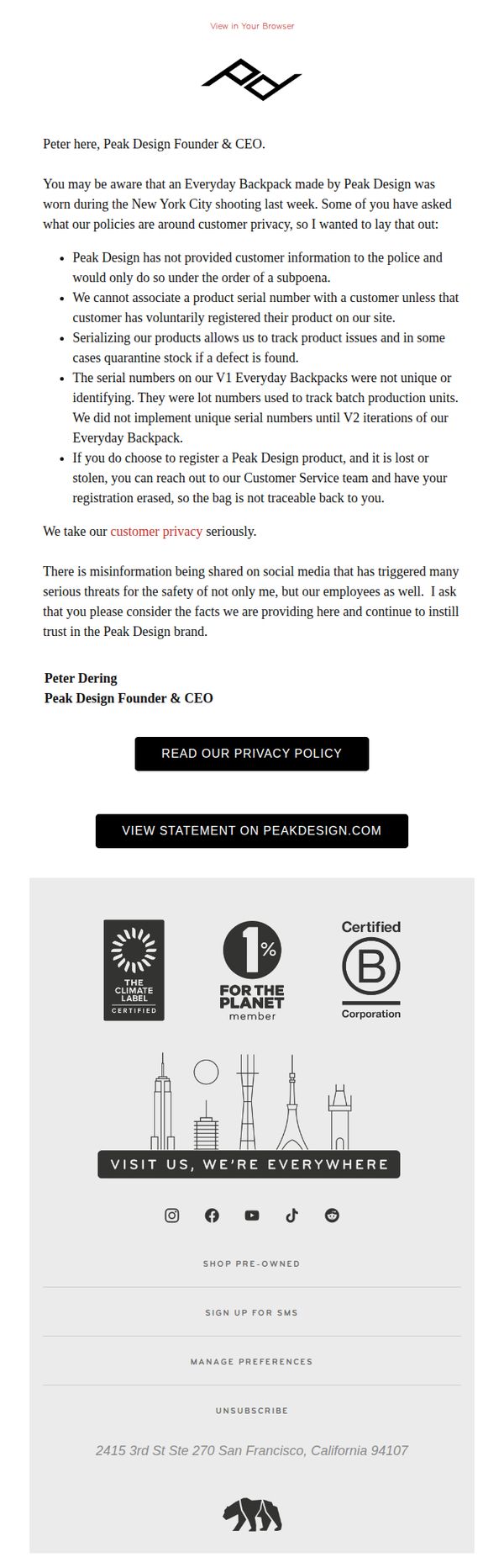
Peak Design aims to address public concern and misinformation following the use of one of its backpacks in a high-profile incident, while reaffirming its commitment to customer privacy and brand integrity. The email seeks to rebuild trust by clarifying policies and distancing the brand from external events.
Why this works
Peak Design masterfully turns a potentially damaging situation into a trust-building moment by leading with transparency, directly addressing customer concerns, and grounding its response in clear policy rather than emotion or defensiveness.
How to implement
The email strategically uses the founder’s personal voice to humanize the brand, lending credibility and emotional weight to the message while subtly reinforcing that leadership is accountable and accessible during moments of public scrutiny.
Pro Tip
Add a brief FAQ or 'Common Questions' section beneath the main statement to preemptively address likely customer concerns about product traceability, data retention, or future policy changes, reducing support inquiries and reinforcing clarity. • Include a secondary CTA such as 'Contact Our Support Team' or 'Share Your Feedback' to encourage dialogue and demonstrate openness, turning passive readers into engaged stakeholders who feel heard during a sensitive moment.
8. Biggest Deals of the Hollandaise

Objective
This email aims to drive urgency and immediate purchases by promoting Peak Design’s Black Friday sale with deep discounts across nearly all products, while also incentivizing higher cart values through a free mystery gift offer for orders over $300.
Why this works
The email brilliantly frames its discount as a rare exception to Peak Design’s premium pricing, using honest copy to validate the brand’s value while making the sale feel like a privileged, time-sensitive opportunity rather than a desperate clearance.
How to implement
By segmenting products into themed sections like 'Top-Tier Bangers' and 'All-Time Bestsellers,' the email guides shoppers through curated paths instead of overwhelming them with a flat list, making decision-making easier and increasing the likelihood of multiple purchases.
Pro Tip
Add a visible countdown timer in the hero section to reinforce urgency, since the sale end time is buried in fine print, this would increase FOMO and reduce hesitation for impulse buyers. • Include a short testimonial or social proof near the 'Free Mystery Gift' section to validate the perceived value of the gift, since customers may question whether a $20–$100 item is worth spending $300 on without social reinforcement.
9. Ice Cold Savings

Objective
This email aims to drive last-minute holiday sales by reminding subscribers of a time-sensitive 10% off sitewide discount, positioning Peak Design gear as ideal gifts while encouraging immediate purchase before the Winter Weekend Sale ends.
Why this works
The email brilliantly leverages FOMO by anchoring the sale to a specific end date, Sunday, Dec. 14th, while subtly reframing missed Black Friday deals as a second chance to treat yourself or others, making the urgency feel personal and timely.
How to implement
By organizing products into gift-friendly price tiers, under $50, $150, and $500, the email removes decision fatigue and speaks directly to holiday shoppers’ budgeting instincts, turning a generic sale into a curated gifting experience that aligns with real-world purchasing behavior.
Pro Tip
Add a dynamic countdown timer near the hero section to visually reinforce urgency, seeing the clock tick down to Sunday, Dec. 14th at 11:59pm PT would increase conversion by making the deadline feel more immediate and real. • Include a short testimonial or user-generated photo near the product grid to build social proof, seeing real customers using the Everyday Sling or Travel Duffel in action would validate the 'Durable, Beautiful, Capable' claim and reduce perceived risk.
10. When it comes to phone cases...

Objective
This email aims to drive sales of Peak Design’s Everyday Case for iPhone 15 by highlighting its multifunctional design and new color options, using humor and visual storytelling to position it as both stylish and practical for daily use.
Why this works
The email brilliantly uses absurd humor, a person in a horse mask, to break through inbox noise, making the product memorable while subtly reinforcing the ‘one-trick pony’ metaphor for competitors’ less versatile cases.
How to implement
By showcasing the case’s built-in stand and wallet features with clear visual callouts and playful miniatures, the email transforms technical specs into tangible lifestyle benefits that resonate with users seeking convenience without compromise.
Pro Tip
The primary CTA 'UNLEASH THE FULL RODEO' is clever but vague, replacing it with a benefit-driven phrase like 'Get the Case That Does It All' would better align with the product’s functional value and improve conversion clarity. • The hero section’s yellow background, while bold, visually competes with the product imagery, toning it down or using a gradient would help the phone case and CTA button stand out more effectively for mobile viewers.