Proven Calm Applications email designs you can use


1. 💙 Here’s how to prioritize yourself (without the guilt)
Objective
This email aims to help subscribers prioritize self-care without guilt by offering actionable mental wellness strategies and promoting Calm Premium as a tool to support emotional balance. It blends educational content with a limited-time discount to drive conversions while reinforcing brand empathy.
Why this works
The email opens with a relatable emotional hook, saying 'yes' to others at your own expense, then immediately reframes self-care as non-negotiable, making the reader feel seen before pitching the solution, which builds trust before the ask.
How to implement
By embedding multiple content-driven CTAs tied to specific emotional needs, like self-compassion or forgiveness, the email turns passive reading into active self-discovery, subtly guiding users toward premium content without aggressive sales pressure.
Pro Tip
The Home Chef cross-sell section feels disconnected from Calm’s core mental wellness message; either reframe it as a self-care ritual (e.g., 'Cooking as mindfulness') or replace it with a Calm-exclusive content offer to maintain thematic consistency. • The primary CTA 'Claim 40% off now' appears only once in the hero section; repeating a secondary CTA after the 'Calm to the Rescue' content block would capture users who scroll past the initial offer without breaking the email’s calm, reflective tone.
2. 💙 You’re never too busy for self-care
Objective
This email aims to remind busy users that self-care is non-negotiable and can be practiced in under a minute, while gently guiding them toward a Calm Premium subscription by offering a 40% discount and curated content to support mental wellness.
Why this works
The email brilliantly reframes self-care as non-negotiable by positioning it as something you can do in 30 seconds, making it feel instantly accessible even for the busiest people, which reduces psychological resistance to starting.
How to implement
By embedding the discount within educational content rather than leading with it, Calm positions the offer as a natural extension of care, not a sales tactic, building trust and making the CTA feel like a helpful next step, not a push.
Pro Tip
Add a subtle countdown timer near the 'Claim 40% off now' CTA to create urgency without being aggressive, leveraging the 'Week of February 21' context to imply the offer is time-bound and exclusive to this weekly edition. • Include a brief testimonial or user stat (e.g., '92% of users report feeling calmer within 7 days') near the offer section to reinforce social proof and reduce perceived risk before the user commits to the discount.
3. Featured Music from Calm
Objective
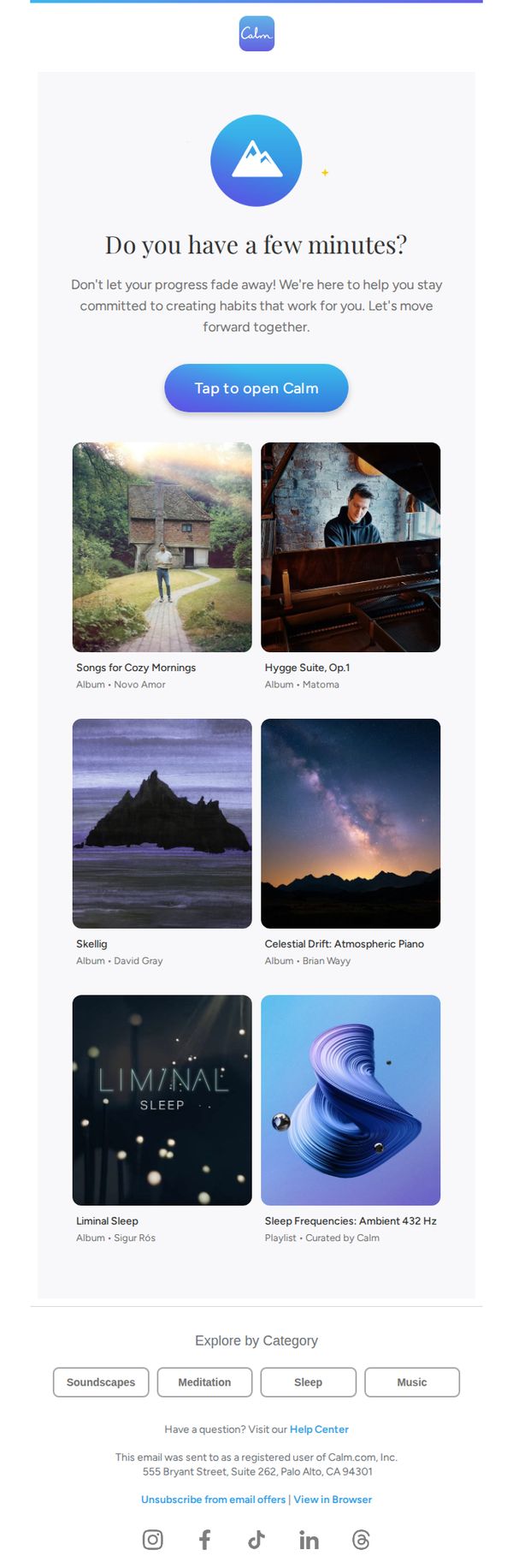
This email aims to re-engage users by reminding them to maintain their mindfulness habits through curated music content, encouraging immediate app interaction with a gentle, supportive tone that reinforces Calm’s role as a personal wellness companion.
Why this works
The email opens with a warm, conversational question, 'Do you have a few minutes?', that lowers the barrier to engagement by framing the interaction as a brief, guilt-free moment rather than a demand on the user’s time.
How to implement
Each music album is presented with evocative imagery and minimal text, allowing the visual mood to communicate the emotional benefit first, which aligns with Calm’s brand identity of intuitive, sensory-driven wellness experiences.
Pro Tip
Add a micro-copy line under the CTA button like 'Start your 5-minute reset' to clarify the immediate benefit and reduce friction for users unsure what to expect after tapping. • Include a small progress indicator or habit streak counter near the hero text (e.g., 'You’ve meditated 3 days in a row!') to personalize the message and reinforce behavioral momentum.
4. Get your 50% off before it’s gone
Objective
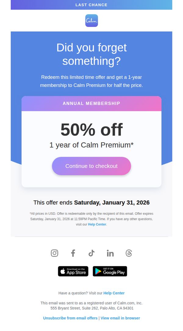
This email aims to re-engage users who may have abandoned their purchase by reminding them of a limited-time 50% discount on a 1-year Calm Premium membership, creating urgency to complete checkout before the offer expires.
Why this works
The subject line and opening question 'Did you forget something?' create a gentle, guilt-free nudge that feels personal rather than pushy, making the recipient more likely to re-engage with the offer without feeling pressured.
How to implement
Positioning the 50% discount as a 'last chance' with a specific expiration date leverages scarcity psychology effectively, turning passive interest into immediate action by anchoring the value to a time-sensitive window.
Pro Tip
Add a brief testimonial or social proof near the CTA to reinforce trust, for example, 'Join 100,000+ users who improved their sleep with Calm Premium', to reduce hesitation for users on the fence. • Include a small countdown timer or 'X hours left' indicator beneath the expiration date to amplify urgency visually, making the deadline feel more immediate and tangible than static text alone.
5. Featured Music from Calm
Objective
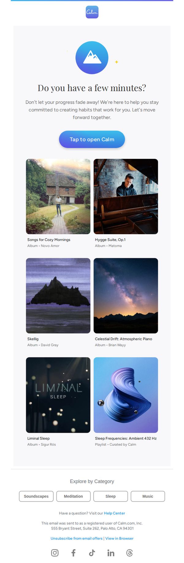
This email aims to re-engage users by reminding them to maintain their mindfulness and relaxation habits through Calm’s curated music offerings, encouraging immediate app interaction with a gentle, supportive tone.
Why this works
The email opens with a warm, conversational question that invites reflection rather than demands action, making the user feel seen and gently nudged, not pressured, toward re-engagement with the app.
How to implement
Each music album is presented with evocative imagery and minimal text, letting the visual mood and artist name do the heavy lifting, this aesthetic-first approach aligns perfectly with Calm’s brand identity and emotional promise.
Pro Tip
Add a subtle progress indicator or habit streak counter near the hero text to visually reinforce the user’s existing commitment, making the ‘Don’t let your progress fade away’ message more personal and data-driven. • Include a micro-testimonial or user stat (e.g., ‘87% of users who listened to Hygge Suite reported feeling calmer within 10 minutes’) beneath one or two top albums to add social proof without disrupting the serene layout.
6. 💙 Feeling low? Try this

Objective
This email aims to emotionally resonate with users experiencing low moods by offering immediate, actionable coping strategies while gently guiding them toward a premium subscription as a long-term solution for mental wellness. It blends empathy with conversion by positioning Calm as both a compassionate companion and a practical tool for daily emotional resilience.
Why this works
The email opens with a relatable, emotionally intelligent hook that validates the reader’s low mood without judgment, immediately building trust and making the subsequent advice feel like a natural, supportive next step rather than a sales pitch.
How to implement
By framing the 50% discount as a 'backup plan' tied to a specific emotional state, not just a generic promotion, the campaign transforms a transactional offer into a personalized, empathetic intervention that aligns with the user’s current psychological need.
Pro Tip
The two 'Unlock with 50% Off' buttons under the content modules are visually identical to the main CTA, which dilutes urgency and decision-making clarity, consider differentiating them with softer styling or rephrasing to 'Explore This Session' to reduce friction before the primary conversion point. • The 'Calm Life' section includes two article links that compete for attention without clear hierarchy, prioritize one based on user intent (e.g., 'How to feel better' for immediate relief) and either remove or visually subordinate the secondary link to avoid cognitive overload.
7. Jan 6, 2026: featured and trending sessions
Objective
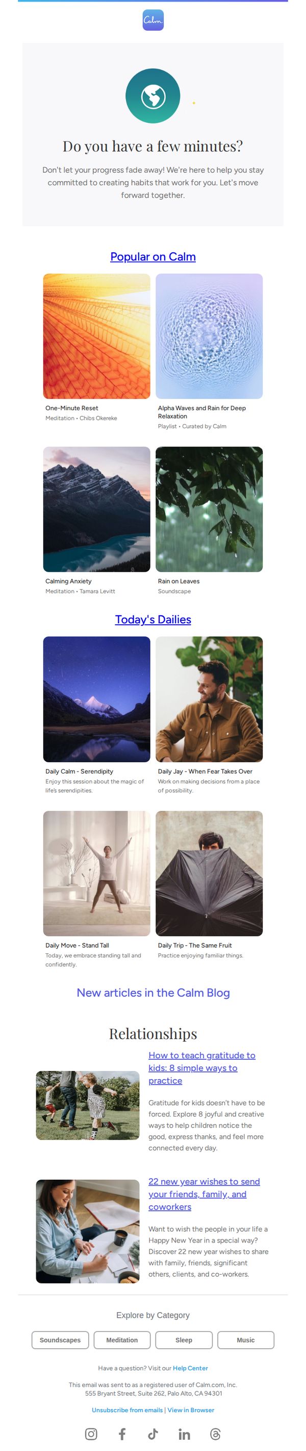
This email aims to re-engage users by reminding them to maintain their mindfulness habits through curated, timely content that aligns with their personal growth journey, while subtly reinforcing Calm’s value as a daily companion for mental well-being.
Why this works
The email opens with a gentle, time-sensitive question, 'Do you have a few minutes?', that lowers the barrier to engagement by framing meditation as a micro-commitment, not a chore, which is psychologically smart for busy users.
How to implement
By organizing content into clearly labeled sections like 'Popular on Calm' and 'Today’s Dailies,' the email creates a sense of editorial curation and daily rhythm, making users feel like they’re returning to a trusted, evolving resource rather than just a static app.
Pro Tip
Add a visual or text-based progress indicator near the top (e.g., 'You’ve meditated 3x this week, keep going!') to personalize the re-engagement message and leverage behavioral momentum, making the 'Don’t let your progress fade away!' line more impactful. • Reposition the 'Popular on Calm' CTA to be a button with higher contrast and placement directly under the hero text, currently it’s a hyperlink that blends in, reducing its effectiveness as the primary action driver for returning users.
8. Get your 50% off before it’s gone
Objective
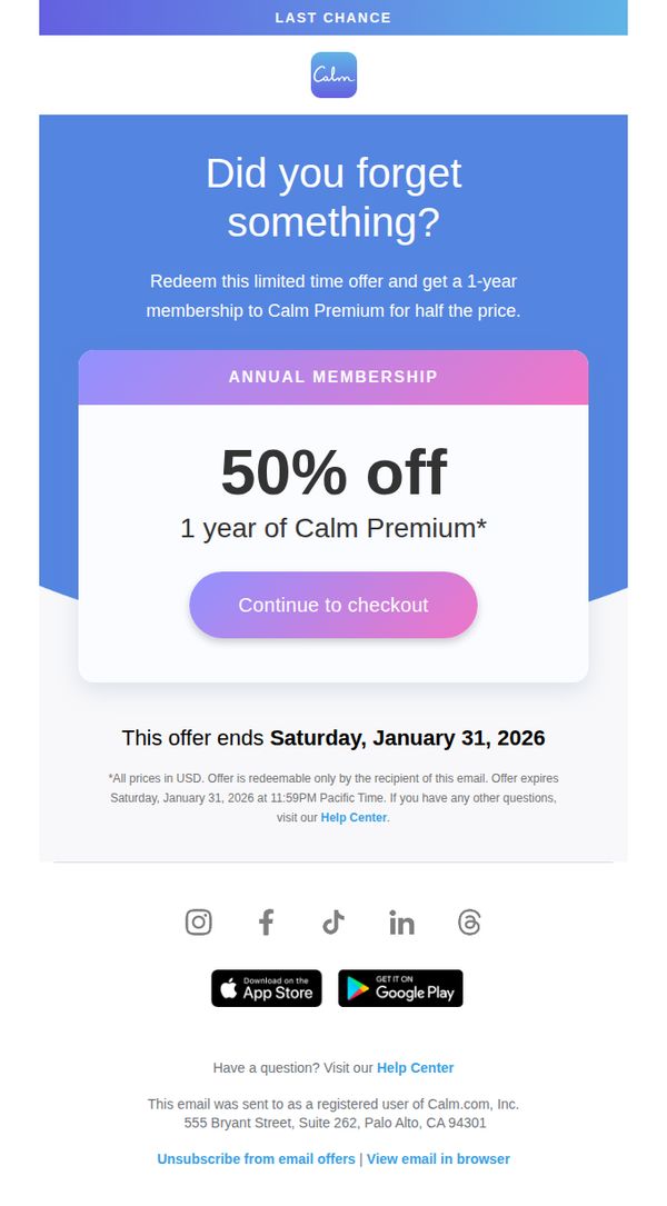
To re-engage users who may have abandoned their purchase by reminding them of a limited-time 50% discount on a 1-year Calm Premium membership, encouraging immediate conversion before the offer expires.
Why this works
The email leverages gentle urgency with a 'Did you forget something?' hook that feels helpful rather than pushy, making the user feel personally reminded rather than marketed to.
How to implement
By anchoring the offer around a specific expiration date, January 31, 2026, the campaign creates a clear time-bound incentive that motivates action without overwhelming the reader with pressure.
Pro Tip
Add a subtle progress bar or countdown timer beneath the expiration date to visually reinforce urgency and encourage immediate action before the deadline. • Include a short testimonial or user stat (e.g., 'Join 5M+ users who sleep better with Calm') near the CTA to build social proof and reduce perceived risk for hesitant users.
9. Get your 50% off before it’s gone
Objective
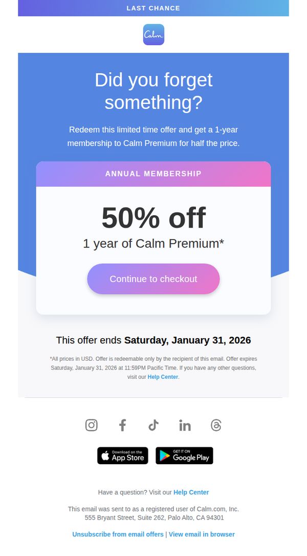
This email aims to re-engage users who may have abandoned their purchase by reminding them of a limited-time 50% discount on a 1-year Calm Premium membership, creating urgency to complete checkout before the offer expires.
Why this works
The email leverages psychological urgency by framing the discount as a forgotten opportunity, making the recipient feel personally responsible for reclaiming value rather than simply being sold to.
How to implement
By anchoring the offer to a specific expiration date, January 31, 2026, the campaign creates a tangible deadline that reduces decision fatigue and encourages immediate action without overwhelming the reader.
Pro Tip
Add a brief testimonial or social proof near the CTA to reinforce trust, such as 'Join 5M+ users who’ve transformed their sleep and stress levels with Calm Premium', to reduce hesitation before checkout. • Include a subtle countdown timer beneath the expiration date to visually reinforce urgency, making the deadline feel more immediate and emotionally compelling than static text alone.
10. 💙 Look back to move forward

Objective
This email aims to encourage users to embrace self-reflection as a path to meaningful personal growth, while promoting a limited-time partnership offer between Calm and Sweat to drive premium subscriptions and cross-platform engagement.
Why this works
The email brilliantly reframes self-improvement not as relentless forward motion but as intentional reflection, making the message feel both emotionally resonant and psychologically grounded for users seeking sustainable change.
How to implement
By pairing Calm’s mental wellness tools with Sweat’s fitness content, the campaign creates a holistic self-care narrative that appeals to users’ desire for integrated mind-body wellness, increasing perceived value and conversion potential.
Pro Tip
The CTA 'Start Your Journey' is generic and doesn’t leverage the emotional context of reflection; rephrasing it to 'Begin Your Reflective Journey' would better align with the email’s core message and increase psychological resonance. • The Avatar sleep story section, while charming, interrupts the self-reflection flow and dilutes the campaign’s central theme; relocating it to a footer or secondary banner would preserve narrative cohesion and conversion focus.