Tappan Art campaign ideas that work
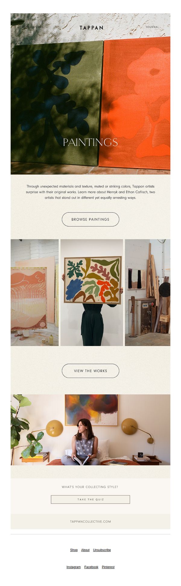
1. Works With Impact
Objective
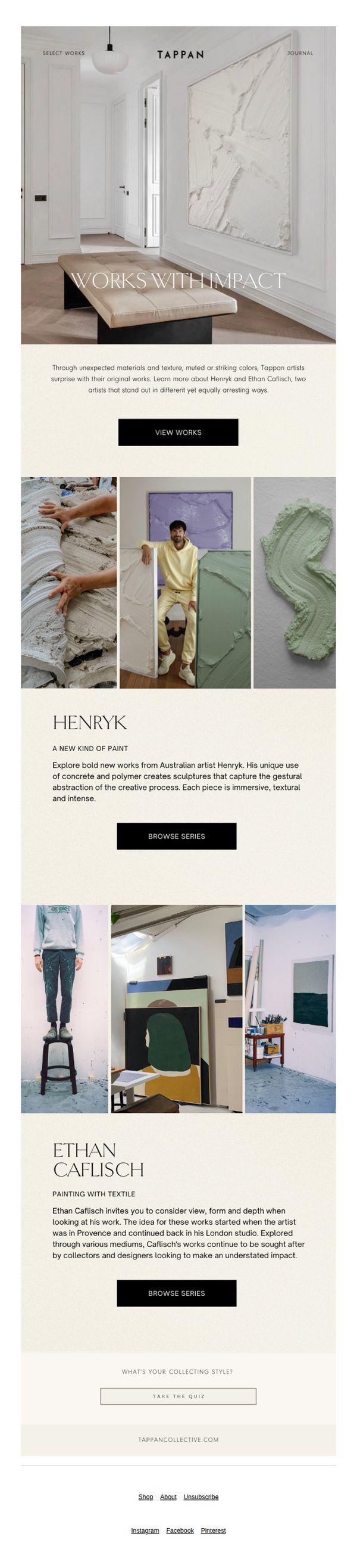
This email aims to introduce and spotlight two emerging artists, Henryk and Ethan Caflisch, by highlighting their unique artistic processes and materials, encouraging recipients to explore their collections and engage further with the brand’s curated art offerings.
Why this works
The email masterfully frames each artist’s work through a narrative lens, not just visual presentation, this storytelling approach builds emotional resonance and positions the art as experiential rather than transactional, which deepens collector engagement.
How to implement
By spotlighting artists’ unconventional materials and creative origins, the campaign elevates the perceived value of the work, turning product features into compelling brand differentiators that appeal to discerning collectors seeking authenticity and innovation.
Pro Tip
Add a subtle visual cue or hover animation on the 'VIEW WORKS' CTA to increase perceived interactivity and draw more attention to the primary action, especially since it’s placed below a large hero image where users may scroll past without engaging. • Integrate a brief testimonial or collector quote beneath each artist’s bio to reinforce social proof, this would strengthen credibility and help hesitant buyers feel more confident in the artistic value and market relevance of the pieces.
2. New This Week
Objective
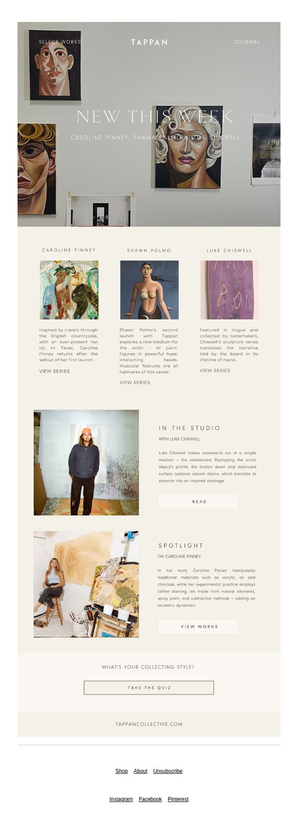
This email aims to introduce subscribers to newly added artists and their latest works, while encouraging deeper engagement through artist spotlights and studio features. It also seeks to guide collectors toward personalized discovery with a style quiz and direct access to the full collection.
Why this works
The email brilliantly balances artistic storytelling with commercial intent by spotlighting each artist’s unique process and inspiration, making the collection feel personal and culturally rich rather than purely transactional.
How to implement
By embedding artist studio photos and behind-the-scenes narratives, the campaign builds emotional credibility and invites collectors to see themselves as part of the creative journey, not just passive buyers.
Pro Tip
Add a subtle countdown or ‘New Arrivals’ badge near the hero section to create urgency and signal exclusivity, encouraging immediate clicks before the featured works sell out or rotate. • Reposition the ‘TAKE THE QUIZ’ CTA higher in the email, perhaps after the artist spotlights, to capture interest while users are still emotionally engaged with the stories, rather than at the bottom where it may be overlooked.
3. New Art
Objective
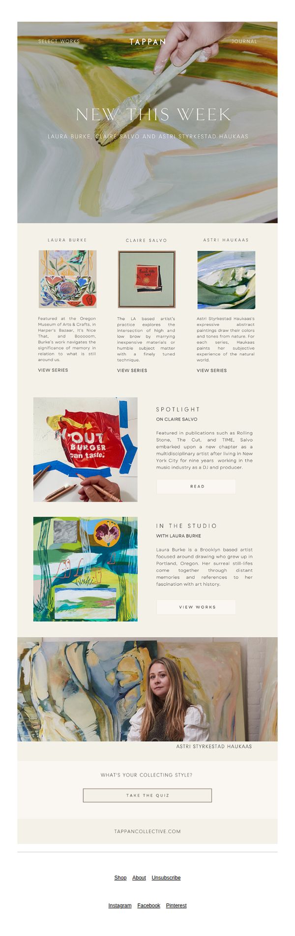
This email aims to introduce subscribers to newly featured artists and their latest works, encouraging exploration of their portfolios and deeper engagement through curated content like artist spotlights and studio visits. It also seeks to drive traffic to the Tappan Collective website by prompting users to take a collecting style quiz.
Why this works
The email masterfully blends artist storytelling with visual discovery by spotlighting each creator’s background and aesthetic, making the collection feel personal and culturally rich rather than purely transactional.
How to implement
By embedding a ‘What’s Your Collecting Style?’ quiz at the bottom, the campaign transforms passive browsing into an interactive experience that builds user investment and guides future personalized recommendations.
Pro Tip
The primary CTA 'TAKE THE QUIZ' is visually underwhelming and buried at the bottom; relocating it higher with stronger visual contrast or adding a secondary CTA like 'Explore New Works' above the artist grid would improve conversion flow. • The hero section’s headline 'NEW THIS WEEK' lacks urgency or emotional hook; adding a time-sensitive phrase like 'Just Added, Discover 3 Emerging Voices Before They Sell Out' would better motivate immediate engagement.
4. Art 101: The Meaning Behind Making
Objective
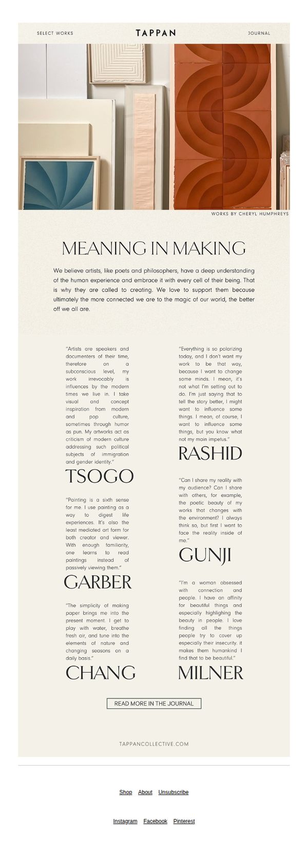
This email aims to deepen the audience’s emotional and intellectual connection with Tappan’s mission by showcasing artists’ personal philosophies on creation, thereby positioning the brand as a curator of meaningful art rather than just a retailer. It invites readers to explore the Journal for richer storytelling and context.
Why this works
Tappan brilliantly elevates its brand narrative by centering artists’ voices, not just their work, creating an emotional bridge that positions collecting art as participating in a deeper cultural dialogue rather than mere consumption.
How to implement
The minimalist layout paired with thoughtful typography gives each artist’s quote room to breathe, turning the email into a curated gallery experience that respects the gravity of artistic intention while guiding the reader toward further exploration.
Pro Tip
Add a subtle visual cue or hover effect on the ‘READ MORE IN THE JOURNAL’ button to increase perceived interactivity and reduce friction for users unfamiliar with the Journal’s value proposition. • Integrate a brief teaser sentence beneath the CTA, such as ‘Discover how these artists turn emotion into form’, to strengthen intent and clarify what readers gain by clicking, especially for those skimming the email.
5. Original Paintings
Objective
To introduce and showcase original paintings from Tappan artists, highlighting their unique materials and color palettes while encouraging recipients to explore the collection and discover their personal collecting style through an interactive quiz.
Why this works
Tappan masterfully frames its artists not just as creators but as explorers of texture and color, making the collection feel like a curated sensory journey rather than a simple product catalog, which deepens emotional engagement.
How to implement
By spotlighting two distinct artists with contrasting styles yet unified by artistic integrity, the email subtly reassures collectors that there’s a place for diverse tastes within the Tappan universe without diluting brand identity.
Pro Tip
Add a subtle countdown timer or limited-edition tag near the 'Browse Paintings' CTA to create urgency, especially since original artworks are inherently scarce and time-sensitive for collectors. • Reposition the 'View the Works' button directly beneath the artist grid to reduce cognitive load, users should be able to act immediately after seeing the art, rather than scrolling past a decorative image.
6. Profile: Mariana Velasquez
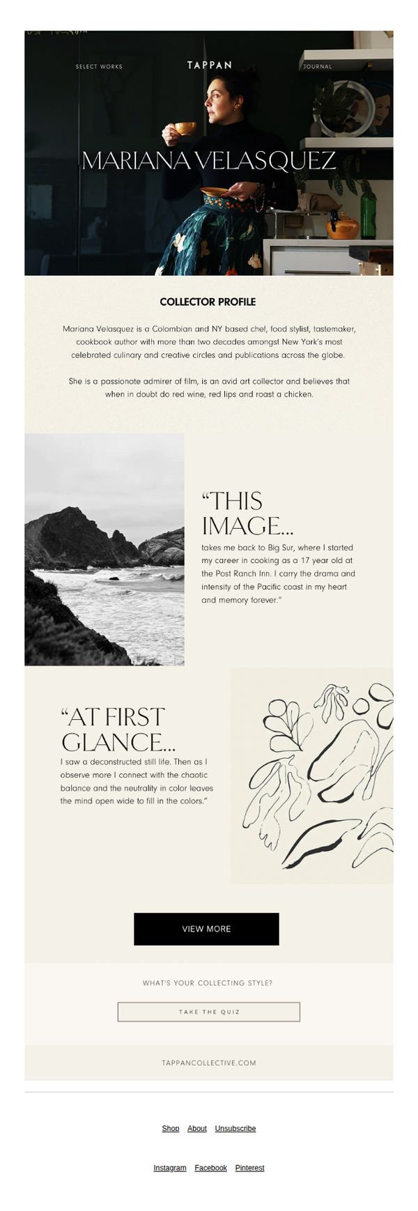
Objective
This email aims to introduce Mariana Velasquez as a featured collector for Tappan, building brand authority and emotional connection by highlighting her creative journey and aesthetic philosophy. It encourages deeper engagement through a profile deep-dive and a personality quiz to personalize the collecting experience.
Why this works
The email masterfully blends personal storytelling with brand identity by letting the collector’s voice and memories anchor the narrative, making the brand feel like a curator of human stories rather than just objects.
How to implement
Using evocative, minimalist visuals paired with poetic quotes transforms a simple profile into an immersive experience, inviting the reader to emotionally inhabit the collector’s world rather than just observe it.
Pro Tip
Add a subtle visual cue or micro-animation to the 'VIEW MORE' CTA to increase click-through, since the button currently blends into the neutral background and lacks urgency or interactivity. • Include a brief teaser of what the quiz reveals, e.g., 'Discover your collector archetype', to reduce friction and clarify value, as the current 'WHAT’S YOUR COLLECTING STYLE?' lacks incentive for immediate action.
7. Subtle Tones
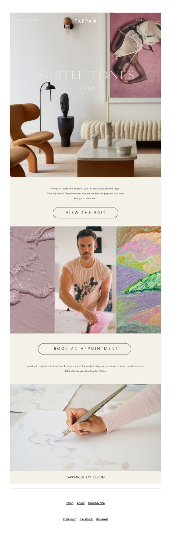
Objective
This email aims to guide art lovers toward a curated collection of subtle, tonal artworks that align with refined interior aesthetics, while encouraging direct engagement through appointment booking or browsing the edit. It positions Tappan as a tastemaker in thoughtful, color-sensitive art curation.
Why this works
The email masterfully uses atmospheric visuals and restrained typography to evoke a mood rather than just sell art, making the viewer feel like they’re stepping into a curated gallery experience rather than receiving a sales pitch.
How to implement
By anchoring the campaign around a thematic edit, 'Subtle Tones', Tappan transforms a broad product category into a digestible, emotionally resonant story that appeals to buyers seeking harmony and sophistication in their home decor.
Pro Tip
Add a secondary CTA beneath 'Book an Appointment' that says 'Browse All Subtle Tones' to capture users who prefer self-guided exploration over scheduling a consultation, reducing friction for casual browsers. • Include a small visual indicator, like a 'New This Week' badge or a 'Curator’s Pick' tag, on one of the artwork thumbnails to create urgency and highlight editorial authority, nudging hesitant viewers toward action.
8. Fall In Love
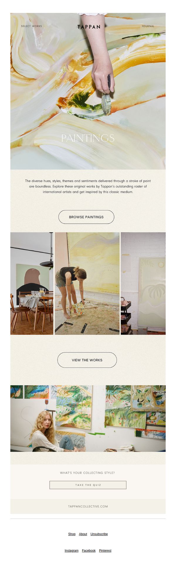
Objective
This email aims to inspire art lovers to explore Tappan’s curated collection of original paintings by highlighting the emotional and aesthetic diversity of their artists’ work, while encouraging immediate engagement through browsing and personality-based discovery.
Why this works
The email opens with a visually arresting hero image of a painter’s hand mid-stroke, instantly communicating authenticity and artistic process, a powerful emotional hook that aligns with the brand’s mission to celebrate original art.
How to implement
By framing the collection as a journey of ‘diverse hues, styles, themes, and sentiments,’ the copy invites curiosity and personal connection, positioning art not as a commodity but as an emotional experience tailored to the viewer’s taste.
Pro Tip
Add a subtle countdown or limited-edition tag near the ‘Browse Paintings’ CTA to create urgency, especially since the subject line ‘Fall In Love’ implies a fleeting, emotional moment that benefits from time-sensitive framing. • Integrate a mini testimonial or collector quote beneath the ‘View the Works’ section to build social proof, currently, the email lacks third-party validation that could reassure hesitant buyers about the value and quality of the art.
9. L.A. MADE

Objective
This email aims to celebrate Tappan’s roots in Los Angeles while showcasing an exclusive art exhibition that highlights local artists and the city’s cultural influence. It invites recipients to engage with the brand’s story and view the show before it ends on October 28, 2023.
Why this works
The email masterfully ties brand identity to place by opening with a bold ‘L.A. MADE’ headline and weaving local pride into every section, making the audience feel part of a cultural movement rather than just consumers.
How to implement
By blending candid gallery photos with curated artwork shots, the email creates an immersive, behind-the-scenes experience that builds emotional connection and authenticity, encouraging viewers to see themselves at the event.
Pro Tip
Add a subtle countdown timer near the final CTA to create urgency around the October 28, 2023 deadline, leveraging FOMO without disrupting the elegant, editorial tone of the email. • Include a short artist quote or testimonial snippet next to one of the artwork images to humanize the creators and deepen emotional resonance, making the ‘L.A. MADE’ theme more personal and relatable.
10. Profile: Jihan Zencirli
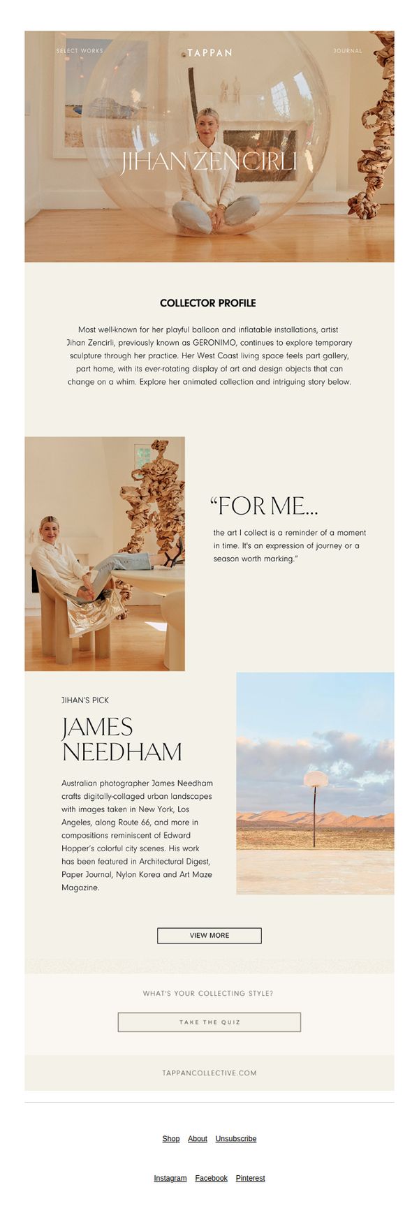
Objective
To introduce and celebrate artist Jihan Zencirli’s unique collecting philosophy and curated taste, while subtly guiding readers toward deeper engagement with Tappan’s platform through featured artists and a personality quiz. The email positions Tappan as a curator of meaningful, story-driven art experiences.
Why this works
The email masterfully blends personal storytelling with art curation by spotlighting Jihan Zencirli’s collecting philosophy, making the brand feel intimate and culturally attuned rather than purely transactional.
How to implement
By featuring a specific artist pick, James Needham, the email creates a natural bridge from personality to product, subtly guiding the reader from admiration to exploration without overt sales pressure.
Pro Tip
Add a secondary CTA beneath the 'VIEW MORE' button that links directly to Jihan’s full collection or related artworks, this would capitalize on the emotional momentum created by her profile and reduce friction to discovery. • Incorporate a subtle visual indicator, such as a small badge or icon, next to 'Jihan’s Pick' to signal exclusivity or editor’s choice, enhancing perceived value and guiding attention more effectively.