The complete Lululemon Back to School email collection




1. New school year, go-to gear
Objective
To drive back-to-school apparel and accessory sales by positioning Lululemon gear as essential, versatile campus wear for students. The campaign aims to convert interest into purchases through curated product categories and a membership incentive.
Why this works
The email brilliantly frames everyday campus life as a lifestyle moment, not just a shopping occasion, making the gear feel essential rather than optional by aligning products with student identity and daily routines.
How to implement
Each product category is anchored with a strong visual context, like a lecture hall or football field, that subtly communicates functionality and emotional resonance, helping shoppers envision the items in their own lives without needing lengthy descriptions.
Pro Tip
Add a subtle countdown timer or urgency indicator near the 'Final Sale? Not for you.' section to nudge hesitant shoppers by reinforcing the exclusivity of membership perks during a high-intent back-to-school window. • Integrate a small 'Top Picks for Campus Life' badge or icon on 2–3 hero products to guide overwhelmed shoppers and highlight items most aligned with the campaign’s lifestyle messaging, reducing decision fatigue.
2. Shades of a starry sky
Objective
This email aims to drive engagement and sales by showcasing Lululemon’s new color palette, Oil Grey and Yellow Serpentine, across apparel and accessories, encouraging customers to explore coordinated outfits and complementary products while subtly promoting membership perks.
Why this works
The email masterfully ties product launches to an evocative theme, 'Shades of a starry sky', which transforms color selection into an emotional, lifestyle-driven experience rather than a mere transactional choice.
How to implement
By visually grouping apparel and accessories in matching tones, the campaign encourages bundle thinking, subtly guiding customers to complete their look while increasing average order value through strategic cross-category placement.
Pro Tip
Add a subtle countdown timer or limited-edition badge near the 'Shop What’s New' CTA to create urgency around the new color launch, leveraging FOMO without disrupting the clean aesthetic. • Reposition the 'Partner Perks' membership promotion higher in the email, perhaps after the hero section, to capture attention before users scroll past, increasing conversion potential for high-value loyalty sign-ups.
3. Go for gold
Objective
This email aims to drive product engagement and conversions by showcasing Lululemon’s new Scuba hoodie collection with gold detailing, while cross-promoting complementary categories like shorts, matching sets, and back-to-school gear. It also encourages app downloads and membership sign-ups to deepen customer loyalty.
Why this works
The email masterfully uses aspirational copy like 'First place fit' to emotionally connect with athletic consumers, positioning apparel not just as clothing but as a symbol of achievement and confidence in their fitness journey.
How to implement
By grouping products into themed sections, like 'Sets for success' and 'Student life, in the bag', Lululemon creates contextual shopping experiences that guide users from inspiration to purchase without overwhelming them with choice.
Pro Tip
Add a subtle countdown timer or limited-availability tag near the 'Shop Scuba' CTA to create urgency, especially since the email promotes new arrivals that benefit from perceived scarcity to drive faster conversions. • Reposition the 'Tap into even more' membership section higher in the email, perhaps after the hero section, to capture attention while users are most engaged, rather than burying it near the footer where it’s easily overlooked.
4. Wunder Puff, works for all degrees
Objective
This email aims to drive sales of the Wunder Puff collection by positioning it as a versatile, weather-ready solution for everyday wear, while also encouraging membership sign-ups through exclusive post-sale benefits.
Why this works
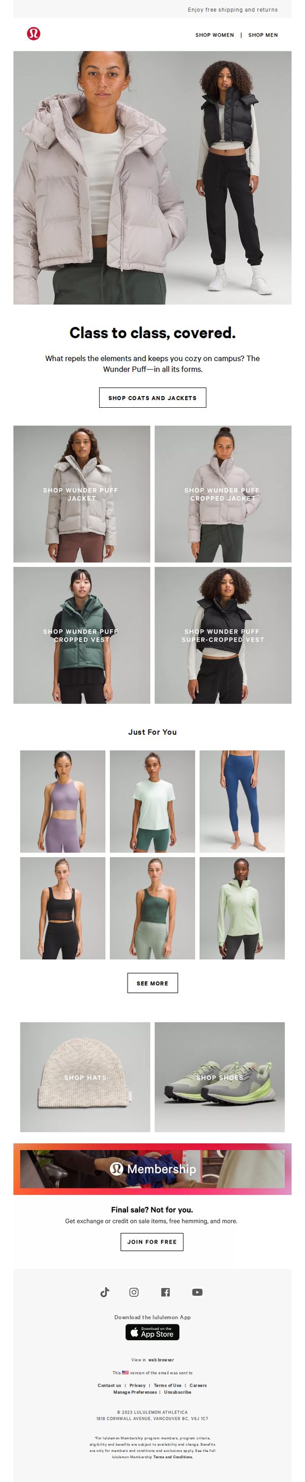
The email brilliantly frames the Wunder Puff as a lifestyle essential rather than just outerwear, using relatable scenarios like ‘class to class’ to emotionally connect with students and urban commuters who need adaptable, stylish warmth.
How to implement
By showcasing four distinct silhouettes, jacket, cropped jacket, vest, and super-cropped vest, the email speaks to diverse body types and style preferences, subtly reinforcing inclusivity and personalization without overtly stating it.
Pro Tip
Add a subtle countdown timer or urgency indicator near the ‘SHOP COATS AND JACKETS’ CTA to nudge immediate action, especially since the email references ‘Final sale? Not for you’, tying exclusivity to time-sensitive behavior would strengthen conversion. • Reposition the ‘JOIN FOR FREE’ membership CTA higher in the flow, perhaps after the product grid, so users who’ve engaged with the Wunder Puff collection are more likely to convert to members while still in purchase mindset.
5. Back-to-school gear that gives 100%
Objective
To drive back-to-school apparel sales by positioning Lululemon gear as essential for campus life, blending performance with everyday style while encouraging immediate shopping through curated product highlights and membership incentives.
Why this works
The email brilliantly reframes athletic wear as campus-ready essentials by pairing aspirational messaging like 'Your potential, unrestricted' with real-world student scenarios, making functional gear feel emotionally resonant and lifestyle-aligned.
How to implement
By organizing products into clean, labeled grid tiles with consistent styling and clear naming conventions, the email reduces decision fatigue while subtly guiding shoppers toward versatile, mix-and-match pieces that support a cohesive wardrobe strategy.
Pro Tip
Add a subtle countdown timer or urgency indicator near the hero CTA to reinforce the back-to-school timing and encourage faster decision-making, especially since the subject line implies limited-time relevance. • Integrate one short testimonial or social proof element, perhaps from a student ambassador, within the product grid to build trust and validate the claim that these fits ‘go with your agenda,’ bridging emotional appeal with credibility.
6. This school year, made seamless

Objective
This email aims to drive back-to-school athletic wear purchases by positioning Lululemon’s Swiftly collection as the ideal performance fabric for students and active lifestyles, while also promoting membership perks to increase long-term customer loyalty.
Why this works
The email smartly frames the Swiftly fabric as a coach-endorsed performance essential, subtly implying authority and trust without overpromising, a persuasive tactic that aligns athletic credibility with everyday student needs.
How to implement
By using a clean, grid-based product layout with clear category labels like 'Shop the Short-Sleeve' and 'Shop the Long Sleeve,' the email reduces decision fatigue and guides users intuitively toward specific product types based on their preferences.
Pro Tip
Add a subtle countdown timer or urgency indicator near the 'Final sale? Not for you.' section to reinforce the exclusivity of membership perks and nudge immediate sign-ups. • Reposition the 'Just For You' product grid higher in the email, ideally after the hero section, to personalize the experience earlier and increase relevance before users scroll past key offerings.
7. Feels like team spirit

Objective
This email aims to drive back-to-school apparel sales by tapping into school spirit and team energy, encouraging customers to shop colorful, comfortable activewear that aligns with seasonal enthusiasm and social identity.
Why this works
The email brilliantly ties emotional nostalgia, school spirit and team energy, to functional activewear, making the purchase feel like a celebration of identity rather than just a transaction, which deepens customer connection and justifies premium pricing.
How to implement
By organizing products into color-coded categories with clear CTAs like 'SHOP RED' or 'SHOP PURPLE,' Lululemon turns browsing into an intuitive, visually driven experience that reduces decision fatigue and increases the likelihood of multiple category clicks.
Pro Tip
The 'Final sale? Not for you.' membership CTA feels disconnected from the back-to-school theme, reposition it earlier or reframe the message to tie membership perks directly to school season benefits like 'Free hemming for growing kids' or 'Priority access to team colors.' • The hero section’s CTA 'SHOP BACK TO SCHOOL' lacks urgency or incentive, adding a time-sensitive hook like 'Shop now, get 10% off first order' or a countdown timer would increase conversion by creating immediate motivation to act.
8. New campus looks for the books

Objective
To drive engagement and sales by showcasing Lululemon’s new campus-ready apparel and accessories, targeting students and young professionals seeking adaptable, stylish, and performance-driven wardrobe essentials for academic and active lifestyles.
Why this works
The email brilliantly merges campus culture with athletic performance by featuring real-life settings like lecture halls and sports fields, making the products feel relevant and aspirational for students without sacrificing brand identity.
How to implement
By organizing products into intuitive category tiles like 'Shop Pants' and 'Shop Shorts' with clear product names, the email reduces decision fatigue and guides users seamlessly from inspiration to purchase with minimal friction.
Pro Tip
Add a subtle countdown timer or limited-time tag near the 'Shop What’s New' CTA to create urgency and increase click-through rates, especially since the campaign targets students who respond well to time-sensitive offers. • Integrate a short testimonial or student quote near the hero section to humanize the 'Campus Material' theme, for example, 'This outfit got me through finals week', to strengthen emotional resonance and social proof.
9. Double major in comfort and confidence

Objective
This email aims to drive engagement and sales by positioning Lululemon’s new Campus Material collection as the perfect blend of comfort and confidence for students returning to school, while also promoting membership perks and app adoption to deepen customer loyalty.
Why this works
The email brilliantly frames the new Scuba pants as a solution for academic life, tying comfort to focus and confidence to participation, which emotionally resonates with students seeking both performance and style in their daily wear.
How to implement
By visually segmenting product categories with lifestyle imagery, like school bags, shoes, and shirts, the email creates intuitive navigation that mirrors real-world student needs, making it effortless for shoppers to imagine building a complete campus-ready wardrobe.
Pro Tip
Add a countdown timer or urgency indicator near the 'Final sale? Not for you.' section to reinforce the exclusivity of member benefits and nudge non-members toward immediate sign-up. • Include a brief testimonial or student quote near the hero section to humanize the 'comfort and confidence' message and build social proof for the Campus Material line.
10. Bags that are anything but textbook

Objective
This email aims to drive traffic to Lululemon’s bag collection by positioning them as versatile, functional companions for active lifestyles, while subtly cross-promoting apparel and digital fitness offerings to deepen customer engagement and increase average order value.
Why this works
The email brilliantly reframes bags not as accessories but as essential lifestyle tools, emphasizing spaciousness, multipocket design, and comfort to resonate with users who value function without sacrificing style, making the product feel indispensable rather than optional.
How to implement
By integrating a dynamic product grid with clear, action-oriented labels like 'Shop New Crew Backpack 22L,' the email reduces decision fatigue and guides users seamlessly from inspiration to purchase, turning visual browsing into intentional shopping behavior with minimal friction.
Pro Tip
The 'Final Sale? Not for you.' membership CTA feels disconnected from the bag-focused narrative; reposition it as a value-add for bag buyers (e.g., 'Get free hemming on your new bag purchase with membership') to align incentives and improve conversion relevance. • The hero section’s dual CTAs ('Shop Bags' and 'Shop Back to School') create visual and strategic tension, simplify to one primary CTA and use the secondary as a sub-headline or hover tooltip to maintain focus on the core product while still acknowledging seasonal context.