Brand History email gallery from real Applications brands



1. McDonald's - UK: Dobble® just landed in Happy Meal®! 💟
Objective
This email aims to drive immediate Happy Meal purchases by announcing the exciting new Dobble® toy partnership, while also leveraging World Book Day to position McDonald’s as a brand that supports family fun and childhood imagination through both play and reading.
Why this works
McDonald’s brilliantly ties a popular card game to the Happy Meal by framing it as a shared family experience, not just a toy, but a reason to connect, play, and laugh together over dinner, which elevates the emotional value beyond the product itself.
How to implement
By aligning the Dobble® launch with World Book Day, the campaign smartly layers educational value onto a toy promotion, subtly reassuring parents that their purchase supports creativity and literacy, a clever dual-benefit positioning that broadens appeal without diluting the core offer.
Pro Tip
Add a countdown timer or urgency indicator near the CTA (e.g., 'Dobble® toys available until 3rd March') to create scarcity and nudge immediate action, especially since the offer is time-limited and tied to a specific event. • Include a small visual icon or badge next to the World Book Day section indicating 'FREE BOOK TOKEN WITH PURCHASE' to make the added value instantly scannable, currently, the benefit is buried in paragraph text and may be missed by skim-readers.
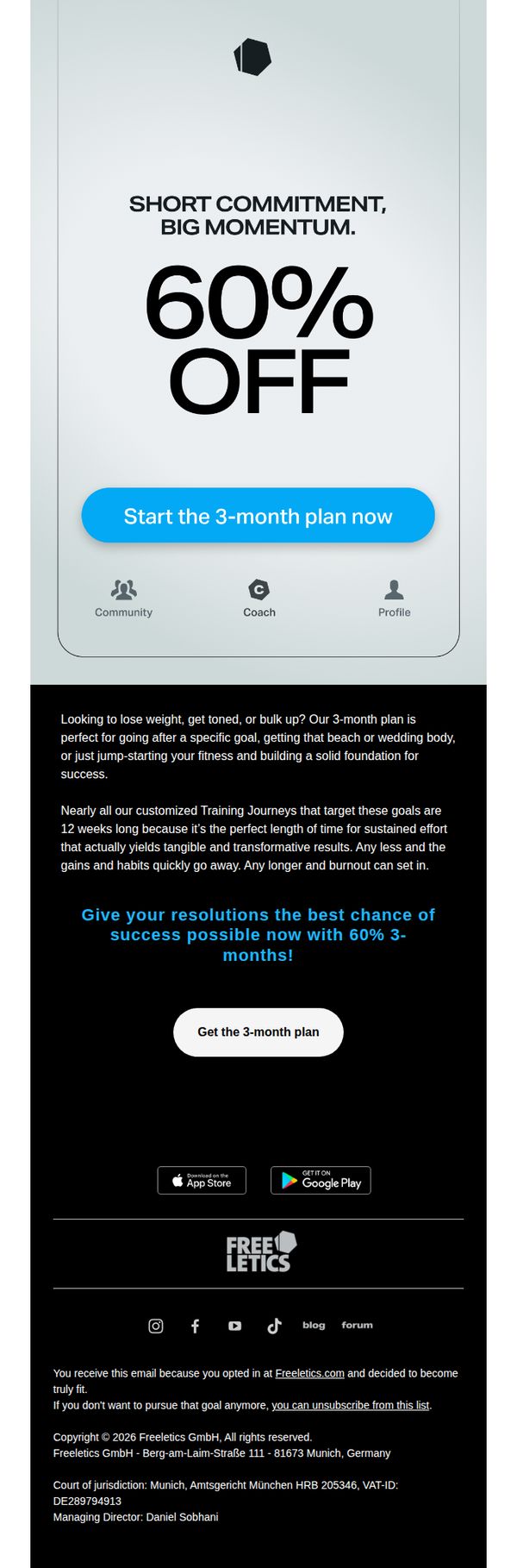
2. Freeletics - EN: What can 90 days do?
Objective
This email aims to convert recipients into paying customers by promoting a limited-time 60% discount on Freeletics’ 3-month fitness plan, positioning it as the ideal timeframe to achieve tangible, goal-oriented results without burnout.
Why this works
The email brilliantly frames the 3-month plan not as a long-term commitment but as a short, high-impact window that aligns with real human motivation cycles, making transformation feel urgent, achievable, and psychologically safe.
How to implement
By explicitly calling out common fitness goals like losing weight, getting toned, or building a beach body, the copy speaks directly to the recipient’s personal aspirations, turning a generic offer into a tailored invitation for self-improvement.
Pro Tip
Add a countdown timer or urgency indicator near the CTA to reinforce the limited-time nature of the 60% discount, which would increase conversion pressure without altering the existing message or layout. • Include a single short testimonial or user result (e.g., 'Lost 12 lbs in 90 days') in the education section to provide social proof that validates the claim that 12 weeks yields 'tangible and transformative results.'
3. Freeletics - EN: Fit & Fueled: Selene & Japanese Omelet
Objective
This email aims to engage users by offering a themed workout and complementary recipe to inspire holistic fitness, while subtly encouraging app upgrades through curated content that highlights exclusive features and personalized coaching.
Why this works
The email brilliantly ties mythology to fitness by naming the workout 'Selene', a Greek goddess, creating emotional resonance and making the routine feel epic, not just another exercise set, which elevates user motivation and brand storytelling.
How to implement
Pairing a high-energy workout with a nutritionally aligned recipe (Japanese Omelet) reinforces the brand’s holistic health philosophy, subtly teaching users that fitness isn’t just movement, it’s fuel, timing, and intention, which builds deeper lifestyle loyalty.
Pro Tip
The primary CTA 'Face Selene' is visually prominent but lacks urgency or benefit-driven language; rephrasing to 'Unlock Selene’s Workout, Free This Week Only!' would better leverage scarcity and clarify the value proposition. • The 'Want more?' section buries the upgrade CTA beneath a paragraph; moving the 'Upgrade for more Gods' button higher or adding a secondary CTA after the recipe would capture users already engaged by the content before they scroll away.
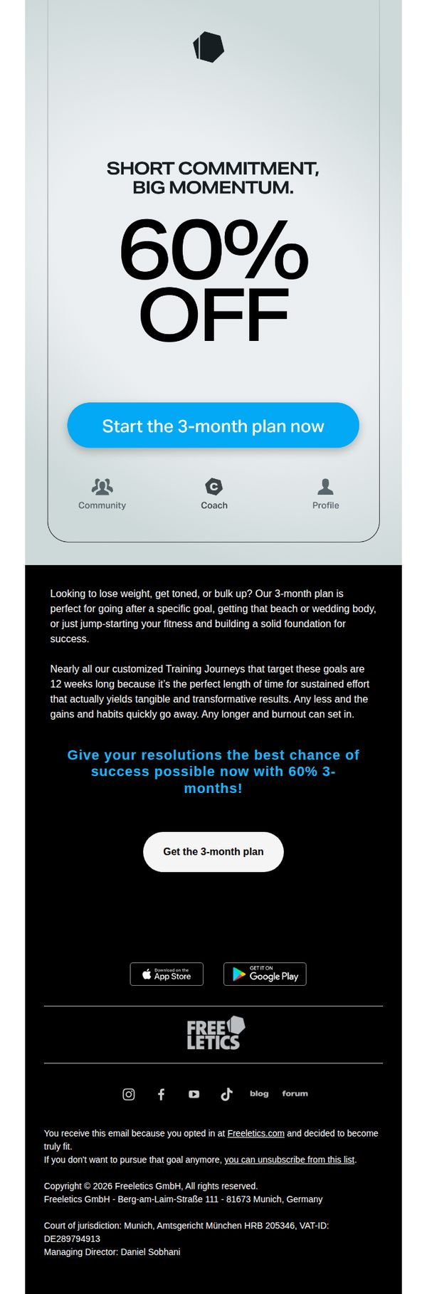
4. Freeletics - EN: What can 90 days do?
Objective
The email aims to convert subscribers into paying customers by promoting a limited-time 60% discount on a 3-month fitness plan, positioning it as the ideal timeframe to achieve tangible, goal-oriented results without burnout.
Why this works
By framing the 3-month plan as the scientifically optimal window for sustainable transformation, not too short to fail, not too long to burn out, Freeletics taps into behavioral psychology to reduce decision paralysis and boost perceived value.
How to implement
The bold ‘60% OFF’ headline paired with the urgent ‘Start the 3-month plan now’ CTA creates a powerful visual hierarchy that immediately communicates scarcity and action, making the offer feel both exclusive and time-sensitive without needing extra copy.
Pro Tip
Add a micro-testimonial or user stat (e.g., '92% of users hit their goal in 12 weeks') beneath the hero section to reinforce credibility and social proof right where the offer is introduced. • Introduce a countdown timer near the CTA to visually amplify urgency, since the discount is likely time-limited, this small addition could significantly increase conversion by triggering FOMO before the user scrolls away.
5. Kic : I can’t believe I’m sending this…
Objective
To build anticipation and exclusivity around the launch of KICStudio by inviting subscribers to join a waitlist for early access to limited foundation memberships and studio updates.
Why this works
The email opens with a personal, vulnerable tone that immediately builds emotional rapport, by admitting the sender feels 'surreal' about the announcement, it humanizes the brand and invites the reader into a shared moment of excitement.
How to implement
By framing the studio launch as a 'brand new era of mindful movement to Australia' and tying it to community and belonging, the message positions the offering not as a service but as a cultural movement, which elevates perceived value and loyalty potential.
Pro Tip
Add a subtle visual element like a soft border or background tint around the CTA button to increase its visual prominence without disrupting the minimalist aesthetic, helping guide the eye more naturally toward the desired action. • Include a brief teaser image or icon of the studio space or a class in progress, even if placeholder, to give subscribers a tangible glimpse of the experience they’re waiting for, strengthening emotional connection and reducing ambiguity.
6. The Gupta Program : Live Wed 4th Feb - New “Gupta Trauma-Protection Matrix™: Why The Body Protects

Objective
This email aims to drive registrations for a live educational event introducing the Gupta Trauma-Protection Matrix™, while positioning it as a gateway to a paid 12-week webinar series by highlighting the science of nervous system retraining and offering exclusive early-bird discounts.
Why this works
The email brilliantly frames chronic illness as a protective neurological response rather than a psychological flaw, which instantly reframes the reader’s self-blame into curiosity and opens the door for scientific solutions rooted in brain retraining.
How to implement
By offering two distinct live event formats, a social media livestream and a Zoom Q&A, the campaign accommodates different audience comfort levels and engagement styles, increasing accessibility and perceived value without diluting the core message or call to action.
Pro Tip
Add a countdown timer or urgency indicator near the CTA to emphasize the limited-time nature of the exclusive discount, which would increase conversion by leveraging scarcity psychology tied directly to the webinar series launch date. • Reposition the 'Upgrade Here' link for the premium webinar series higher in the email, perhaps right after the event details, to reduce friction for high-intent readers who are ready to commit before scrolling through the full newsletter content.
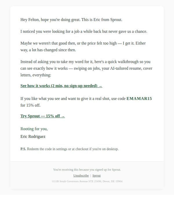
7. Sprout: Did you end up landing that job?
Objective
This email aims to re-engage a past prospect who showed interest in Sprout’s job search tools but didn’t convert, by acknowledging their hesitation, highlighting product improvements, and offering a personalized discount to encourage a second look.
Why this works
The email opens with a warm, personalized tone that acknowledges the recipient’s past behavior without sounding accusatory, which builds trust and lowers resistance to re-engagement by validating their previous decision not to commit.
How to implement
Instead of pushing a hard sell, the message offers a frictionless, no-sign-up demo that lets the user experience the product’s value firsthand, a smart strategy that reduces perceived risk and increases conversion likelihood for hesitant prospects.
Pro Tip
Add a brief visual preview or screenshot of the AI-tailored resume or job-swiping interface in the hero section to give the user a quick, tangible sense of the product’s value before they click through. • Include a subtle social proof element, such as ‘Used by 50,000+ job seekers’ or a short testimonial quote, near the CTA to reinforce credibility and reduce hesitation for users still on the fence.
8. Calm : 💙 Who needs a nap?

Objective
This email aims to reframe rest as a holistic, multi-dimensional need beyond sleep, while promoting a limited-time bundled offer with Sweat by Kayla Itsines to encourage Calm Premium subscriptions. It seeks to drive conversions by aligning emotional resonance with practical wellness tools.
Why this works
The email brilliantly reframes exhaustion not as a sleep problem but as a rest deficit, introducing seven distinct types of rest to help readers self-diagnose their true need, a subtle but powerful shift that positions Calm as a holistic wellness partner rather than just a sleep app.
How to implement
By partnering with Sweat and featuring Kayla Itsines, Calm leverages cross-category credibility to appeal to users who may not yet see mental wellness as their primary need, effectively expanding its audience by tying emotional restoration to physical fitness in a natural, non-salesy way.
Pro Tip
The CTA 'Unlock Calm + Sweat' is visually prominent but lacks urgency or benefit-driven language; adding a time-sensitive phrase like 'Get 6 Free Months, Offer Ends Soon' directly on the button would strengthen conversion motivation without cluttering the layout. • The 'Keep this in mind' section, while thoughtful, interrupts the flow between the sleep story and the breathing exercise; relocating it to follow the breathing graphic or integrating its prompts into the closing would maintain momentum and reinforce the email’s core message more cohesively.
9. The Gupta Program : How Meghan healed insomnia, fatigue, and brain fog within months

Objective
This email aims to inspire potential customers by showcasing a real-life success story of healing from chronic symptoms through the Gupta Program, while encouraging immediate engagement via free discovery calls and daily guided meditation sessions. It seeks to convert interest into action by emphasizing community support, structured recovery, and personalized guidance.
Why this works
The email masterfully opens with a relatable, emotionally resonant transformation story that immediately connects with readers suffering from similar symptoms, making the program feel both credible and deeply personal rather than just another wellness product.
How to implement
By embedding specific, time-bound live session schedules with coach bios and passwords, the campaign creates urgency and accessibility, turning passive reading into active participation without overwhelming the reader with too many choices or steps.
Pro Tip
Add a countdown timer or visual indicator near the 'take the next step' CTA to emphasize limited availability of discovery call slots or early-bird program access, leveraging scarcity to boost conversion without compromising the nurturing tone. • Include a short testimonial quote or stat (e.g., '92% of participants report improved sleep within 6 weeks') directly beneath the hero image to reinforce social proof before the reader scrolls, anchoring credibility at the top of the funnel.
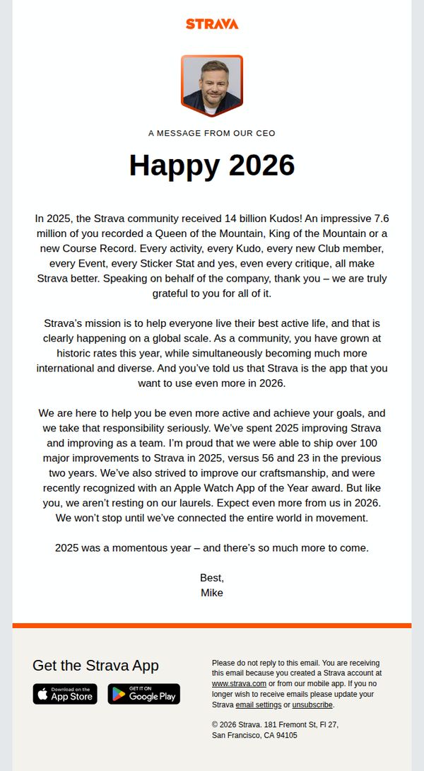
10. Strava: Kudos on a great 2025
Objective
To celebrate the Strava community’s achievements in 2025 and reinforce brand loyalty by highlighting collective milestones, product improvements, and future ambitions, all while positioning Strava as an essential tool for active living in 2026.
Why this works
Strava brilliantly turns user-generated milestones, like 14 billion Kudos and 7.6 million crowns, into a shared narrative of community triumph, making every recipient feel personally celebrated while reinforcing the platform’s cultural impact.
How to implement
By anchoring the message in tangible product progress, over 100 improvements shipped in 2025, Strava builds credibility and trust, subtly signaling that user feedback drives innovation, which encourages continued engagement and loyalty in the year ahead.
Pro Tip
Add a visual timeline or infographic in the Education Section to illustrate the 100+ improvements made in 2025, this would make abstract achievements more tangible and increase perceived value without adding text clutter. • Reposition the ‘Get the Strava App’ CTA higher in the email, perhaps as a sticky banner or after the first paragraph, to capture attention before users scroll past, especially since the current placement risks being overlooked in the footer.