How Banking & Finance does brand history emails




1. Chase: Gold silver and staying focused amid the noise
Objective
This email aims to educate high-net-worth investors on the strategic role of gold and silver in portfolios amid geopolitical and economic uncertainty, while positioning J.P. Morgan Wealth Management as a trusted advisor for long-term financial planning.
Why this works
The email masterfully frames gold not as a speculative asset but as a disciplined anchor during volatility, using data-driven narratives to transform emotional market reactions into rational, long-term portfolio decisions that align with investor psychology.
How to implement
By embedding macroeconomic context, like central bank gold purchases and tariff impacts, alongside clear visuals and digestible survey data, the campaign transforms complex financial trends into actionable insights without overwhelming the reader or diluting credibility.
Pro Tip
Add a dynamic countdown or progress bar near the 'New 529 Plan Rules' section to create urgency around year-end planning deadlines, since the content references expiring provisions and time-sensitive tax advantages that could motivate immediate action. • Reposition the primary CTA 'Invest on your own' to appear earlier, perhaps after the first key insight, and pair it with a secondary CTA like 'Schedule a Portfolio Review' to better segment audiences by intent and reduce friction for those seeking advisory support.
2. Goldman Sachs: Will Japan’s Election Move Stocks?
Objective
This email aims to inform high-net-worth and institutional investors about key macroeconomic and market-moving developments in Japan, software sector trends, and Latin American GDP forecasts, while positioning Goldman Sachs as a trusted source for actionable, data-driven insights ahead of critical global events.
Why this works
The email masterfully frames geopolitical uncertainty, like Japan’s snap election, as a catalyst for strategic investment decisions, transforming potential market anxiety into an opportunity for informed positioning backed by proprietary research and expert commentary.
How to implement
By embedding a visual data-driven comparison of ROE bands across major global indexes, the email transforms complex equity analysis into digestible, visually anchored insights that empower readers to quickly grasp relative market inefficiencies and potential value pockets.
Pro Tip
The CTA 'Check the answer here' is buried at the bottom of a long email and lacks urgency or visual prominence; repositioning it as a sticky, color-contrasted button near the quiz question would significantly improve conversion and engagement. • While the email includes strong data visualizations, it lacks a clear, one-sentence summary or takeaway beneath each chart, adding a bolded insight line under each graph would help busy investors absorb key messages without reading the full paragraph.
3. Investopedia: Dollar Hits 4-Year Low—How It Could Impact Your Wallet and Financial Plans
Objective
This email aims to inform subscribers about timely financial news and trends that could affect their personal finances, while encouraging continued engagement through article clicks and newsletter retention. It positions Investopedia as a trusted source for actionable, real-world financial insights.
Why this works
The email leads with a high-impact, emotionally resonant headline about the dollar’s decline to immediately capture attention and frame the content as personally relevant to the reader’s financial well-being.
How to implement
Each article preview pairs a compelling, curiosity-driven title with a relevant image and a consistent 'READ MORE' CTA, creating a clean, scannable rhythm that reduces friction and encourages multiple clicks.
Pro Tip
Add a personalized subject line or preheader text referencing the subscriber’s past behavior (e.g., 'Since you read about inflation, here’s how the weak dollar affects you') to increase open rates and perceived relevance. • Include a brief 'Top Story' highlight at the top with a slightly larger image or bolded headline to guide attention and reduce decision fatigue among readers scanning multiple articles.
4. Triple A: Albert, Triple-A has received your webform submission! ✅
Objective
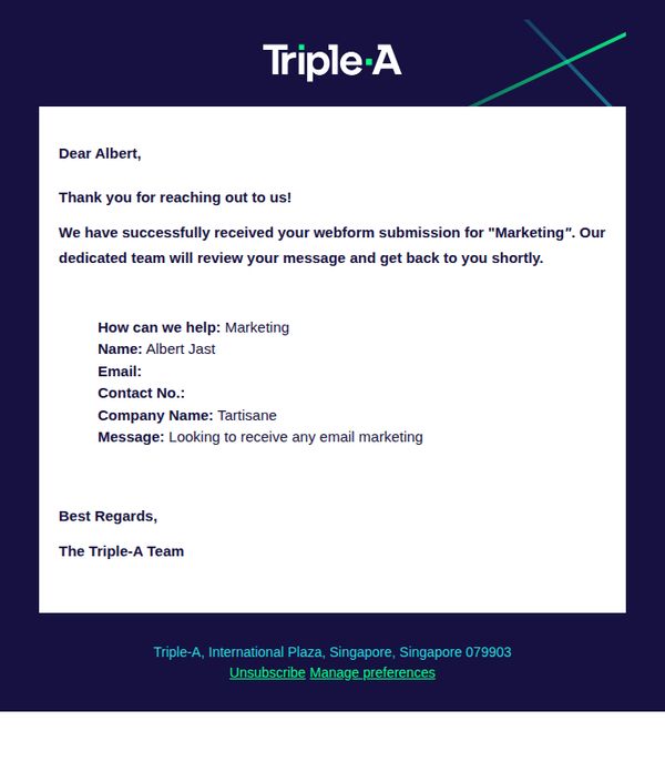
This email confirms receipt of a webform submission and reassures the recipient that their inquiry is being processed by the team. It aims to build trust through immediate acknowledgment and set clear expectations for follow-up.
Why this works
The email immediately personalizes the experience by using the recipient’s first name and referencing their specific inquiry topic, which makes the interaction feel human and attentive rather than automated and generic.
How to implement
By restating the submitted details including name, company, and message intent, the email reinforces transparency and reduces user anxiety about whether their form was processed correctly or fully understood by the team.
Pro Tip
Add a secondary CTA such as 'View Your Submission Details' or 'Contact Us Directly' to empower the user with next steps, reducing passive waiting and increasing engagement beyond just acknowledgment. • Include an estimated response time (e.g., 'We’ll reply within 24–48 hours') to manage expectations more precisely and reduce uncertainty, which can improve perceived reliability and decrease follow-up inquiries.
5. J.P. Morgan: Cut a Path
Objective
This email aims to position J.P. Morgan as a thought leader in macroeconomic and commercial real estate insights by delivering timely, data-driven analysis to inform high-net-worth and institutional investors. It encourages engagement through curated content that anticipates market shifts and reinforces trust in J.P. Morgan’s strategic foresight.
Why this works
The email opens with a sharp, question-driven hook that immediately aligns with investor anxieties, like Fed rate cuts and economic expansion, making the content feel urgent, relevant, and tailored to sophisticated financial audiences.
How to implement
Each section is anchored by a bold, benefit-driven headline paired with a concise data point or quote, which builds credibility while reducing cognitive load, perfect for time-pressed executives scanning for actionable intelligence.
Pro Tip
Add a subtle progress indicator or 'read time' estimate near each article CTA to reduce friction for busy readers and signal content depth without overwhelming them. • Include a personalized subject line variant or dynamic content block (e.g., 'Based on your interest in commercial real estate...') to increase relevance and open rates for segmented audiences.
6. Investopedia: 5 Things to Know Before the Stock Market Opens

Objective
This email aims to position Investopedia as a trusted, daily source of pre-market financial insights by delivering timely, digestible summaries that help readers make informed decisions before the market opens. It also encourages ongoing engagement through article clicks and newsletter retention.
Why this works
The email opens with a time-sensitive, action-oriented headline that immediately signals relevance to traders and investors who need pre-market intelligence, creating urgency without being pushy or salesy.
How to implement
Each article preview pairs a compelling, curiosity-driven title with a relatable image and a consistent 'READ MORE' CTA, making it easy for readers to self-select content that matches their interests without overwhelming them.
Pro Tip
Add a subtle visual hierarchy to the article list, such as a numbered or highlighted 'Top Pick', to guide readers toward the most time-sensitive or high-value content, reducing decision fatigue and increasing click-through on priority stories. • Include a micro-CTA beneath the main headline (e.g., 'Get today’s top 3 market movers in 60 seconds') to offer immediate value and incentivize engagement before the reader scrolls, reinforcing the email’s utility beyond just article links.
7. InvestEngine: Have a pension somewhere else?
Objective
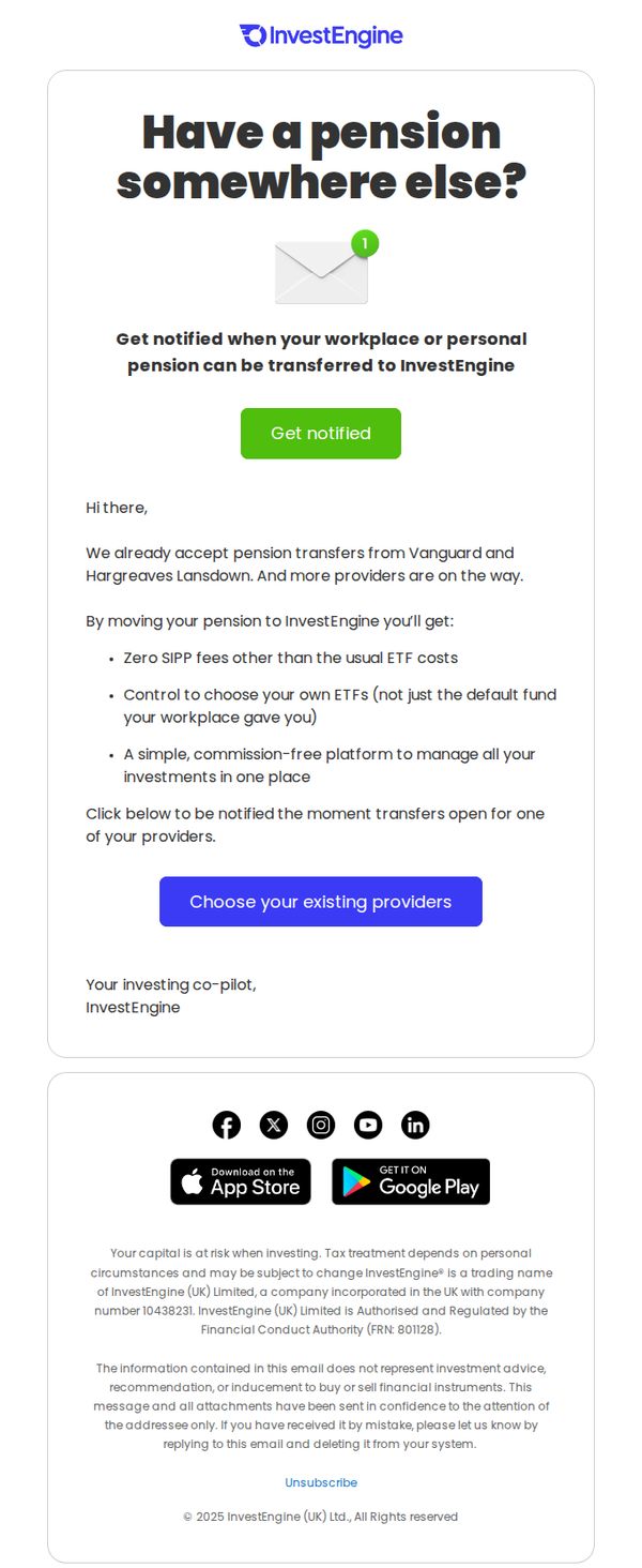
The email aims to encourage users with pensions held elsewhere to consider transferring them to InvestEngine by highlighting key benefits like zero SIPPs fees, ETF control, and a unified platform, while prompting immediate action through provider selection.
Why this works
The email opens with a direct, relatable question, 'Have a pension somewhere else?', which instantly resonates with the target audience and frames the entire message as a personalized solution rather than a generic pitch.
How to implement
By listing concrete benefits like zero SIPP fees and ETF control, the email transforms abstract financial advantages into tangible, emotionally compelling reasons to act, making the value proposition impossible to ignore for cost-conscious investors.
Pro Tip
Add a brief testimonial or social proof near the offer section, for example, 'Over 12,000 users have already transferred their pensions to InvestEngine', to reduce perceived risk and build trust before the CTA. • Include a simple visual indicator (like a progress bar or checkmark icons) next to each benefit to enhance scannability and reinforce the ease of the transfer process, especially for users skimming on mobile.
8. Moneybox: Claim your £10 gift card

Objective
This email aims to re-engage users who started but didn’t complete their Moneybox account setup by offering a £10 gift card incentive, while also reinforcing brand trust through mission storytelling and social proof.
Why this works
The email brilliantly turns an incomplete user action into a positive opportunity by framing the £10 gift card as a reward for finishing setup, not a penalty for abandonment, which reduces friction and increases conversion likelihood.
How to implement
By weaving in their updated mission statement and brand evolution, Moneybox transforms a simple promotional email into a values-driven narrative that builds emotional connection and positions the brand as a long-term partner in financial well-being.
Pro Tip
Add a visible countdown timer next to the CTA to create urgency, since the deadline is specific (11.59pm on 11.01.2026), visualizing the time left would significantly boost conversion rates for procrastinators. • Reposition the 'Finish set up' button higher in the flow, currently buried after the Aurora section, so users who are motivated by the gift card can act immediately without scrolling past secondary content.
9. InvestEngine: Top 5 highest-yielding markets in 2026

Objective
This email aims to educate subscribers on high-yield global stock markets and investment strategies while driving engagement through educational content and a referral-based £50k prize competition. It positions InvestEngine as a knowledgeable, trustworthy platform for income-focused investors.
Why this works
The email smartly blends market education with a high-stakes referral contest, turning passive readers into active participants by tying financial insight directly to a tangible, emotionally compelling reward.
How to implement
By anchoring the content in timely, data-driven visuals like the UK youth unemployment chart, the campaign builds credibility and urgency without overwhelming the reader with jargon or complex analysis.
Pro Tip
The primary CTA 'Read more' is too generic, it should be more benefit-driven, such as 'Discover the 5 highest-yielding markets' or 'See which ETFs pay the most income,' to better align with the email’s income-focused objective. • The £50k competition section lacks visual hierarchy, the prize amount and referral mechanic should be more prominently displayed above the image, with clearer instructions on how to enter to reduce friction and increase conversion.
10. J.P. Morgan: On the Home Front

Objective
This email aims to position J.P. Morgan as a thought leader in macroeconomic and real estate trends by delivering timely, data-driven insights on housing forecasts, government shutdown impacts, and corporate acquisition strategies, encouraging engagement from institutional and high-net-worth investors.
Why this works
The email smartly opens with a teaser list of provocative questions that mirror investor anxieties, immediately signaling relevance and prompting deeper reading without overwhelming the reader upfront.
How to implement
Each section is cleanly segmented with bold headers, contextual imagery, and a single focused CTA, creating a modular, scannable experience that respects the reader’s time while guiding them toward specific research paths.
Pro Tip
Add a subtle visual hierarchy indicator, like numbered sections or progress dots, to help readers track where they are in the multi-topic flow, especially since the content spans distinct verticals (housing, policy, M&A). • Replace generic CTAs like 'SEE IMPACT' or 'BE PREPARED' with more benefit-driven language tied to the reader’s role (e.g., 'Assess Risk for Your Portfolio' or 'Build Your Exit Strategy') to increase conversion intent.