Brand History campaign ideas that work for Health & Wellness
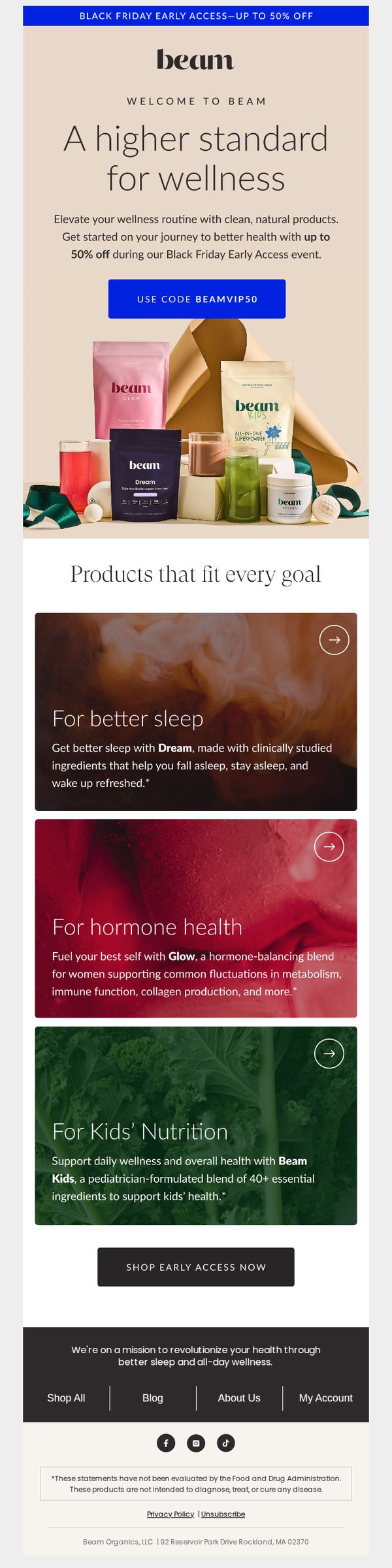



1. beam: Inside: up to 50% off for Black Friday!
Objective
This email aims to drive early Black Friday sales by offering up to 50% off to new customers, while positioning Beam as a premium wellness brand that delivers science-backed, natural solutions for specific health goals.
Why this works
The email brilliantly frames the discount as an exclusive early access perk for new customers, which elevates perceived value and reduces the risk of appearing overly promotional or desperate for sales.
How to implement
By organizing products into goal-specific categories, sleep, hormone health, kids’ nutrition, the email speaks directly to customer pain points, making it easier for recipients to self-identify and feel personally addressed by the offer.
Pro Tip
Add a countdown timer near the CTA to create urgency around the early access window, which would increase conversion by leveraging FOMO without altering the existing offer or design. • Include a short customer testimonial or trust badge near the hero section to validate the ‘clinically studied ingredients’ claim and reduce skepticism among first-time buyers.
2. The Healthy Maven: The Holiday Card
Objective
This email aims to spark reflection on the cultural and emotional evolution of holiday cards, inviting readers to reconsider their personal relationship with the tradition while subtly encouraging subscription to support the writer’s independent publication.
Why this works
The email brilliantly reframes a mundane holiday ritual as a cultural performance shaped by technology and social expectation, turning a simple card into a lens for examining modern identity and visibility in a feed-driven world.
How to implement
By weaving personal anecdotes with historical context and sociological insight, the piece transforms a nostalgic topic into a thought-provoking commentary that resonates emotionally while rewarding the reader’s curiosity with unexpected depth and nuance.
Pro Tip
Add a subtle visual cue or icon next to the 'Upgrade to paid' CTA to increase attention without disrupting the editorial tone, such as a small gift box or envelope icon that ties back to the holiday card theme. • Insert a short, bold pull-quote near the top that captures the core insight, e.g., 'Holiday cards aren’t about warmth. They’re about reach.', to anchor the reader’s attention and reinforce the central thesis early.
3. Optibac - UK: A huge announcement! 🎉
Objective
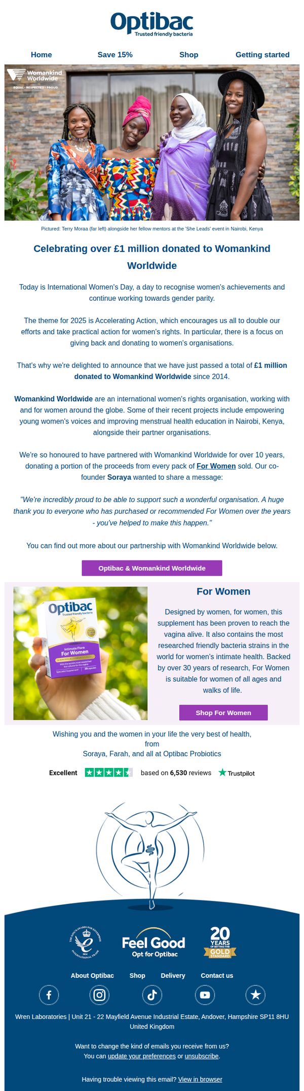
This email aims to celebrate International Women’s Day by announcing Optibac has donated over £1 million to Womankind Worldwide since 2014, while reinforcing brand values and driving engagement with their 'For Women' product line through emotional storytelling and social proof.
Why this works
The email masterfully ties a major brand milestone, £1 million donated, to a culturally relevant moment, International Women’s Day, making the announcement feel timely, purposeful, and emotionally resonant rather than purely transactional.
How to implement
By featuring real women from the partner organization and including a heartfelt quote from the co-founder, the campaign builds authentic credibility and human connection, transforming a donation announcement into a shared victory that invites customer pride and participation.
Pro Tip
Add a subtle countdown or progress bar near the donation milestone (e.g., '£1M reached, let’s hit £1.2M by end of year!') to transform a past achievement into an ongoing movement, encouraging continued purchases as future contributions. • Include a short, scannable bullet list under the 'For Women' product description highlighting 1–2 key clinical benefits or strain names, to reinforce scientific credibility for skeptical buyers without disrupting the emotional flow of the message.
4. Ohne: 🩸 THE DRIP #05: Eating for your menstrual cycle
Objective
This email aims to educate subscribers on how to align their diet with their menstrual cycle phases to support hormonal health and overall wellbeing, while subtly reinforcing Ohne’s brand as a trusted, science-backed resource for cycle-aware living.
Why this works
The email brilliantly frames nutrition as a dynamic, phase-based practice rather than a one-size-fits-all diet, making readers feel seen and empowered to listen to their bodies’ changing needs throughout the cycle.
How to implement
By blending scientific insight with relatable humor, like the pasta-eating face mask photo, it disarms the clinical tone often associated with hormonal health, making complex topics feel approachable and emotionally resonant.
Pro Tip
Add a clear, secondary CTA above the footer, such as 'Download Your Cycle Nutrition Guide', to convert engaged readers into leads, since the current 'Join us on insta' doesn’t align with the educational intent of the content. • Integrate a visual phase tracker or mini calendar graphic next to each cycle phase section to help readers quickly identify where they are in their cycle, enhancing personal relevance and usability.
5. Anima Mundi Apothecary: 🗓️ The Science Behind the February Strain
Objective
This email aims to educate subscribers on the physiological and energetic shifts occurring in February while positioning Anima Mundi’s herbal products as gentle, science-backed allies to support emotional and physical transition through late winter. It blends Ayurvedic wisdom with modern wellness to build trust and guide intentional purchasing.
Why this works
The email brilliantly frames seasonal fatigue not as personal failure but as a natural biological recalibration, using lunar cycles and Ayurvedic Kapha theory to validate the reader’s experience and position herbal support as intuitive, not indulgent.
How to implement
By organizing products into thematic categories like 'Adaptogenic Mood Support' and 'Emotional Grounding Essentials,' the campaign transforms a product grid into a personalized wellness roadmap, making selection feel intuitive and aligned with the reader’s current inner state.
Pro Tip
The primary CTA 'KEEP READING ON THE BLOG' is buried after a long educational section and doesn’t drive immediate product engagement; consider adding a secondary, product-focused CTA like 'SHOP FEBRUARY’S HERBAL ALLIES' above the product grid to capture intent while the reader is still emotionally primed. • The 'Sugar Body Scrub' section feels disconnected from the email’s core theme of internal, energetic transition; either reframe it as a ritual for external grounding or replace it with a product more aligned to the February strain narrative, like a warming tea or adaptogen blend.
6. BioTRUST: Is your probiotic DEAD?

Objective
To drive immediate sales of BioTRUST Pro-X10 by highlighting the urgency of gut health and exposing the ineffectiveness of typical probiotics, while offering a limited-time discount to incentivize purchase. The email positions Pro-X10 as a scientifically superior, life-changing solution for digestive and immune wellness.
Why this works
The email opens with a provocative, fear-based hook, 'Is your probiotic DEAD?', immediately creating urgency and curiosity, which primes the reader to keep reading and positions the product as the only viable solution to a hidden, widespread problem.
How to implement
It masterfully combines scientific credibility with emotional appeal by citing third-party testing, patented technology, and specific bacterial strains, while also framing gut health as foundational to energy, mood, and immunity, making the product feel essential, not optional.
Pro Tip
Add a visual countdown timer near the CTA to reinforce urgency, since the offer is framed as a VIP special, a ticking clock would heighten FOMO and encourage immediate action rather than letting the reader delay. • Include a short testimonial or customer quote near the product benefits section, while stats and science are strong, a real user voice would humanize the claims and build emotional trust before the reader reaches the CTA.
7. ripple: Family First ♥️
Objective
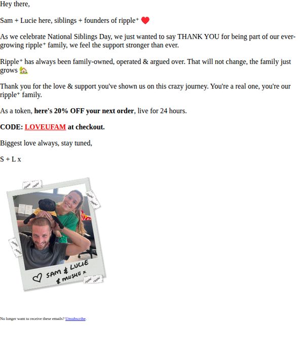
To celebrate National Siblings Day by expressing gratitude to customers and reinforcing Ripple’s family-owned identity, while driving immediate sales through a time-sensitive 20% discount offer.
Why this works
The email brilliantly ties a cultural moment, National Siblings Day, to brand identity by positioning customers as part of the ‘Ripple family,’ creating emotional resonance that goes beyond transactional marketing and fosters long-term loyalty.
How to implement
By featuring founders Sam and Lucie in a casual, authentic photo with their dog, the brand humanizes itself without overproducing the moment, making the message feel personal, warm, and genuinely appreciative rather than promotional.
Pro Tip
Add a visual countdown timer next to the 24-hour offer to heighten urgency and reduce decision latency, especially since the discount is time-bound and the email lacks any visual cue to reinforce scarcity. • Include a small product grid or ‘Most Loved by Families’ section beneath the offer to guide customers toward popular items, reducing friction in the buying journey and increasing average order value without disrupting the emotional tone.
8. Glucose Goddess: my emergency sweet treat
Objective
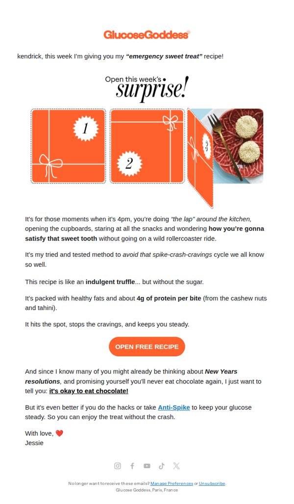
This email aims to engage subscribers with a personalized, timely solution for sugar cravings while reinforcing the brand’s mission of glucose-friendly eating. It positions the recipe as both indulgent and scientifically balanced to build trust and encourage immediate action.
Why this works
The email brilliantly frames the recipe as an 'emergency sweet treat', a relatable, emotionally resonant hook that speaks directly to the reader’s late-afternoon cravings while subtly validating their struggle without judgment.
How to implement
By comparing the treat to an 'indulgent truffle... but without the sugar,' the copy creates instant desire while reassuring health-conscious readers that they won’t sabotage their goals, perfectly aligning indulgence with science-backed nutrition.
Pro Tip
Add a small visual indicator, like a progress bar or countdown, near the CTA to create urgency around accessing the recipe, especially since the email positions it as an 'emergency' solution for immediate cravings. • Include a micro-testimonial or user quote beneath the CTA (e.g., 'Over 12,000 readers used this to beat their 4pm crash!') to reinforce social proof and reduce friction for clicking the 'OPEN FREE RECIPE' button.
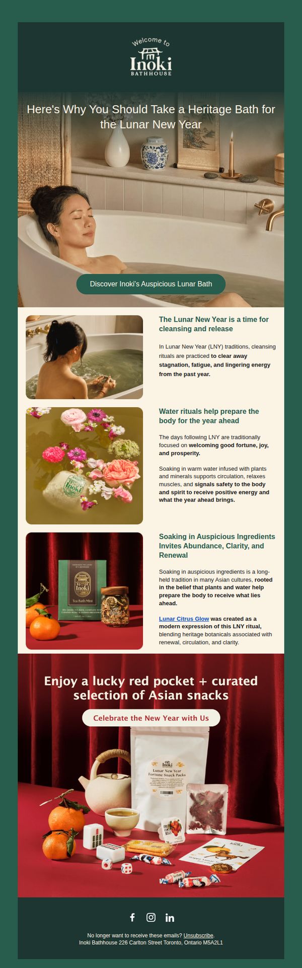
9. Inoki Bathhouse : Here's why you should take a heritage bath for the LNY 🍊🧧
Objective
This email aims to position Inoki Bathhouse’s heritage bath experience as a culturally meaningful and rejuvenating ritual for Lunar New Year, encouraging recipients to book a visit by tying wellness to tradition and offering a festive incentive with red pockets and snacks.
Why this works
The email brilliantly frames bathing not as self-care but as a cultural ritual, aligning product use with Lunar New Year traditions to create emotional resonance and elevate perceived value beyond mere relaxation.
How to implement
By visually pairing botanical bath products with symbolic Lunar New Year elements like oranges and red pockets, the campaign transforms a wellness offer into a culturally immersive experience that feels both luxurious and meaningful.
Pro Tip
Add a subtle countdown timer or limited-availability note near the CTA to create urgency, since Lunar New Year is time-sensitive and customers may delay booking without a clear deadline. • Include a short testimonial or social proof near the product imagery, such as a customer quote about post-bath clarity or renewal, to reinforce the emotional benefits and reduce perceived risk for first-time visitors.
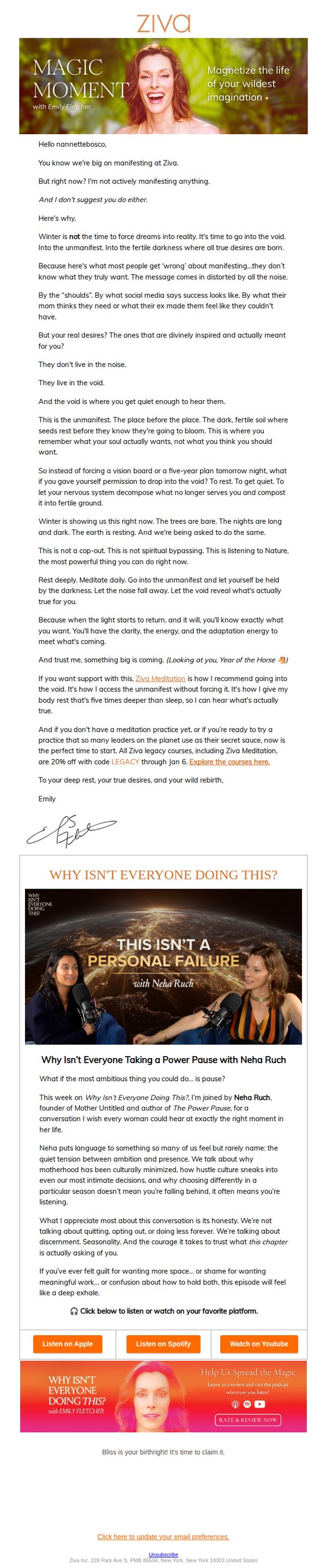
10. ZIVA : What I'm NOT doing this New Year's Eve
Objective
This email aims to reframe New Year’s Eve as a time for inner stillness and spiritual preparation rather than forced manifestation, encouraging recipients to embrace rest and meditation as a path to deeper self-awareness and authentic desire. It subtly promotes Ziva Meditation as the ideal practice to support this inward journey.
Why this works
The email brilliantly flips the script on New Year’s pressure by positioning rest and stillness as radical acts of self-trust, making the brand feel like a wise, calming guide rather than another voice shouting for attention during a noisy season.
How to implement
By anchoring the message in seasonal metaphors, winter’s darkness, fertile soil, and natural rest, the email creates an emotionally resonant, almost poetic narrative that aligns spiritual practice with nature’s rhythms, making meditation feel inevitable, not optional.
Pro Tip
The primary CTA 'Explore the courses here' is buried mid-email and lacks urgency or emotional alignment; it should be repeated above the fold with stronger framing like 'Begin Your Restorative Practice Before the Year Ends' to match the email’s tone and intent. • The podcast section, while valuable, visually competes with the core message; consider simplifying the layout by moving the 'Listen on Apple/Spotify/YouTube' buttons below the episode description to reduce visual clutter and reinforce the email’s meditative, unhurried tone.