Insurance Brand History email designs from top brands
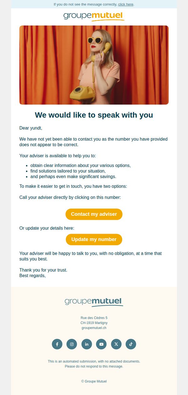
1. Groupe Mutuel: We would like to speak with you
Objective
The email aims to re-engage a customer by addressing a failed contact attempt due to an incorrect phone number, offering personalized advisory support and encouraging the recipient to either call their adviser or update their contact details, all while reinforcing trust and obligation-free service.
Why this works
The email opens with a warm, human-centered subject line and greeting that immediately acknowledges the recipient’s value, turning a logistical issue into a personalized outreach opportunity rather than a transactional error message.
How to implement
By clearly listing the three tangible benefits of speaking with an adviser, clarity, tailored solutions, and potential savings, the message transforms a simple contact request into a compelling value proposition that speaks directly to customer pain points.
Pro Tip
Add a subtle visual cue or icon next to each CTA button (e.g., a phone icon for 'Contact my adviser' and a pencil for 'Update my number') to reinforce the action and improve scanability for mobile users. • Include a brief, reassuring sentence above the CTAs such as 'Your information is secure and will only be used to reconnect with your dedicated adviser' to reduce hesitation and increase trust before the user clicks.
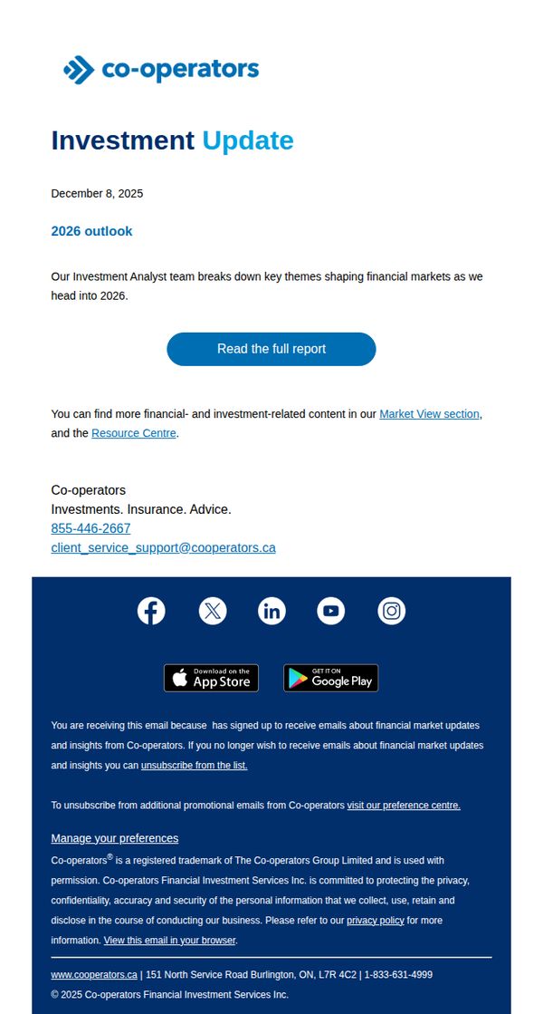
2. Co-operators: 2026 outlook: Investment Update (December 8, 2025)
Objective
This email aims to position Co-operators as a trusted source of forward-looking financial insight by delivering a timely, expert-driven 2026 market outlook to engaged subscribers, encouraging them to deepen their relationship by reading the full report.
Why this works
The email leverages timely relevance by anchoring its message to a specific future date, 2026, which creates urgency and positions the brand as a forward-thinking guide rather than just a reactive commentator on market conditions.
How to implement
It strategically frames the content as exclusive insight from an internal Investment Analyst team, which builds credibility and subtly implies that subscribers are receiving privileged, high-value intelligence not available to the general public.
Pro Tip
Add a brief teaser bullet list or infographic snippet under the headline to preview 1–2 key 2026 themes, this would increase perceived value and reduce friction for clicking the CTA by showing immediate relevance. • Reposition the CTA button higher in the visual hierarchy, perhaps immediately after the headline, to reduce scroll depth and increase conversion, since the current placement requires users to read past supporting text before acting.
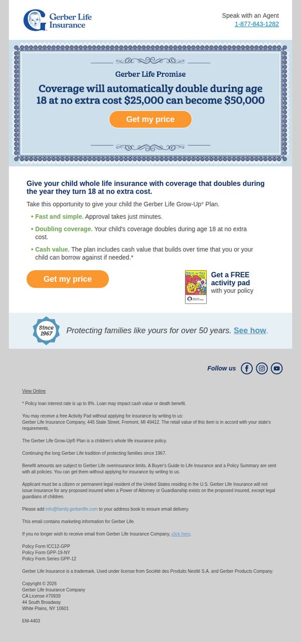
3. Gerber Life: Doubling life insurance coverage for your growing child
Objective
To encourage parents to secure life insurance for their children by highlighting the unique benefit of automatic coverage doubling at age 18 without additional cost, positioning Gerber Life as a trusted, long-term family protector.
Why this works
The email brilliantly frames a complex financial product as a simple, emotionally resonant gift, positioning life insurance not as a morbid necessity but as a loving, forward-thinking act of parental care that grows with the child.
How to implement
By anchoring the offer to a specific life milestone, the child’s 18th birthday, the campaign creates urgency and relevance, making the abstract concept of life insurance feel timely, personal, and tied to real family moments.
Pro Tip
Add a visual timeline or age-based graphic showing how coverage grows from $25K to $50K at 18, this would make the ‘doubling’ benefit more intuitive and emotionally compelling for visual learners. • Place the second CTA button directly beneath the bullet-point benefits, not just under the hero section, to reinforce actionability at the moment the reader is most convinced by the value proposition.
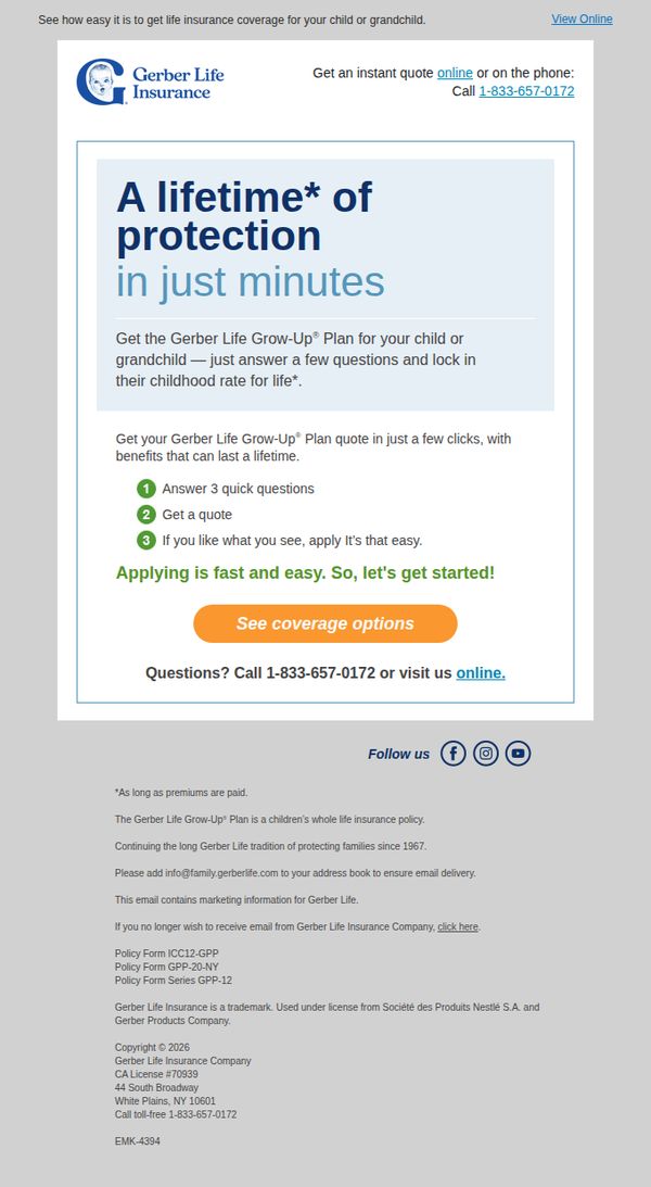
4. Gerber Life: Get your personalized quote TODAY
Objective
The email aims to drive immediate action by encouraging parents or grandparents to get a personalized life insurance quote for their child or grandchild, emphasizing speed, simplicity, and lifelong protection through the Gerber Life Grow-Up Plan.
Why this works
The email brilliantly frames life insurance as a timeless gift by using the phrase 'A lifetime of protection in just minutes,' which emotionally resonates while reducing perceived friction around a complex financial decision.
How to implement
By breaking the quote process into three simple, numbered steps, answer questions, get a quote, apply, the campaign lowers psychological barriers and makes the process feel approachable, even for hesitant first-time buyers.
Pro Tip
Add a brief testimonial or trust indicator near the CTA to reinforce credibility, for example, 'Trusted by over 1 million families since 1967', to reduce hesitation for users unfamiliar with Gerber Life’s insurance offerings. • Include a subtle visual cue like a progress bar or time-saving icon next to the '3 quick questions' step to further emphasize ease and speed, making the process feel even more effortless and reassuring.
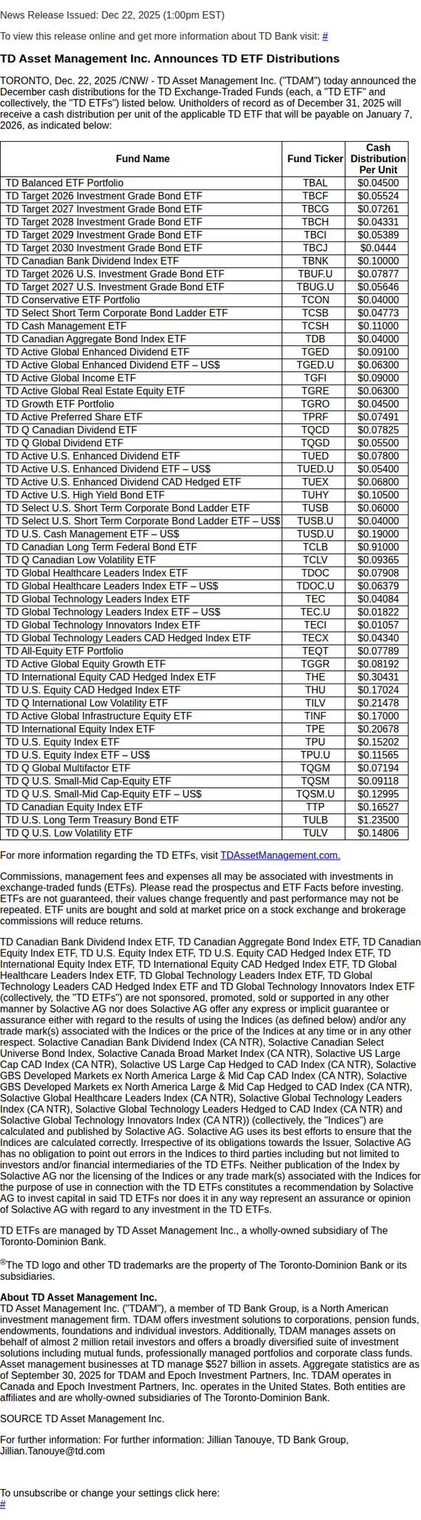
5. TD Insurance: TD Asset Management Inc. Announces TD ETF Distributions
Objective
To inform TD ETF unitholders of upcoming cash distributions per unit, ensuring transparency and compliance while directing investors to official resources for further details. The email serves as a formal regulatory disclosure rather than a promotional campaign.
Why this works
The email clearly structures complex financial data into a scannable table format, making it easy for investors to quickly locate their specific ETF and its corresponding distribution amount without sifting through dense paragraphs.
How to implement
By including a direct link to TDAssetManagement.com alongside a disclaimer about fees and risks, the email balances regulatory compliance with user empowerment, guiding investors toward informed decision-making without overstepping legal boundaries.
Pro Tip
Add a visual highlight or icon next to the most popular or highest-yielding ETFs to draw attention to key offerings without compromising the email’s formal tone, helping investors prioritize information. • Include a brief summary paragraph above the table that highlights the total distribution value or average payout across all ETFs to give context before diving into granular details.
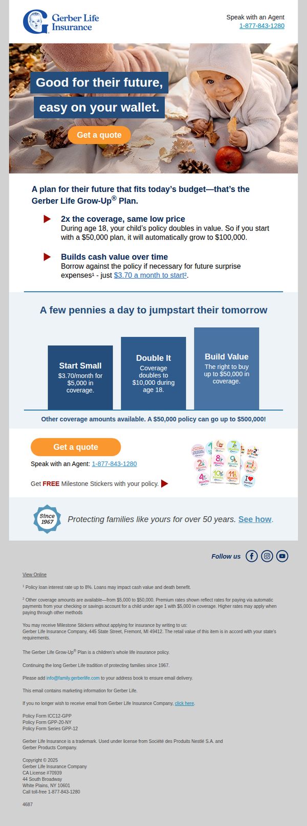
6. Gerber Life: Gerber Life Grow-Up® Plan policy details enclosed
Objective
This email aims to educate parents about the Gerber Life Grow-Up® Plan’s unique value proposition, affordable, scalable life insurance for children, and motivate them to request a quote by emphasizing long-term financial protection and low monthly costs.
Why this works
The email brilliantly frames life insurance as a budget-friendly investment in a child’s future, using emotionally resonant imagery and simple math to show how small monthly payments can grow into substantial coverage, making a complex product feel accessible and urgent.
How to implement
By highlighting the automatic doubling of coverage at age 18, the campaign taps into parental instincts to secure long-term stability, transforming a financial product into a milestone-driven promise that aligns with natural parenting timelines and emotional triggers.
Pro Tip
Add a brief testimonial or customer quote near the product grid to build social proof, parents are more likely to trust the plan if they see real families who’ve benefited from the coverage doubling feature. • Include a small visual progress bar or timeline graphic showing how coverage grows from $5K to $50K by age 18, making the value proposition more intuitive and visually compelling for skimmers.
7. Ethos Life : RE: Ethos Agent Verification Required [ ref:!00D3h03wCHS.!500Uc0fLKUE:ref ]
![7. Ethos Life : RE: Ethos Agent Verification Required [ ref:!00D3h03wCHS.!500Uc0fLKUE:ref ]](https://nudge-growth-experimental.s3.amazonaws.com/nudge/email-screenshots/3559697.jpg)
Objective
This email aims to guide a new Ethos Life agent through mandatory identity verification to enable commission processing, while reinforcing brand trust through clear, step-by-step instructions and a reassuring tone.
Why this works
The email opens with a warm, personalized welcome that immediately frames the recipient as part of the 'Ethos family,' building emotional connection before diving into procedural steps, which softens the compliance requirement.
How to implement
By explicitly stating that identity verification protects the agent’s own interests, not just company policy, the message reframes a bureaucratic task as a mutual safeguard, increasing cooperation without sounding authoritarian.
Pro Tip
Add a visual progress indicator or checklist graphic next to the verification steps to help the agent mentally track completion and reduce abandonment due to perceived complexity. • Include a brief testimonial or quote from another agent who successfully completed verification, to build social proof and reduce anxiety around submitting personal documents.
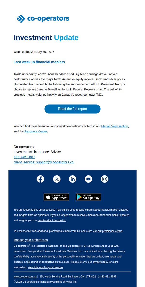
8. Co-operators: Gold lost its shine: Weekly recap (January 26 to 30, 2026)
Objective
This email aims to inform subscribers about recent market movements, particularly the decline in gold and silver prices, while positioning Co-operators as a trusted source for timely financial insights and encouraging deeper engagement through a detailed report.
Why this works
The subject line 'Gold lost its shine' immediately grabs attention by personifying market performance, making complex financial shifts feel relatable and urgent without resorting to sensationalism.
How to implement
By anchoring the update to a specific week and tying price drops to a concrete political event, Trump’s Fed chair announcement, the email builds credibility through timely, cause-and-effect storytelling that readers can easily follow.
Pro Tip
Add a brief bullet-point summary of key takeaways above the CTA to cater to skimmers and reinforce value before asking them to click through. • Include a small visual element, like a mini chart or icon, next to the gold/silver price mention to make the data more scannable and emotionally resonant.
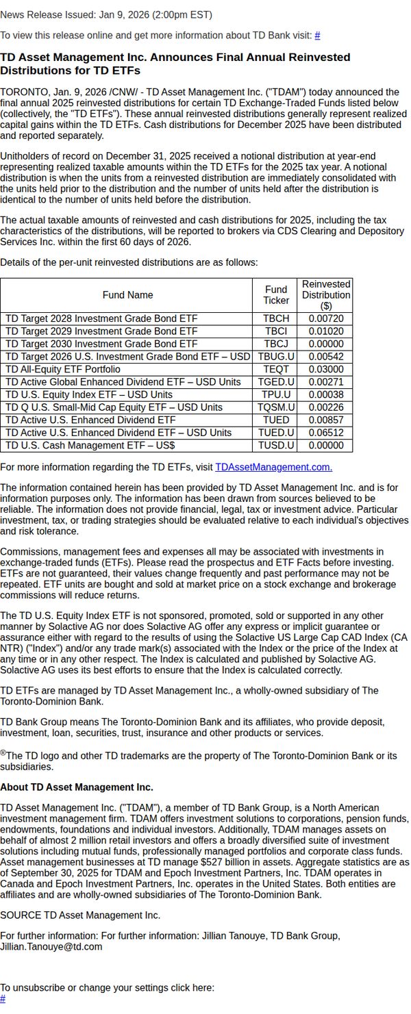
9. TD Insurance: TD Asset Management Inc. Announces Final Annual Reinvested Distributions for TD ETFs
Objective
To formally notify shareholders of the final annual 2025 reinvested distributions for specific TD ETFs, ensuring transparency around taxable amounts and unit adjustments while directing investors to official resources for further details.
Why this works
The email opens with a clear, date-stamped news release header that immediately signals authority and timeliness, helping recipients understand this is an official corporate update rather than promotional content.
How to implement
By structuring distribution details in a clean, sortable table with fund names, tickers, and exact reinvested amounts, the email empowers investors to quickly cross-reference their holdings without needing to dig through external documents.
Pro Tip
Add a brief visual highlight or icon next to the CTA link to increase visibility and encourage clicks, especially since the current text-only link blends into the legal disclaimers and may be overlooked. • Include a short summary paragraph above the table that explains in plain language what reinvested distributions mean for the average investor, for example, how unit counts change and tax implications, to improve accessibility for non-expert readers.
10. RT Specialty: Ryan Specialty Underwriting Managers Launches Public Entity MGU: Ryan Specialty Public Entity
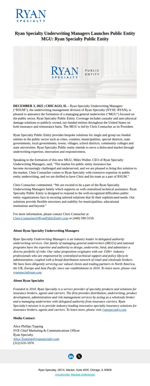
Objective
To announce the official launch of Ryan Specialty Public Entity, a new managing general underwriter focused on public sector insurance solutions, and to position it as a trusted, expert-driven partner for tax-funded institutions across the U.S.
Why this works
The email opens with a bold, clear headline that immediately signals strategic expansion, establishing credibility by anchoring the announcement in a specific date and location while tying it directly to the parent brand’s authority.
How to implement
It strategically positions the new MGU not just as a product but as a mission-driven solution for underserved public entities, using executive quotes to humanize the offering and reinforce trust through leadership endorsement and industry-specific expertise.
Pro Tip
Add a visual hierarchy to the body text, such as subheadings or bullet points, to break up dense paragraphs and guide readers toward key differentiators like ‘bespoke solutions’ or ‘flexible structures’ for faster comprehension. • Include a secondary CTA button or link near the top (e.g., ‘Download the Public Entity Solutions Overview’) to capture interest from readers who prefer to learn more before contacting, increasing conversion pathways without disrupting the primary goal.