How jewelry brands do brand history emails
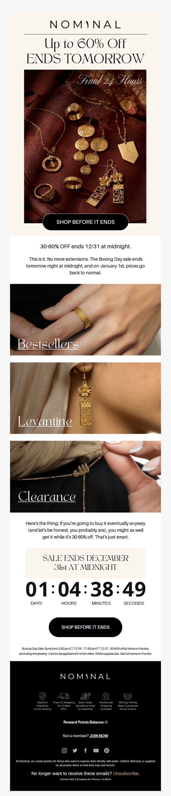




1. Nominal : 🕰️ Final 24H For Savings
Objective
This email aims to drive immediate purchases by creating urgency around a limited-time sale ending in 24 hours, encouraging customers to act before prices return to normal. It leverages scarcity and social proof through bestsellers and category highlights to convert hesitant shoppers.
Why this works
The email brilliantly uses a countdown timer not just as decoration but as a psychological trigger that turns abstract urgency into a tangible, ticking deadline, making procrastination feel like a real loss.
How to implement
By segmenting products into 'Bestsellers,' 'Levantine,' and 'Clearance,' the campaign speaks to different buyer motivations, social proof, cultural identity, and value-seeking, without overwhelming the reader.
Pro Tip
Add a small visual indicator (like a red badge or star) next to 'Bestsellers' and 'Levantine' sections to subtly reinforce their popularity or exclusivity, increasing perceived value without cluttering the layout. • Reposition the countdown timer directly beneath the hero image and above the product categories to anchor urgency at the top of the scroll, ensuring it’s seen before users decide to browse or leave.
2. Kimaï: Meet the couple: Victoria & Melody
Objective
To emotionally engage subscribers by sharing a heartfelt customer love story centered around the Jackie Ring, subtly encouraging product exploration and future purchases through authentic storytelling and visual inspiration.
Why this works
The email masterfully uses a real customer love story to create emotional resonance, making the product feel like a meaningful milestone rather than just a luxury item, which deepens brand connection and purchase intent.
How to implement
By featuring intimate, black-and-white photography alongside candid quotes, the campaign builds authenticity and trust, subtly guiding the reader to visualize themselves in the story, a powerful tool for converting sentiment into sales.
Pro Tip
Add a secondary CTA button beneath the 'If you love the Jackie ring...' section that says 'View All Engagement Rings' to capture broader interest and reduce friction for users not ready to commit to a specific style. • Include a small visual cue or icon next to the product grid items (e.g., 'Bestseller' or 'Customer Favorite') to add social proof and help guide decision-making without requiring additional clicks or reading.
3. Body Candy Body Jewelry: Wait, what? 🤯 50% Off Absolutely Everything?!
Objective
This email aims to drive immediate sales by creating urgency around a limited-time 50% off sitewide sale while also promoting new seasonal collections and educational content to build trust and guide purchasing decisions.
Why this works
The email masterfully combines urgency with emotional appeal by declaring this the 'last deal' while pairing it with glittering visuals and a bold neon CTA that pulls the eye directly to the conversion point without distraction.
How to implement
By featuring a specific waterproof nose ring with lifestyle-focused copy, the campaign transforms a generic discount into a personalized solution for spring breakers, making the offer feel relevant and timely rather than just transactional.
Pro Tip
The hero section’s '50% OFF' message is visually dominant, but the secondary CTA 'use code: HALFOFF' is buried beneath the primary button, repositioning the promo code closer to the top or integrating it into the button text would reduce friction and increase redemption rates. • While the St. Patrick’s Day jewelry section is visually striking, it lacks a clear urgency or limited-edition cue; adding a subtle 'Limited Stock' tag or countdown timer would better align this seasonal promotion with the email’s overarching scarcity-driven strategy.
4. Tom Wood Project: Modern Amulets in the Year of the Fire Horse
Objective
This email aims to introduce and drive interest in Tom Wood Project’s Lunar New Year jewelry collection, positioning their modern amulets as meaningful talismans for the Year of the Fire Horse that blend heritage with contemporary style. It seeks to convert curiosity into exploration and ultimately purchases by emphasizing symbolic storytelling and emotional resonance.
Why this works
The campaign brilliantly frames jewelry as modern amulets tied to cultural moments, transforming products from accessories into meaningful talismans that resonate emotionally with customers seeking symbolism and personal narrative in their purchases.
How to implement
By anchoring the collection in the Year of the Fire Horse, the email leverages cultural relevance to create urgency and exclusivity, making the pieces feel timely and significant rather than just another seasonal drop, which elevates perceived value and emotional investment.
Pro Tip
Add a subtle countdown timer or limited-edition badge near the 'EXPLORE NOW' CTA to reinforce urgency around the Lunar New Year theme, encouraging faster decision-making without disrupting the email’s elegant tone. • Include a short customer testimonial or social proof snippet near the product grid to build trust, for example, a quote like 'Wearing my Felix Ring reminds me daily of my goals', to humanize the symbolic messaging and validate emotional claims.
5. Secret Wood: 🐎🔥 Fire Horse arrives. Only 20 exist.
Objective
To drive immediate purchases of the limited-edition Fire Horse sculpture by leveraging its symbolic meaning and scarcity, while cross-promoting other high-margin, thematic products to expand customer spend.
Why this works
The email brilliantly ties cultural symbolism to product scarcity, framing the Fire Horse not just as art but as a talisman of momentum and prosperity, making it emotionally resonant and urgent for collectors seeking meaning alongside rarity.
How to implement
By placing the primary CTA immediately after the product’s symbolic narrative and scarcity trigger, the email creates a seamless emotional-to-action journey that minimizes friction and maximizes conversion potential for high-intent buyers.
Pro Tip
Add a subtle countdown timer or inventory tracker next to the 'ONLY 20 FIRE HORSE SHELLS' banner to visually reinforce scarcity and trigger FOMO without requiring users to scroll or guess availability. • Include a short customer testimonial or collector quote near the product description to build social proof and validate the symbolic value, helping hesitant buyers justify the premium price with emotional and social validation.
6. Body Candy Body Jewelry: Wait, what? 🤯 50% Off Absolutely Everything?!

Objective
This email aims to drive immediate sales by creating urgency around a limited-time 50% off sitewide discount, while also showcasing new collections and educational content to engage both new and returning customers.
Why this works
The email opens with a bold, emotionally charged subject line and hero section that immediately grabs attention by framing the discount as a shocking, last-chance event, a psychological trigger that converts curiosity into clicks.
How to implement
By weaving seasonal collections like St. Patrick’s Day and Spring Break themes into the promotion, the brand makes the sale feel timely and relevant, encouraging impulse buys tied to real-life moments customers are already planning for.
Pro Tip
Add a visible countdown timer under the '50% OFF' headline to reinforce urgency and prevent the discount from feeling like a perpetual offer, which could reduce conversion pressure. • Reposition the 'Shop Now' CTA button to appear both above and below the fold, currently, it’s buried after the hero image on mobile, risking missed clicks from users who don’t scroll.
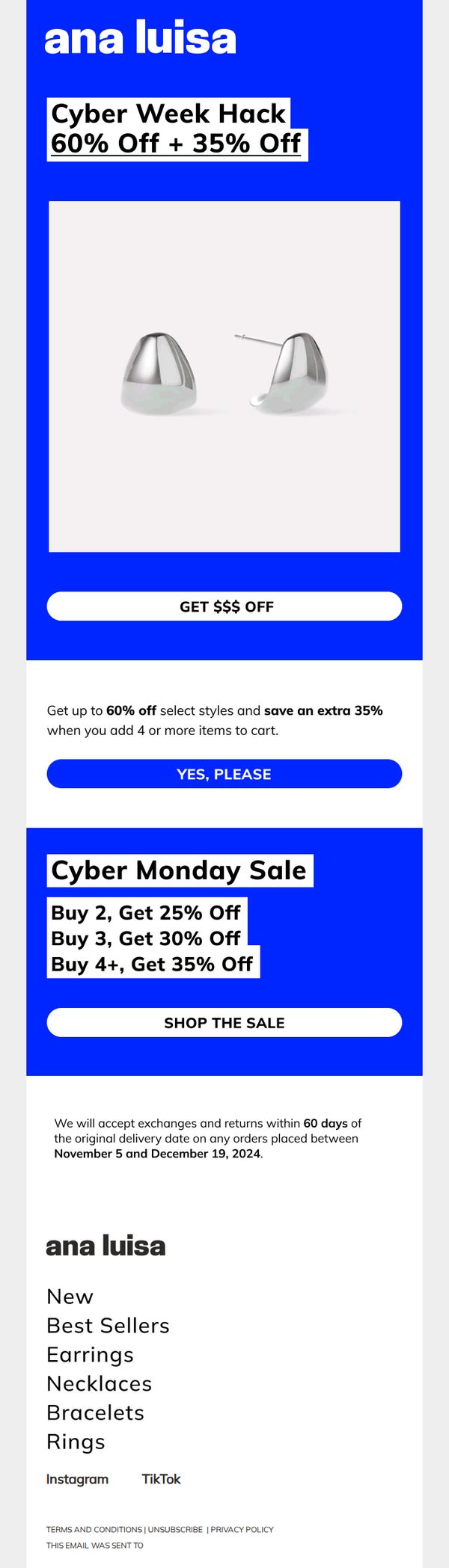
7. Ana Luisa: CYBER WEEK: 60% OFF + 35% OFF
Objective
This email aims to drive immediate sales during Cyber Week by highlighting layered discounts, 60% off plus an extra 35% off for bulk purchases, to incentivize higher cart values and urgency among jewelry shoppers.
Why this works
The email brilliantly layers discounts, 60% off plus an extra 35% for buying 4+ items, to create perceived value and encourage larger purchases without overwhelming the customer with complexity.
How to implement
Using bold, high-contrast blue and white design immediately signals urgency and trust, while keeping the focus on the product image and discount messaging without visual clutter or distractions.
Pro Tip
Add a countdown timer under the hero section to reinforce urgency and prevent procrastination, especially since Cyber Week is time-bound and shoppers respond strongly to scarcity cues. • Include a small product grid or carousel of bestsellers under the main offer to reduce decision fatigue and visually showcase what qualifies for the 60%+35% discount, increasing conversion likelihood.
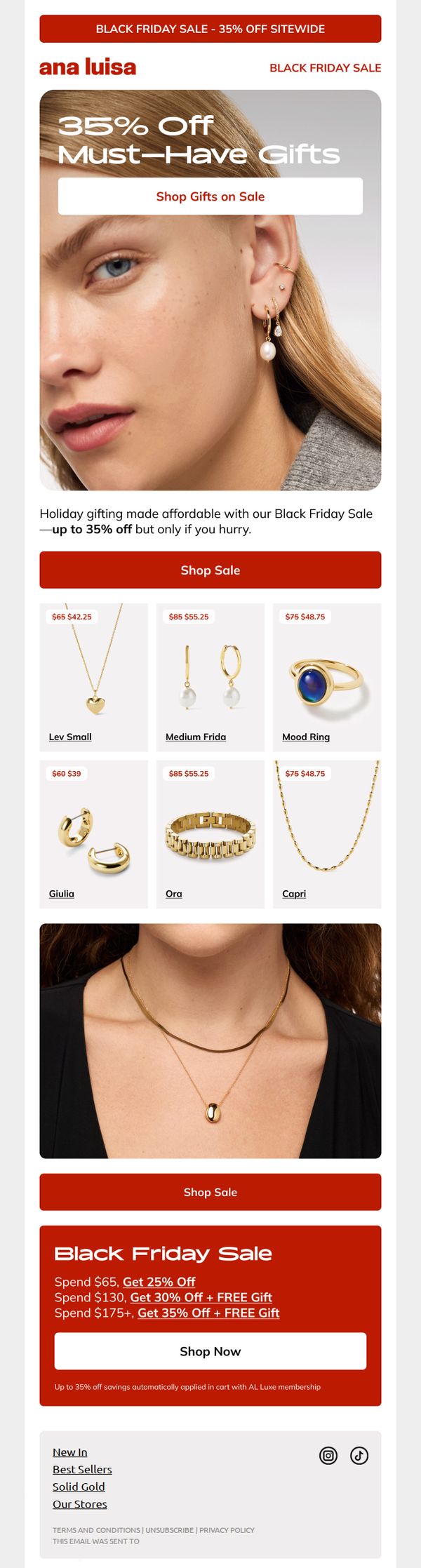
8. Ana Luisa: BLACK FRIDAY IS GETTING OUT OF HAND 😳
Objective
This email aims to drive immediate Black Friday purchases by highlighting deep discounts on popular jewelry items and tiered spending incentives, while positioning Ana Luisa as the go-to for affordable, giftable luxury during the holiday season.
Why this works
The email brilliantly frames the sale as a time-sensitive gifting solution, not just a discount event, which emotionally aligns with holiday shoppers’ urgency and desire to give thoughtfully without overspending.
How to implement
By showcasing real products with clear before-and-after pricing in a clean grid, the campaign builds instant trust and reduces decision fatigue, making it effortless for customers to visualize value and click through.
Pro Tip
Add a countdown timer near the hero section or offer block to amplify urgency, since the email’s goal is time-sensitive conversion and the current design lacks a visible deadline to trigger FOMO. • Include a small testimonial or social proof snippet near the product grid, like 'Over 10,000 gifted this necklace last week', to reinforce popularity and reduce perceived risk for first-time buyers.
9. Tiffany & Co. - US: Fernan, Embrace the Strength of HardWear by Tiffany

Objective
This email aims to emotionally connect the recipient with the HardWear by Tiffany collection by highlighting personal stories of strength and resilience from real women, encouraging them to see the jewelry as a symbol of their own power and to explore or purchase the collection.
Why this works
Tiffany brilliantly humanizes luxury by anchoring the HardWear collection to authentic, emotionally resonant stories from real women, transforming jewelry from an accessory into a personal emblem of resilience and self-worth.
How to implement
The email strategically uses minimal, high-contrast visuals and clean typography to let the emotional weight of each testimonial shine, proving that luxury marketing doesn’t need clutter, it needs clarity and conviction.
Pro Tip
Add a subtle countdown timer or limited-edition badge near the CTA to create urgency, since the current design lacks any time-sensitive incentive that could nudge hesitant shoppers toward immediate action. • Include a small visual cue or icon next to each 'Explore the Collection' link to indicate it’s clickable, currently, the text blends into the body copy, reducing perceived interactivity and potentially lowering engagement rates.
10. Tom Wood Project: Discover the Arch Rings l Sharp and raw design

Objective
This email aims to introduce and drive interest in the Arch Rings collection by highlighting its architectural inspiration and minimalist aesthetic, encouraging recipients to explore and shop the new designs as part of the broader Vault collection.
Why this works
The email masterfully ties product design to a compelling narrative, brutalist architecture, giving the Arch Rings emotional and cultural weight that elevates them beyond mere accessories into wearable art with a story.
How to implement
By featuring both male and female models wearing the rings in moody, editorial-style photography, the campaign subtly communicates gender-neutral appeal and lifestyle integration, making the product feel aspirational yet accessible.
Pro Tip
Add a subtle countdown timer or limited-edition badge near the 'SHOP NOW' CTA to create urgency, especially since the Vault collection implies exclusivity, this would nudge hesitant shoppers toward immediate action. • Include a small testimonial or customer review snippet near the product grid to reinforce social proof, as the current layout relies heavily on visuals and narrative without third-party validation.