How media brands do brand history email campaigns





1. Pittsburgh: Why a Pittsburgh museum is crucial to the history of broadcasting
Objective
This email aims to engage Pittsburgh residents by highlighting culturally significant local stories, from sports and broadcasting history to community initiatives, while subtly promoting sponsor partners and encouraging readers to explore the full digital magazine issue.
Why this works
The email masterfully ties local pride to historical milestones by anchoring the National Museum of Broadcasting in Pittsburgh’s legacy, making readers feel personally connected to the city’s cultural impact beyond just entertainment.
How to implement
By blending human-interest stories like Billy Strayhorn’s musical tribute and community-driven initiatives such as stylists supporting mental health, the campaign creates emotional resonance that transcends typical event promotion and builds authentic local loyalty.
Pro Tip
The primary CTA 'READ MORE >>' is overused and lacks urgency or differentiation; tailoring CTAs per section (e.g., 'Discover the Museum’s Origins' or 'Meet Scamper Today') would better guide user intent and improve click-through relevance. • The layout lacks visual hierarchy between editorial and sponsored content, risking reader confusion; adding subtle visual cues like 'Sponsored' badges with distinct borders or background tints would clarify content type without disrupting flow.
2. Fortune: Nvidia's rocket ride
Objective
This email aims to inform tech investors and industry professionals about Nvidia’s extraordinary financial performance and strategic hiring surge, positioning the company as a dominant force in the AI computing era while subtly encouraging newsletter engagement and event sign-ups.
Why this works
The email masterfully frames Nvidia’s earnings surge not just as a financial win but as the dawn of a new computing era, leveraging CEO quotes and hiring data to emotionally anchor readers in the magnitude of the company’s strategic pivot toward AI infrastructure.
How to implement
By spotlighting specific job postings and salary ranges, the email transforms abstract corporate growth into tangible human stories, subtly signaling opportunity to tech talent while reinforcing Nvidia’s market dominance through workforce expansion metrics.
Pro Tip
The primary CTA for the San Francisco event is visually underwhelming and buried mid-email; elevate it with a contrasting button or hero banner to match the urgency of Nvidia’s momentum and drive higher registration rates. • Add a brief visual timeline or infographic summarizing Nvidia’s revenue jump, hiring surge, and AI milestones to break up text density and reinforce key data points for skimmers who may miss the narrative depth.
3. South Sound Magazine: Sip & Savor
Objective
This email aims to engage readers with curated local food, drink, and event experiences in the South Sound region, encouraging exploration and participation while subtly promoting subscription and advertising opportunities.
Why this works
The email masterfully blends local culture with culinary discovery by spotlighting unique food events and regional businesses, creating an emotional hook that invites readers to become part of the community story.
How to implement
By weaving in seasonal themes like autumn harvests and international sister-city connections, the campaign taps into timely, emotionally resonant narratives that elevate everyday dining into memorable experiences.
Pro Tip
The primary CTA 'READ MORE' is repetitive and lacks urgency or specificity, consider varying CTAs per section (e.g., 'Grab a Taco Now', 'Book Your Wine Tasting') to better match content and drive action. • The footer’s dual CTAs ('Subscribe to the Magazine', 'Advertise with Us') compete visually and strategically, separate them with whitespace or hierarchy to clarify audience intent and reduce decision fatigue.
4. Nice News : A comeback against the odds
Objective
This email aims to deliver uplifting, curiosity-driven news stories that inspire hope and wonder while subtly integrating sponsored content and brand partnerships to sustain the free newsletter model. It seeks to deepen reader loyalty by blending human interest, science, culture, and light commerce in a digestible daily format.
Why this works
The email masterfully balances emotional resonance with practical value by opening with a powerful obituary that honors legacy, then immediately pivots to hopeful, science-backed stories that leave readers feeling informed and uplifted, a rhythm that builds trust and encourages daily opens.
How to implement
By embedding sponsored content as natural extensions of editorial themes, like pairing mitochondrial health with a wellness product or celebrating a wedding photographer within a culture story, the campaign makes advertising feel like helpful curation rather than interruption, preserving the brand’s feel-good ethos.
Pro Tip
The repeated 'Restore Your Quality of Life' ad section appears twice with identical copy and CTA, which feels redundant and disrupts flow; consolidate into one strategically placed, visually distinct banner with stronger benefit-driven language tied to the day’s theme of resilience. • The 'Eyes on Milano Cortina' sports section lacks a clear CTA or link to deeper coverage, adding a 'Watch the Race Replay' or 'See Team Canada’s Medal Count' button would capitalize on reader momentum and drive traffic to partner content or video platforms.
5. Sifted : Predicting the workplace in 2026
Objective
This email aims to engage startup founders and tech operators by delivering forward-looking insights on workplace evolution in 2026, while subtly promoting Sifted’s thought leadership and sponsored content from Box. It also encourages reader interaction through submissions and applications to Sifted’s Leaderboards.
Why this works
The email opens with a warm, personalized greeting and immediately anchors the reader in the present moment, January 2026, making the predictions feel timely, relevant, and grounded in real-world context rather than abstract speculation.
How to implement
By weaving in curated quotes, founder insights, and investor predictions, the email transforms a broad topic like workplace evolution into a dynamic, multi-voiced conversation that feels authoritative, insider-driven, and deeply engaging for its startup-savvy audience.
Pro Tip
The primary CTA 'Apply now' for the Leaderboards is visually underwhelming and buried beneath a long section, consider elevating it with a contrasting color, larger button, or sticky placement to increase conversion from interested readers. • The 'Smart reads' section includes external links without clear value framing, add a one-sentence hook for each article (e.g., 'This reveals how AI is quietly reshaping sales teams') to boost click-through rates and align with the email’s predictive theme.
6. Popular Mechanics: Immortality Is Impossible. Blame the Physics of Aging, Scientists Say

Objective
To engage readers with compelling science and technology stories while driving membership sign-ups by highlighting exclusive content and benefits available to subscribers.
Why this works
The email opens with a provocative, science-backed headline that immediately hooks curiosity by challenging a popular fantasy, immortality, while grounding it in real physics, making the content feel both urgent and intellectually satisfying.
How to implement
By juxtaposing high-profile, human-interest stories like Bryan Johnson’s anti-aging quest with deep science mysteries like the Möbius strip, the email creates a rhythm of wonder and credibility that keeps readers scrolling without feeling overwhelmed.
Pro Tip
Add a subtle countdown timer or limited-time offer badge near the 'Join Now' CTA to create urgency, especially since the email targets readers already interested in science and exclusivity, this could boost conversion without disrupting the editorial tone. • Include a short testimonial or quote from a current member near the membership section to reinforce social proof, helping skeptical readers overcome inertia by seeing real people who value the content and benefits offered.
7. Men’s Journal: First Ride: 2023 Ducati Diavel V4 Is the Brand's Most Ferocious Cruiser Yet
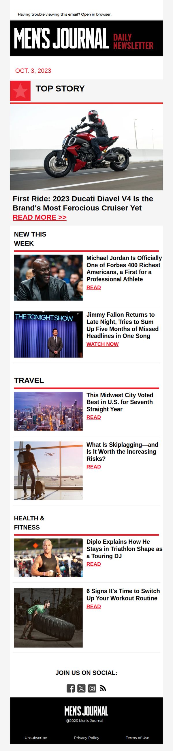
Objective
This email aims to drive engagement with Men’s Journal’s daily content by spotlighting a high-impact motorcycle review while curating other timely stories across lifestyle verticals to keep subscribers informed and clicking through. It reinforces brand authority in men’s interests through diverse, editorially rich content.
Why this works
The email leads with a bold, visually arresting hero image of the Ducati Diavel V4 in motion, immediately signaling high-energy, premium content that appeals to automotive enthusiasts and sets the tone for the entire newsletter’s editorial quality.
How to implement
By organizing content into clearly labeled verticals like Travel and Health & Fitness, the email caters to diverse reader interests without overwhelming them, making it easy for subscribers to self-select topics that resonate with their personal lifestyle priorities.
Pro Tip
Add a subtle countdown or time-sensitive language near the top story to create urgency, for example, 'First Ride: Limited Access Until Midnight', to encourage immediate clicks rather than passive scrolling. • Include a personalized subject line or dynamic content block (e.g., 'Based on your interest in motorcycles, here’s our top ride review this week') to increase relevance and open rates by leveraging subscriber behavior data.
8. Bloomberg: Hedge funds need to plan for failure

Objective
This email aims to engage Bloomberg Businessweek subscribers with high-impact financial analysis, particularly around hedge fund risk management and historical market failures, while subtly reinforcing the value of Bloomberg’s data-driven journalism to retain and deepen reader loyalty.
Why this works
The email masterfully uses a high-stakes financial failure story, LTCM’s collapse, as a narrative hook to frame modern hedge fund risk, making complex market dynamics feel urgent and personally relevant to finance professionals who need to plan for worst-case scenarios.
How to implement
By weaving in expert commentary from insiders like Victor Haghani and tying it to timeless risk frameworks, the email positions Bloomberg not just as a news source but as a strategic advisor, subtly elevating its authority in a crowded financial media landscape.
Pro Tip
The primary CTA is buried at the bottom and visually underwhelming; relocating a stronger, more visually distinct CTA button, perhaps after the LTCM analysis, would capitalize on peak reader engagement and increase conversion likelihood. • The ad for LifeMD interrupts the financial narrative flow and feels tonally mismatched; replacing it with a Bloomberg-branded content upgrade (e.g., ‘Download our Hedge Fund Risk Playbook’) would maintain thematic consistency and drive deeper engagement.
9. Scientific American : Today in Science: Artificial lungs rescue near-death patient

Objective
To engage readers with compelling, timely science stories that highlight medical breakthroughs and cosmic discoveries, while subtly encouraging newsletter subscriptions and deeper interaction through quizzes and discussion prompts.
Why this works
The email opens with a dramatic, human-centered medical breakthrough, artificial lungs saving a near-death patient, which immediately hooks readers by connecting high-stakes science to real human survival, making complex innovation feel urgent and personal.
How to implement
By embedding interactive elements like a science quiz and a call to join the discussion, the campaign transforms passive readers into active participants, fostering community and increasing time-on-content without disrupting the editorial tone or scientific credibility.
Pro Tip
The primary CTA 'Join the Discussion' is buried under a long news list and lacks visual prominence; elevating it with a contrasting button color or moving it above the fold would increase engagement without compromising editorial flow. • The 'Play Now' quiz section feels disconnected from the rest of the content; integrating a teaser question into the 'Top Stories' section or tying the quiz topic to the artificial lungs story would create narrative continuity and improve conversion.
10. Nice News : What makes a good apology?

Objective
This email aims to engage readers with uplifting, thought-provoking content while subtly promoting brand partnerships and sponsorships. It seeks to reinforce Nice News’ mission of re-envisioning how people engage with news by delivering emotionally resonant, human-centered stories that inspire reflection and action.
Why this works
The email masterfully blends emotional storytelling with data-backed insights, such as the psychology of apologies, making complex human behavior feel relatable and actionable for everyday readers without sacrificing depth or credibility.
How to implement
By featuring a sponsored segment that feels editorially integrated, like the Miso Robotics story, it demonstrates how branded content can add value without disrupting the reader’s experience, turning advertising into authentic storytelling that aligns with the publication’s mission.
Pro Tip
The CTA 'Become a Shareholder' appears only once and is buried within a long-form article; adding a sticky or secondary CTA near the top or mid-scroll would capture attention from skimmers and reinforce the conversion goal without disrupting flow. • While the email offers rich, varied content, the lack of visual hierarchy or section-specific CTAs (e.g., 'Watch the video' or 'Read the full story') misses opportunities to guide readers toward deeper engagement with individual stories or sponsor content.