Music brand history emails worth copying
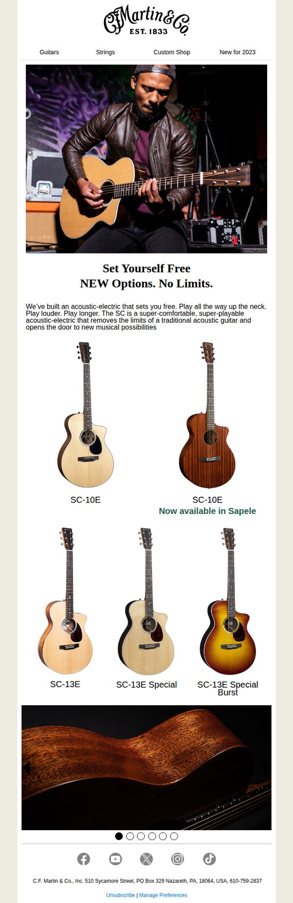

1. Martin Guitar: NEW Options. No Limits.
Objective
This email aims to introduce Martin Guitar’s new SC series of acoustic-electric guitars, highlighting their enhanced playability and versatility to attract musicians seeking freedom and innovation in their instruments. It encourages immediate exploration of the new models and their unique finishes.
Why this works
The campaign brilliantly frames the new SC series not just as instruments, but as tools for musical liberation, emphasizing freedom of expression, extended playability, and breaking traditional acoustic limits to emotionally resonate with serious players.
How to implement
By showcasing multiple finishes and models in a clean, grid-based layout, the email visually reinforces variety and customization without overwhelming the viewer, making it easy for customers to imagine their ideal guitar and reducing decision fatigue.
Pro Tip
Add a clear, secondary CTA button beneath the product grid, such as 'Explore All SC Models' or 'Find Your Sound', to guide users who want to browse beyond the featured options, improving conversion flow without cluttering the hero. • Include a short testimonial or quote from a professional musician using the SC series to build social proof and credibility, especially since the email targets serious players who value peer validation before investing in premium gear.
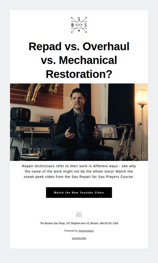
2. The Boston Sax Shop: 🎷Overhaul, Repad, Mechanical Restoration - What’s the Difference?
Objective
To educate saxophone players on the distinctions between repad, overhaul, and mechanical restoration services, while driving engagement through a video preview that positions The Boston Sax Shop as a trusted authority in saxophone repair.
Why this works
The email brilliantly reframes a technical service question into an educational hook, inviting curiosity rather than pushing a sale, a subtle but powerful trust-building move that positions the brand as a helpful guide, not just a vendor.
How to implement
By featuring a real technician in a warm, studio-like setting with saxophones in the background, the email visually reinforces expertise and authenticity, making the educational content feel personal and credible rather than corporate or generic.
Pro Tip
Add a secondary CTA below the video button, such as 'Book a Free Repair Consultation', to capture intent from users who may not watch the video but are ready to take action, improving conversion pathways. • Include a short testimonial or quote from a satisfied customer who benefited from understanding these service differences, to reinforce social proof and reduce perceived risk for first-time repair customers.
3. XOTICPC: Free Shipping On Select Laptops!
Objective
This email aims to drive immediate laptop purchases by removing shipping cost as a barrier for high-value orders, while reinforcing XOTICPC’s reputation for customization and customer-centric service through social proof and brand heritage.
Why this works
The email brilliantly reframes free shipping not as a discount but as a customer appreciation gesture, which elevates perceived value and positions the brand as generous rather than desperate to sell.
How to implement
By showcasing four distinct laptop models with clear use-case labels, gaming, professional, workstation, stealth, the email speaks directly to segmented buyer personas, making it easier for each to self-identify and act.
Pro Tip
Add a subtle countdown timer or urgency indicator near the CTA to nudge procrastinators, since the offer is conditional on price ($1299+), a time-bound element could increase conversion without altering the core message. • Reposition the 'SHOP LAPTOPS' CTA higher in the email, perhaps beneath the offer explanation, to reduce scroll friction, users who qualify for free shipping may not scroll far enough to see the main action button.
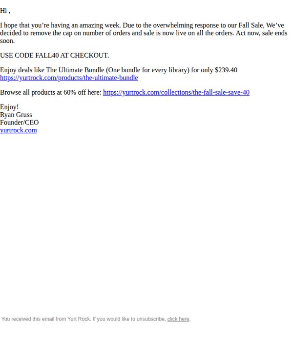
4. Yurt Rock: Your Weekend surprise is here
Objective
This email aims to create urgency and drive immediate purchases by announcing the removal of order limits on a popular Fall Sale, encouraging subscribers to act before the sale ends.
Why this works
The email leverages social proof by referencing 'overwhelming response' to justify removing order caps, which subtly pressures readers to act before the sale disappears, a clever psychological nudge that boosts conversion urgency.
How to implement
By anchoring the offer around a specific, high-value product, 'The Ultimate Bundle', the email gives subscribers a clear starting point, reducing decision fatigue and increasing the likelihood of immediate purchase.
Pro Tip
Add a visual countdown timer or 'Sale ends in [X] hours' notice near the CTA to reinforce urgency, since the current text only says 'sale ends soon' without a concrete timeframe. • Include a small hero image or product thumbnail of 'The Ultimate Bundle' to break up text and visually anchor the offer, increasing click-through by giving the eye a focal point.
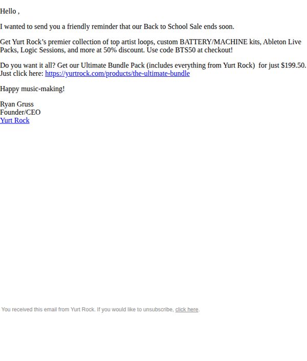
5. Yurt Rock: Your 50% OFF expires soon!
Objective
This email aims to create urgency and drive immediate conversions by reminding subscribers that the Back to School Sale, featuring 50% off premium music production tools, is ending soon, encouraging them to redeem the discount before it expires.
Why this works
The email leverages personalization by addressing the recipient directly and using a warm, conversational tone from the founder, which builds trust and makes the offer feel exclusive rather than transactional.
How to implement
It strategically bundles high-value products into a single compelling package, the Ultimate Bundle Pack, which simplifies decision-making for the customer while maximizing perceived value at a discounted price point.
Pro Tip
Add a visual countdown timer near the CTA to reinforce urgency and reduce cognitive friction, seeing the clock tick down increases conversion likelihood more than text alone. • Include a short testimonial or user quote from a producer who used the bundle successfully, to build social proof and validate the value proposition before the user clicks through.
6. Vandoren: Newsletter September 2023

Objective
This email aims to engage musicians by introducing the new JUNO reed line, promoting upcoming masterclasses at the Paris showroom, and highlighting new educational sheet music, all while reinforcing Vandoren’s brand authority and commitment to musicians at every level.
Why this works
The email brilliantly positions the JUNO reed as an accessible yet premium entry point for beginners, leveraging the brand’s French craftsmanship heritage to build trust while emphasizing universal playability across skill levels.
How to implement
By featuring real-world masterclasses with named artists and clear dates, the campaign transforms passive readers into active participants, creating urgency and community around live educational experiences that align with Vandoren’s mission to support musicians at every stage.
Pro Tip
The CTA 'Discover the range of JUNO reeds' appears only once and is visually buried beneath dense product text; adding a second, sticky CTA button near the top or after the first product image would improve conversion by reducing scroll friction. • The media section featuring the video thumbnail lacks a clear headline or context, adding a short, benefit-driven title like 'Watch Eva Barthes perform Fauré with Vandoren reeds' would better entice clicks and align with the campaign’s educational tone.
7. Yurt Rock: Here's your upgrade for 2026!
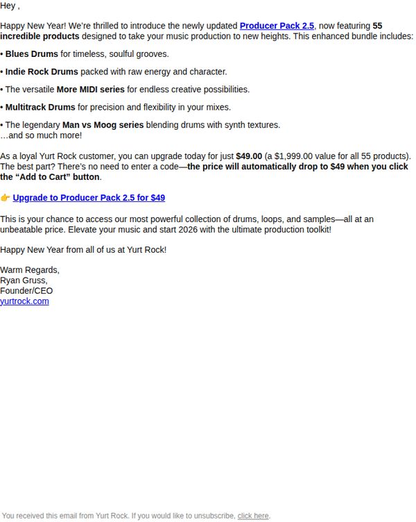
Objective
To incentivize existing Yurt Rock customers to upgrade to the Producer Pack 2.5 by highlighting its expanded content and offering a limited-time discounted price of $49, positioning it as a must-have toolkit for elevating music production in 2026.
Why this works
The email smartly frames the upgrade as a New Year’s gift to the customer, tying the product launch to a natural moment of reflection and goal-setting in music production, which boosts emotional resonance and urgency.
How to implement
By emphasizing the massive value drop, from $1,999 to $49, the campaign creates a powerful perception of exclusivity and reward for loyal customers, making the offer feel like a privileged insider deal rather than a standard sale.
Pro Tip
Add a visual hero banner or product collage to break up the text-heavy layout and immediately convey the richness of the 55 included products, which would strengthen visual appeal and reduce cognitive load for skimmers. • Include a short customer testimonial or social proof near the CTA to reinforce credibility and reduce perceived risk, especially since the offer is time-sensitive and targets existing users who may question the value of upgrading.
8. Charlotte Magazine: The Best Things to Do and See This Month in Charlotte
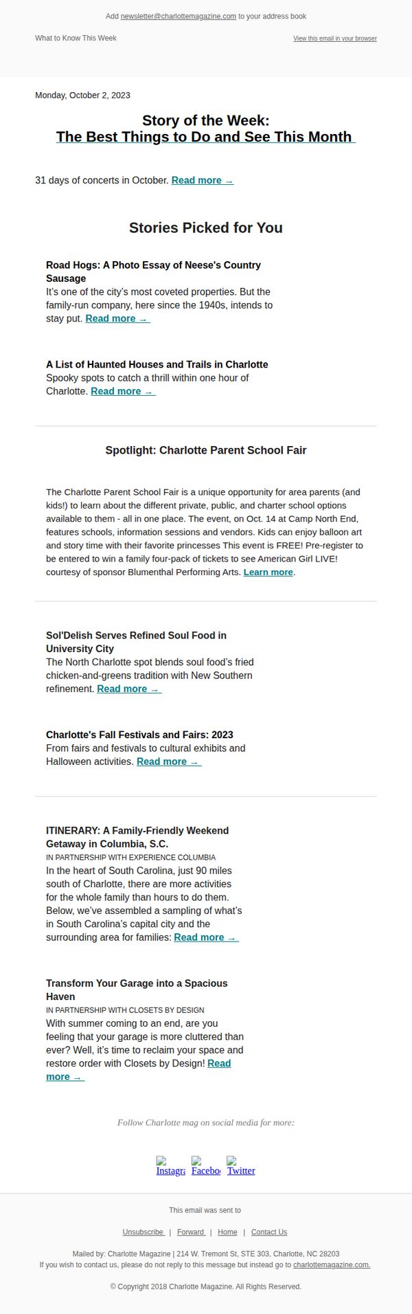
Objective
To engage local readers by curating and highlighting the top events, stories, and activities happening in Charlotte during October, encouraging them to explore their community and stay connected through the magazine’s content and partnerships.
Why this works
The email successfully frames local events as must-see experiences by blending editorial storytelling with practical details, making readers feel like insiders who are being personally guided through the month’s best offerings.
How to implement
By spotlighting community-driven events like the Parent School Fair and seasonal festivals, the campaign builds emotional resonance and positions the magazine as a trusted curator of family-friendly, culturally rich local experiences worth planning around.
Pro Tip
Add a visual countdown or calendar icon next to time-sensitive events (like the Oct. 14 School Fair) to create urgency and help readers prioritize dates without scrolling through text. • Reposition the social media follow section higher in the email, perhaps beneath the hero, to capitalize on early engagement momentum and convert casual readers into loyal followers before they reach the footer.
9. Charlotte Magazine: Charlotte's Fall Festivals and Fairs: 2023

Objective
To engage local readers by highlighting seasonal events and curated lifestyle content while subtly promoting a sponsored home organization brand. The email aims to position Charlotte Magazine as a go-to source for community happenings and tasteful living.
Why this works
By anchoring the email around a timely seasonal theme, Charlotte’s Fall Festivals, the campaign taps into local pride and event-driven urgency, making content feel relevant and immediately actionable for readers planning their autumn weekends.
How to implement
The seamless integration of sponsored content from Closets by Design doesn’t disrupt the editorial flow; instead, it’s framed as a lifestyle solution that complements the magazine’s tone, making the ad feel like a natural extension of the reader’s interests rather than a sales pitch.
Pro Tip
The primary CTA 'Read more →' is repetitive and lacks urgency or specificity, consider varying CTAs per section (e.g., 'Explore Fall Festivals' or 'Get Organized Now') to better match content intent and drive higher click-through rates. • The email lacks a clear visual hierarchy between editorial content and sponsored sections, which could dilute brand trust, adding subtle visual dividers or badges like 'Sponsored Feature' would improve transparency and reader experience.
10. Yurt Rock: More products at 60% OFF!
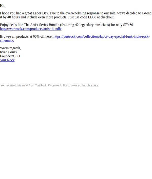
Objective
The email aims to extend a limited-time Labor Day sale by 48 hours due to high customer demand, encouraging immediate purchases with a 60% discount and a specific promo code to drive conversions.
Why this works
The email leverages social proof by citing 'overwhelming response' to justify extending the sale, which subtly pressures readers to act before the deal vanishes again, tapping into FOMO without being pushy.
How to implement
Including a specific product example, The Artist Series Bundle, with a clear price and unique value proposition (42 legendary musicians) makes the discount feel tangible and helps customers visualize the benefit instantly.
Pro Tip
Add a visual hero section with product imagery or a banner to break up the text-heavy layout and immediately capture attention, since the current design lacks visual hierarchy and emotional pull. • Include a countdown timer or urgency indicator near the CTA to reinforce the 48-hour extension and motivate faster action, as the current text-only urgency may not register strongly enough for distracted readers.