Proven Podcast Brand History email designs you can use



1. Jay Shetty: We’re Asking the Wrong Question
Objective
This email aims to provoke self-reflection on personal and technological biases while positioning The Rundown AI as a trusted, time-efficient resource for understanding AI’s role in daily life. It subtly drives sign-ups by aligning AI learning with personal growth and Jay Shetty’s philosophy.
Why this works
The email brilliantly reframes AI not as a threat but as a mirror of human bias, making the topic emotionally resonant and personally relevant to every reader regardless of their technical background.
How to implement
By embedding a relatable personal anecdote about cooking as a weakness, Jay Shetty humanizes the message and models the very self-awareness he’s encouraging readers to adopt toward their own limitations.
Pro Tip
Add a visual progress bar or countdown timer near the CTA to create urgency around the '5 minutes a day' promise, subtly reinforcing the time-saving benefit and nudging immediate action. • Include a short, authentic testimonial from a real Rundown AI subscriber within the offer section to validate the claim that 'over a million readers have signed up,' making the social proof more tangible and persuasive.
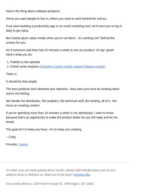
2. Castos: don’t use our product (weekly)
Objective
To reinforce Castos’ value proposition by positioning it as a set-and-forget podcast hosting platform that empowers creators to focus on content, not maintenance, while subtly encouraging continued engagement through low-friction usage.
Why this works
Castos brilliantly flips the script by inviting users not to use the product daily, which reframes their value as reliability and automation, a refreshing contrast to attention-hungry SaaS tools that demand constant logins.
How to implement
By highlighting their unique 'Followers metric' as a core action item, Castos subtly showcases differentiation without hard selling, letting product uniqueness speak for itself through user behavior rather than feature lists.
Pro Tip
Add a secondary CTA above the footer, such as 'See how little time you actually need', linking to a 60-second demo video or usage dashboard screenshot to visually reinforce the '10 minutes a week' claim. • Include a micro-testimonial or user stat (e.g., '87% of users spend under 10 mins/week') near the 'That’s it' line to socially validate the low-effort promise and reduce perceived risk.
3. Jay Shetty: My newsletter got a makeover
Objective
This email announces the rebranding of Jay Shetty’s newsletter from 'Weekly Wisdom' to 'The Daily Wisdom,' highlighting the visual redesign and deeper content value while encouraging readers to engage with the new format and explore the partnership with Rare Days.
Why this works
The email brilliantly frames the newsletter redesign not as a cosmetic change but as a purposeful evolution aligned with the brand’s mission, turning a simple update into a meaningful story that invites readers to grow alongside the content.
How to implement
By weaving in a personal narrative about trying new things, including the fear and reward of novelty, the email mirrors its own transformation, making the rebrand feel authentic, relatable, and emotionally resonant rather than purely promotional.
Pro Tip
Add a visual comparison slider or before/after thumbnail to immediately showcase the redesign’s impact, this would reinforce the ‘makeover’ claim and give readers a tangible reason to appreciate the new look. • Include a short, embedded audio preview of the ‘On Purpose’ podcast episode with Dr. Sara Szal to reduce friction for listeners and increase click-through to external platforms.
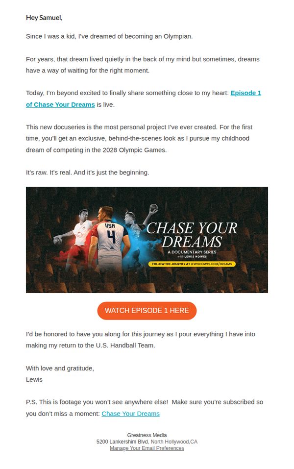
4. Lewis Howes: It’s Official! Episode 1 is Here 🎯
Objective
This email aims to emotionally engage subscribers by announcing the launch of Lewis Howes’ personal documentary series, 'Chase Your Dreams,' while inviting them to watch Episode 1 and stay subscribed for exclusive behind-the-scenes access to his Olympic handball journey.
Why this works
The email opens with a vulnerable, personal story about childhood dreams, instantly creating emotional resonance and positioning the documentary not as content, but as a shared journey the reader is invited to witness.
How to implement
By emphasizing exclusivity and raw authenticity, 'footage you won’t see anywhere else' and 'It’s raw. It’s real.', the campaign leverages FOMO and intimacy to drive immediate clicks without relying on discounts or hype.
Pro Tip
Add a short testimonial or social proof snippet from early viewers beneath the CTA to reduce friction, for example, 'Over 12,000 viewers watched Episode 1 in the first 24 hours, join them now.' • Include a subtle countdown timer or 'New episodes drop every Thursday' reminder near the CTA to encourage immediate viewing and set expectations for ongoing engagement.
5. Jay Shetty: Productivity begins with rest
Objective
This email aims to reframe productivity as rooted in intentional rest, offering practical mindfulness techniques while subtly promoting Paleovalley Organic Coffee as a ritual-aligned morning companion that supports calm focus without overstimulation.
Why this works
The email brilliantly reframes rest not as laziness but as a non-negotiable foundation for true productivity, using Jay Shetty’s voice to make mindfulness feel accessible and essential rather than indulgent or optional.
How to implement
By embedding the product offer within a narrative about morning rituals and mental clarity, the campaign avoids hard selling and instead positions Paleovalley Coffee as a natural extension of the reader’s self-care journey, making the CTA feel like a personal upgrade.
Pro Tip
Add a small visual indicator or icon next to each of the three mindfulness techniques (box breathing, 5-4-3-2-1, tech-free zone) to make them more scannable and memorable for readers skimming the email. • Include a subtle countdown timer or urgency cue near the 15% discount offer to encourage immediate action, since the current CTA lacks temporal motivation despite the limited-time framing.
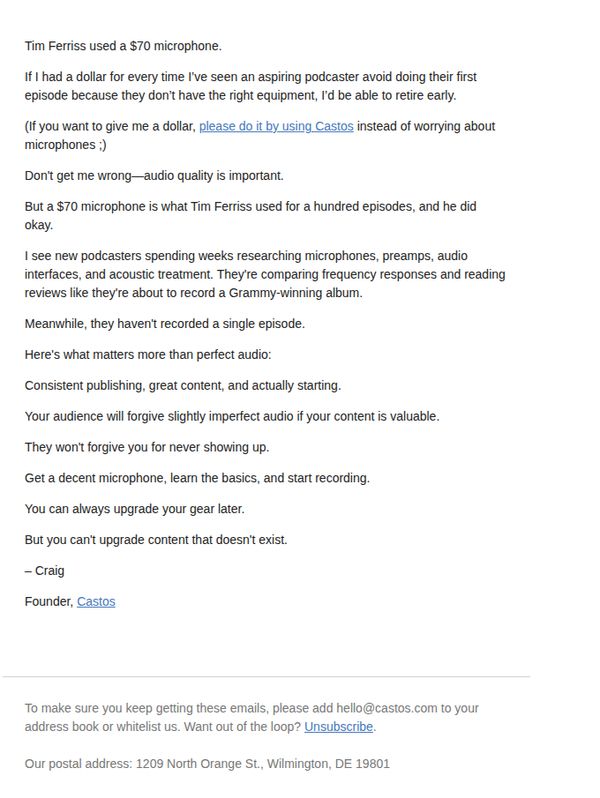
6. Castos: Tim Ferriss used a $70 microphone
Objective
To encourage aspiring podcasters to stop overthinking equipment and start recording by emphasizing that content and consistency matter more than perfect audio gear, while subtly promoting Castos as the platform to begin their podcasting journey.
Why this works
The email brilliantly reframes the fear of imperfect gear by anchoring it to Tim Ferriss’s real-world example, making the message feel credible, relatable, and instantly actionable for hesitant creators.
How to implement
Instead of pushing high-end equipment, the copy focuses on the psychological barrier of starting, positioning Castos as the enabler of momentum rather than just a tech tool, which builds emotional trust.
Pro Tip
Add a visual of Tim Ferriss’s $70 mic or a simple illustration of a beginner podcaster with basic gear to reinforce the message visually and reduce cognitive load for skimmers. • Include a secondary CTA button or link like ‘Start Your First Episode Today’ to guide users directly to a signup or onboarding flow, rather than relying solely on a hyperlinked phrase.
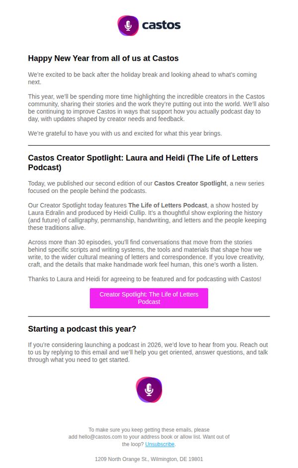
7. Castos: Creator Spotlight #2
Objective
This email aims to re-engage subscribers after the holiday break by spotlighting a standout creator in the Castos community, while also inviting new podcasters to start their journey with Castos in 2026 through personalized onboarding support.
Why this works
The email opens with a warm, human tone that acknowledges the holiday break and frames the new year as a fresh opportunity, making subscribers feel valued and part of a shared journey rather than just recipients of marketing content.
How to implement
By spotlighting a specific creator with a compelling story and niche focus, calligraphy, penmanship, and handmade letters, the campaign builds emotional resonance and positions Castos as a platform that elevates meaningful, artisanal voices, not just generic podcasters.
Pro Tip
Add a secondary CTA below the creator spotlight that links to a 'Start Your Podcast' guide or onboarding checklist, this would capture interest from readers who aren’t ready to reply but want to explore next steps independently. • Include a short testimonial or quote from Laura or Heidi about their experience using Castos, this would strengthen social proof and subtly reinforce platform value without interrupting the storytelling flow.
8. Jay Shetty: Is Loneliness Really a Health Concern?

Objective
This email aims to educate readers on the health impacts of loneliness while encouraging meaningful social connection through actionable, everyday behaviors. It also seeks to deepen audience engagement by inviting feedback and modeling compassionate interaction.
Why this works
The email masterfully reframes loneliness not as a personal failure but as a societal health issue, using research-backed language to validate reader emotions while offering practical, non-intimidating steps toward connection that feel immediately doable in daily life.
How to implement
By embedding a personal photo and gratitude message, the campaign humanizes the brand voice, transforming a newsletter into a two-way conversation that invites reader input, making subscribers feel seen, heard, and co-creators of the content rather than passive recipients.
Pro Tip
Add a visual hierarchy to the 'Try This' section by using icons or bold headers for each behavior (Respect, Openness, etc.) to increase scannability and reinforce the actionable nature of the advice without increasing text density. • Include a micro-CTA after the 'Thankful For You' section, such as 'Reply with your answer to Q1', to nudge immediate engagement before the reader scrolls further, capitalizing on emotional momentum from the gratitude moment.
9. Lewis Howes: 💛 You’re here for a reason
Objective
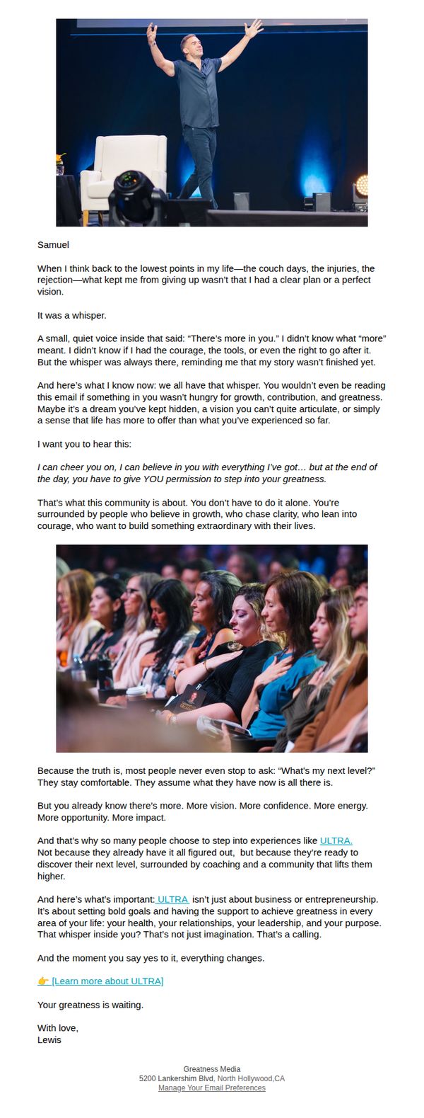
This email aims to inspire recipients by validating their inner drive for growth and positioning ULTRA as the transformative experience that helps them answer their personal 'next level' calling. It seeks to convert emotional resonance into action by inviting them to learn more about the program.
Why this works
The email masterfully reframes personal struggle as a sign of untapped potential, using the metaphor of an inner 'whisper' to create emotional intimacy and position the recipient as someone destined for more, a narrative that builds trust before pitching.
How to implement
By anchoring ULTRA not as a business program but as a holistic journey for health, relationships, leadership, and purpose, the email speaks to the full human experience, making the offer feel essential rather than optional and widening its appeal beyond entrepreneurs.
Pro Tip
Add a visual countdown timer or urgency indicator near the CTA to create psychological momentum, since the current email relies entirely on emotional appeal without any time-sensitive trigger to prompt immediate action. • Include a short, authentic testimonial quote with a photo and name directly under the CTA to reinforce social proof at the point of decision, which would help bridge the emotional connection to a tangible outcome before the reader scrolls away.
10. Podcastle: Podcastle to become Async: Reminder

Objective
This email aims to gently inform existing users that Podcastle is rebranding to Async, reassuring them that no functional changes are coming and encouraging them to stay engaged by reading the full story behind the change. It also subtly promotes the platform’s value as an all-in-one AI-powered creation tool.
Why this works
The email opens with a warm, reassuring tone that immediately addresses user anxiety around rebranding by emphasizing continuity, no account, project, or team changes, which builds trust before delivering the news.
How to implement
By positioning the rebrand as an 'evolution' rather than a disruption, the message frames change as progress, subtly reinforcing brand maturity and long-term vision without alienating current users.
Pro Tip
Add a visual element or icon next to the 'Start for free' CTA to increase visual prominence and draw attention, currently, the button blends into the minimal layout and may be overlooked. • Include a short testimonial or user stat (e.g., 'Used by 50,000+ creators') near the CTA to build social proof and reinforce credibility, especially since the rebrand may trigger user skepticism.