Software Brand History email designs from top brands
1. Samsung VXT: Tune in today for Galaxy Unpacked
Objective
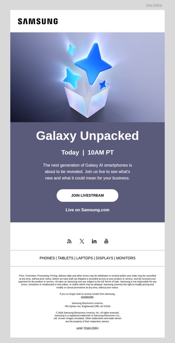
This email aims to drive immediate attendance to Samsung’s Galaxy Unpacked livestream by creating urgency around the reveal of next-generation Galaxy AI smartphones, while positioning the event as strategically valuable for business users.
Why this works
The email leverages time-sensitive urgency by anchoring the event to a specific date and time, making the CTA feel like a must-attend moment rather than just another product announcement, which boosts conversion potential.
How to implement
It smartly frames the product reveal around business value, not just specs, by asking what the new Galaxy AI smartphones could mean for your business, subtly aligning innovation with ROI for professional audiences.
Pro Tip
Add a brief teaser bullet list or icon grid under the headline highlighting 1–2 key business-relevant features (e.g., 'AI-powered productivity tools' or 'enterprise-grade security') to strengthen the value proposition before the CTA. • Include a countdown timer or 'X hours left to join' indicator near the CTA to amplify urgency and encourage immediate action, especially since the event is happening 'today' and timing is critical.
2. Atticus: Just so you know
Objective
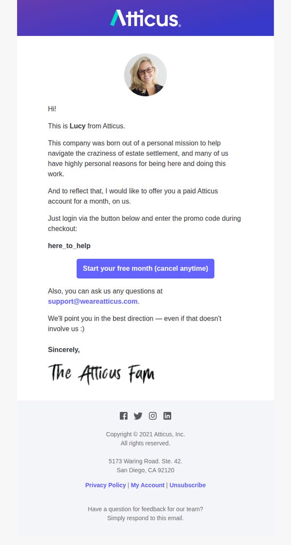
The email aims to build emotional connection and trust by sharing a personal story from a team member, then converting that goodwill into a trial by offering a free month of service with no commitment. It positions the brand as mission-driven and customer-centric.
Why this works
By opening with a personal note from Lucy, Atticus transforms a promotional email into a human conversation, making the offer feel like a genuine gesture rather than a sales pitch, which builds trust before asking for action.
How to implement
The phrase 'on us' paired with the mission-driven backstory frames the free trial not as a marketing tactic but as a values-based gift, aligning the brand’s purpose with the customer’s emotional need for support during a stressful life event.
Pro Tip
Add a subtle visual cue or icon next to the promo code 'here_to_help' to make it more scannable and reduce friction for users who may overlook plain text in the body copy. • Include a brief bullet list or one-line benefit summary under the CTA button, such as 'Access legal docs, timeline tools, and expert guidance', to reinforce value and reduce hesitation before clicking.
3. Mozilla: Our choices today will change the future of technology
Objective
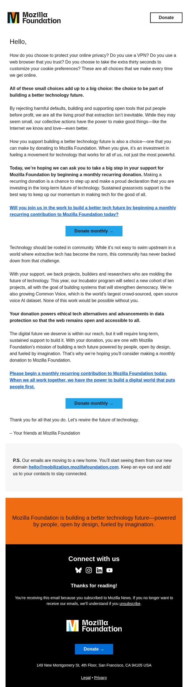
This email aims to inspire readers to make a monthly recurring donation to Mozilla Foundation by framing their support as a meaningful, collective choice that shapes a more ethical, people-first technology future. It positions individual action as part of a larger movement for digital democracy.
Why this works
The email masterfully reframes donation not as charity but as a proactive, values-driven choice, tying everyday tech habits like browser selection and cookie settings to a larger mission of building ethical technology, which deepens emotional resonance and personal accountability.
How to implement
By emphasizing collective momentum and long-term impact, the message transforms a single transaction into a sustained movement, appealing to readers’ desire to be part of something bigger while reinforcing that sustained grassroots support is what truly fuels systemic change in tech.
Pro Tip
Add a subtle countdown timer or progress bar near the CTA to create urgency and social proof, such as 'Join 12,400 supporters who’ve already committed this week,' which would amplify the sense of momentum and encourage immediate action. • Include a short, visually distinct testimonial or quote from a past donor or project builder within the body to humanize the impact, e.g., 'As a developer, my monthly gift helps keep Common Voice open and growing,' which would strengthen emotional connection and credibility.
4. Shutterstock: Celebrate Lunar New Year with vibrant visuals 🧧
Objective
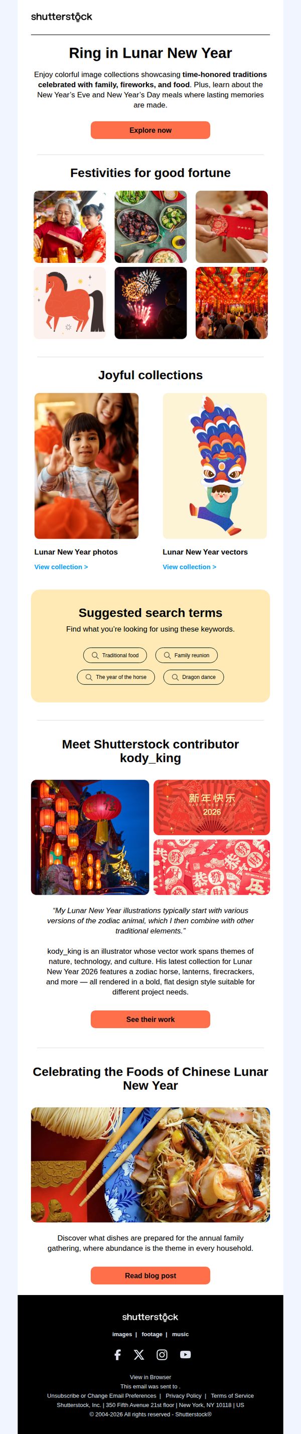
This email aims to drive engagement and exploration of Shutterstock’s Lunar New Year-themed visual content by highlighting culturally rich imagery, contributor stories, and festive search terms, encouraging users to discover and license assets for their own creative projects during the holiday season.
Why this works
The email brilliantly ties cultural storytelling to visual discovery by framing Lunar New Year traditions through imagery, making users feel emotionally connected before they even click, a powerful way to turn seasonal interest into content exploration.
How to implement
Including a featured contributor with a personal quote and portfolio link adds authenticity and humanizes the platform, subtly encouraging users to trust and explore curated talent rather than just browsing generic stock assets.
Pro Tip
Add a subtle countdown timer or urgency cue near the ‘Explore now’ CTA to leverage FOMO, especially since Lunar New Year is time-sensitive, this could nudge users to act before the holiday passes. • Include a small ‘Top 3 Most Downloaded Lunar New Year Assets’ section with thumbnails and download stats to socially proof popular content and guide users toward high-performing visuals.
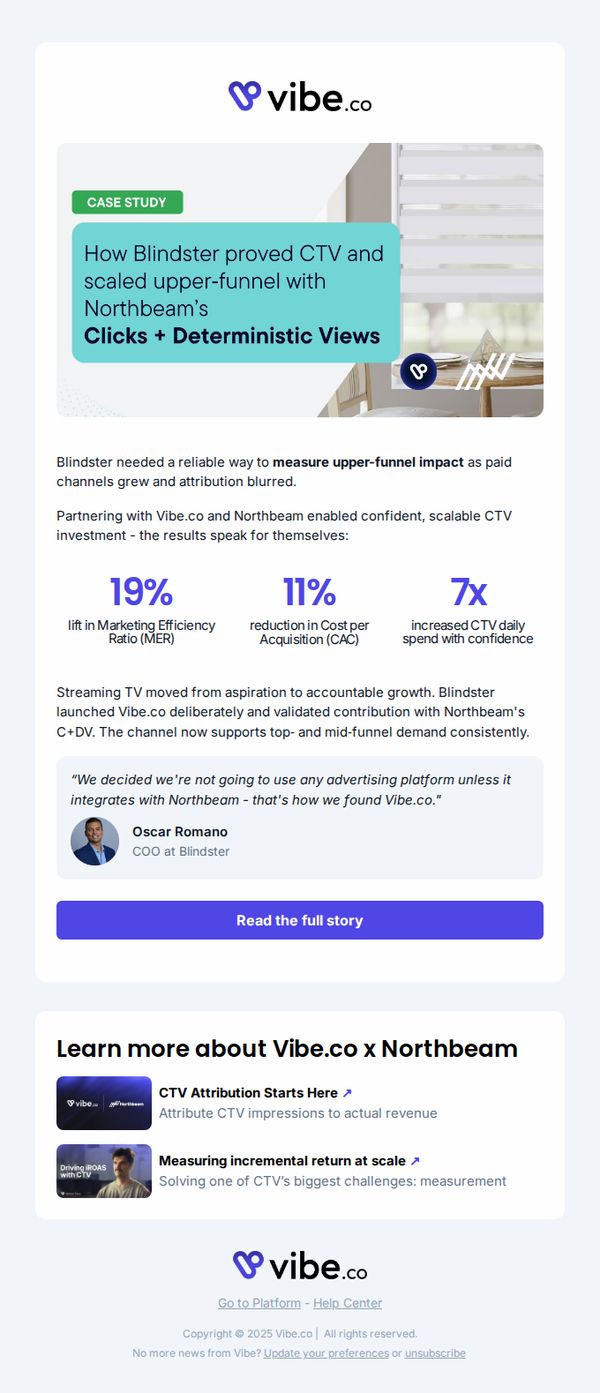
5. Vibe.co : How Blindster scaled upper-funnel growth with TV
Objective
This email aims to showcase Vibe.co’s impact on Blindster’s upper-funnel growth through CTV advertising, using a case study to build credibility and drive interest in their attribution platform by highlighting measurable ROI and strategic partnerships.
Why this works
The email opens with a bold, results-driven headline that immediately signals value by naming the client, the channel (CTV), and the outcome (upper-funnel growth), which grabs attention from marketers focused on measurable TV ROI.
How to implement
Including specific, quantified metrics like 19% lift in MER and 7x increased CTV spend creates instant credibility and helps prospects visualize the tangible impact Vibe.co can deliver, making the case study feel less like marketing and more like proof.
Pro Tip
Add a secondary CTA above the fold, such as 'Book a Demo' or 'See How It Works', to capture high-intent readers who may not want to read the full case study but are ready to engage further. • Include a brief visual timeline or icon-based flow showing how Blindster moved from problem → solution → result, to help skimmers grasp the narrative faster and reinforce the cause-effect relationship of Vibe.co’s impact.
6. EstateExec: Your EstateExec Account

Objective
This email aims to warmly welcome new users to EstateExec and reinforce trust by personally thanking them for signing up, while also inviting them to reach out with questions to foster early engagement and support.
Why this works
The email opens with a sincere, human-toned thank-you that immediately validates the user’s decision to sign up, making them feel seen and supported rather than just another account number in the system.
How to implement
By having the founder personally sign off, the message conveys authenticity and accountability, subtly signaling that even leadership is invested in the user’s success and willing to be directly accessible for help.
Pro Tip
Add a clear, visually distinct primary CTA button (e.g., 'Start Your First Task' or 'Watch a 2-Minute Tour') to guide new users toward immediate value, rather than relying solely on passive text-based outreach. • Include a brief 'What’s Next' section with 2–3 bullet points outlining first steps or key features, helping users overcome onboarding friction by reducing uncertainty about how to begin using the platform.
7. EstateExec: Your EstateExec Account

Objective
This email aims to warmly welcome new users to EstateExec and reinforce trust by personally thanking them for signing up, while also inviting them to reach out with questions to foster early engagement and support.
Why this works
The personal sign-off from the founder creates immediate emotional resonance and positions the brand as human-centered, which is especially powerful in sensitive domains like estate execution where trust is paramount.
How to implement
By explicitly wishing the user success in simplifying their executor process, the message aligns with the user’s emotional and practical goals, making the brand feel like a supportive partner rather than just a tool.
Pro Tip
Add a visual element like the EstateExec logo or a simple divider line to break up the text-heavy layout and reinforce brand identity, which is currently missing and reduces perceived professionalism. • Include a secondary CTA such as 'Watch a 2-minute tour' or 'Start your first task' to guide users toward immediate action, since the current email relies solely on passive outreach and misses an onboarding momentum opportunity.
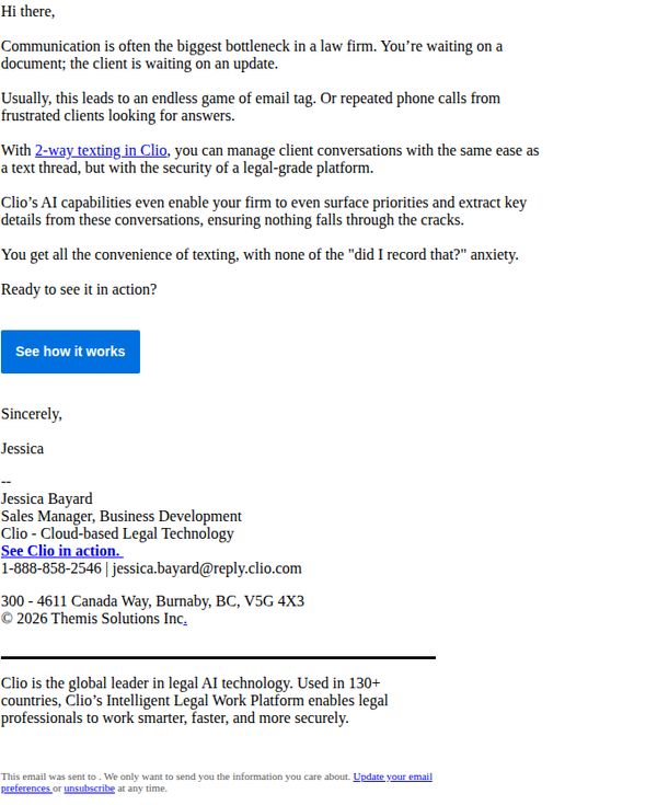
8. Clio : Say goodbye to never-ending email threads
Objective
This email aims to position Clio’s 2-way texting feature as a solution to inefficient client communication in law firms, reducing reliance on email threads and phone calls while emphasizing security and AI-powered efficiency.
Why this works
The email immediately taps into a universal pain point for legal professionals, the chaos of endless email threads, and positions the product as the intuitive, secure solution that mirrors familiar texting behavior without compromising compliance.
How to implement
By highlighting AI capabilities that extract key details and surface priorities, the message elevates the feature beyond mere convenience into a productivity and risk-mitigation tool, making it compelling for decision-makers focused on operational efficiency.
Pro Tip
Add a short testimonial or client quote near the CTA to reinforce trust, for example, a law firm partner saying how 2-way texting cut their client response time by 50%, making the benefit more tangible and socially validated. • Include a visual element, even a simple screenshot or icon, to demonstrate what ‘2-way texting in Clio’ looks like in practice, since the current text-only format misses an opportunity to show, not just tell, the user experience.
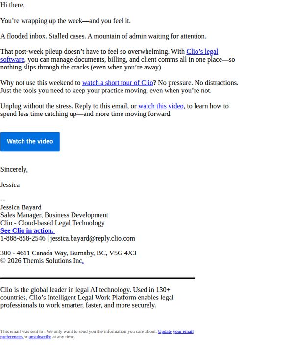
9. Clio : Try Clio free—before the next sprint of work hits
Objective
The email aims to convert overwhelmed legal professionals into trial users of Clio’s legal software by positioning it as the solution to end-of-week chaos, encouraging them to watch a short video tour before the next workload surge hits.
Why this works
The email taps into the visceral stress of legal professionals at week’s end, flooded inboxes, stalled cases, and admin backlogs, making the software feel like an urgent, empathetic solution rather than just another tool.
How to implement
By framing the video tour as a stress-free weekend activity with no pressure or distractions, the email lowers the barrier to engagement and positions the product as a restorative, not another demand on their time.
Pro Tip
Add a brief testimonial or client stat near the CTA to reinforce social proof, e.g., '92% of lawyers who watched this video started their free trial within 24 hours', to reduce hesitation and boost conversion. • Include a subtle visual hierarchy cue like a small icon or arrow pointing to the 'Watch the video' button, since the current layout relies entirely on text and may not draw the eye as effectively on mobile or cluttered inboxes.
10. Piknik: Brrr-ing on the fun! ❄️

Objective
This email aims to engage families during winter by showcasing themed, screen-based play activities across Piknik’s bundled apps, encouraging immediate trial with a $0.00 offer while subtly promoting seasonal content and printable extensions to boost retention and perceived value.
Why this works
The email brilliantly ties seasonal emotions, cabin fever and winter fun, to specific in-app experiences, making the offer feel timely and emotionally resonant rather than just promotional, which increases the likelihood of immediate engagement.
How to implement
Each product section uses vivid, character-driven visuals paired with playful, action-oriented headlines that mirror kids’ language and imagination, creating an irresistible invitation to play that speaks directly to both children and their parents.
Pro Tip
Add a visual countdown timer near the $0.00 CTA to create urgency around the trial offer, leveraging FOMO without changing the price, this would nudge hesitant parents to act before the ‘winter fun’ window closes. • Include a short testimonial or star rating from a parent or child near each app section to build social proof and reduce perceived risk, especially since the offer is free, social validation can significantly boost conversion from curiosity to action.