Digital Services email designs from top Applications brands
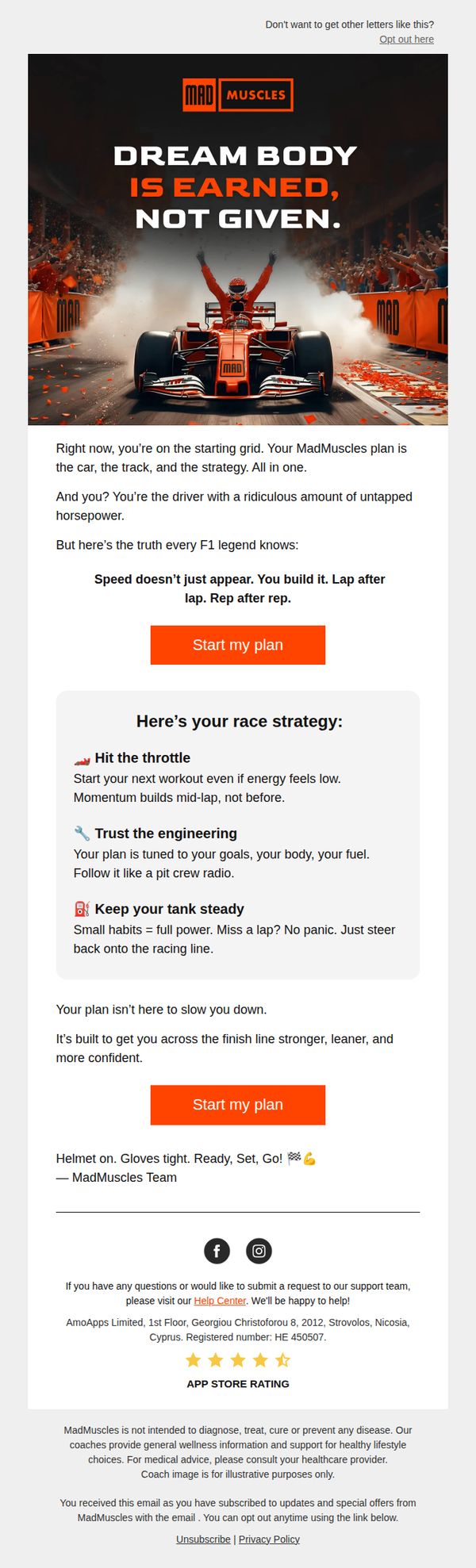


1. MadMuscles : Ready to hit race pace? 🏎️
Objective
This email aims to motivate subscribers to commit to their fitness journey by framing their MadMuscles plan as a high-performance racing strategy, encouraging immediate sign-up through urgency and empowerment. It positions the user as the driver of their transformation, leveraging motorsport imagery to reinforce discipline and progress.
Why this works
The email brilliantly reframes fitness as a race strategy, giving users a visceral sense of control and momentum, positioning them as the driver, not the passenger, in their own transformation story.
How to implement
By using F1 metaphors like 'pit crew radio' and 'tank steady,' the campaign makes abstract fitness concepts tangible and emotionally resonant, turning daily habits into mission-critical race tactics that feel heroic and urgent.
Pro Tip
Add a subtle countdown timer or progress bar near the second CTA to amplify urgency, especially since the racing theme implies time-sensitive performance, this would visually reinforce the 'lap after lap' messaging. • Include a short testimonial or user result snippet (e.g., 'John gained 8lbs muscle in 8 weeks using this plan') right after the strategy section to validate the 'engineering' claim and reduce perceived risk before the final CTA.
2. UniMeal: Spring is almost here 🌱
Objective
This email aims to drive immediate sign-ups for UniMeal’s personalized weight loss plans by leveraging the emotional momentum of spring as a fresh start, while offering a compelling 90% discount to reduce friction and encourage conversion.
Why this works
The email brilliantly ties seasonal renewal to personal transformation, using spring’s emotional resonance to make the offer feel timely, emotionally aligned, and psychologically irresistible rather than just transactional.
How to implement
By emphasizing a 'personalized plan' and 'clear path,' the email reduces perceived complexity and anxiety around weight loss, positioning UniMeal as a supportive guide rather than just another diet service, which builds trust and lowers barriers to action.
Pro Tip
Add a subtle countdown timer near the CTA to create urgency around the 90% discount, since the current design lacks time-sensitive cues that could push hesitant readers to act immediately. • Include a short customer testimonial or success metric (e.g., '92% of users feel more confident after 4 weeks') beneath the 'What you’ll get' section to strengthen social proof and reinforce the value of the personalized plan.
3. UniMeal: Make your dream come true day 💪
Objective
This email aims to convert subscribers into paying customers by offering a time-sensitive 90% discount on the first month of UniMeal’s personalized weight loss plan, positioning the service as the solution to overcoming early dieting frustration and inaction.
Why this works
The email brilliantly reframes weight loss as a dream worth pursuing, not a chore, by using emotionally resonant language like 'Make your dream come true day' to tap into aspirational motivation rather than guilt or shame.
How to implement
It preempts common drop-off points by acknowledging that most people quit in the first week, then immediately positions UniMeal as the antidote, offering structure, simplicity, and no guesswork to build instant trust and reduce perceived friction.
Pro Tip
Add a subtle countdown timer near the CTA to visually reinforce urgency, since the 90% discount is a limited-time offer, a timer would create psychological pressure without altering the message or layout. • Include a short testimonial or user result (e.g., 'Lost 12 lbs in 4 weeks, no dieting, just UniMeal') beneath the bullet points to add social proof and make the abstract 'results' claim more tangible and trustworthy.
4. UniMeal: Skip this to lose -4 kg
Objective
The email aims to motivate subscribers to adopt a personalized nutrition plan by highlighting common dietary pitfalls and offering smarter food swaps that support sustainable weight loss without extreme restriction. It positions UniMeal as a practical, science-backed solution for achieving realistic goals.
Why this works
Instead of shaming users for slipping up, this email reframes failure as a result of hidden dietary traps, not personal weakness, making the reader feel understood and more open to adopting a smarter, personalized plan.
How to implement
By visually pairing 'problem foods' with 'solution foods' in side-by-side comparisons, the email creates an instant mental shortcut that helps readers instantly recognize better choices without feeling overwhelmed by complex nutrition rules.
Pro Tip
Add a brief testimonial or user stat near the second CTA (e.g., '87% of users who swapped these foods lost 4kg in 6 weeks') to reinforce social proof and urgency right before the conversion point. • Include a small visual indicator, such as a progress bar or calendar icon, next to the CTA to subtly suggest time-sensitive results, helping bridge the gap between awareness and immediate action.
5. UniMeal: These habits can fuel inflammation
Objective
This email aims to educate subscribers on how everyday habits contribute to low-grade inflammation and gently guide them toward taking a personalized quiz to discover how an anti-inflammatory meal plan could improve their daily well-being without rigid rules.
Why this works
The email opens with a relatable, non-alarmist truth about hidden inflammation triggers, like rushed meals and stress, making the reader feel seen rather than scolded, which builds trust before introducing the solution.
How to implement
By framing the anti-inflammatory diet as a 'practical, everyday reset' instead of a restrictive trend, the message lowers psychological barriers and positions the brand as a compassionate, realistic partner in wellness.
Pro Tip
Add a subtle countdown timer or urgency cue near the CTA (e.g., 'Join 12,400+ who got their plan this week') to nudge procrastinators without compromising the calm, educational tone. • Include a micro-testimonial or user result snippet (e.g., 'Sarah reduced her afternoon crashes in 3 days') right after the self-check to reinforce social proof and bridge the gap between self-assessment and action.
6. UniMeal: Your Valentine’s special 💝

Objective
This email aims to convert subscribers into paying customers by framing a 90% discount as a self-love Valentine’s Day gift, encouraging them to take a quiz to unlock a personalized weight loss plan and commit to their health journey.
Why this works
By repositioning a weight loss plan as a Valentine’s Day gift to oneself, the email emotionally reframes health goals as acts of self-love, making the offer feel indulgent rather than restrictive and increasing emotional resonance with the audience.
How to implement
The repeated use of the quiz mechanic as a gateway to the discount creates a sense of earned reward, transforming a promotional offer into an interactive experience that boosts engagement and makes the user feel personally invested in the outcome.
Pro Tip
Add a subtle countdown timer near the CTA to create urgency around the Valentine’s Day offer, since the current design lacks temporal pressure and may lead users to delay taking action. • Include a short testimonial or user result snippet (e.g., 'Sarah lost 12 lbs in 4 weeks') in the education section to build social proof and reinforce the credibility of the personalized plan before the user commits to the quiz.
7. UniMeal: Your easiest way to start fasting ⏳

Objective
This email aims to guide new users toward adopting intermittent fasting by personalizing the experience through a quick quiz, positioning UniMeal as a supportive, science-backed companion for sustainable health changes.
Why this works
The email brilliantly reframes fasting not as a rigid diet but as a customizable menu, reducing intimidation and inviting users to explore options that align with their lifestyle rather than forcing conformity.
How to implement
By visually categorizing popular fasting methods with icons, names, and brief use cases, the email transforms abstract concepts into digestible, relatable choices that empower users to self-select based on personal goals and routines.
Pro Tip
Add a subtle countdown timer or urgency cue near the second CTA to nudge procrastinators, for example, '92% of users complete the quiz in under 60 seconds', to reduce drop-off before the final click. • Include a short testimonial or user quote near the quiz CTA, such as 'I found my perfect fast in 90 seconds, now I’m down 12 lbs and feel energized!' to build social proof and emotional resonance.
8. Move With Us : What will you choose? 👀 20% Off

Objective
This email aims to drive immediate sign-ups for Move With Us by offering a limited-time 20% discount on memberships and programs, encouraging recipients to choose a plan that fits their fitness goals and commitment level.
Why this works
The email brilliantly simplifies decision-making by presenting three clear, benefit-driven paths, Program, Monthly, or Annual, each framed as a personal choice, which reduces friction and empowers the reader to act confidently.
How to implement
By anchoring the offer to a time-sensitive countdown and auto-applied discount, the campaign creates urgency without overwhelming the user, making the value proposition feel both exclusive and effortless to claim.
Pro Tip
Add a small countdown timer beneath the '20% off ends in 5 days' line to visually reinforce urgency and prevent users from mentally deferring the decision. • Reposition the 'MAKE A CHOICE' CTA button higher in the email, ideally directly under the hero section, to reduce scroll friction and align with the user’s immediate intent to act.
9. UniMeal: Still struggling with weight?

Objective
This email aims to convert readers struggling with weight into engaged users by positioning fasting as a smart, personalized solution and driving them to take a quick quiz that generates a tailored fasting plan. It seeks to reduce perceived effort and build trust through contrast and social proof.
Why this works
The email brilliantly contrasts personalized fasting with random fasting using side-by-side visuals and emotional icons, making the value proposition instantly relatable and emotionally compelling for anyone who’s ever felt overwhelmed by dieting.
How to implement
By framing the quiz as a '1-minute' solution that turns effort into results, the campaign lowers the psychological barrier to entry and positions the brand as a supportive, time-sensitive partner rather than just another diet app.
Pro Tip
Add a subtle countdown timer or progress bar near the CTA to create urgency and reduce friction, since the quiz is framed as '1-minute,' visually reinforcing that brevity can increase completion rates. • Include a short testimonial or user result snippet (e.g., 'Sarah lost 12 lbs in 8 weeks using her plan') near the CTA to strengthen social proof and reduce skepticism about personalized outcomes.
10. Asana Rebel - EN: Start 2026 with 6 months off

Objective
The email aims to convert subscribers into long-term users by offering a limited-time promotion, six months free with a 12-month subscription, to motivate immediate action aligned with New Year fitness resolutions.
Why this works
The campaign brilliantly ties the promotional offer to the emotional momentum of New Year’s resolutions, framing the discount not just as savings but as a personal transformation tool for health and fitness goals in 2026.
How to implement
By embedding workout illustrations directly into the word 'SALE,' the design visually reinforces brand identity while making the promotion feel active and experiential rather than transactional, which increases perceived value and engagement.
Pro Tip
Add a countdown timer near the CTA to amplify urgency, since the New Year context implies time sensitivity but currently lacks visual reinforcement to drive faster conversions. • Include a short testimonial or social proof snippet beneath the offer description to reduce perceived risk, especially effective for new users hesitant about committing to a 12-month plan.