How Healthcare Services Brands Do Digital Services Emails




1. Sleep Doctor: Lab Sleep Study or Home Sleep Study
Objective
The email aims to educate potential customers about the benefits of home sleep studies versus in-lab studies and to drive conversions by positioning the home option as convenient, accurate, and affordable. It encourages immediate action through a clear, low-cost offer with added value.
Why this works
The email brilliantly reframes a medical decision as a lifestyle upgrade by emphasizing comfort, convenience, and cost, making the home sleep study feel less clinical and more like a personal wellness investment.
How to implement
By directly comparing home vs. in-lab studies in a clean, visual table, the email reduces decision fatigue and positions the home option as the obvious choice for time-pressed, cost-conscious consumers seeking reliable results.
Pro Tip
Add a countdown timer or limited-time badge near the $189 CTA to create urgency, since the offer ends January 31, 2026, this would leverage scarcity psychology to boost conversions without changing the core message. • Include a short testimonial or patient quote beneath the comparison table to humanize the data and reinforce trust, especially since diagnostic accuracy and comfort are emotional decision drivers for sleep health.
2. PrivateDoc: Pick up where you left off - your personalised plan awaits
Objective
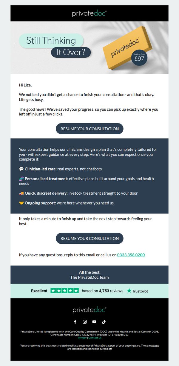
This email aims to re-engage a user who started but didn’t complete their consultation, reassuring them that their progress is saved and encouraging them to resume with minimal friction. It positions the service as personalized, expert-led, and convenient to rebuild momentum toward conversion.
Why this works
The email brilliantly reduces friction by acknowledging the user’s incomplete action without judgment, then immediately offering a seamless return path, turning abandonment into an invitation rather than a failure.
How to implement
By clearly articulating four tangible benefits of completing the consultation, clinician-led care, personalization, discreet delivery, and ongoing support, the email transforms a simple reminder into a compelling value proposition that addresses emotional and practical concerns.
Pro Tip
Add a subtle visual indicator (like a progress bar or icon) near the CTA to show how much of the consultation remains, reducing perceived effort and making the next step feel even more achievable. • Include a short testimonial snippet or trust badge directly beneath the second CTA to reinforce social proof at the moment of decision, leveraging existing Trustpilot data already present in the footer for higher impact.
3. OVME : What Your Skin Needs Right Now 👉
Objective
This email aims to guide subscribers toward personalized skincare solutions by diagnosing common skin concerns and pairing them with targeted treatments and products, ultimately driving bookings and product purchases through a consultative, educational approach.
Why this works
The email brilliantly uses skin concern categories as entry points, making the content instantly relatable and helping readers self-identify before being guided to tailored solutions that feel personally curated rather than generic.
How to implement
By pairing each skin issue with both a clinical treatment and a complementary at-home product, the campaign creates a seamless bridge between professional services and retail, encouraging dual conversions without overwhelming the customer.
Pro Tip
Add a subtle countdown timer near the top banner to reinforce urgency around the 'this month only' 30% off filler offer, leveraging scarcity psychology to nudge immediate action without disrupting the educational tone. • Integrate brief patient testimonials or results stats (e.g., '92% saw improved hydration after 1 HydraFacial') within each concern section to build social proof and strengthen perceived efficacy of recommended treatments.
4. OVME : The Power Duo
Objective
This email aims to drive bookings for OVME’s combined VI Peel and Tox injection treatment by highlighting their synergistic anti-aging benefits, while also promoting January discounts and VIP membership to increase conversion and customer retention.
Why this works
The email brilliantly frames two separate treatments as a unified 'Power Duo' strategy, transforming a simple combo into a premium, results-driven experience that feels intentional and scientifically backed rather than just discounted.
How to implement
By visually pairing clinical imagery with soft, glowing skin results, the campaign creates emotional resonance while maintaining medical credibility, a rare balance that reassures skeptical consumers while appealing to aesthetic desires.
Pro Tip
Add a subtle countdown timer under the January Offers section to create urgency around the limited-time discounts, especially since the offer expires 1/31/26, this would nudge hesitant users to act before the window closes. • Include a short patient testimonial or before/after visual in the 'What you’ll notice' section to reinforce credibility, right now it’s all benefit claims without social proof, which could reduce perceived trust for new customers.
5. OVME : Glowing Skin Is Built 💫
Objective
This email aims to encourage recipients to book skincare services or join a membership by emphasizing the value of consistency in achieving glowing, healthy skin over time. It positions OVME as a partner in long-term skin health rather than a one-time solution.
Why this works
The email brilliantly reframes skincare from a quick fix to a long-term ritual, using the phrase 'Consistency looks good on you' to emotionally align the brand with personal discipline and self-care, making the service feel aspirational and sustainable.
How to implement
By breaking down the science of consistency into three digestible benefits, maintaining results, supporting long-term quality, and making progress predictable, the email builds trust through education, turning a sales pitch into a consultative conversation that feels personalized and credible.
Pro Tip
Add a subtle countdown timer or limited-availability indicator near the 'Book to Glow' CTA in the hero section to create urgency, since the current design lacks any time-sensitive incentive that could nudge hesitant readers to act immediately. • Include a short testimonial or client result snippet under the 'Why it works' section to reinforce credibility, right now, the claims are purely educational, and adding social proof would strengthen emotional persuasion and reduce perceived risk for first-time bookers.
6. Resmed - US: Show your heart some love this February
Objective
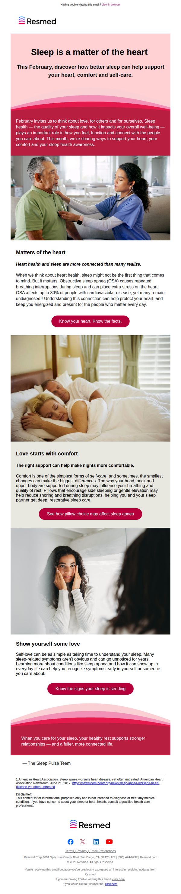
This email campaign aims to raise awareness about the connection between sleep health and heart health during February, encouraging recipients to prioritize self-care and recognize early signs of sleep-related conditions like obstructive sleep apnea. It positions ResMed as a trusted resource for improving well-being through better sleep.
Why this works
By tying heart health awareness to February’s cultural theme of love, this campaign emotionally resonates while educating readers on how sleep quality directly impacts cardiovascular wellness, making a clinical topic feel personal and urgent.
How to implement
The email strategically uses relatable visuals, a caregiver checking a patient’s heart, couples sleeping peacefully, and a woman reflecting in the mirror, to humanize medical information and subtly position comfort and self-awareness as acts of love and care.
Pro Tip
Add a brief testimonial or quote from a real user or cardiologist in the 'Matters of the Heart' section to reinforce credibility and emotional resonance, helping readers relate the statistics to real-life outcomes. • Include a subtle visual cue, such as a small icon or badge, next to the CTA buttons indicating they link to educational resources (e.g., 'Learn More') to reduce hesitation and increase click-through confidence.
7. OVME : A Little Extra Glow 💫

Objective
This email aims to upsell existing Hydrafacial customers by introducing the Lip + Eye Perk add-on, positioning it as a premium enhancement for instant glow and targeted hydration. It also leverages limited-time February Filler savings to drive immediate bookings from both members and non-members.
Why this works
The email brilliantly frames the Lip + Eye Perk not as an afterthought but as a strategic upgrade that elevates the core Hydrafacial experience, making customers feel they’re unlocking a more luxurious, results-driven treatment rather than just adding a service.
How to implement
By visually anchoring each benefit with close-up imagery of glowing skin and serene expressions, the campaign creates emotional resonance while subtly reinforcing the ‘instant glow’ promise through real-looking results, not just claims.
Pro Tip
Add a subtle countdown timer or 'limited spots available' indicator near the final CTA to amplify urgency, especially since the February Filler savings are date-restricted, this would nudge hesitant users toward immediate action. • Include a short video snippet or animated GIF in the 'Why we love it' section showing the device in action on lips/eyes, visual proof of movement and texture enhances credibility and reduces perceived risk for first-time users.
8. OVME : A Head Start on Summer ☀️

Objective
This email aims to motivate recipients to begin their summer skincare prep early by highlighting the benefits of timely treatments like peels and lasers, while promoting memberships for consistent results. It positions OVME as the essential partner for achieving glowing skin before peak sun season.
Why this works
The email brilliantly frames summer skincare as a proactive journey rather than a reactive fix, using seasonal urgency to position treatments as smart, timely investments that pay off when it matters most, a psychological nudge that aligns with consumer desire for control and preparedness.
How to implement
Each treatment section is distilled into a memorable, benefit-driven headline like 'Smooth It Out' or 'Clear the Slate,' making complex procedures feel approachable and outcome-focused, which reduces decision fatigue and increases conversion likelihood by simplifying the customer’s mental path to action.
Pro Tip
Add a subtle countdown timer or seasonal milestone (e.g., 'Only 4 weeks until peak UV') near the hero section to amplify urgency without being pushy, leveraging time-sensitive psychology to nudge immediate action. • Include a mini testimonial or social proof snippet under each treatment card, even just a 1-line quote like 'My skin glowed all summer!', to build trust and reduce perceived risk for first-time users.
9. DentalPlans.com : Hello new friend. Goodbye stressful dental bills.
Objective
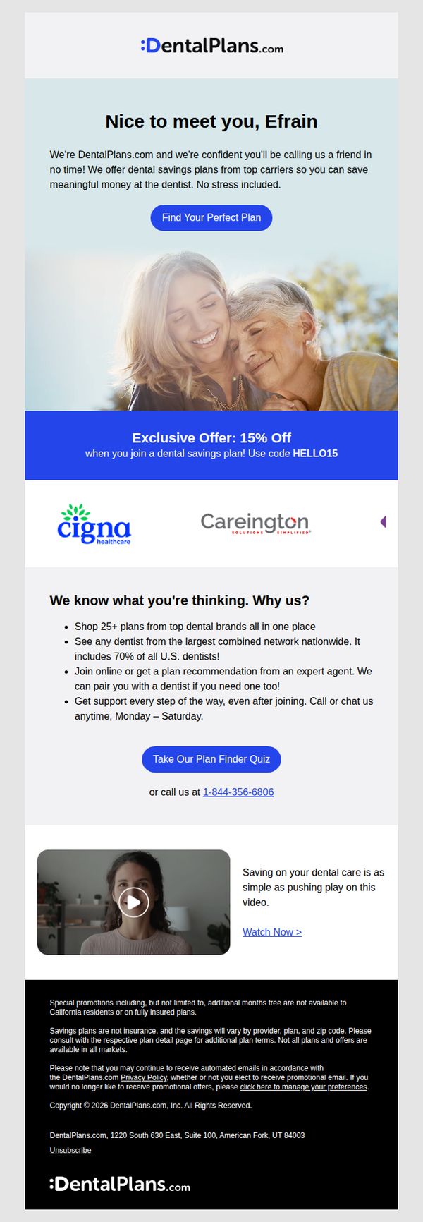
This email aims to welcome new subscribers by positioning DentalPlans.com as a trusted, stress-free solution for reducing dental costs, while encouraging immediate engagement through a personalized plan finder and a limited-time discount offer.
Why this works
The email opens with a warm, personalized greeting that instantly builds rapport, making the recipient feel seen and valued rather than just another lead in a database.
How to implement
By anchoring the offer around a specific discount code and pairing it with a strong visual banner, the campaign creates urgency and makes redemption feel effortless and exclusive.
Pro Tip
Add a subtle countdown timer next to the 15% off offer to visually reinforce urgency and encourage faster decision-making without overwhelming the layout. • Reposition the phone number directly beneath the primary CTA button instead of after the quiz link, ensuring users who prefer human interaction can act immediately without scrolling.
10. OVME : Balance Looks Better 💉

Objective
This email aims to drive bookings for facial filler services by emphasizing holistic facial balance and natural-looking results, while offering a limited-time discount to create urgency and encourage immediate action.
Why this works
The campaign brilliantly reframes filler treatments not as isolated enhancements but as part of a holistic facial balance philosophy, which reduces cosmetic stigma and appeals to clients seeking subtle, natural refinement rather than dramatic change.
How to implement
By positioning consultations as a low-pressure discovery tool, not a sales pitch, the email removes friction for hesitant customers, making it easier for them to take the first step without feeling pressured to commit immediately.
Pro Tip
Add a subtle countdown timer near the hero CTA to visually reinforce the urgency of the 30% offer, which could increase conversion by leveraging time-sensitive psychological triggers without disrupting the clean layout. • Include a short video or animated GIF in the 'Let’s talk it through' section showing a quick before/after or provider consultation snippet, this would build trust and reduce perceived risk for first-time clients.