How Health brands do drive to store campaigns by email

1. Beyond Organic Doctors: RFK Jr. warns: these toxins don’t leave your body
Objective
To alert subscribers to the dangers of accumulated toxins in the body, leveraging RFK Jr.’s report to position Beyond Organic Doctors as a trusted source for a patented, non-pharmaceutical detox solution that empowers natural bodily cleansing.
Why this works
The email masterfully uses RFK Jr.’s credibility to frame a public health crisis as urgent and personal, transforming abstract chemical exposure into a visceral, body-level threat that demands immediate attention and action.
How to implement
By positioning the detox solution as 'U.S.-patented' and 'not something Big Pharma can push,' the message taps into anti-establishment sentiment while offering a scientifically backed, empowering alternative that feels both exclusive and trustworthy.
Pro Tip
Add a brief testimonial or user result snippet near the CTA to reinforce credibility, e.g., '92% of users reported clearer thinking within 2 weeks', to bridge the gap between alarming claims and actionable trust. • Include a subtle visual cue like a downward arrow or 'scroll to learn more' near the CTA to guide attention and reduce bounce risk, since the email relies heavily on text and lacks visual hierarchy to sustain engagement.
2. Tiger Medical: Customer account confirmation
Objective
This email confirms the activation of a new customer account and encourages the recipient to log in for a faster checkout experience on their next visit, reinforcing brand engagement and streamlining future purchases.
Why this works
The email immediately reassures the customer that their account is active, reducing friction and building trust by framing login as a convenience rather than a requirement for future shopping.
How to implement
By positioning the CTA as 'Visit our store' instead of a generic 'Shop Now,' the brand subtly invites exploration while reinforcing the value of account-based shopping without overwhelming the user.
Pro Tip
Add a brief personalized welcome line (e.g., 'Hi [Name], we’re thrilled to have you!') to strengthen emotional connection and increase perceived value of the account activation. • Include a secondary CTA or visual cue, like a small icon or link to 'View Your Account Dashboard', to guide users toward account features beyond just visiting the store.
3. Beyond Organic Doctors: "Cellular Sludge" is aging you FAST
Objective
The email aims to educate recipients on the concept of 'Cellular Sludge' as a hidden cause of aging and poor health, while positioning Beyond Organic Doctors’ 3-Step Cellular Flush as a gentle, effective solution that avoids the harsh side effects of traditional cleanses.
Why this works
The email masterfully frames a complex health concept, 'Cellular Sludge', as a relatable, urgent problem by comparing it to grease clogging a drain, making abstract science feel personal and actionable for everyday readers.
How to implement
By highlighting that most cleanses dump toxins into the bloodstream and cause worse symptoms, the email creates a sharp contrast that positions their 3-Step Flush as the only safe, gradual alternative, building trust through problem-awareness before offering the solution.
Pro Tip
Add a visual element, like a simple before/after graphic or animated cell diagram, near the 'Cellular Sludge' explanation to reinforce the metaphor and improve retention of the core concept. • Include a short testimonial or user result snippet right after the CTA to reduce friction and build social proof before the reader clicks through, increasing conversion likelihood.
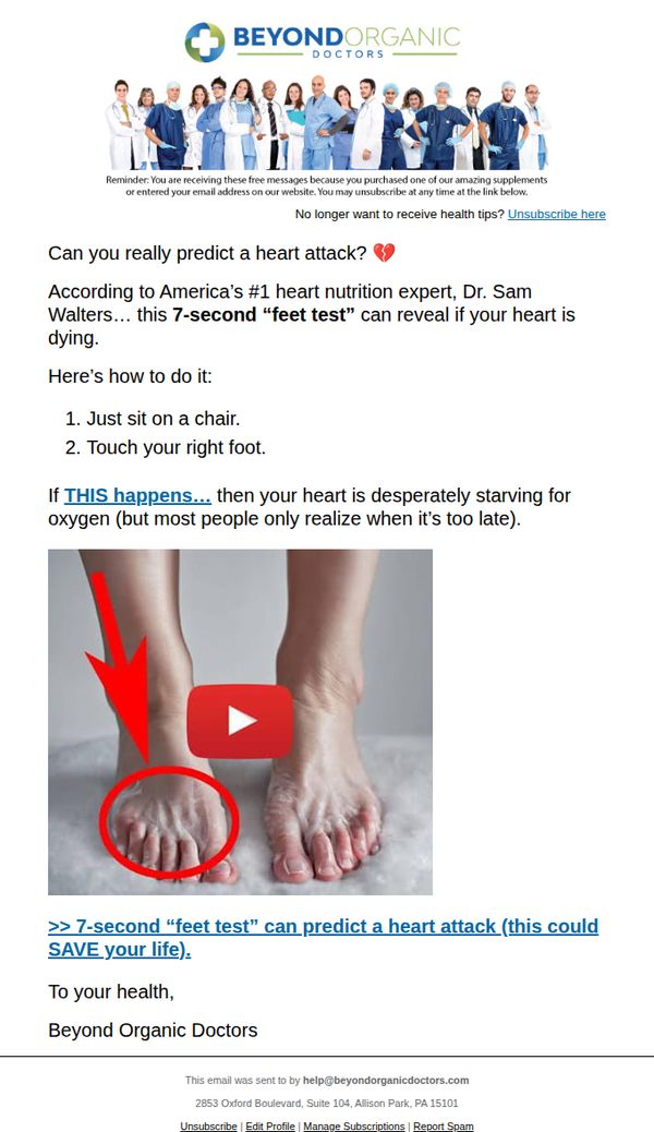
4. Beyond Organic Doctors: touch your feet 🦶 like THIS (for 7 sec)
Objective
To engage subscribers with a surprising, health-related hook, a 7-second foot test, that implies urgent cardiac insight, driving curiosity and video engagement while subtly reinforcing brand authority in heart nutrition.
Why this works
The email opens with a provocative, body-based health test that leverages curiosity and urgency, turning a simple physical action into a life-or-death diagnostic moment to instantly capture attention and drive video clicks.
How to implement
By anchoring the claim to a named expert, 'America’s #1 heart nutrition expert, Dr. Sam Walters', the campaign builds instant credibility and positions the brand as a trusted source of unconventional but science-adjacent health insights.
Pro Tip
Add a brief testimonial or stat near the CTA (e.g., 'Over 12,000 viewers reported noticing symptoms after trying this test') to reinforce social proof and reduce skepticism around the claim’s validity. • Include a secondary CTA below the video thumbnail, such as 'Download our free Heart Health Checklist', to capture leads who watch the video but don’t immediately act, extending the conversion funnel.
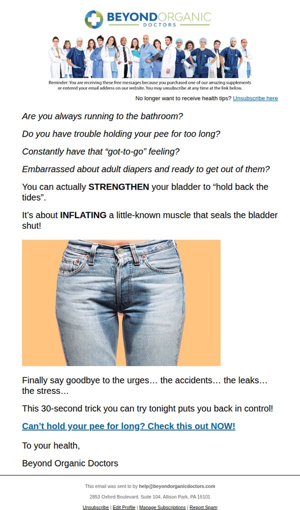
5. Beyond Organic Doctors: Can’t hold your pee for long? (do this tonight)
Objective
This email aims to engage recipients who struggle with bladder control by offering a quick, actionable solution that promises immediate relief, while subtly positioning Beyond Organic Doctors as a trusted authority on natural health fixes.
Why this works
The email opens with a series of emotionally resonant, conversational questions that instantly validate the reader’s frustration, making them feel seen and more receptive to the solution offered.
How to implement
By framing the solution as a '30-second trick you can try tonight,' the campaign lowers the barrier to action and creates urgency without sounding pushy, which increases the likelihood of immediate engagement.
Pro Tip
Add a short testimonial or stat (e.g., '92% of users saw improvement in 3 days') near the CTA to build social proof and reduce skepticism about the '30-second trick' claim. • Include a visual cue like a downward arrow or 'Scroll to learn the trick' just above the CTA to guide users who may miss the call-to-action due to the minimal layout.
6. Beyond Organic Doctors: Neil Armstrong’s SHOCKING Apollo 11 confession
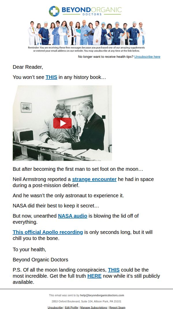
Objective
To capture attention and drive clicks by leveraging a sensational, conspiracy-themed hook tied to Neil Armstrong and NASA, ultimately steering readers toward a product or content offer disguised as exclusive historical truth. The goal is to convert curiosity into engagement or sales through emotional urgency and mystery.
Why this works
The email brilliantly hijacks historical intrigue by framing a health brand’s message around a fictional ‘shocking confession’ from Neil Armstrong, turning a mundane supplement pitch into a must-see mystery that triggers FOMO and emotional curiosity.
How to implement
By embedding a video thumbnail directly into the narrative flow, the campaign creates an irresistible visual pause point that mimics documentary-style storytelling, making the reader feel like they’re uncovering classified information rather than being sold a product.
Pro Tip
Add a clear, secondary CTA button above the fold, such as 'Watch the Recording Now', to reduce friction for users who want immediate access without scrolling, improving conversion rates by aligning with the video-centric hook. • Include a brief, credible-sounding disclaimer or source attribution near the 'NASA audio' claim to mitigate potential distrust or backlash, especially since the content leans into conspiracy, this builds perceived legitimacy without sacrificing intrigue.
7. Beyond Organic Doctors: do THIS with castor oil to flush out your liver clog & drop belly fat
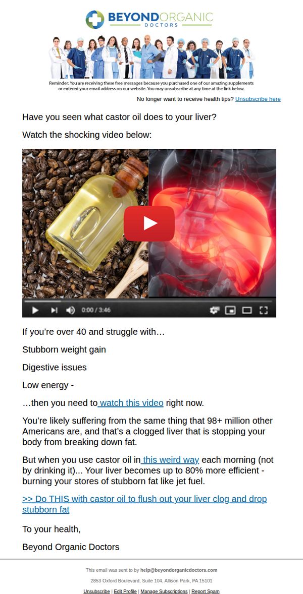
Objective
This email aims to drive immediate video engagement by positioning castor oil as a surprising, liver-cleansing solution for stubborn belly fat, especially targeting adults over 40 who feel their metabolism is broken. It seeks to convert curiosity into product interest by implying a hidden, underused method that unlocks fat-burning potential.
Why this works
The email brilliantly taps into a specific demographic pain point, adults over 40 struggling with weight gain, and immediately offers a visually compelling, counterintuitive solution that feels like a secret medical hack, making the viewer feel uniquely targeted and urgently informed.
How to implement
By framing castor oil not as a supplement to ingest but as a ‘weird way’ to use topically for liver detox, the campaign creates intrigue and bypasses skepticism, turning a common household item into a mysterious, high-impact health tool that demands immediate attention.
Pro Tip
Add a short testimonial or stat near the CTA, like ‘92% of users saw reduced bloating in 7 days’, to reinforce credibility and reduce skepticism around the ‘weird way’ claim, which currently lacks social proof to back up the bold liver-efficiency claim. • Include a small visual cue or icon next to the video thumbnail indicating ‘3:46 min’ or ‘Watch before scrolling’ to reduce bounce rate and increase video completion, since the video is the core conversion driver but currently blends into the layout without urgency cues.
8. Beyond Organic Doctors: Use this instead for thick nails, glowing skin and gorgeous hair
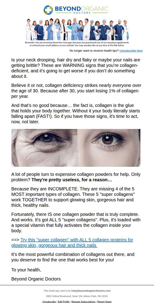
Objective
The email aims to educate recipients about the signs of collagen deficiency and persuade them to try a specific collagen supplement by highlighting its unique formulation and benefits for skin, hair, and nails. It leverages urgency and scientific framing to drive product trial.
Why this works
The email effectively creates urgency by framing collagen loss as a fast-approaching physical decline after age 30, making the reader feel the need to act immediately before visible damage becomes irreversible.
How to implement
It builds credibility by positioning most collagen powders as incomplete and ineffective, then introduces its product as the rare, scientifically complete solution, leveraging scarcity and superiority to justify premium positioning.
Pro Tip
Add a clear visual hierarchy around the CTA, currently buried in text, by using a button with contrasting color and whitespace to increase click-through rates and reduce cognitive load. • Include a short testimonial or user result (e.g., '92% saw thicker nails in 30 days') near the CTA to reinforce social proof and reduce perceived risk for first-time buyers.
9. Beyond Organic Doctors: This Natural "Ozempic" Alternative Burns So Much Fat It Shocked Plastic Surgeons

Objective
The email aims to drive immediate engagement by positioning a natural supplement as a superior, side-effect-free alternative to Ozempic, leveraging shock value and medical authority to compel readers to watch a video and consider purchasing.
Why this works
The email masterfully uses medical authority by featuring a group of doctors in scrubs to instantly build trust and imply clinical validation, making the natural alternative feel safer and more credible than pharmaceutical options.
How to implement
It creates urgency and exclusivity by suggesting Big Pharma is trying to suppress the product, which taps into anti-corporate sentiment and motivates readers to act before the opportunity disappears or is taken away.
Pro Tip
Add a clear secondary CTA button below the video thumbnail, such as 'See Real Results' or 'Get Yours Now', to reduce friction for users who are convinced but don’t want to watch the video first. • Include a short, bulleted list of key benefits or ingredients near the top to reinforce credibility and give skimmers a quick reason to keep reading, especially since the video is the only conversion point.
10. Beyond Organic Doctors: 6 foods PROVEN to eliminate inflammation
Objective
To educate subscribers on anti-inflammatory foods while positioning turmeric as a key solution, encouraging engagement with the brand’s health philosophy and driving clicks to learn more about combining foods for faster results.
Why this works
The email brilliantly frames turmeric not as a standalone remedy but as a force multiplier when paired with other foods, creating urgency and curiosity by implying synergy accelerates healing beyond what any single ingredient can achieve.
How to implement
By invoking vivid imagery of 'a private squad of firefighters' battling inflammation, the message transforms abstract science into an emotional, action-oriented narrative that resonates with readers seeking relief from chronic pain and mobility loss.
Pro Tip
Add a visual cue like a small icon or color highlight next to the CTA link to draw attention and increase click-through rates, since the current plain blue text may blend into the body copy without sufficient visual hierarchy. • Include a brief testimonial or stat near the CTA, such as '92% of users reported reduced joint pain within 3 weeks', to build social proof and reduce hesitation before clicking, strengthening the persuasive flow toward conversion.