Drive to Store email examples & ideas for Lifestyle brands
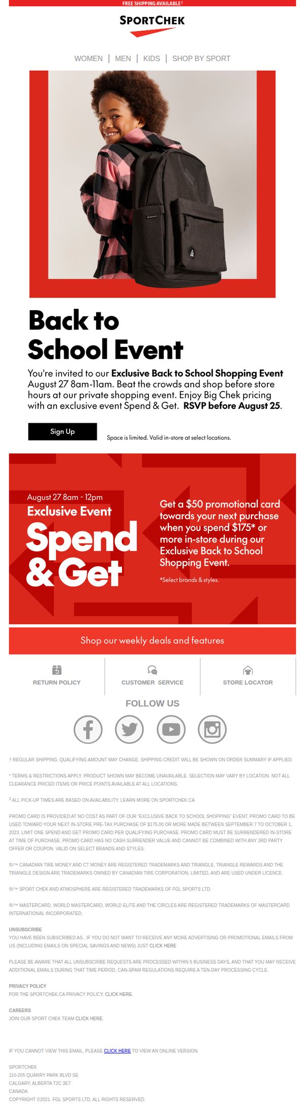


1. Sport Chek: Beat The Crowds At Our Exclusive Back To School Event
Objective
This email aims to drive in-store attendance for Sport Chek’s exclusive Back to School Shopping Event by creating urgency through limited space and time, while incentivizing purchases with a $50 promotional card for spending $175 or more.
Why this works
The email brilliantly leverages FOMO by framing the event as ‘exclusive’ and ‘private,’ positioning early shoppers as insiders who beat the crowds, a psychological trigger that elevates perceived value and drives immediate action.
How to implement
By tying the $50 promotional card to a clear spending threshold of $175, the campaign effectively upsells while giving customers a tangible, future-oriented reward that encourages larger basket sizes without feeling like a discount gimmick.
Pro Tip
Add a countdown timer or ‘X spots left’ indicator near the ‘Sign Up’ CTA to amplify urgency and reduce hesitation, especially since the event is time-limited and space-constrained. • Include a small visual map or list of ‘select locations’ hosting the event to reduce friction for local shoppers and increase confidence that the offer is accessible to them.
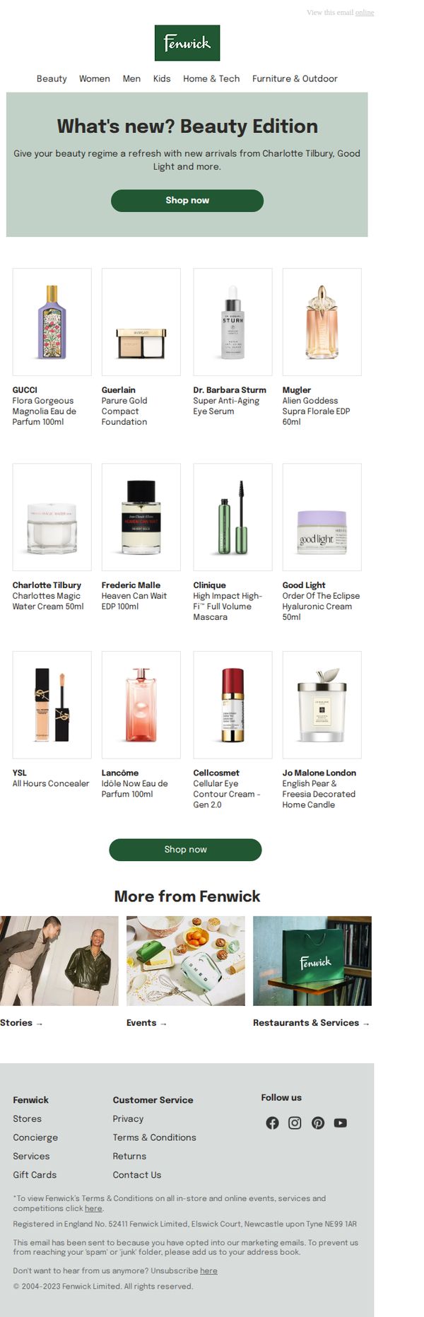
2. Fenwick: What's new? Beauty Edition
Objective
This email aims to drive engagement and sales by showcasing new beauty product arrivals from premium brands like Charlotte Tilbury and Good Light, encouraging subscribers to refresh their beauty routines with curated, high-end offerings.
Why this works
The email effectively curates a luxury beauty experience by spotlighting recognizable premium brands, instantly signaling quality and exclusivity to subscribers who value prestige and performance in their skincare and fragrance choices.
How to implement
By organizing products in a clean, grid-based layout with consistent image sizing and clear labeling, the email reduces cognitive load and makes browsing effortless, which is essential for converting casual scrollers into intentional buyers.
Pro Tip
Add a short testimonial or social proof snippet near the hero section to reinforce trust, e.g., 'Loved by 10,000+ beauty enthusiasts', to reduce hesitation for new customers unfamiliar with the featured brands. • Introduce a limited-time offer or free shipping threshold beneath the hero CTA to create urgency and incentivize immediate purchase, especially since the email highlights new arrivals that benefit from early adoption messaging.
3. Fenwick: It takes a century to have a moment
Objective
This email aims to reintroduce Fenwick as a bold, modern fashion brand after a period of quiet presence, leveraging its heritage since 1882 to position itself as a style pioneer ready to make a loud cultural statement with its new 'Quiet No More' campaign.
Why this works
Fenwick brilliantly flips the script on 'quiet luxury' by embracing volume and statement-making design, turning a trend into a brand-defining rebellion that resonates with Gen Z and millennial audiences seeking authenticity over subtlety.
How to implement
The campaign’s emotional hook, 'It takes a century to have a moment', ties Fenwick’s 140-year legacy to a bold new era, creating narrative depth that transforms a product launch into a cultural moment worth participating in, not just shopping.
Pro Tip
Add a countdown timer or 'limited stock' indicator near the 'Shop now' CTA to create urgency around the limited-edition T-shirts, which would better convert interest into immediate action. • Include a short video or GIF in the hero section showing the T-shirts in motion or being styled, to better convey the 'volume' and 'unquiet luxury' messaging visually rather than relying solely on static imagery.
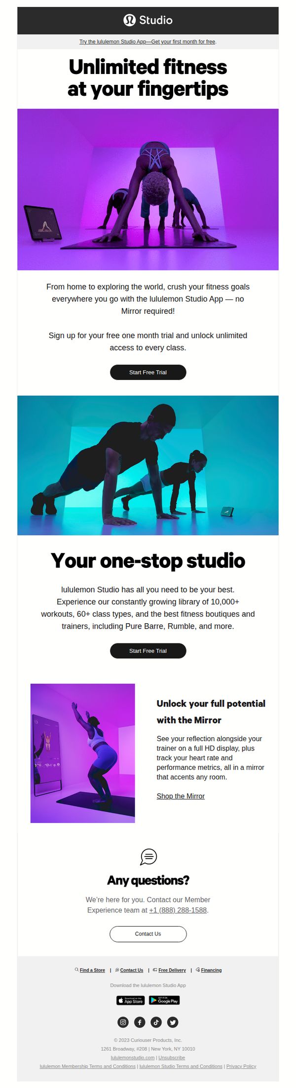
4. lululemon Studio (formerly Mirror): Ready To Crush Your Fitness Goals?
Objective
This email aims to convert fitness-minded users into trial subscribers by highlighting the convenience and breadth of the lululemon Studio App’s on-demand classes, while also promoting the physical Mirror device as a premium upgrade path for deeper engagement.
Why this works
The email brilliantly frames the app as a portable fitness studio, using dynamic visuals and aspirational language to make users feel they’re not just signing up for classes, but unlocking a lifestyle upgrade that travels with them anywhere.
How to implement
By separating the app’s free trial from the Mirror hardware in distinct sections, the campaign avoids overwhelming the user while still strategically cross-selling the premium product as a natural next step for those seeking immersive, real-time feedback and metrics.
Pro Tip
Add a subtle countdown timer or urgency indicator near the 'Start Free Trial' button in the hero section to nudge procrastinators, since the offer is time-sensitive, visual scarcity cues could boost conversion without altering the message. • Include a short testimonial or social proof snippet under the 'Your one-stop studio' section, such as '92% of users complete 3+ workouts/week', to reinforce credibility and reduce perceived risk before the second CTA.
5. BIG W: Boxing Day bargains inside 👇
Objective
This email aims to drive immediate post-Christmas sales by highlighting time-sensitive Boxing Day discounts across a wide range of categories, encouraging recipients to shop before deals expire. It leverages urgency and variety to convert holiday shoppers into buyers during the critical post-Christmas sales window.
Why this works
The email masterfully uses visual urgency with bold yellow discount tags and 'SALE' banners layered over product imagery, creating an instant emotional trigger that makes savings feel tangible and immediate rather than abstract.
How to implement
By organizing deals into clearly labeled sections like 'Hot picks for your home' and 'Save on the essentials,' the campaign reduces decision fatigue and guides shoppers through logical purchase paths based on real-life needs and categories they already browse.
Pro Tip
Add a countdown timer beneath the hero headline to reinforce urgency, 'Deals end in [X] hours', since the current copy says 'not for long' without quantifying the scarcity, which weakens the psychological trigger. • Reposition the 'Shop now' CTA buttons under each product grid section to be sticky or more visually prominent, currently, they’re small and buried, which may cause users to scroll past without clicking, especially on mobile.
6. SMALLable: Back To School Looks & Kids' Skincare

Objective
To drive engagement and sales by showcasing curated back-to-school fashion for kids alongside new skincare products and mid-season adult jackets, encouraging customers to explore seasonal collections and complete purchases.
Why this works
The email masterfully blends seasonal kid’s fashion with skincare education, creating a holistic back-to-school narrative that appeals to parents’ practical and emotional needs while subtly cross-promoting complementary categories.
How to implement
By featuring both children’s outfits and adult mid-season jackets under unified color palettes and lifestyle photography, the campaign builds a cohesive brand story that encourages family-wide shopping without overwhelming the reader’s attention.
Pro Tip
Add a visible countdown timer or urgency cue near the 'SEE MORE' CTA in the Back To School section to create time-sensitive motivation, especially since school shopping is often deadline-driven. • Integrate customer testimonials or user-generated content within the Etnoo skincare section to build trust around the new brand launch, as sensitive skin care requires higher social proof than fashion items.
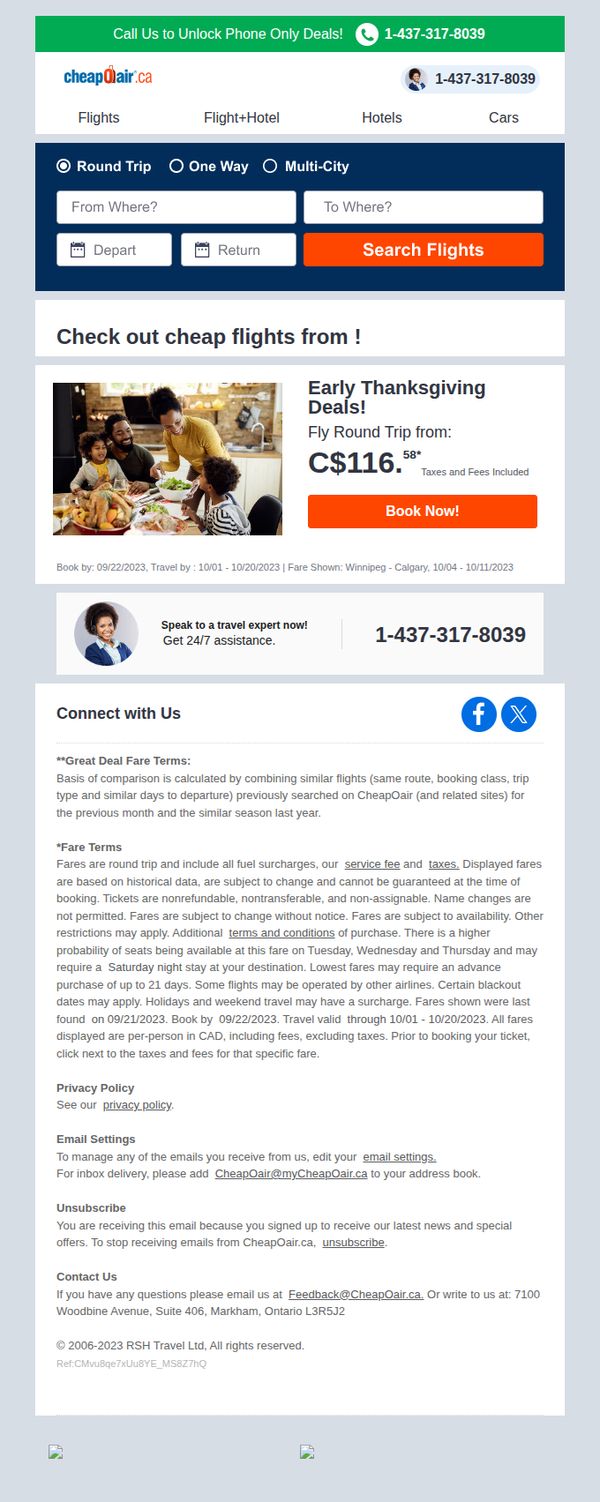
7. CheapOair Canada: ✈ Grab Early Thanksgiving Deals!
Objective
This email aims to drive immediate flight bookings by promoting time-sensitive early Thanksgiving deals, leveraging urgency and price comparison to convert subscribers into customers before peak travel dates.
Why this works
The email smartly anchors urgency by pairing a specific price point with a hard deadline, making the deal feel exclusive and time-bound, which nudges hesitant travelers to act before prices climb.
How to implement
By featuring a warm, relatable family image alongside the offer, the campaign emotionally connects with the recipient’s holiday travel intentions, transforming a transactional message into a personal invitation to celebrate together.
Pro Tip
Add a countdown timer beneath the C$116.58 price to visually reinforce urgency and scarcity, which would increase conversion by making the time-sensitive nature of the deal impossible to ignore. • Reposition the phone number and 'Speak to a travel expert' section higher, ideally beside or just below the 'Book Now!' button, to reduce friction for users who need reassurance before clicking.
8. Horizn Studios: Art Moves with Wura-Natasha Ogunji
Objective
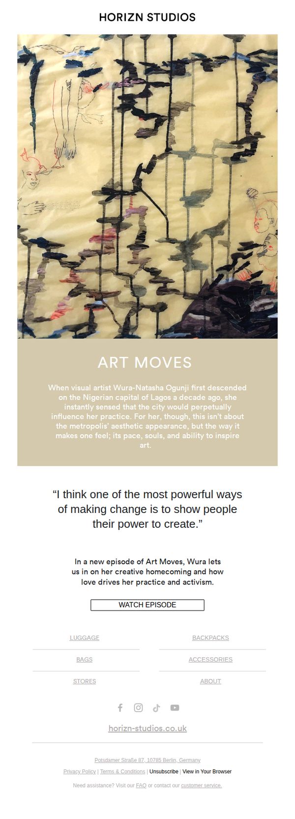
To engage subscribers with a culturally rich narrative centered on artist Wura-Natasha Ogunji, while subtly reinforcing Horizn Studios’ brand ethos of art, movement, and meaningful storytelling. The email aims to drive viewership of the 'Art Moves' episode and deepen emotional connection with the brand.
Why this works
The email masterfully blends cultural storytelling with brand identity by spotlighting an artist whose creative journey mirrors the brand’s values of movement, emotion, and transformation, making the content feel deeply personal and purpose-driven.
How to implement
By opening with evocative imagery and a poetic narrative about Lagos, the email immediately immerses the reader in atmosphere and emotion, setting a tone that’s more cinematic than promotional, a powerful technique for luxury and art-forward brands.
Pro Tip
Add a brief visual teaser or thumbnail of the episode directly above the CTA to reduce cognitive load and increase click-through by giving users a preview of what they’re about to watch. • Integrate a subtle social proof element, such as a quote from a previous viewer or a note like 'Watched by 10K+ creatives', to validate the episode’s impact and encourage engagement from hesitant viewers.
9. Horizn Studios: We can’t protect the planet by travelling it?
Objective
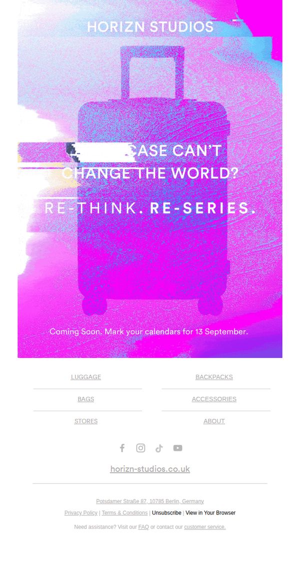
To generate anticipation and excitement for Horizn Studios’ upcoming product launch on September 13 by challenging the perception that travel is incompatible with sustainability, positioning the brand as a forward-thinking innovator in eco-conscious luggage.
Why this works
The email brilliantly flips a common consumer guilt, travel’s environmental cost, into a provocative brand statement, making the audience feel part of a movement rather than just a customer.
How to implement
By using bold, glitch-style visuals and minimal copy, the campaign creates a modern, tech-savvy aesthetic that aligns with eco-innovation, subtly signaling that sustainability doesn’t mean sacrificing style or edge.
Pro Tip
Add a subtle countdown timer beneath the CTA to heighten urgency and visually anchor the September 13 date, transforming passive awareness into active anticipation. • Include a micro-testimonial or sustainability stat (e.g., 'Made with 100% recycled materials') near the hero to immediately validate the eco-claim and strengthen emotional resonance.
10. Sport Chek: Back To School Big Chek Event: Under Armour 30% Off + More

Objective
This email aims to drive immediate back-to-school purchases by highlighting time-sensitive discounts across popular athletic brands and categories, while creating urgency through a limited-time event window and prominent doorbuster messaging.
Why this works
The email masterfully leverages seasonal urgency by anchoring the entire campaign to the 'Back to School' timeline, making the discounts feel timely and relevant rather than generic, which increases perceived value and motivates faster purchasing decisions.
How to implement
By organizing offers into clearly labeled, visually distinct category blocks with brand logos and product imagery, the email reduces cognitive load for shoppers and allows them to instantly scan for their preferred brand or item type without scrolling endlessly.
Pro Tip
Add a countdown timer beneath the hero section to visually reinforce the urgency of the Aug. 24–Sept. 13 event window, which would increase FOMO and encourage immediate clicks rather than deferred browsing. • Include a small testimonial or social proof snippet (e.g., 'Over 10,000 students shopped last week') near the top of the offer grid to build trust and validate the popularity of the deals, especially for price-sensitive back-to-school shoppers.