Drive to Store email gallery from real Media brands
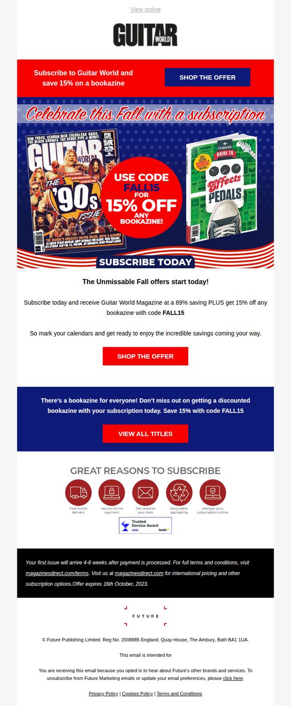



1. Guitarist: Celebrate this fall with a subscription
Objective
This email aims to drive magazine subscriptions by promoting a limited-time fall offer that includes a 15% discount on any bookazine when users subscribe, leveraging seasonal urgency and added value to convert readers into paying subscribers.
Why this works
The email smartly combines seasonal celebration with a tangible discount, making the offer feel timely and exclusive while anchoring the promotion to a cultural moment that resonates with guitar enthusiasts.
How to implement
By highlighting both the subscription savings and the bonus bookazine discount, the campaign creates layered value that appeals to both cost-conscious readers and collectors seeking premium content.
Pro Tip
Add a countdown timer near the CTA to reinforce urgency, since the offer expires October 16, 2023, this would visually pressure readers to act before the deadline. • Include a short testimonial or subscriber quote in the 'Great Reasons to Subscribe' section to build social proof and humanize the value proposition beyond icons and bullet points.
2. Us Weekly: Gisele Bundchen Says Tom Brady Split Isn’t What She ‘Hoped For’
Objective
This email aims to drive immediate clicks and engagement by leading with a high-profile celebrity breakup headline, then sustaining interest with a grid of trending celebrity news stories that cater to fans of gossip, relationships, and pop culture.
Why this works
The email opens with a emotionally charged celebrity quote that immediately taps into reader curiosity, making the headline feel personal and urgent rather than just another gossip update, which significantly boosts open-to-click conversion.
How to implement
By using a clean two-column grid layout with consistent image-to-headline-to-CTA spacing, the design reduces cognitive load and lets readers scan multiple stories quickly without feeling overwhelmed, encouraging deeper engagement across the newsletter.
Pro Tip
The hero section’s CTA button lacks urgency or exclusivity; adding a time-sensitive phrase like 'Read before it’s gone' or 'Exclusive details inside' would better leverage the emotional hook of the headline to drive immediate clicks. • The footer lacks a personalized re-engagement element, such as 'You might also like: [user’s favorite celeb name]', which could increase session depth by recommending content based on past behavior or stated preferences.
3. Honolulu: 💡 First Look at February: Lights Out?
Objective
This email aims to engage readers by previewing the February issue of Honolulu Magazine, highlighting diverse local stories, from energy crises and cultural events to food and community features, while encouraging subscriptions and deeper exploration of content through 'Read More' links.
Why this works
The email brilliantly curates a mosaic of local stories that reflect Hawaii’s cultural, environmental, and social pulse, making readers feel like insiders who are in the know about what truly matters across the islands this month.
How to implement
Each story preview is paired with a compelling, high-res image and a concise, curiosity-driven headline that invites clicks without overwhelming the reader, perfectly balancing visual appeal with editorial depth to sustain engagement down the scroll.
Pro Tip
Add a sticky 'Subscribe Now' CTA button that follows the user as they scroll, since the only subscription prompt appears at the very bottom, after 15+ story previews, risking low conversion from casual scrollers. • Introduce a brief teaser or pull quote from the 'Lights Out?' cover story at the top of the email to immediately establish stakes and urgency, anchoring the rest of the content under a unifying narrative thread that drives emotional investment.
4. Glossy: This Valentine’s Day, perfume is playing matchmaker
Objective
This email aims to position Glossy as a thought leader in beauty and fashion by delivering timely, insider industry news around Valentine’s Day, while subtly reinforcing brand relevance through curated stories about fragrance, retail, and marketing trends.
Why this works
The email smartly ties Valentine’s Day to fragrance trends without being salesy, using cultural relevance to position the brand as a curator of industry insight rather than a pushy marketer, which builds trust with its professional audience.
How to implement
By leading with a member-exclusive headline and featuring bold, personality-driven imagery, Glossy creates instant FOMO and emotional resonance, making subscribers feel like insiders who get the real stories before anyone else does.
Pro Tip
Add a secondary CTA above the footer, such as 'Read the full interview with Carey Collins Krug', to drive deeper engagement with high-value content, rather than relying solely on a generic newsletter sign-up link at the bottom. • Include a visual divider or icon next to 'SPONSORED CONTENT' labels to help readers instantly distinguish paid partnerships from editorial, improving transparency and maintaining credibility without disrupting the reading experience.
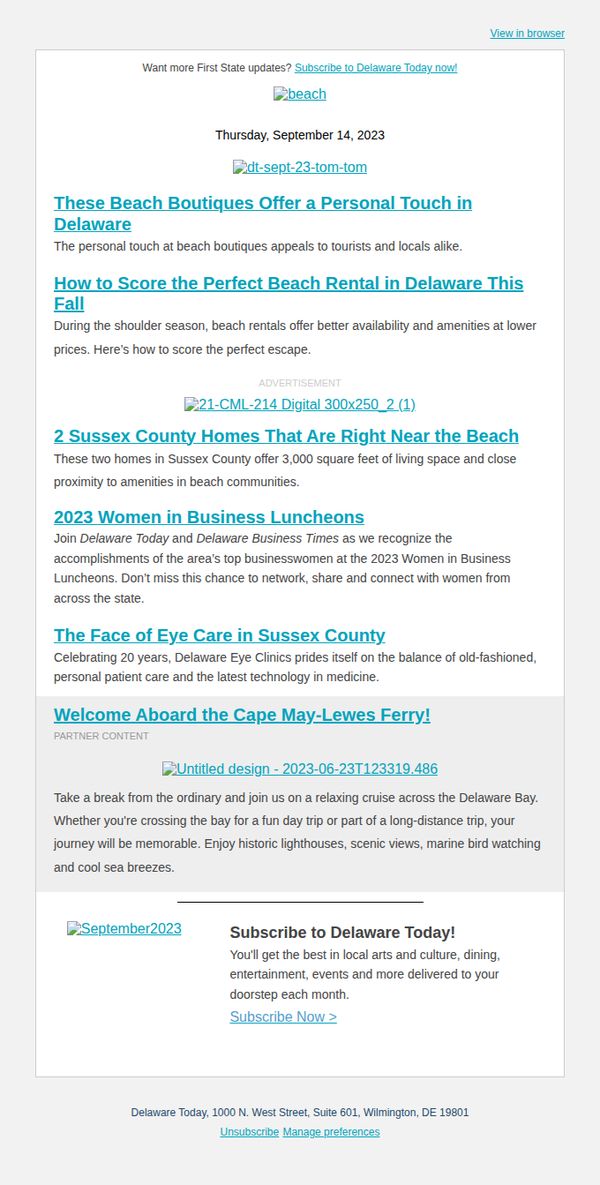
5. Delaware Today: Beach Boutiques Perfect for Fall Shopping 🛍️➡️
Objective
This email aims to engage readers with curated local content about beach boutiques, rentals, and community events in Delaware while encouraging subscription to the Delaware Today newsletter for ongoing updates on culture, dining, and events.
Why this works
The email smartly blends seasonal relevance with local charm by spotlighting beach boutiques and fall rentals, making it feel timely and personally useful to both tourists and residents seeking authentic Delaware experiences.
How to implement
By weaving in community celebrations like the Women in Business Luncheons and medical milestones like Delaware Eye Clinics’ 20-year anniversary, the email builds emotional connection and positions the brand as a cultural curator, not just a content distributor.
Pro Tip
Add a visual hierarchy to the article headlines using bolding, spacing, or icons to help readers quickly scan and prioritize content, especially since the current layout blends multiple topics without clear visual separation. • Include a secondary CTA near the top or mid-funnel, such as 'Download Our Fall Beach Guide', to capture early interest before readers scroll past, increasing conversion potential beyond the single bottom CTA.
6. Cleveland Magazine: CLE Weekender: Chagrin Documentary Film Fest

Objective
This email aims to engage local readers by curating a compelling weekend guide filled with cultural events, entertainment, and seasonal happenings in Cleveland, while subtly encouraging subscription to the print magazine for deeper city coverage.
Why this works
The email smartly anchors its content around a timely seasonal theme, Halloween, to create immediate relevance and emotional resonance, making readers feel the guide is tailored to their current mood and interests.
How to implement
By blending high-profile events like David Sedaris with local gems like the Chagrin Documentary Film Festival, the email positions itself as both culturally authoritative and deeply community-rooted, building trust through curation.
Pro Tip
The primary CTA 'Subscribe to Cleveland Magazine' appears only once near the top and lacks visual urgency; adding a second, more prominent CTA button near the bottom, perhaps with a benefit-driven label like 'Get the Full Weekend Guide in Print', would improve conversion. • The weather section, while useful, interrupts the flow of event content; relocating it to a collapsible or sidebar element would maintain momentum and keep the focus on driving attendance or engagement with featured events.
7. Travel + Leisure: This Stunning Beach Was Named No. 1 in the U.S.

Objective
To drive engagement and clicks by showcasing the top 10 trending travel stories of the moment, leveraging curiosity and FOMO around top-ranked destinations, luxury travel gear, and seasonal experiences. The email aims to position Travel + Leisure as the go-to authority for curated, high-impact travel inspiration.
Why this works
The email masterfully combines aspirational imagery with authoritative rankings to create instant credibility and emotional pull, making readers feel they’re accessing insider knowledge on the most coveted travel experiences of the year.
How to implement
By mixing destination highlights with product roundups like luxury travel accessories, the campaign subtly bridges inspiration with commerce, guiding readers from dream to do without breaking the editorial flow or feeling overly promotional.
Pro Tip
Add a subtle visual hierarchy to the CTA buttons, such as varying button sizes or colors for high-priority stories (e.g., the No. 1 beach), to guide users toward the most compelling content first and increase click-through on top-performing pieces. • Include a short, punchy teaser sentence under each headline (e.g., 'Voted by 10,000 travelers' or 'Only 3 spots left at this resort') to add urgency or social proof, enhancing persuasion without cluttering the clean layout.
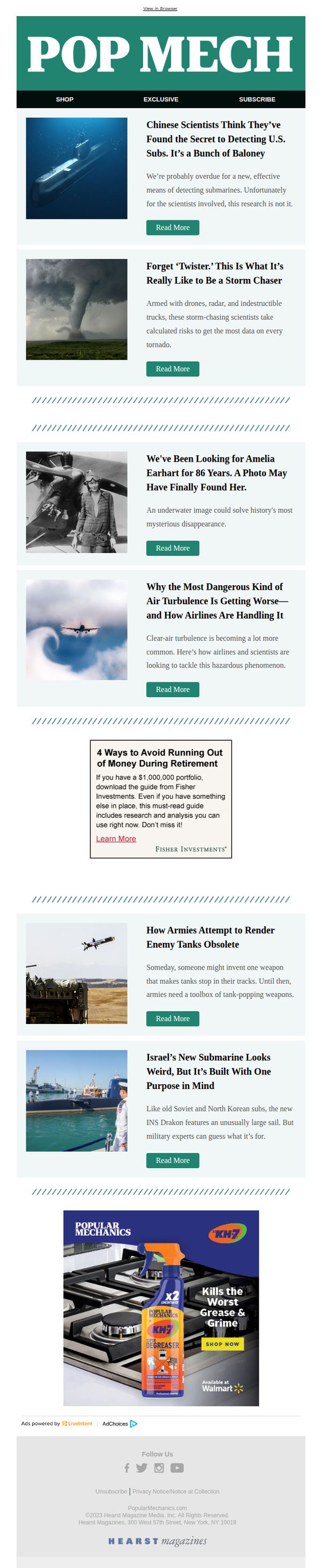
8. Popular Mechanics: Chinese Scientists Think They’ve Found the Secret to Detecting U.S. Subs. It’s a Bunch of Baloney
Objective
To engage readers with provocative, science-driven headlines that spark curiosity and drive clicks to in-depth articles, while subtly integrating sponsored content and brand partnerships to support revenue without disrupting the editorial tone.
Why this works
The email leverages bold, skeptical headlines like 'It’s a Bunch of Baloney' to instantly hook readers by challenging sensational claims, a smart tactic for science audiences who value critical thinking and debunking over hype.
How to implement
By placing a non-intrusive but visually distinct sponsored guide within the content flow, the campaign maintains editorial integrity while monetizing curiosity, a seamless blend of value and promotion that doesn’t feel like an ad.
Pro Tip
The CTA 'Read More' is repetitive and generic across all articles; personalizing it per article (e.g., 'See the Evidence,' 'Unlock the Mystery') would increase relevance and conversion by aligning with each headline’s promise. • The ad for KH7 degreaser, while visually integrated, lacks a clear value proposition tied to the audience, adding a line like 'Engineers Trust KH7 for Tough Grease' would better resonate with Popular Mechanics’ DIY/technical readership.
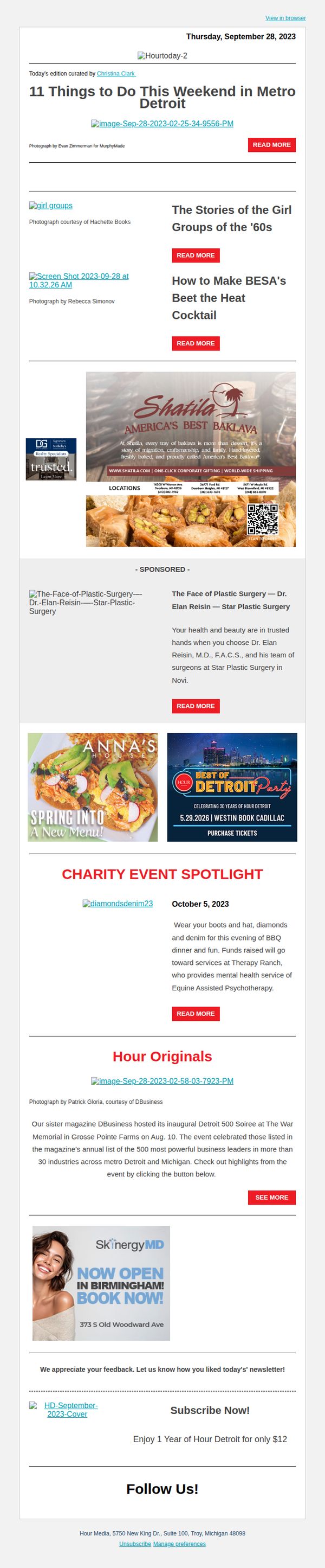
9. Hour Detroit: Weekend Events in Metro Detroit
Objective
To engage local readers by curating and promoting weekend events, cultural stories, and community happenings in Metro Detroit, while subtly driving subscriptions and brand loyalty through editorial highlights and sponsored content.
Why this works
The email smartly opens with a compelling, numbered list of weekend activities that immediately grabs attention by promising local relevance and variety, making it feel like a personalized city guide rather than a generic newsletter.
How to implement
Sponsored content is seamlessly integrated with editorial pieces using consistent visual spacing and branding cues, allowing advertisers to feel valued without disrupting the reader’s experience or diluting the editorial tone of the publication.
Pro Tip
Add a countdown timer or date badge next to the 'Best of Detroit Party' promotion to create urgency and increase ticket purchase conversion, especially since the event date (5.29.2026) is far in the future and lacks immediate traction. • Reposition the 'Subscribe Now!' CTA higher in the email, perhaps after the charity spotlight or alongside the Hour Originals section, to capture engaged readers while they’re still immersed in content, rather than waiting until the footer.
10. Traverse: sco, Fall adventures begin at Shanty Creek! 🍂

Objective
This email aims to inspire readers to plan a fall getaway to Shanty Creek Resort by highlighting its scenic beauty, outdoor adventures, and cozy accommodations, positioning it as the ideal base camp for experiencing Northern Michigan’s autumn splendor.
Why this works
The email masterfully ties seasonal nostalgia to location-specific experiences, using phrases like 'Fall’s Hottest Trend: Earth Tones' to emotionally resonate while subtly guiding readers toward booking activities that match the mood of the season.
How to implement
By integrating sponsored content like the blue chairlift ride with natural storytelling, the campaign turns promotional partnerships into authentic experiences, making the resort feel like a curated adventure rather than a commercial destination.
Pro Tip
Add a countdown timer near the 'Set Up Your Base Camp' CTA to create urgency around fall color viewing, since peak foliage is time-sensitive and could motivate faster booking decisions. • Include a small map or visual itinerary in the 'Happy Trails' section to help readers visualize proximity between attractions, reducing decision fatigue and reinforcing the resort’s role as a central hub for exploration.