Sainsbury’s drive to store email examples & ideas


1. Stay Stylish 🌧️🌨️☀️
Objective
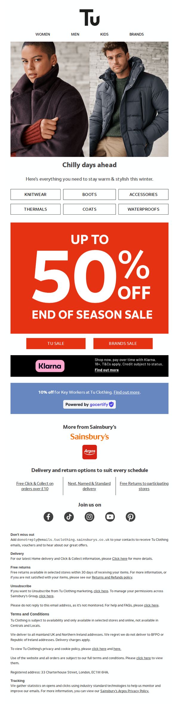
This email aims to drive immediate sales by promoting Sainsbury’s Tu Clothing end-of-season sale with up to 50% off, while encouraging customers to shop across categories like coats, boots, and thermals to stay warm and stylish through changing weather. It also leverages brand trust and payment flexibility to reduce purchase friction.
Why this works
The email smartly ties seasonal weather changes to product relevance, using ‘Chilly days ahead’ to create urgency and position clothing as a practical solution, not just a fashion choice, which increases perceived value and emotional resonance with the audience.
How to implement
By prominently featuring ‘UP TO 50% OFF’ in bold, high-contrast typography against a vibrant red background, the campaign immediately captures attention and communicates the core offer with visual dominance, reducing cognitive load and increasing conversion likelihood.
Pro Tip
Add a countdown timer or limited-time badge near the ‘UP TO 50% OFF’ CTA to amplify urgency, since the ‘End of Season Sale’ implies time sensitivity but lacks a visual cue to trigger immediate action. • Include a small ‘Best Sellers’ or ‘Customer Favorites’ product grid beneath the category buttons to guide indecisive shoppers and showcase social proof, increasing conversion by reducing decision fatigue.
2. 20% off Tu Women's Nightwear now on
Objective
This email aims to drive immediate online and in-store sales of Tu Women’s Nightwear by promoting a limited-time 20% discount, while also cross-promoting Valentine’s Day-themed matching PJs and Tu Baby collections to expand purchase intent across family segments.
Why this works
The email smartly ties a product discount to an emotional occasion, Valentine’s Day, by showcasing matching parent-child pajamas, which transforms a simple sale into a gifting opportunity and deepens customer connection through shared experiences.
How to implement
By featuring both women’s nightwear and baby collections under the same promotional umbrella, the campaign leverages family-oriented shopping behavior, encouraging customers to bundle purchases and increasing average order value without adding friction.
Pro Tip
Add a visible countdown timer under the 'Don’t forget must end Sunday' section to create urgency and reduce procrastination, especially since the offer ends soon and the current text lacks temporal pressure. • Reposition the Klarna and Argos banners higher or integrate them into the product grid as 'Shop with Klarna' badges on individual items to reduce visual clutter and better align financing options with purchase decisions.
3. Reset this January
Objective
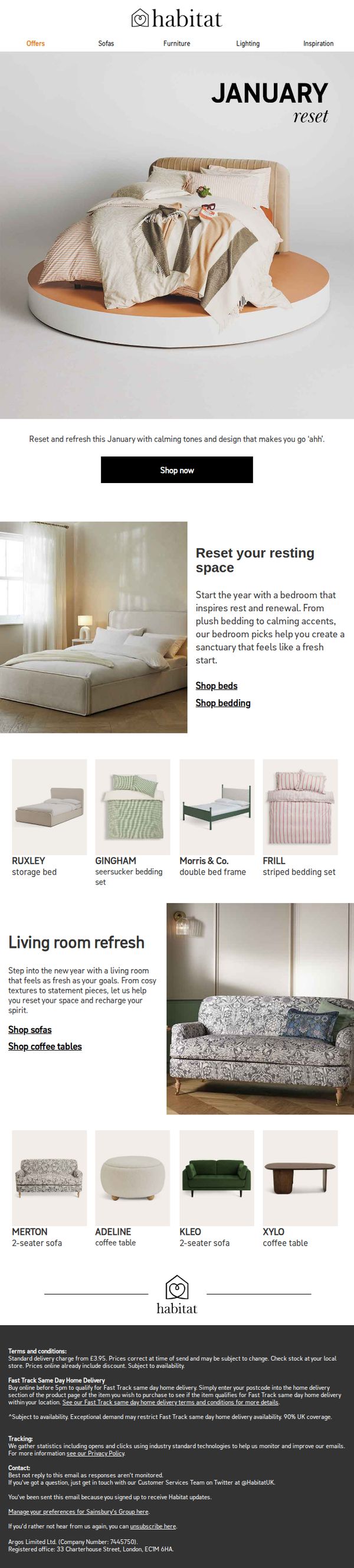
This email aims to inspire customers to refresh their home environments in January by showcasing calming, restful bedroom and living room collections that promote renewal and comfort. It encourages immediate browsing and purchasing through curated product groupings and clear category links.
Why this works
The email brilliantly ties emotional renewal to home design by framing January as a time to reset your space, making the purchase feel like self-care rather than just shopping, which deepens customer connection and justifies spending.
How to implement
By grouping products into themed sections like 'Reset your resting space' and 'Living room refresh,' the campaign simplifies decision-making for overwhelmed customers, guiding them toward complete room transformations instead of isolated item purchases.
Pro Tip
Add a subtle countdown timer or urgency indicator near the 'Shop now' CTA to nudge procrastinators, especially since January resets are time-sensitive and benefit from perceived scarcity to drive faster action. • Include a short customer testimonial or review snippet under the 'Reset your resting space' section to build social proof, seeing real people praise the calming effect of these products would strengthen emotional appeal.
4. Wrap up warm in cosy layers for less
Objective
This email aims to drive immediate purchases of affordable, seasonal outerwear and cozy layers across women’s, men’s, and children’s categories by emphasizing value-driven pricing and timeless style. It positions Tu Clothing as a go-to for budget-friendly, high-quality winter essentials that don’t compromise on comfort or trend.
Why this works
The email brilliantly leverages the phrase 'YES, REALLY.' alongside bold pricing to instantly disarm price skepticism and create a sense of delightful surprise, turning affordability into an emotional selling point rather than just a feature.
How to implement
By segmenting product highlights into distinct gender and age categories with tailored visuals and CTAs, the campaign respects shopper intent and reduces decision fatigue, making it effortless for parents or individuals to find exactly what they need without scrolling endlessly.
Pro Tip
Add a subtle countdown timer or urgency indicator (e.g., 'Limited stock at these prices') beneath the hero section to nudge immediate action, especially since the campaign targets seasonal, weather-driven purchasing behavior. • Include a small testimonial or star rating snippet under each product block, even just 'Rated 4.7/5 by 2K shoppers', to reinforce social proof and reduce perceived risk for first-time buyers of Tu Clothing.
5. Have you seen this yet?
Objective
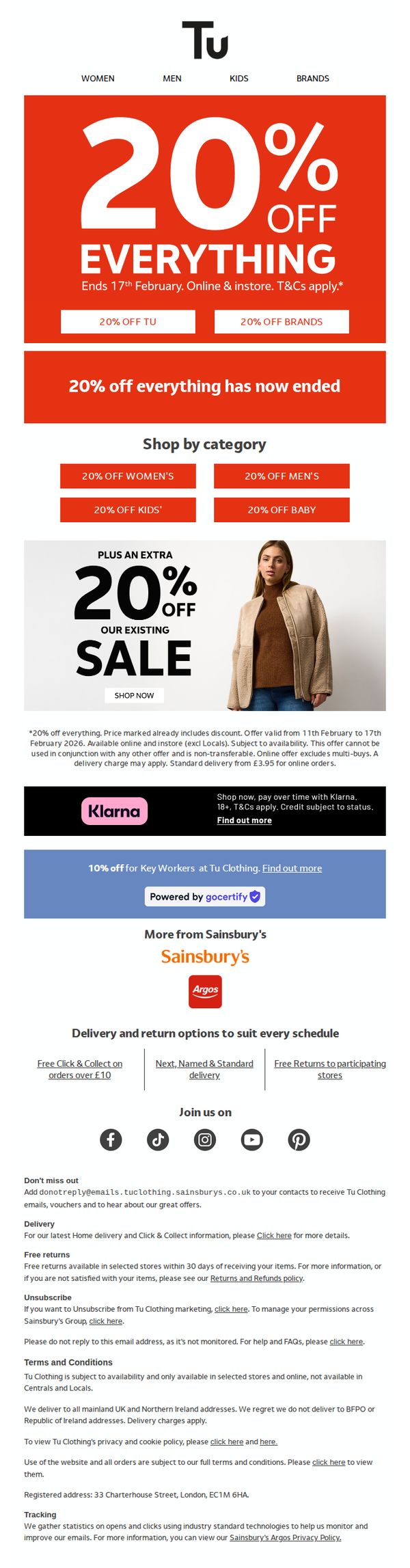
To drive immediate sales by promoting a time-sensitive 20% off everything sale across Tu Clothing, while also encouraging category-specific browsing and highlighting additional discounts for key workers and financing options through Klarna.
Why this works
The email leverages urgency effectively by prominently displaying a bold, red banner with a clear end date, creating immediate FOMO that motivates shoppers to act before the 20% off everything sale expires.
How to implement
By segmenting the offer into categories like Women’s, Men’s, Kids’, and Baby, the campaign personalizes the shopping experience and guides users to relevant sections, increasing the likelihood of conversion through targeted navigation.
Pro Tip
The email states the main 20% off everything sale has ended, which contradicts the headline and creates confusion, this message should be removed or repositioned to avoid undermining the urgency and credibility of the ongoing promotions. • The Klarna and Key Worker discount sections are visually buried below the main offer; they should be elevated or integrated into the hero or category grid to increase visibility and conversion for these high-intent customer segments.
6. This just in: Pieces to elevate every room
Objective
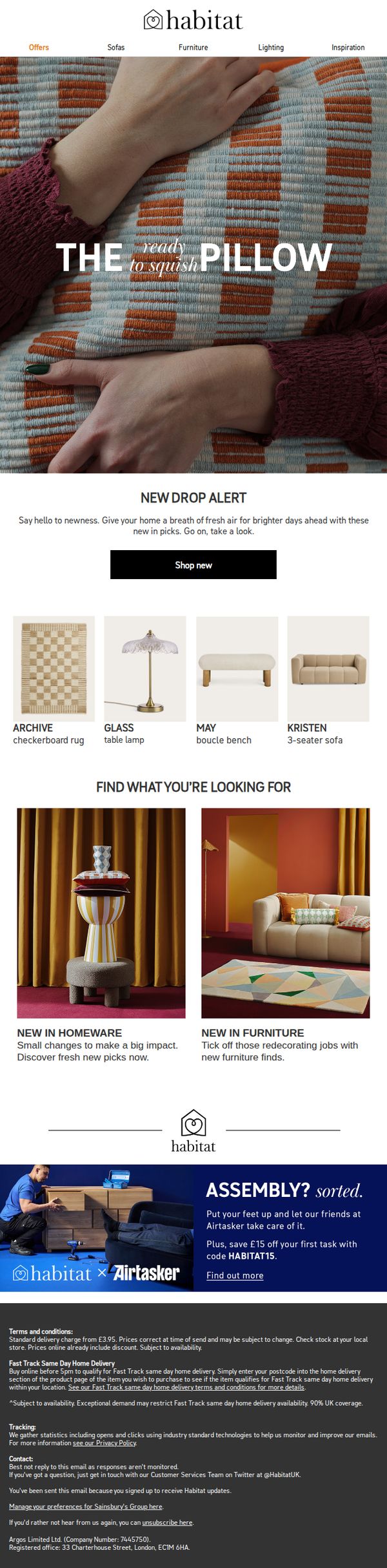
To drive immediate engagement with Habitat’s latest home decor and furniture arrivals by highlighting tactile, trend-led pieces that refresh living spaces. The email aims to convert curiosity into clicks with a clear 'Shop new' CTA and strategic product groupings.
Why this works
The email masterfully uses tactile language like 'ready to squish' to evoke sensory appeal, making inanimate objects feel inviting and emotionally resonant, a subtle but powerful technique to boost desire and reduce purchase hesitation.
How to implement
By splitting the product grid into two distinct categories, 'New in Homeware' and 'New in Furniture', the email guides users through logical shopping paths, reducing decision fatigue and helping them self-segment based on their current renovation or styling goals.
Pro Tip
The hero section’s headline 'THE ready to squish PILLOW' visually dominates but lacks a direct link to the CTA, adding a subtle arrow or hover effect on the pillow image that leads to the 'Shop new' button would strengthen visual flow and reduce friction. • The 'Find what you’re looking for' section uses compelling imagery but doesn’t include direct category links or filters, embedding clickable category headers (e.g., 'Browse Homeware') would improve navigation and reduce bounce rate by guiding users deeper into the funnel.
7. New In! - New year new you with Reaktiv
Objective
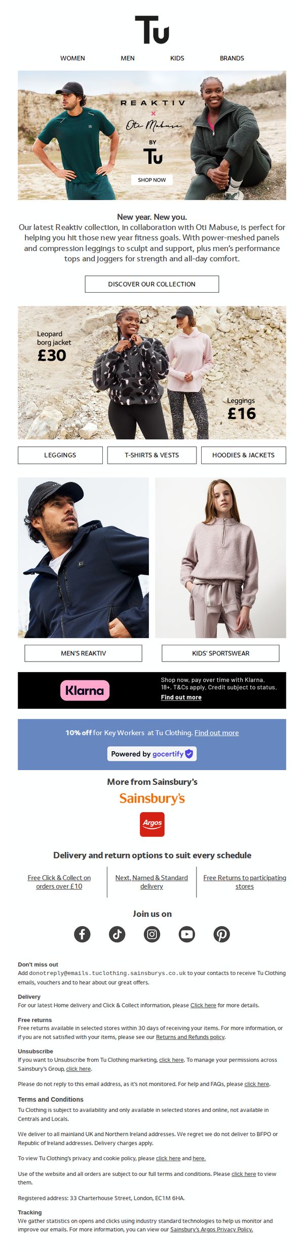
This email aims to drive engagement and sales for Sainsbury’s Tu Clothing Reaktiv collection by highlighting its fitness-focused design and collaboration with Otti Mabuse, encouraging customers to shop the new line for their New Year fitness goals.
Why this works
The email smartly ties the product launch to the New Year mindset by positioning the Reaktiv collection as a tool for achieving fitness resolutions, creating emotional resonance and timely relevance for the audience.
How to implement
By featuring both male and female models in active, natural settings, the campaign visually communicates inclusivity and real-world performance, making the clothing feel aspirational yet attainable for everyday wearers.
Pro Tip
Add a subtle countdown timer near the CTA to create urgency around the new collection launch, especially since New Year motivation peaks early January and fades quickly. • Integrate a short testimonial or quote from Otti Mabuse within the hero section to strengthen the collaboration’s credibility and add a human, motivational voice to the campaign.
8. Snuggle into spring
Objective
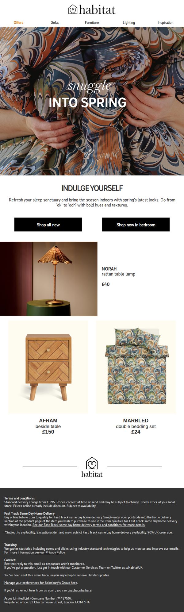
To inspire customers to refresh their bedrooms for spring by showcasing new arrivals with bold colors and textures, encouraging immediate browsing and purchase through clear CTAs and product highlights.
Why this works
The email opens with an emotionally resonant headline, 'snuggle into spring', that transforms a seasonal update into a sensory, comfort-driven experience, making the product feel essential rather than optional.
How to implement
By pairing lifestyle photography with concise product descriptions and pricing, the email creates instant visual appeal while reducing decision fatigue, guiding shoppers effortlessly from inspiration to action.
Pro Tip
Add a subtle countdown timer or limited-availability badge near the 'Shop all new' CTA to create urgency, especially since the email promotes seasonal items that benefit from perceived scarcity. • Include a short customer testimonial or star rating beneath the featured products (like the Marbled bedding) to build social proof and reduce hesitation for first-time buyers.
9. This is not a drill – even more lines 20% off
Objective
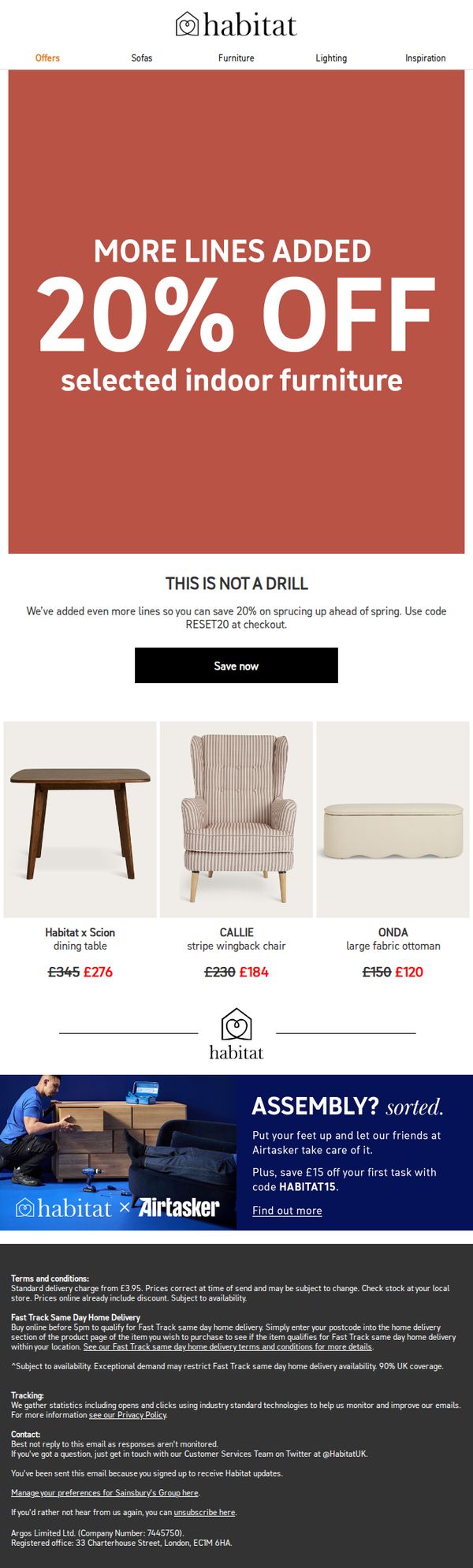
This email aims to drive immediate sales by promoting an expanded 20% discount on selected indoor furniture, encouraging urgency with the phrase 'This is not a drill' and a clear promo code to redeem before spring. It also seeks to reduce friction by offering assembly services through a partnership with Airtasker.
Why this works
The subject line and headline work together to create urgency and intrigue by framing the sale as an unexpected, time-sensitive event, a clever psychological trigger that boosts open rates and immediate engagement.
How to implement
Including specific product examples with crossed-out original prices and bold discount figures visually reinforces value, making the savings tangible and helping customers quickly identify what’s worth buying now.
Pro Tip
Add a countdown timer beneath the 'Save now' CTA to visually reinforce urgency and encourage faster decision-making, especially since the promo code implies limited-time availability. • Include a small 'Most Popular' or 'Bestseller' badge on one or two featured products in the grid to guide indecisive shoppers and highlight social proof within the visual layout.
10. New In Denim – Revamp your style

Objective
To drive traffic and conversions to Tu Clothing’s new denim collection by showcasing versatile styles for women, men, and children, while encouraging exploration through fit guides and exclusive offers for key workers.
Why this works
The email brilliantly positions denim as a lifestyle staple by showing how each piece transitions effortlessly from work to weekend, making it feel indispensable rather than just trendy.
How to implement
By segmenting denim into clearly labeled categories for women, men, and children, the campaign simplifies navigation and speaks directly to diverse household shopping needs without overwhelming the reader.
Pro Tip
Add a subtle countdown timer or urgency indicator near the Key Workers 10% offer to encourage immediate action, since the current static banner lacks time-sensitive motivation. • Reposition the Klarna banner higher, ideally just below the men’s denim CTA, to ensure financing options are visible before users scroll past, increasing conversion potential for higher-ticket items.