Accessories educational email examples & ideas



1. Anya Hindmarch: Book now: Father Christmas at Anya’s Grotto
Objective
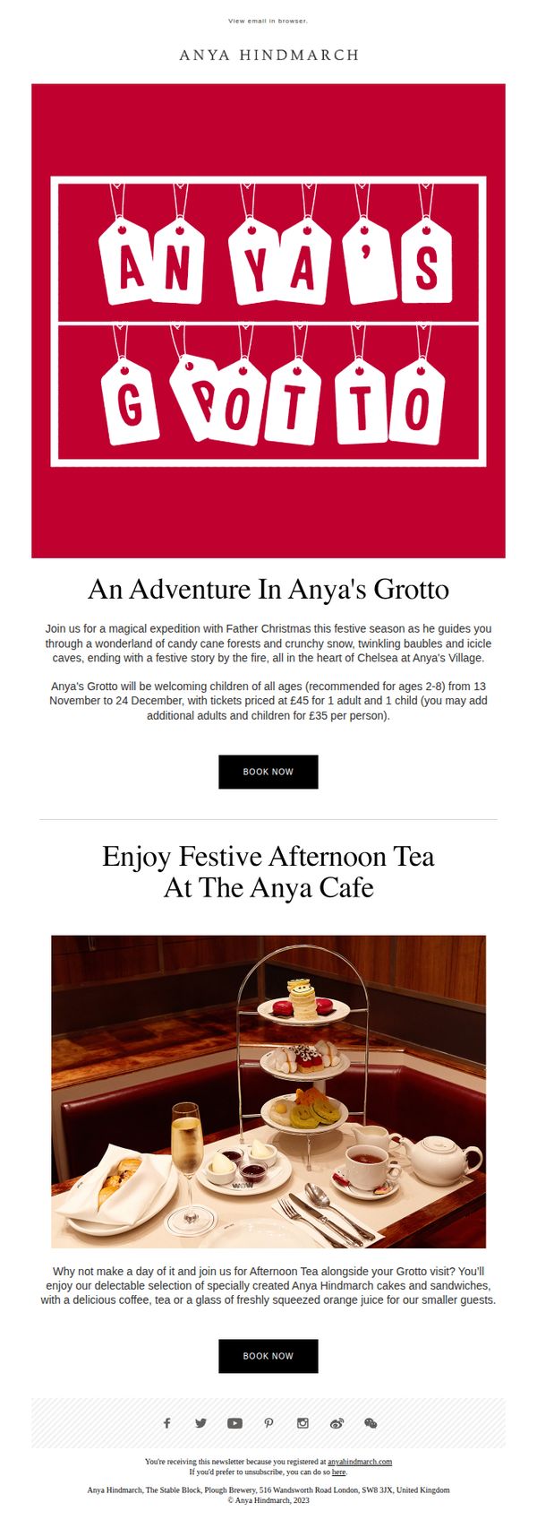
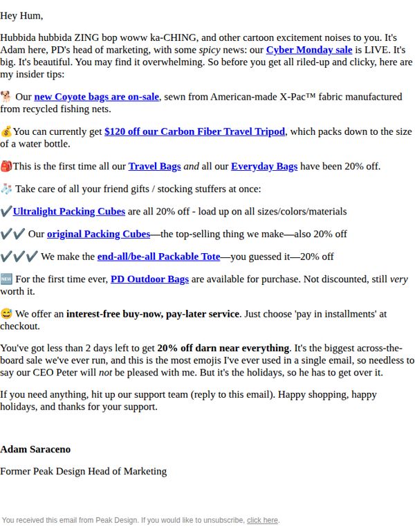
The email aims to drive bookings for a festive family experience at Anya Hindmarch’s Grotto by highlighting a magical, story-driven visit with Father Christmas, while also encouraging guests to extend their outing with a curated afternoon tea at the brand’s café.
Why this works
The email brilliantly frames the Grotto visit as a narrative adventure, complete with candy cane forests and twinkling baubles, transforming a simple photo op into an immersive, emotionally resonant experience that justifies the premium pricing.
How to implement
By pairing the Grotto experience with a branded afternoon tea, the campaign leverages cross-selling not as an afterthought but as a natural extension of the festive journey, encouraging longer stays and higher spend while reinforcing brand luxury through curated culinary moments.
Pro Tip
Add a subtle countdown timer or limited-availability indicator near the CTA to create urgency, since the experience runs for a finite window and tickets are likely to sell out, especially for peak dates. • Include a small testimonial or photo from a past visitor in the Grotto section to build social proof, parents are more likely to book if they see real children enjoying the experience, especially for a premium-priced event.
2. Pela Case: Sustainability Saturday | Climate Doomerism vs Climate Optimism
Objective
This email aims to engage subscribers with curated, uplifting sustainability content while subtly reinforcing Pela’s brand mission of eco-conscious living. It positions the brand as a thought leader by blending education, inspiration, and light product integration without overt sales pressure.
Why this works
The email masterfully balances brand identity with editorial value by presenting itself as a weekly digest rather than a promotional blast, building trust through consistent, non-salesy sustainability storytelling that aligns with its audience’s values.
How to implement
By featuring real-world, actionable eco-tips and recipes alongside thought-provoking reads, the campaign transforms passive readers into active participants in sustainable living, a subtle but powerful way to deepen emotional connection without pushing products.
Pro Tip
Add a subtle visual cue or icon next to each CTA button to indicate the type of content (e.g., shopping cart for product links, book for articles) to improve user intuition and reduce friction in decision-making. • Integrate a micro-CTA or teaser for Pela’s own products within the ‘Read’ or ‘Recipe’ sections, for example, ‘Pair this recipe with our compostable food wraps’, to gently bridge editorial content with brand offerings without disrupting the tone.
3. Peak Design: 🌶️ Cyber Monday: UNLOCKED 🥵
Objective
To drive immediate sales during Cyber Monday by highlighting time-sensitive discounts across multiple product lines while leveraging personal, enthusiastic messaging from the Head of Marketing to build trust and urgency.
Why this works
The email opens with a playful, high-energy tone that mirrors the excitement of Cyber Monday, making the reader feel like they’re getting insider access to a limited-time event rather than just another promotional blast.
How to implement
By listing specific product categories with clear discount percentages and unique selling points, like ‘packs down to the size of a water bottle’, the email turns generic sales into tangible, benefit-driven reasons to buy now.
Pro Tip
Add a visual countdown timer near the top of the email to reinforce urgency and reduce the cognitive load of calculating ‘less than 2 days left’, this would increase conversion by making time pressure more visceral. • Include a small product grid or thumbnail carousel beneath the offer section to visually showcase discounted items, helping users quickly identify what’s on sale without scrolling through text-heavy bullet points.
4. Timberbits: The Craftsman 🪵 Issue #138
Objective
This email aims to engage woodworkers by delivering curated educational content, promoting hands-on classes and gift cards as Father’s Day gifts, and subtly driving product sales through community inspiration and project showcases.
Why this works
The email opens with a culturally resonant woodworking quote that immediately grounds the reader in the brand’s ethos, creating emotional alignment before diving into practical content or offers.
How to implement
By embedding gift card promotions within a Father’s Day context and pairing them with testimonials, the campaign transforms a transactional offer into an emotionally intelligent gifting solution for a specific audience segment.
Pro Tip
The primary CTA 'Shop Now' appears only at the bottom after multiple content sections, reducing conversion urgency; consider adding a sticky or mid-funnel CTA button after the product highlight or gift card section to capture early interest. • The 'Throwback Build' section lacks visual hierarchy, adding a thumbnail image or project preview would increase click-through rates by giving readers a visual reason to engage with the tutorial link.
5. Cult Pens : It's Very Winter - but that means it's Winter Sale time!
Objective
This email aims to drive sales during the winter season by highlighting themed pens and inks with seasonal discounts, while also engaging customers through storytelling and product nostalgia to encourage immediate purchases.
Why this works
The email brilliantly ties product features to seasonal storytelling, like the Benu Baikal Ice pen’s frosty aesthetic, making the discount feel like a natural extension of the winter mood rather than a forced sale tactic.
How to implement
Each product section blends rich narrative with clear discount messaging, such as the Pentel EnerGel’s winter-themed design paired with 20% off, which transforms functional writing tools into emotionally resonant seasonal gifts.
Pro Tip
Add a visual countdown timer near the top of the email to create urgency around the Winter Sale, especially since multiple products mention time-limited discounts but lack a unified deadline cue. • Reposition the 'Tell us your preferences' CTA higher in the email, perhaps after the first 2–3 product sections, to capture user interest while engagement is highest, rather than burying it near the footer.
6. Pela Case: Sustainability Saturday | 3 Ways to Win at Secondhand September

Objective
This email aims to engage subscribers with sustainability-themed content while subtly promoting eco-conscious products and lifestyle choices. It positions Pela as a thought leader in sustainable living by curating tips, recipes, and product highlights that align with Secondhand September and everyday green habits.
Why this works
The email masterfully blends editorial storytelling with product promotion by framing socks as a sustainability conversation starter, making the CTA feel like a natural next step rather than a sales pitch.
How to implement
By anchoring the content to Secondhand September and seasonal themes like back-to-school, the campaign taps into cultural momentum, increasing relevance and encouraging immediate engagement without feeling forced or opportunistic.
Pro Tip
The primary CTA 'SHOP THE SOCKS' appears only once and is buried mid-email; adding a sticky or repeated CTA above the fold and near the footer would improve conversion by reinforcing the action without disrupting the editorial flow. • The 'Recipe' and 'Scroll' sections feel disconnected from the sustainability theme, adding a brief line explaining how quinoa or supporting local artists ties into waste reduction or ethical consumption would strengthen message cohesion and brand alignment.
7. uncommon goods: First look: Valentine's Day gift guide 😍

Objective
To drive early engagement and sales for Valentine’s Day by showcasing curated, unique gift ideas that stand out from traditional options like chocolates. The email encourages immediate browsing through clear category filters and a prominent CTA.
Why this works
The email positions itself as a curator of emotional, personalized experiences rather than just products, making gift-giving feel more meaningful and less transactional for the recipient.
How to implement
By using playful, benefit-driven copy like 'So much better than drugstore chocolates…', the brand creates instant differentiation and emotional appeal that resonates with gifters seeking memorable presents.
Pro Tip
Add a subtle countdown timer near the CTA to create urgency around Valentine’s Day gifting, encouraging faster decision-making without disrupting the clean layout. • Include a short customer testimonial or review snippet beneath 1–2 high-impact products to build social proof and reinforce the emotional value proposition of the gifts.
8. uncommon goods: Actually, it's always 4/20 at The Vibe Shop

Objective
This email aims to drive traffic and sales to The Vibe Shop by celebrating cannabis culture with playful, design-forward products while positioning the brand as a lifestyle destination for relaxed, creative consumers. It encourages immediate browsing with a clear CTA and leverages humor and novelty to stand out in the inbox.
Why this works
The email brilliantly leans into cultural moments with humor and irreverence, turning a niche holiday into a year-round lifestyle brand statement that resonates with its audience’s identity and values.
How to implement
By curating products that blend utility, design, and wit, like CBD bath bombs and cannabis-themed cookbooks, the campaign transforms a potentially polarizing topic into approachable, giftable, and highly shareable content.
Pro Tip
Add a countdown timer or urgency indicator near the CTA to create scarcity around the '4/20' theme, even if it’s not the actual date, this would boost immediate click-through by tapping into FOMO psychology. • Include a short customer testimonial or social proof snippet under the hero section, for example, 'Over 10,000 stoners can’t be wrong', to validate the product selection and reduce perceived risk for new visitors.
9. Baby Bunting: Spend & Save ENDS TOMORROW! 📢

Objective
This email aims to drive immediate sales by creating urgency around the 'Spend & Save' promotion ending tomorrow, encouraging customers to spend more to unlock tiered discounts while showcasing high-value deals across key baby product categories.
Why this works
The email brilliantly leverages tiered discount thresholds to incentivize larger purchases, making customers feel they’re unlocking exclusive value by spending more, which increases average order value without feeling pushy.
How to implement
By prominently featuring ‘ENDS TOMORROW’ in bold, high-contrast typography and repeating the urgency in both the header and footer, the campaign creates psychological pressure that compels immediate action without overwhelming the reader.
Pro Tip
Add a dynamic countdown timer in the hero section to visually reinforce the 'ENDS TOMORROW' urgency, making the deadline feel more immediate and reducing the chance of procrastination. • Include a short testimonial or social proof badge near the top-tier discount (20% off $2500+) to validate the value proposition, especially for high-spending customers who may need reassurance before committing.
10. Métier: Cultural Fix, Autumn
Objective
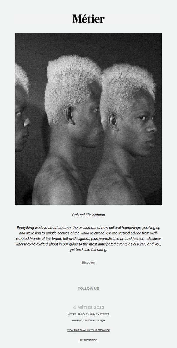
This email aims to re-engage subscribers by curating an autumn cultural guide rooted in art, fashion, and travel, positioning Métier as a tastemaker that helps discerning readers navigate the season’s most meaningful experiences through trusted insider perspectives.
Why this works
Métier brilliantly frames its brand not as a retailer but as a cultural curator, using seasonal storytelling to build emotional resonance and position its audience as insiders who are in the know about the season’s most meaningful artistic moments.
How to implement
By leaning on trusted voices, fellow designers and journalists, the email builds credibility without hard selling, allowing the brand to feel like a well-connected friend sharing exclusive intel rather than a marketer pushing products.
Pro Tip
Add a subtle visual cue or icon next to the 'Discover' CTA to increase click-through, such as a right-pointing arrow or underline animation, since the current text-only link lacks visual hierarchy and may be overlooked in a sparse layout. • Include a teaser line or micro-preview of one highlighted event or destination beneath the main copy to create immediate curiosity and reduce the cognitive load on the reader before they commit to clicking 'Discover'.