Educational email campaign ideas that work for agencies
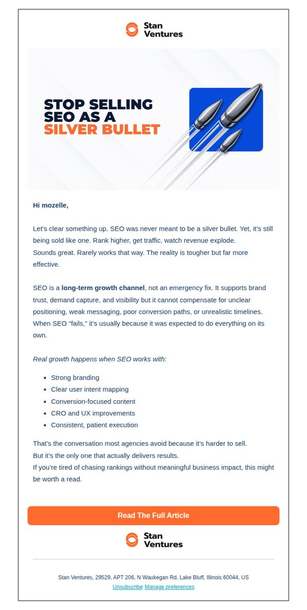


1. Stan Ventures: How to Set Realistic SEO Expectations (and Actually See Results)
Objective
This email aims to reset client expectations around SEO by positioning it as a long-term growth strategy rather than a quick fix, while building trust in Stan Ventures as a transparent, results-driven partner who prioritizes sustainable business outcomes over vanity metrics.
Why this works
The email brilliantly reframes SEO not as a magic solution but as a strategic growth engine that demands alignment with branding, user intent, and conversion architecture, a truth many agencies avoid but clients desperately need to hear.
How to implement
By calling out the industry’s tendency to oversell SEO as a ‘silver bullet,’ the message instantly builds credibility and positions Stan Ventures as a refreshingly honest partner who values long-term client success over short-term sales.
Pro Tip
Add a subtle visual hierarchy or iconography next to each bullet point in the education section to increase scannability and reinforce the importance of each supporting factor for SEO success. • Include a micro-testimonial or client result snippet just above the CTA to bridge the gap between educational content and social proof, making the ‘Read The Full Article’ action feel more outcome-driven and less abstract.
2. Front Row: Front Row Access | What’s Defining Commerce in 2026: Brand Is Back. Measurement Is Mandatory.
Objective
This email aims to position Front Row as a thought leader in commerce strategy by delivering high-value, forward-looking insights to marketers and brand leaders. It encourages engagement with their content while subtly reinforcing their consulting and intelligence services as essential for navigating 2026’s commerce landscape.
Why this works
The email masterfully blends urgency with authority by anchoring its insights in 2026’s commerce realities, making the content feel both timely and indispensable for forward-thinking brand leaders who need to act now to stay ahead.
How to implement
Each insight is framed as a strategic imperative, not just information, creating a subtle but powerful narrative that positions Front Row as the essential guide for brands navigating complex, high-stakes commerce transformations in a post-AMC, post-Shopify world.
Pro Tip
The CTA 'LEARN MORE' is generic and doesn’t reflect the specific value of each insight; tailoring CTAs to each section (e.g., 'Get the 7 Content Tips' or 'See Why AMC Is Now Essential') would increase click-through intent by aligning action with perceived benefit. • The footer’s bright yellow background visually competes with the content above it, creating a jarring transition; softening the contrast or adding a subtle divider would improve flow and keep the reader’s focus on the insights before prompting them to contact or follow.
3. Front Row: Front Row Access | RSVP: The Future of Beauty & Wellness Webinar, and Front Row Acquires Socium Media
Objective
This email aims to position Front Row as a thought leader in beauty and wellness e-commerce by promoting a high-value webinar while simultaneously announcing a strategic acquisition to build credibility and attract potential clients or partners.
Why this works
The email smartly pairs a timely, industry-specific webinar with a strategic acquisition announcement, creating dual value propositions that appeal to both educational and business-minded readers without diluting either message.
How to implement
Using bold yellow headers against a black background creates high contrast and visual urgency, making key sections like 'WEBINAR' and 'PRESS' impossible to miss, a design choice that reinforces brand confidence and message hierarchy.
Pro Tip
Add a countdown timer or limited-seating indicator near the 'REGISTER HERE' CTA to create urgency and increase conversion for the webinar, since the current design lacks time-sensitive motivation. • Include a short testimonial or quote from a past webinar attendee or client in the webinar section to build social proof and reduce perceived risk for new registrants.
4. Shift ONE Digital: 4 days to go - AI-Powered B2B Demand Generation
Objective
This email aims to drive registrations for an upcoming live session on AI-powered B2B demand generation by creating urgency with a 4-day countdown and highlighting strategic value for industrial and tech marketers. It positions Shift ONE Digital as a thought leader while reassuring prospects that AI enhances, not replaces, existing marketing fundamentals.
Why this works
The email brilliantly balances urgency and education by leading with a 4-day countdown while immediately anchoring the value in strategic outcomes, helping B2B teams turn strategy into a consistent pipeline without overhauling what already works, which reduces perceived risk for skeptical marketers.
How to implement
By featuring founder-led credibility and named speakers with clear titles, the campaign builds trust before the CTA, subtly signaling that this isn’t a generic webinar but a high-value, executive-level conversation led by practitioners who understand the real-world friction in long-cycle B2B industries.
Pro Tip
Add a subtle visual indicator, like a progress bar or animated countdown timer, next to the '4 days to go' text to reinforce urgency without increasing cognitive load, leveraging FOMO more effectively than static text alone. • Include a short, one-sentence social proof or stat (e.g., 'Join 1,200+ B2B marketers who’ve optimized their pipeline with AI') near the CTA to reduce friction and boost perceived legitimacy for first-time registrants.
5. Tinuiti: Oh, come all ye waste-ful
Objective
This email aims to position Tinuiti as a thought leader in holiday retail trends by teasing insights from their 2025 study, encouraging marketers to download the full report to stay ahead of evolving consumer behaviors.
Why this works
The email masterfully uses holiday-themed wordplay in the subject line to grab attention while subtly positioning the brand as a diagnostician of retail inefficiencies, making the content feel urgent and relevant to performance marketers.
How to implement
By highlighting three specific, data-backed insights, free shipping’s dominance, tariff-driven deal hunting, and inspiration sources, the email creates immediate perceived value, making the CTA feel like a necessary next step rather than a sales pitch.
Pro Tip
Add a subtle countdown timer or urgency cue near the CTA to increase conversion, since the study is positioned as forward-looking and time-sensitive for strategic planning. • Include a short testimonial or client result snippet near the CTA to build credibility, e.g., 'Brands using these insights saw 22% higher holiday ROAS', to reduce friction for decision-makers.
6. Click&Go HOLIDAYS: 🌞 Summer 2026 + Premium Extra Drinks = Best Holiday Package Alphanitz!

Objective
This email aims to drive immediate bookings for MSC Cruises’ Summer 2026 Mediterranean fly/cruise packages by highlighting premium inclusions, competitive pricing, and family-friendly features while encouraging direct contact with cruise specialists for personalized planning.
Why this works
The email strategically anchors each cruise deal with a clear price point, departure city, and ship name, making it effortless for travelers to compare options and visualize their ideal vacation without needing to click through multiple pages.
How to implement
By prominently featuring the 'Premium Extra Drinks Package' as an upsell at just €33pp per day, the campaign smartly positions a high-margin add-on as an affordable luxury, increasing perceived value while nudging customers toward higher spend without pressure.
Pro Tip
Add a countdown timer or limited-availability badge near the top of the email to create urgency around the Summer 2026 pricing, since early-bird offers are more compelling when framed as time-sensitive rather than static. • Reposition the 'Enquire now' CTA buttons to appear both above and below the price details in each product card to reduce friction, users shouldn’t have to scroll to find the next step after seeing the price.
7. ROAR Digital Marketing : ROAR | Your Resource is Ready to Download
Objective
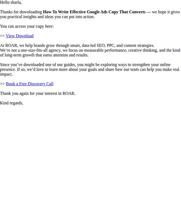
This email aims to thank the recipient for downloading a resource and gently guide them toward booking a discovery call by reinforcing ROAR’s value proposition and positioning the agency as a strategic partner for measurable growth.
Why this works
The email opens with personalized gratitude, immediately validating the recipient’s action and building rapport before transitioning into brand positioning, a subtle but powerful trust-building sequence that keeps engagement high without being pushy.
How to implement
ROAR positions itself not as a generic agency but as a performance-driven partner focused on long-term growth, which reframes the conversation from transactional services to strategic collaboration, a compelling angle for decision-makers evaluating marketing partners.
Pro Tip
Add a brief testimonial or client result snippet after the brand description to substantiate the claim of 'measurable performance' and build credibility before prompting the discovery call. • Include a secondary CTA or visual cue (like a button) next to 'View Download' to reduce cognitive load and increase click-through rates by offering a clearer, more prominent path to access the resource.
8. Brafton: How many keywords to use, according to experts

Objective
This email aims to position Brafton as a thought leader in content marketing by delivering high-value, educational content on SEO strategy and AI-generated content, while encouraging readers to engage further through downloads, video views, and subscription.
Why this works
The email strategically opens with a curiosity-driven subject line and immediately follows up with a clear value proposition, promising expert insights that solve a common SEO dilemma, how many keywords to use, which hooks readers who are actively seeking actionable guidance.
How to implement
By segmenting content into digestible, themed blocks with consistent visual cues and time-to-read indicators, the email reduces cognitive load and empowers readers to choose what’s most relevant to them, increasing the likelihood of engagement without overwhelming the user.
Pro Tip
The primary CTA 'SUBSCRIBE' appears only at the bottom after multiple content blocks, which may reduce conversion; placing a sticky or secondary CTA after the first article section would capture early interest before readers scroll away. • The white paper download CTA is visually underwhelming compared to the surrounding content; enhancing its button design with contrasting color or animation would better signal its value and increase click-through rates.
9. SmartBug Media: Quick Call to Align on Your HubSpot and Digital Service Goals?
Objective
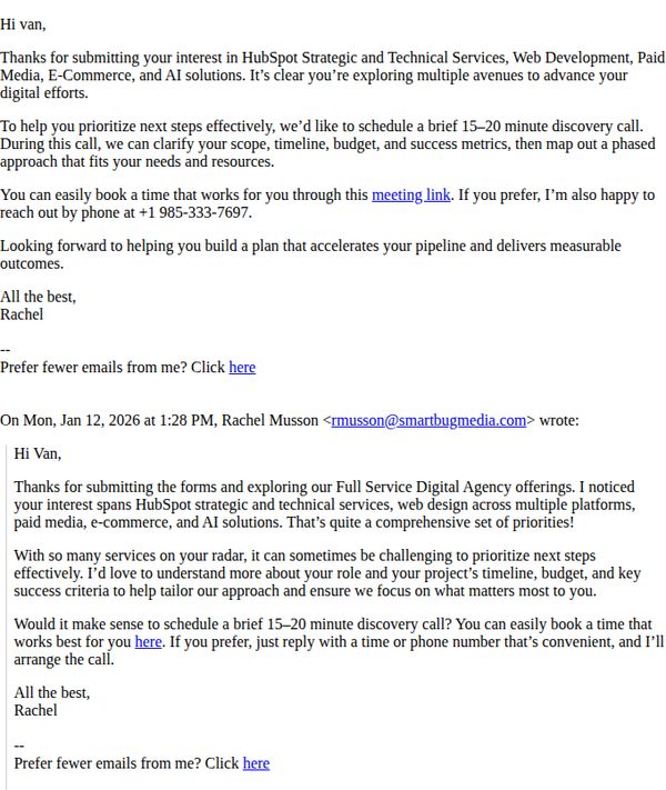
The email aims to convert a lead’s initial interest into a scheduled discovery call by positioning SmartBug Media as a strategic partner who can clarify goals, timelines, and budgets to deliver measurable digital outcomes.
Why this works
The email opens with personalized acknowledgment of the recipient’s specific interests, immediately validating their inquiry and building rapport before introducing the next step, which increases trust and response likelihood.
How to implement
By framing the call as a ‘discovery’ rather than a sales pitch, the message reduces pressure and positions the conversation as collaborative, helping prospects feel safe to explore options without feeling sold to.
Pro Tip
Add a brief bullet-point list under the call-to-action summarizing what the prospect will gain from the discovery call (e.g., ‘Clarify your scope,’ ‘Align budget with goals,’ ‘Define success metrics’) to reinforce value and reduce hesitation. • Include a subtle social proof element, such as ‘92% of clients who complete this call leave with a clear roadmap’, to build credibility and urgency without overwhelming the minimalist tone.
10. Click&Go HOLIDAYS: 🌴 Alphanitz, Beautiful Barbados with direct Aer Lingus Flights 🛫

Objective
This email aims to drive immediate bookings for Barbados holidays by highlighting direct Aer Lingus flights, showcasing appealing hotel options with transparent pricing, and leveraging social proof through Trustpilot ratings and awards to build trust and urgency.
Why this works
The email masterfully combines destination storytelling with practical travel logistics, painting Barbados as a vibrant cultural escape while immediately anchoring it to real flight schedules and pricing to reduce decision friction.
How to implement
By featuring multiple hotel options with clear star ratings, stay durations, and upfront pricing, the campaign empowers users to self-select based on budget and preference without needing to click away or decode hidden costs.
Pro Tip
Add a countdown timer near the CTA to emphasize the limited-time nature of the Aer Lingus direct flight offer, creating urgency that aligns with the 'starting 31st March' message already in the header. • Include a brief comparison table or icon-based differentiator (e.g., ‘Best for Couples’, ‘Family-Friendly’, ‘Luxury Pool Views’) under each hotel to help users quickly identify which option matches their trip goals.