Educational email designs from top Applications brands




1. Calm : 💙 How to beat the holiday blues
Objective
This email aims to help subscribers navigate post-holiday emotional fatigue by validating their feelings and offering science-backed self-care strategies, while gently guiding them toward Calm Premium with time-sensitive discounts and curated content to support mental well-being in the new year.
Why this works
The email opens with emotional validation, acknowledging the 'holiday come down', which instantly builds trust by meeting readers where they are, making the subsequent offer feel like support rather than a sales pitch.
How to implement
Instead of pushing one generic discount, Calm layers multiple value-driven CTAs tied to specific content themes, like 'Mattering' or 'Authenticity', which personalizes the offer and increases relevance for different reader mindsets.
Pro Tip
The 'Calm to the Rescue' section lists multiple content offerings with identical CTAs, which dilutes urgency, consider prioritizing one flagship session with a stronger visual treatment and unique CTA like 'Start Your Healing Journey Today' to guide decision-making. • The Life360 Silver cross-sell is buried near the bottom and lacks visual distinction from other offers, elevate it with a contrasting background or icon to highlight the family-focused value proposition, which could resonate more deeply during post-holiday reflection.
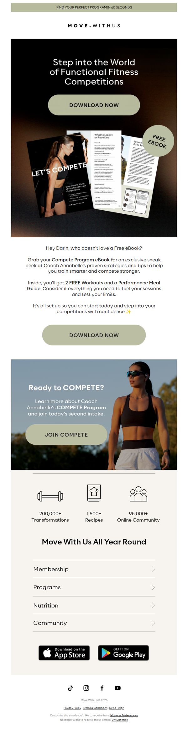
2. Move With Us : Darin, Free eBook? 📚
Objective
This email aims to convert the recipient into a lead by offering a free eBook that teases exclusive training strategies and meal guidance from Coach Annabelle, while subtly promoting enrollment in the COMPETE Program to drive long-term engagement and membership sign-ups.
Why this works
The email brilliantly uses personalization by addressing the recipient by name and framing the free eBook as a tailored gift, which immediately lowers resistance and increases perceived value before the reader even scrolls further.
How to implement
By visually showcasing the eBook’s interior pages with real content snippets like 'What to Expect on Race Day,' the campaign builds instant credibility and curiosity, making the download feel like a sneak peek rather than a generic lead magnet.
Pro Tip
Add a countdown timer or urgency cue near the 'DOWNLOAD NOW' button to nudge immediate action, since the current design lacks time-sensitive motivation despite offering a high-value freebie. • Reposition the 'JOIN COMPETE' CTA to appear immediately after the eBook offer, rather than below it, to capitalize on the momentum of the recipient’s interest before they disengage or scroll away.
3. Calm : 💙 New year, less tired you?
Objective
This email aims to reframe New Year’s resolutions around rest and mental wellness, encouraging users to prioritize self-care through Calm’s subscription and sleep products. It drives conversions by bundling offers with lifestyle content and strategic partnerships.
Why this works
The email brilliantly reframes New Year’s motivation not as hustle but as rest, positioning exhaustion as the real enemy and calm as the solution, which emotionally resonates with burnt-out audiences seeking sustainable change.
How to implement
By integrating tangible product offerings like bedding with digital subscriptions, Calm creates a holistic wellness ecosystem that feels both aspirational and accessible, making the value proposition feel comprehensive rather than transactional.
Pro Tip
Add a visual countdown timer near the 'Claim 40% off now' CTA to create urgency for the limited-time offer, especially since the promotion expires October 8, 2026, this would boost conversion rates by leveraging scarcity psychology. • Reorder the 'Calm to the Rescue' section to appear immediately after the hero offer, placing high-impact content where attention is highest, this strengthens the emotional bridge between problem (exhaustion) and solution (Calm tools).
4. The Gupta Program : How You Can Heal in 2026
Objective
This email aims to inspire recipients to recommit to their healing journey in the new year by promoting the Gupta Program’s premium upgrade, while also driving engagement through live sessions, discovery calls, and an upcoming webinar series, all designed to build trust and convert free trial users into paying members.
Why this works
The email masterfully ties the New Year’s emotional reset to the brand’s core mission, framing healing not as a chore but as a joyful, community-driven journey that begins with intention and daily practice, making the upgrade feel like a natural next step rather than a sales pitch.
How to implement
By spotlighting real coaches with personal stories and credentials, the email builds credibility and relatability, transforming abstract program features into human experiences that resonate emotionally and intellectually, which is especially powerful for audiences navigating chronic health challenges.
Pro Tip
The primary CTA 'Upgrade Now and Start the Year Strong' is buried mid-email; it should be repeated above the fold and again after the webinar section, with a contrasting button color to increase visual hierarchy and conversion urgency. • The discovery call section lacks social proof, adding a short testimonial or stat like '92% of discovery call attendees enroll within 7 days' would reduce perceived risk and strengthen the value proposition for hesitant trial users.
5. MapMyRun : This adaptive golf shoe fits like it was made for your foot
Objective
This email aims to drive immediate purchases of the UA Drive Pro Clone golf shoe by highlighting its custom-fit technology and performance benefits, while cross-promoting the matching UA ArmourDry Polo to increase average order value through lifestyle-aligned product pairing.
Why this works
The email brilliantly anchors the product’s value in athletic performance by featuring Jordan Spieth mid-swing, instantly signaling credibility and elite-level engineering to golfers who care about precision and results on the course.
How to implement
By breaking down technical features like the Adaptive Fit Upper and HOVR™ cushioning into digestible, benefit-driven blurbs paired with close-up visuals, the email transforms complex engineering into tangible, relatable advantages that justify the premium price point.
Pro Tip
Add a subtle countdown timer or limited-availability tag near the CTA buttons to create urgency, especially since the email promotes a specific product with athlete endorsement, scarcity would amplify the perceived exclusivity and drive faster conversions. • Reposition the second CTA 'SHOP ALL GOLF' below the primary 'SHOP NOW' button in the hero section to reduce decision fatigue, users should be funneled first to the hero product before being offered broader exploration options.
6. BetterMe Pilates: Verify your email address →
Objective
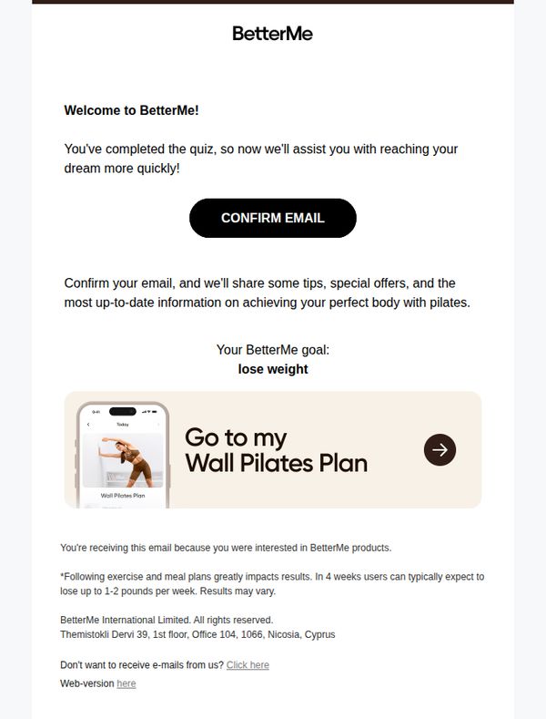
This email aims to confirm the user’s email address after quiz completion, while reinforcing their personal fitness goal and guiding them toward immediate engagement with their customized Pilates plan. It also sets expectations for future value through tips, offers, and progress tracking.
Why this works
The email immediately validates the user’s effort by acknowledging quiz completion, then ties it directly to their personal goal, creating emotional resonance and reducing friction before asking for confirmation.
How to implement
By previewing the user’s custom plan with a mobile screenshot and directional arrow, the email transforms a simple verification step into a teaser for tangible, personalized value they’re about to unlock.
Pro Tip
Add a secondary CTA below the main button, such as 'View My Plan Later', to reduce pressure and accommodate users who aren’t ready to confirm, improving conversion without alienating hesitant subscribers. • Include a brief testimonial or social proof near the goal statement (e.g., '92% of users who confirmed saw results within 4 weeks') to strengthen trust and urgency around email verification.
7. Uber Eats - ES: Enjoy 20% off your next 5 rides
Objective
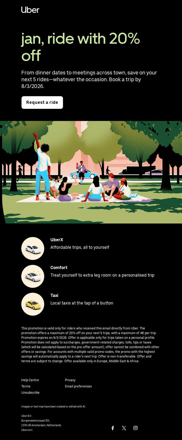
This email aims to incentivize immediate ride bookings by offering a time-sensitive 20% discount on the next five trips, encouraging user engagement and conversion before the 8/3/2026 deadline.
Why this works
The email brilliantly anchors urgency and value by front-loading the 20% discount with a clear expiration date, making the offer feel exclusive and time-sensitive without overwhelming the reader with fine print upfront.
How to implement
By visually pairing the promotion with a warm, social park scene, the campaign emotionally connects the discount to real-life moments, dinner dates, meetings, and casual hangs, making the savings feel like an enabler of lifestyle, not just a transactional perk.
Pro Tip
Add a small countdown timer or 'Offer expires in X days' badge near the CTA to amplify urgency visually, since the current text-based deadline may be overlooked in fast-scrolling behavior. • Reposition the fine print disclaimer above the product grid or as a collapsible 'Terms' toggle, currently buried below the ride options, it risks undermining trust or causing confusion after the user has already engaged with the offer.
8. Grubhub: Reminder: 30% off three orders

Objective
This email aims to re-engage users by reminding them of an expiring promotional offer, 30% off three grocery orders, while encouraging immediate action through a clear, benefit-driven CTA. It also reinforces brand trust by clarifying terms and highlighting zero delivery fees on eligible orders.
Why this works
The email brilliantly combines urgency and value by anchoring the discount to a specific number of orders (three), making the benefit feel tangible and time-sensitive without relying on artificial countdowns.
How to implement
By prominently featuring both the 30% discount and $0 delivery fees together, the campaign removes two major friction points for grocery shoppers, price and convenience, making the offer feel like a complete win.
Pro Tip
Add a subtle countdown timer near the CTA to heighten urgency, since the offer expires on 1/25/26 but the email doesn’t visually communicate how much time remains, this could significantly boost conversion rates. • Include a mini testimonial or social proof near the hero section, such as 'Over 50,000 users saved $30+ last week,' to build credibility and reduce perceived risk for new or hesitant users.
9. Move With Us : Darin, can we take your order? 🥡

Objective
The email aims to re-engage the recipient by offering free, dietitian-created 'fakeaway' recipes as a fun, guilt-free alternative to drive-thru meals, while subtly promoting the broader Move With Us platform and its nutrition-focused community.
Why this works
The email brilliantly reframes unhealthy cravings as an opportunity for creative, guilt-free satisfaction by offering dietitian-approved 'fakeaway' recipes, turning temptation into a win for health goals without sacrificing flavor or fun.
How to implement
By using playful emoji interaction as the gateway to free recipes, the campaign transforms a simple CTA into an engaging, gamified experience that boosts curiosity and participation while reinforcing the brand’s approachable, human-centered tone.
Pro Tip
Add a countdown timer or urgency cue near the 'UNLOCK MORE RECIPES' CTA to create scarcity and encourage immediate action, especially since the offer is framed as a limited-time or exclusive perk for engaged users. • Include a brief testimonial or user quote under the recipe offer section to reinforce credibility, for example, a short line like 'I lost 20lbs without giving up pizza, thanks to these fakeaway recipes!' to humanize the benefit.
10. Uber: 40% off, or a long walk?
Objective
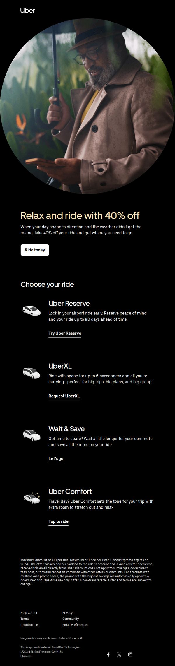
The email aims to drive immediate ride bookings by offering a time-sensitive 40% discount, positioning Uber as a convenient solution when plans change or weather disrupts travel. It encourages users to act now by highlighting ride options that match different needs and moods.
Why this works
The subject line creates urgency and humor by contrasting a valuable discount with the unpleasant alternative of walking, instantly framing the offer as a no-brainer for anyone caught off guard by changing plans or weather.
How to implement
The hero section pairs a relatable visual of a man checking his phone in the rain with a clear, benefit-driven headline that ties the discount to emotional relief, turning a transactional offer into a moment of comfort and control.
Pro Tip
Add a countdown timer near the CTA to reinforce urgency, since the offer expires on 2/1/26 but the email doesn’t visually communicate time sensitivity beyond fine print. • Include a short testimonial or social proof near the hero section, such as '92% of riders who used this discount said they’d book again', to build trust and reduce hesitation before the user scrolls to ride options.