Banking & Finance educational email designs from top brands
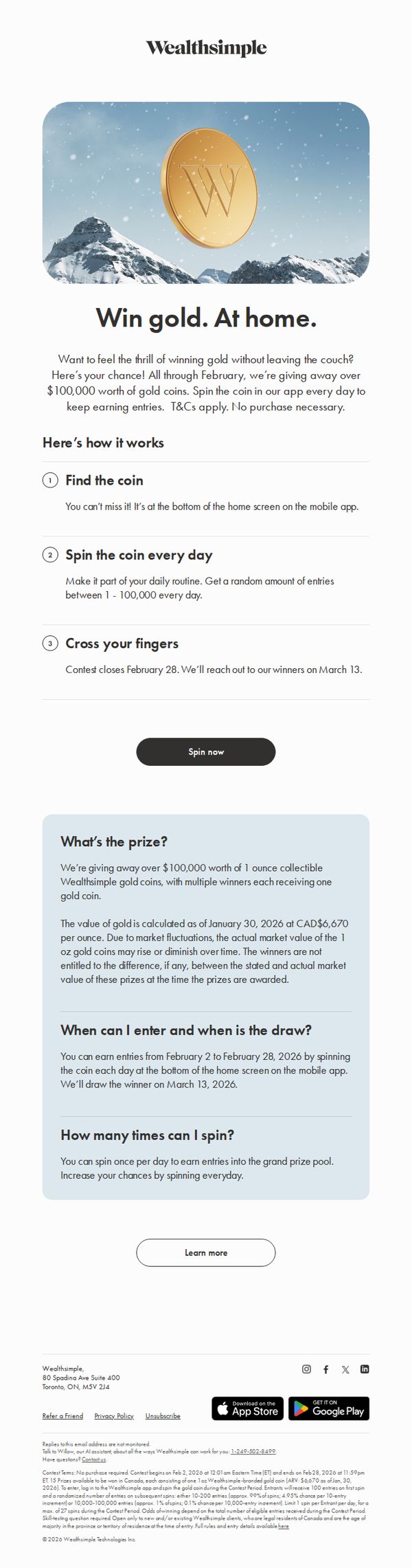




1. Wealthsimple: Win gold. At home.
Objective
This email aims to drive daily engagement with the Wealthsimple mobile app by incentivizing users to spin a virtual coin for a chance to win physical gold coins, thereby increasing app retention and brand excitement during February.
Why this works
The campaign brilliantly turns passive app usage into an addictive daily ritual by gamifying engagement with a tangible, high-value reward, gold coins, that feel luxurious and rare, making users feel like they’re playing for real stakes without spending a dime.
How to implement
By anchoring the contest to a specific, time-bound window in February and clearly explaining the three-step process with numbered simplicity, Wealthsimple reduces friction and cognitive load, making participation feel effortless and urgent without overwhelming the reader with fine print.
Pro Tip
Add a visual progress bar or counter showing how many entries the user has accumulated so far, which would increase daily return rates by tapping into loss aversion and gamified momentum, currently, users have no feedback on their standing. • Include a micro-testimonial or social proof element near the CTA, such as 'Over 12,000 users spun yesterday' or a quote from a past winner, to reduce perceived risk and boost FOMO by showing real people are already playing and winning.
2. Investopedia: AI Chip Giant Nvidia Is Set to Report Earnings—What Investors Need to Know
Objective
This email aims to inform subscribers about Nvidia’s upcoming earnings report while driving engagement through a curated list of timely, high-interest financial articles. It positions Investopedia as a trusted source for market-moving insights and personal finance strategy.
Why this works
The email leads with a high-impact, time-sensitive headline about Nvidia’s earnings to immediately capture investor attention, leveraging FOMO and market relevance to boost open and click-through rates.
How to implement
Each article preview pairs a compelling, question-driven headline with a relatable lifestyle image and a consistent 'READ MORE' CTA, creating visual rhythm and reducing cognitive load for skimmers while encouraging deeper engagement.
Pro Tip
Add a subtle visual hierarchy to the hero section, such as a slightly larger font or accent color on the Nvidia headline, to reinforce its priority status and guide the eye before users scroll to the article grid. • Include a brief 1–2 sentence teaser under the Nvidia headline (e.g., 'Analysts predict record revenue, here’s what to watch for') to increase perceived urgency and reduce the need to click just to understand the stakes.
3. Investopedia: Stock Indexes Rebound Behind Chip, Bank Shares
Objective
To inform subscribers of the latest market movements and financial insights while driving engagement through article clicks. The email positions Investopedia as a trusted, timely source for post-market analysis and forward-looking financial guidance.
Why this works
The email opens with a high-impact headline that immediately signals market relevance, anchoring readers with a timely, data-driven hook that speaks directly to investor curiosity and urgency.
How to implement
Each article preview pairs a provocative, question-based or problem-solving headline with a compelling image, creating visual-textual synergy that boosts click-through intent without overwhelming the reader.
Pro Tip
Add a visual hierarchy to the CTA buttons, such as color contrast or size variation, to guide attention toward top-performing or time-sensitive articles, improving conversion focus without cluttering the layout. • Insert a brief editorial note or curator’s comment above the first article to humanize the content, explain why this roundup matters today, and subtly reinforce Investopedia’s editorial authority.
4. MoneySavingExpert: 13mths' FREE travel + mobile + breakdown cover, free Lidl doughnut, £240k marriage saving, cheap drugs, 10% off Morrisons shop for NHS, £120 window vac for £55
Objective
This email aims to deliver high-impact, time-sensitive money-saving opportunities across banking, insurance, prescriptions, and retail to help readers immediately reduce household expenses and maximize value. It positions MoneySavingExpert as the essential weekly resource for savvy financial decisions.
Why this works
The email brilliantly front-loads its most compelling offers, like free insurance bundles and prescription savings, using bold headlines and urgent language to immediately capture attention and drive action before readers scroll away.
How to implement
By structuring complex financial products into simple, color-coded comparison tables with clear eligibility rules and step-by-step how-to instructions, the campaign transforms overwhelming choices into confident, actionable decisions for even novice savers.
Pro Tip
The primary CTA 'Act NOW to get Warm Home Discount' is buried mid-email and visually underwhelming; it should be moved above the fold with a contrasting button design to match the urgency of the offer and improve conversion. • The 'Revealed: The tricks medicine firms use...' section, while informative, disrupts the flow of actionable deals; consider relocating it to a dedicated 'Education Section' at the end to maintain momentum for immediate savings.
5. Investopedia: Super Bowl Sunday's Big Winners? The Seattle Seahawks—and Prediction Markets
Objective
To engage subscribers with timely, curiosity-driven financial news tied to cultural moments like the Super Bowl, while reinforcing Investopedia’s authority on market trends and personal finance topics. The email aims to drive article clicks and sustain daily newsletter readership.
Why this works
By linking the Super Bowl to prediction markets, Investopedia cleverly taps into pop culture to make complex financial concepts feel relevant and accessible, drawing in casual readers who might otherwise skip market analysis.
How to implement
The email uses high-impact headlines that blend entertainment and economics, like Bad Bunny’s net worth or Olympic medal values, to create emotional hooks that encourage immediate clicks without sacrificing educational value.
Pro Tip
Add a short teaser paragraph under the hero headline explaining why prediction markets matter beyond sports, this would deepen context and convert casual interest into intentional learning. • Introduce a personalized section such as 'Based on your reading history, you might like…' to increase relevance and click-through rates by leveraging subscriber behavior data.
6. Chase: The Know: In Focus

Objective
This email aims to position J.P. Morgan Wealth Management as a trusted, educational resource by delivering a customizable digest of high-value financial insights tailored to subscriber interests, encouraging deeper engagement through content consumption and account interaction.
Why this works
The email brilliantly segments content by life-stage and financial goal, like retirement, taxes, and family planning, making complex topics feel personally relevant and reducing cognitive load for readers overwhelmed by generic finance advice.
How to implement
Each article preview pairs a compelling headline with a clear time commitment and a visual metaphor, which builds trust by setting expectations and subtly signaling that the content is digestible, not dense, even for busy professionals.
Pro Tip
The 'Meet Wealth Plan' section lacks visual hierarchy and emotional pull, adding a short customer testimonial or a benefit-driven subhead like 'See your full financial picture in minutes' would strengthen the value proposition before the CTA. • The footer’s legal disclaimers and compliance text are overly dense and visually overwhelming; breaking them into collapsible sections or using icons with tooltips would improve readability while maintaining regulatory compliance.
7. Investopedia: Major Indexes End Sharply Lower Amid Tariff Uncertainty, AI Disruption

Objective
To inform subscribers of key market movements and economic developments with timely, digestible summaries that drive engagement and reinforce Investopedia’s authority in financial news. The email aims to encourage readers to click through for deeper analysis while maintaining daily relevance.
Why this works
The email leverages urgency and topical relevance by leading with market-moving headlines like tariff uncertainty and AI disruption, immediately signaling value to time-sensitive investors seeking context in volatile conditions.
How to implement
Each article snippet pairs a compelling, question-driven headline with a relevant image and a consistent 'READ MORE' CTA, creating a visually balanced, scannable rhythm that guides the reader through diverse topics without overwhelming them.
Pro Tip
Add a visual hierarchy to the CTA buttons, such as varying size or color for the top 2–3 articles, to guide attention toward the most time-sensitive or high-impact stories, improving click-through rates without cluttering the layout. • Integrate a brief 'Why This Matters' sub-headline beneath each main headline to immediately convey the personal or portfolio-level relevance, helping readers quickly prioritize which articles to engage with based on their interests.
8. Investopedia: Stocks Post Worst Week of 2026 as Tech Jitters Trump Encouraging Inflation, Jobs Reports

Objective
To inform subscribers about key market developments and economic trends following a volatile week, while reinforcing Investopedia’s role as a trusted source for timely, digestible financial news and analysis.
Why this works
The email strategically opens with a high-impact market headline to immediately capture attention, then balances urgency with educational value by linking to deeper analysis, which builds trust without sensationalism.
How to implement
Each article teaser pairs a concise, curiosity-driven headline with a relevant, high-quality image and a consistent 'READ MORE' CTA, creating a clean, scannable rhythm that encourages exploration without overwhelming the reader.
Pro Tip
Add a brief, bolded summary sentence beneath the main headline to immediately clarify the market’s direction and key drivers, helping time-pressed readers grasp the takeaway before deciding whether to click. • Introduce a subtle visual hierarchy, such as a 'Top Story' badge or slightly larger image for the lead article, to guide attention and reflect editorial importance, reducing cognitive load in a content-dense layout.
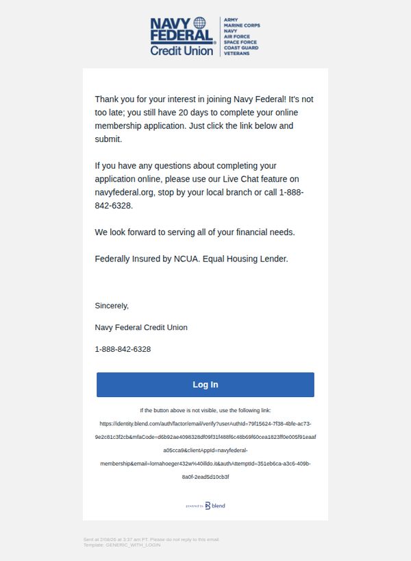
9. Navy Federal Credit Union: Continue your Navy Federal membership application
Objective
This email aims to re-engage prospective members who started but haven’t completed their Navy Federal Credit Union application, reminding them they have 20 days left to finish and encouraging immediate action through a clear login link.
Why this works
The email creates urgency without pressure by clearly stating the 20-day window remaining, which motivates action while still feeling supportive and customer-centric rather than pushy.
How to implement
Including multiple support channels, Live Chat, phone number, and branch visit, builds trust by showing the brand is accessible and ready to assist applicants at any point in their journey.
Pro Tip
Add a brief progress indicator or visual cue (e.g., 'You’re 70% done!') to remind users how close they are to completion, which can significantly boost conversion by reducing perceived effort. • Include a short testimonial or member benefit highlight (e.g., 'Join 10,000+ service members who saved $500+ in their first year') to reinforce value and social proof right before the CTA.
10. MoneySavingExpert: 'Grab the last 4.5%+ savings fix this year', £55 off groceries, 20 mobile savers, Fix mortgage now?, Amazon £5 off

Objective
This email aims to drive immediate action on time-sensitive financial deals, especially high-interest savings accounts, while delivering a broad mix of money-saving tips across mobile, insurance, groceries, and mortgages to position MoneySavingExpert as the go-to authority for smart personal finance decisions.
Why this works
The email masterfully combines urgency with authority by leading with a time-bound savings fix while backing it with Martin Lewis’s analysis, making readers feel they’re acting on insider intelligence rather than just another promo.
How to implement
It leverages a ‘tip-of-the-iceberg’ structure, each numbered mobile tip is self-contained yet invites deeper exploration, creating a scroll-driven journey that keeps users engaged without overwhelming them with dense financial jargon.
Pro Tip
The primary CTA 'Grab the last 4.5%+ savings fix this year' is buried mid-email; move it above the fold with a sticky banner or bold hero section to capture attention before users scroll past the urgency trigger. • The mobile masterclass section, while rich in detail, lacks visual hierarchy, break up the 21 tips with icons, collapsible accordions, or a 'Top 3 Quick Wins' summary to reduce cognitive load and increase scannability for time-poor readers. • The savings rate graph is informative but static; add a micro-CTA beneath it like 'See which banks still offer 4.5%+' with a direct link to the comparison tool to turn passive data into an actionable next step.