Food educational email examples & ideas
1. Sunbasket: Are you getting enough protein?
Objective
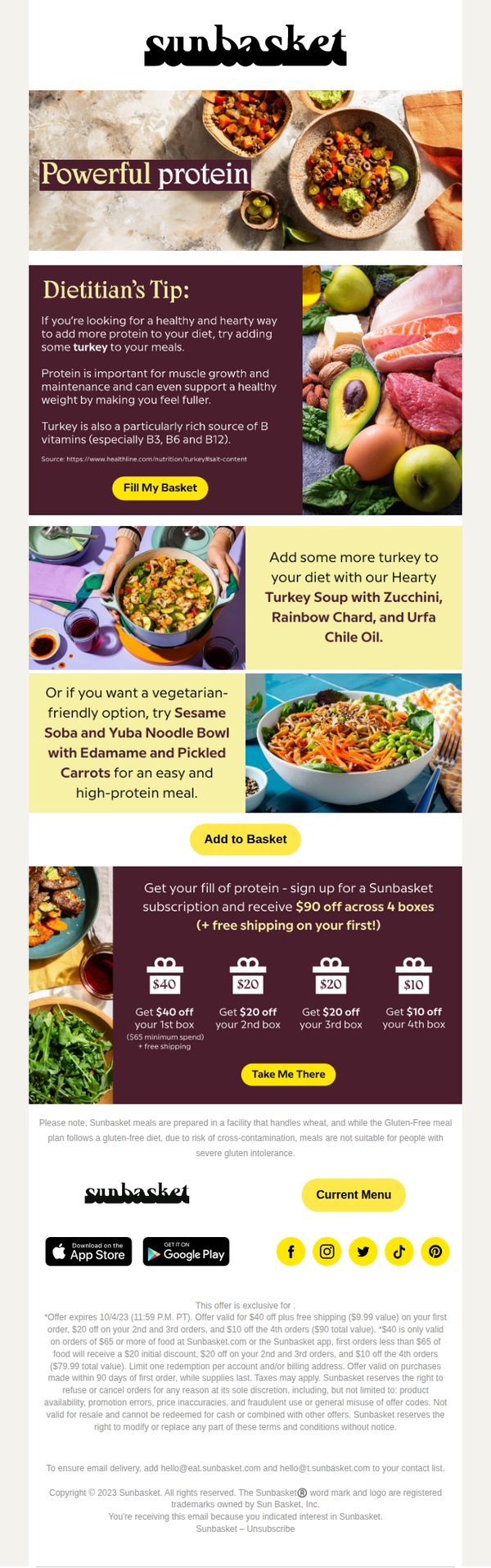
To encourage recipients to increase their protein intake by highlighting turkey-based and plant-based meal options, while incentivizing subscription sign-ups with a tiered discount offer across four boxes.
Why this works
The email smartly bridges nutritional education with product promotion by positioning turkey as a protein-rich, satiating ingredient backed by a dietitian’s tip, making the pitch feel trustworthy and health-focused rather than salesy.
How to implement
By offering a tiered discount across four boxes, the campaign reduces perceived risk for new subscribers while encouraging repeat engagement, turning a one-time trial into a longer-term relationship with escalating value.
Pro Tip
The primary CTA 'Take Me There' lacks specificity, replacing it with 'Start My Protein-Powered Subscription' would better align with the email’s educational theme and clarify the user’s next step. • Adding a small visual progress bar or countdown timer near the offer section would create urgency, especially since the offer expires 10/4/23, helping to nudge hesitant subscribers toward immediate action.
2. GODIVA: Happy National Siblings Day!
Objective
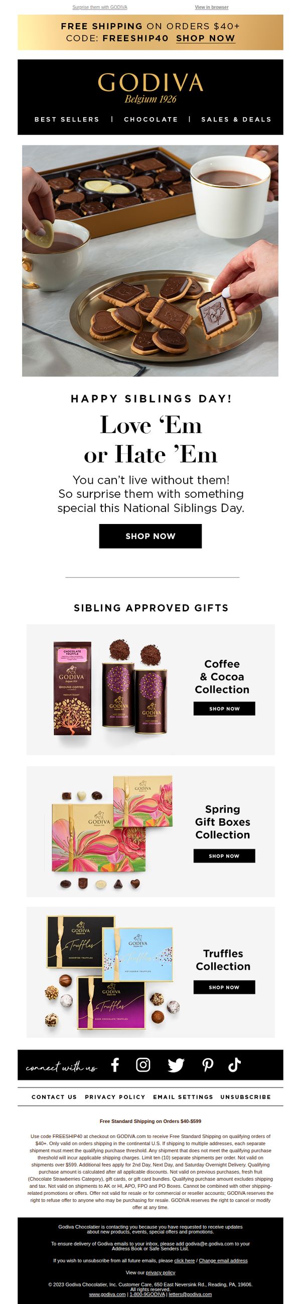
This email aims to drive sales by encouraging recipients to celebrate National Siblings Day with Godiva gifts, leveraging emotional connection and urgency through a holiday-themed offer. It positions chocolate as the perfect peace offering or token of affection for siblings, regardless of relationship dynamics.
Why this works
The email brilliantly taps into the emotional complexity of sibling relationships with the line 'Love ‘Em or Hate ‘Em', turning potential awkwardness into a relatable, humorous reason to gift chocolate, which makes the offer feel both personal and universally applicable.
How to implement
By curating themed gift collections like 'Sibling Approved Gifts' and naming them with seasonal or emotional hooks, Godiva transforms generic product grids into story-driven shopping experiences that reduce decision fatigue and increase perceived relevance for the holiday occasion.
Pro Tip
Add a subtle countdown timer or urgency indicator near the 'SHOP NOW' CTA in the hero section to reinforce the time-sensitive nature of the National Siblings Day offer and nudge procrastinators toward immediate action. • Include a short testimonial or user-generated photo in the 'Sibling Approved Gifts' section, even a single line like 'My brother cried (happy tears!) when I sent him these truffles', to build social proof and emotional validation for gift-givers.
3. Wildgrain: Wildgrain is your secret Thanksgiving hack 🤫
Objective
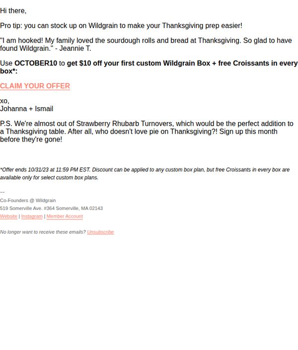
This email aims to drive immediate sign-ups for Wildgrain’s custom bread box by positioning it as a time-saving Thanksgiving prep solution, while creating urgency with a limited-time discount and product scarcity.
Why this works
Positioning the product as a 'secret hack' for a high-stakes holiday instantly frames it as a clever, insider solution rather than just another food delivery, making it feel indispensable to busy hosts.
How to implement
Pairing a customer testimonial with a specific holiday use case builds social proof that’s emotionally resonant and contextually relevant, helping readers visualize their own Thanksgiving success with the product.
Pro Tip
The CTA 'CLAIM YOUR OFFER' is visually underwhelming and lacks urgency, consider bolding it, adding a button-style background, or including a deadline like 'Ends 10/31' to reinforce time sensitivity. • The email lacks a visual hero section or product imagery, adding a photo of the bread box or a Thanksgiving table styled with Wildgrain items would strengthen emotional appeal and product desirability.
4. Huel: The truth about ultra-processed foods
Objective
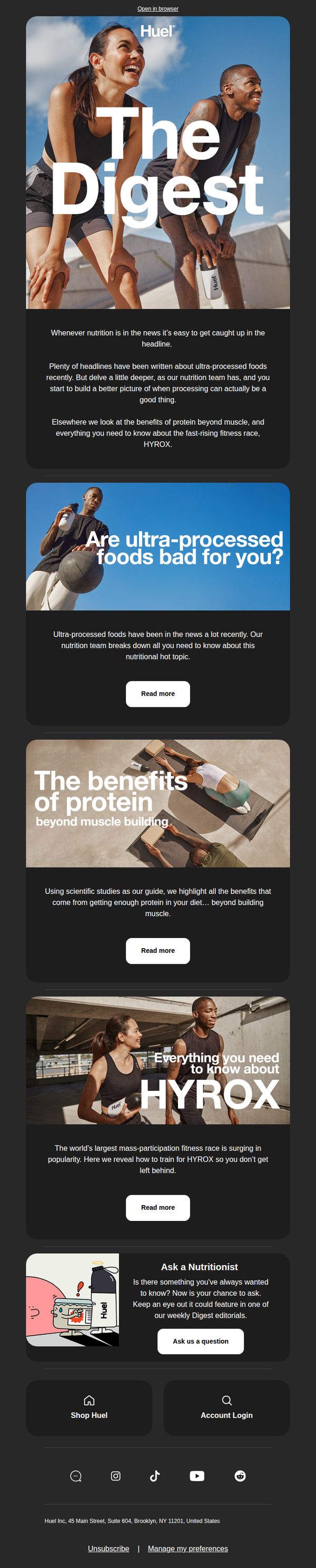
This email aims to educate subscribers on misunderstood nutrition topics, particularly ultra-processed foods, protein benefits, and HYROX training, while positioning Huel as a trusted, science-backed authority in functional nutrition. It subtly drives engagement through content rather than direct sales.
Why this works
Instead of pushing a product, this email leads with curiosity-driven education, addressing controversial topics like ultra-processed foods to build trust and position Huel as a thought leader, not just a seller.
How to implement
Each content block uses a strong, benefit-focused headline paired with a concise teaser and a consistent 'Read more' CTA, creating a clean, scannable rhythm that encourages deeper engagement without overwhelming the reader.
Pro Tip
Add a subtle product tie-in beneath each 'Read more' CTA, e.g., 'Huel’s plant-based protein supports these benefits', to gently connect educational content to the brand’s offerings without disrupting the editorial tone. • Include a visual progress indicator or 'You’re 3/5 articles into your nutrition IQ boost' micro-motivator to gamify content consumption and increase scroll depth, especially since the email relies on sequential engagement.
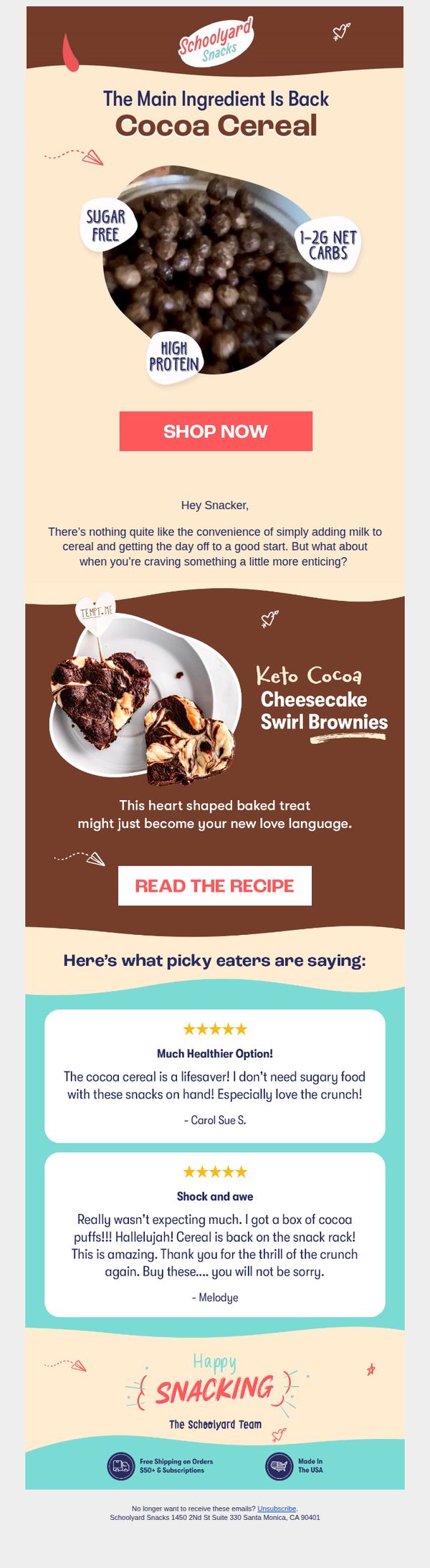
5. Schoolyard Snacks: Sweeten up your Valentines Day with this pro tip 🚨
Objective
To drive immediate purchases of Cocoa Cereal by positioning it as a versatile, indulgent Valentine’s Day treat while highlighting its health benefits and social proof from satisfied customers.
Why this works
The email brilliantly reframes a breakfast staple as a romantic, crave-worthy dessert by pairing Cocoa Cereal with heart-shaped brownies, turning functional nutrition into emotional indulgence without compromising on health claims.
How to implement
By featuring real customer testimonials that emphasize surprise and delight, especially phrases like 'lifesaver' and 'thrill of the crunch', the campaign builds authentic social proof that resonates more deeply than generic praise or star ratings alone.
Pro Tip
Add a time-sensitive element like 'Valentine’s Day Special: Ends Feb 14' near the CTA to create urgency and encourage faster conversions, especially since the subject line implies a limited-time pro tip. • Include a small visual cue or icon next to the 'READ THE RECIPE' button, such as a tiny heart or spoon, to better signal its purpose and increase click-through by reducing cognitive friction for recipe-curious users.
6. Wildgrain: One week left to order for Christmas!
Objective
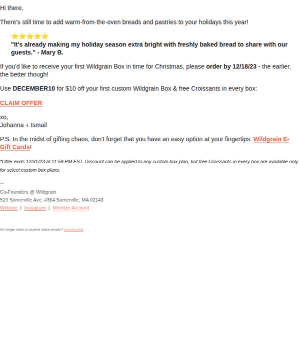
This email aims to create urgency for holiday gifting by reminding recipients they have one week left to order Wildgrain’s freshly baked breads and pastries in time for Christmas, while incentivizing first-time buyers with a discount and free croissants.
Why this works
The email leverages time-sensitive urgency by anchoring the deadline to a specific holiday milestone, Christmas, making the offer feel personally relevant and emotionally resonant for gift-givers during a high-stakes season.
How to implement
Including a customer testimonial with a name and star rating adds social proof that feels authentic and trustworthy, subtly validating the product’s appeal without overwhelming the reader with sales language.
Pro Tip
Add a visual countdown timer or bold deadline banner near the CTA to reinforce urgency more dynamically, since the current text-based deadline may be overlooked in a cluttered inbox. • Include a small product image or icon next to the offer to visually anchor the value proposition, readers may not immediately associate 'custom box' with tangible, appealing baked goods without visual cues.
7. The Ferm: Celebrate the Year of the Horse! 🐴
Objective
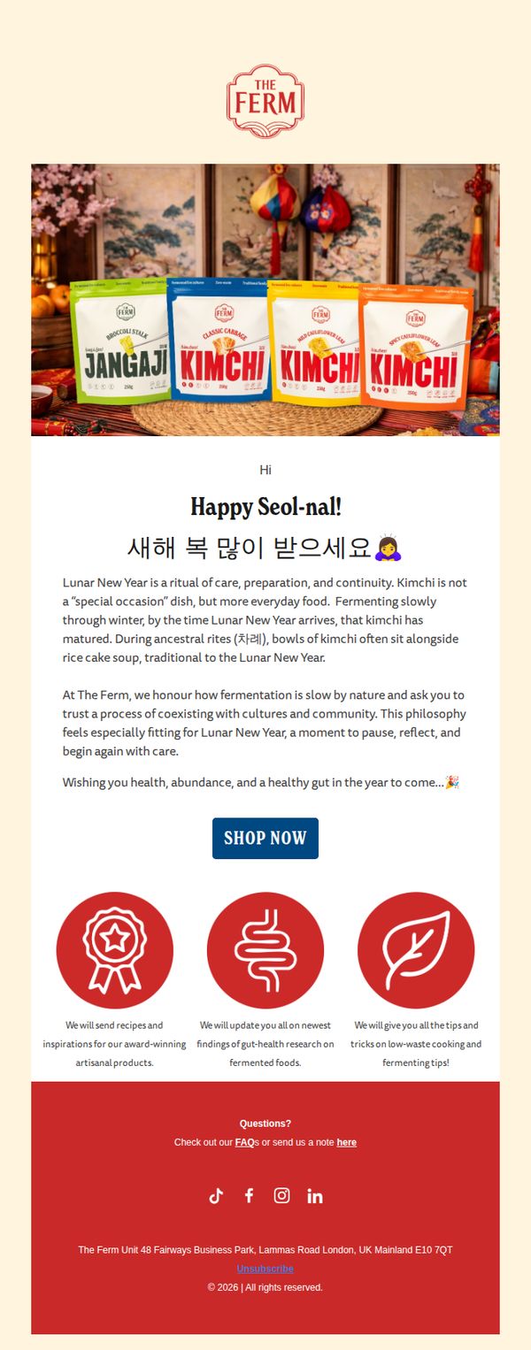
This email aims to celebrate Lunar New Year by connecting The Ferm’s fermented products to cultural traditions, while gently encouraging purchase through emotional storytelling and a clear call to action. It positions kimchi as a meaningful, everyday ritual rather than a seasonal novelty.
Why this works
By framing kimchi as a ritual of care rather than a festive gimmick, the email elevates the product’s cultural relevance and invites customers to see fermentation as a mindful, year-round practice that aligns with their values.
How to implement
The email masterfully blends tradition with modern wellness by linking ancestral rites to gut health research, creating a compelling narrative that positions The Ferm not just as a food brand, but as a thoughtful companion in holistic living.
Pro Tip
Add a subtle countdown timer or limited-time offer language near the CTA to create urgency without undermining the email’s calm, ritualistic tone, for example, 'Celebrate with us, available through Seol-nal weekend only.' • Include a small visual cue or icon next to the 'SHOP NOW' button, such as a shopping bag or horse emoji, to reinforce the Lunar New Year theme and subtly guide the eye toward conversion without disrupting the serene aesthetic.
8. Brightland: Guide to October Produce 🍂

Objective
This email aims to inspire seasonal cooking by highlighting October’s freshest produce and pairing it with a featured recipe that showcases Brightland’s olive oil, subtly driving product consideration and recipe engagement.
Why this works
The email masterfully blends seasonal education with product integration by first celebrating October’s harvest through illustrated produce, then naturally pivoting to a recipe that positions Brightland’s olive oil as the essential ingredient for autumnal flavor.
How to implement
By featuring a visually rich, plated recipe photo followed immediately by the required product, the email creates a seamless narrative that connects culinary inspiration to purchase intent without feeling transactional or forced.
Pro Tip
Add a secondary CTA beneath the recipe image, such as 'Shop All Fall Recipes', to capture users who may want more inspiration before committing to a single dish or product. • Include a brief testimonial or user-generated photo near the recipe section to build social proof and reinforce that real customers are enjoying this dish with Brightland oil.
9. Huel: Too old to get fit? Think again 🏃
Objective
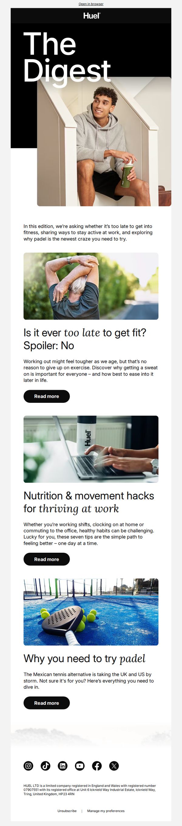
This email aims to inspire older adults to embrace fitness by debunking age-related myths and offering practical, accessible wellness tips, all while subtly positioning Huel as a supportive nutrition partner for active lifestyles at any age.
Why this works
The email opens with a bold, emotionally resonant question, 'Too old to get fit?', that immediately grabs attention by addressing a common fear, then instantly reframes it with a confident, empowering spoiler: 'No,' making the reader feel seen and motivated to keep reading.
How to implement
Each article preview pairs a relatable visual with a concise, benefit-driven headline and subhead, creating a snackable, scannable experience that respects the reader’s time while promising tangible value, whether it’s fitness after 50, workplace wellness, or trying a new sport.
Pro Tip
Add a subtle product tie-in or CTA variation under each 'Read more' button, such as 'Pair this routine with Huel’s balanced nutrition', to gently bridge educational content with conversion without disrupting the editorial tone. • Include a short testimonial or user quote under one of the article previews (e.g., from someone over 50 who started fitness with Huel) to add social proof and humanize the message, reinforcing that the advice is not just theoretical but lived and validated.
10. Huel: The spooky special: Halloween recipes & more 🎃
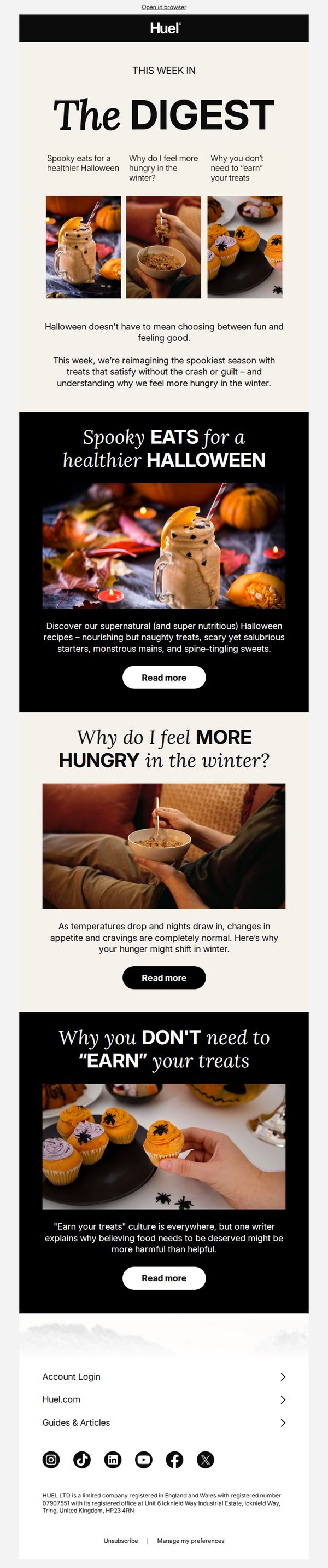
Objective
This email aims to engage subscribers during Halloween by offering themed, nutritious recipes while subtly reinforcing Huel’s brand message that healthy eating doesn’t require sacrifice, even during indulgent seasons. It also seeks to educate readers on seasonal hunger patterns and challenge guilt-driven food culture.
Why this works
By tying Halloween treats to nutrition and emotional well-being, Huel reframes indulgence as empowerment, making healthy choices feel festive rather than restrictive, which builds brand affinity without alienating seasonal excitement.
How to implement
The email cleverly uses seasonal curiosity, like why hunger increases in winter, to position Huel as a thoughtful, science-backed lifestyle partner, not just a meal replacement, thereby deepening subscriber trust through educational content.
Pro Tip
Add a subtle product tie-in in the 'Spooky EATS' section, for example, 'Made with Huel Powder' under the recipe image, to gently convert interest into consideration without disrupting the educational tone. • Include a small visual indicator like a seasonal badge or Halloween-themed icon next to each 'Read more' button to reinforce the campaign theme and improve visual cohesion across sections.