Educational Health email gallery from real brands




1. Cool Crutches: It's World Mental Health Day 🌱
Objective
This email aims to honor World Mental Health Day by sharing authentic, community-driven tips for emotional wellbeing while subtly reinforcing the brand’s mission that mobility aids can empower confidence and joy. It seeks to build emotional connection before guiding readers toward products that support comfort and self-expression.
Why this works
By anchoring the campaign in World Mental Health Day, the brand transforms a product-focused message into a human-centered narrative that validates the emotional experience of living with disability, making the audience feel seen before being sold to.
How to implement
Featuring real community members with personal quotes and social handles builds authentic social proof, turning customer stories into relatable, emotionally resonant content that fosters trust and belonging far more effectively than generic testimonials.
Pro Tip
Add a subtle countdown timer or urgency cue near the product grid to encourage immediate action, since the emotional narrative builds goodwill but lacks a time-sensitive nudge to convert that sentiment into purchases. • Include a short FAQ or ‘Why This Matters’ blurb beneath the ‘comfort = confidence’ section to explicitly connect each product’s design features (e.g., grip, weight, style) to the mental health benefits mentioned earlier, strengthening the value proposition.
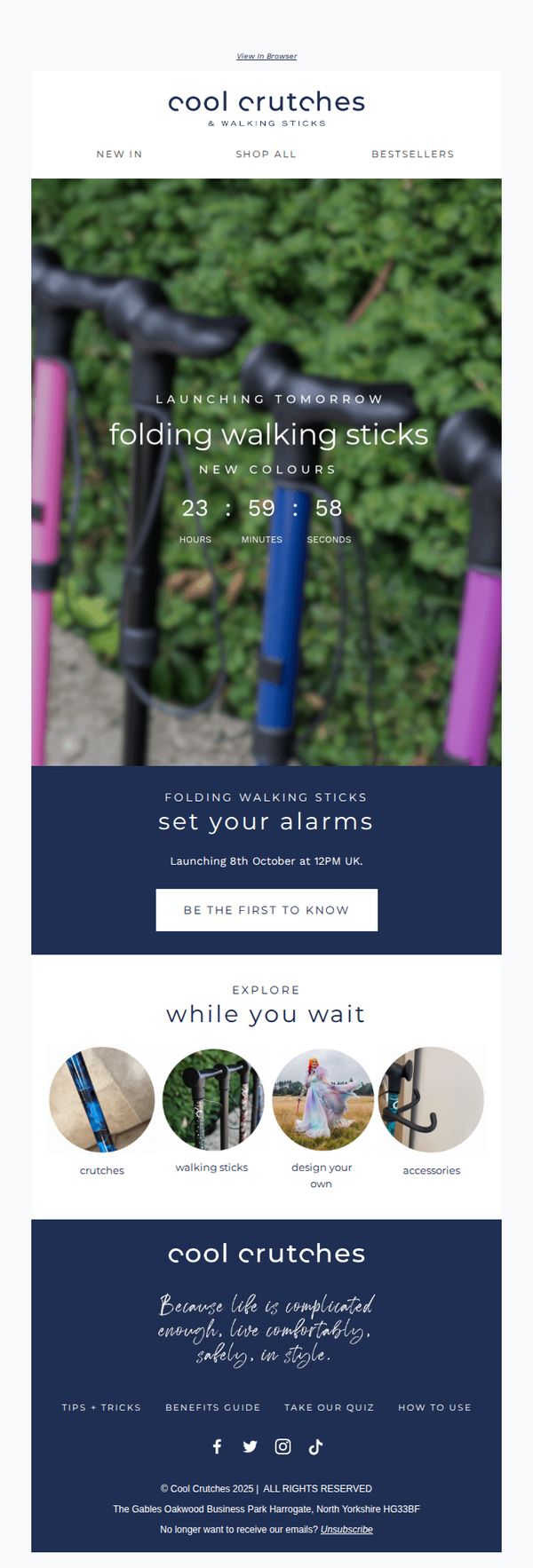
2. Cool Crutches: LAUNCHING TOMORROW ✨ Folding Walking Sticks
Objective
This email aims to build anticipation and drive early engagement for the launch of Cool Crutches’ new folding walking sticks by creating urgency with a countdown and encouraging subscribers to be the first to know when the product goes live. It also subtly promotes exploration of related products while reinforcing brand identity.
Why this works
The email masterfully uses a real-time countdown to create FOMO around the product launch, turning passive subscribers into active participants by framing the event as exclusive and time-sensitive, which boosts open-to-action conversion potential.
How to implement
By embedding a clean, circular product grid labeled 'Explore While You Wait,' the campaign turns waiting time into a discovery opportunity, subtly cross-selling related items without disrupting the launch narrative or overwhelming the reader.
Pro Tip
Add a brief teaser visual or bullet point under the countdown explaining what makes these folding walking sticks unique, such as portability, weight capacity, or design innovation, to strengthen the value proposition before the CTA. • Include a micro-copy line near the CTA like 'Get early access + 10% off for first 50 buyers' to incentivize immediate action and convert curiosity into pre-launch sign-ups, enhancing the urgency already created by the countdown.
3. Bayer : Finerenone approved in Japan for treatment of patients with chronic heart failure
Objective
This email aims to inform healthcare professionals and stakeholders about the regulatory approval of finerenone in Japan for chronic heart failure patients with LVEF ≥40%, positioning Bayer as a leader in cardiovascular innovation and reinforcing confidence in the drug’s clinical value.
Why this works
Bayer strategically anchors its message in clinical authority by citing the New England Journal of Medicine and ESC Congress 2024, lending credibility to finerenone’s approval and subtly positioning it as a gold-standard therapy in a crowded market.
How to implement
The email effectively segments its audience by explaining heart failure subtypes (HFrEF, HFmrEF, HFpEF) with clear LVEF thresholds, ensuring medical professionals immediately recognize the drug’s precise therapeutic niche and relevance to their patient populations.
Pro Tip
Add a visual timeline or infographic in the Education Section to illustrate finerenone’s global approval journey and Phase III trial milestones, helping readers quickly grasp the drug’s development trajectory and market expansion. • Include a short patient impact quote or statistic near the CTA to humanize the data, e.g., 'This approval could benefit over 1.2 million Japanese patients living with HF and LVEF ≥40%', to strengthen emotional resonance and urgency.
4. Beyond Organic Doctors: Post Holiday “Detox Mandate”
Objective
This email aims to convert post-holiday readers into attendees of a webclass by framing detox as a scientifically backed, immune-boosting necessity rather than a fad, positioning it as the critical first step to unlocking sustainable weight loss and metabolic renewal for the new year.
Why this works
The email brilliantly reframes detox not as a trendy diet but as a cellular-level immune upgrade, using scientific language about white blood cells in belly fat to lend credibility and urgency to an otherwise saturated wellness topic.
How to implement
By anchoring the offer to post-holiday weight gain, a universal experience, the message creates instant relatability while positioning the webclass as the essential corrective action, making the CTA feel less like a sales pitch and more like a necessary health intervention.
Pro Tip
Add a visual countdown timer or scarcity indicator near the CTA to create urgency, since the email positions the webclass as time-sensitive for ‘2026 body transformation’, yet currently lacks any temporal pressure to drive immediate sign-ups. • Insert a short video thumbnail or animated GIF preview of one of the experts speaking to humanize the offer and build trust before the click, especially since the email relies heavily on authority claims without visual proof of expertise.
5. Bayer : Bayer confirms 2025 Group outlook, progresses on strategic priorities
Objective
This email aims to inform investors and stakeholders that Bayer has confirmed its 2025 financial outlook while highlighting progress across its strategic divisions, reinforcing confidence in its operational resilience and long-term growth trajectory despite market and litigation headwinds.
Why this works
Bayer strategically frames its financial performance not just as numbers, but as evidence of operational resilience and divisional momentum, turning complex earnings data into a narrative of controlled progress amid external volatility.
How to implement
The email smartly isolates each business division’s performance with clear subheadings and concise bullet-style summaries, allowing investors to quickly scan and digest performance drivers without getting lost in dense financial prose.
Pro Tip
Add a visual summary graphic or mini dashboard above the key data tables to highlight top-line metrics (e.g., EBITDA growth, free cash flow) for faster comprehension, especially for time-constrained investors skimming the email. • Reposition the 'Read the full quarterly statement' CTA higher in the email, perhaps after the executive quote, to capture attention before readers scroll past, increasing click-through to the detailed report.
6. Cool Crutches: Love a bit of colour? So do we! 💓

Objective
This email aims to celebrate self-expression and confidence through vibrant pink mobility aids, encouraging customers to shop curated pink collections and personalize their own crutches or walking sticks. It ties into February’s theme of love and self-love to emotionally connect with users who want to stand out with pride.
Why this works
The email brilliantly frames mobility aids not as medical necessities but as fashion-forward tools of self-expression, using pink as a symbol of confidence and joy to emotionally resonate with users who want to feel seen and stylish.
How to implement
By featuring real customers in diverse settings, from gyms to gardens, the campaign normalizes and celebrates visibility, turning what could be a sensitive topic into an empowering, inclusive movement that invites users to join a community of proud, colorful individuals.
Pro Tip
Add a subtle countdown timer or limited-edition badge near the 'Shop the Edit' CTA to create urgency around the pink collection, especially since the campaign is tied to February’s theme, which naturally has a time-bound emotional hook. • Include a short video or animated GIF in the 'Design Your Own' section showing the customization process in action, this would reduce friction for users unfamiliar with the tool and increase conversion by making the experience feel more tangible and fun.
7. Cool Crutches: Confidence In Colour! 15% off continues… 💕

Objective
This email aims to drive immediate sales by extending a Black Friday discount while reinforcing the brand’s mission of combining comfort with stylish, confidence-boosting mobility aids. It targets customers seeking both function and fashion in adaptive equipment.
Why this works
The email brilliantly frames medical mobility aids as fashion-forward lifestyle products by using emotionally resonant language like 'built for confidence' and 'find your shade,' transforming a functional purchase into a self-expression opportunity that appeals to identity and empowerment.
How to implement
By showcasing crutches in real-life, aspirational settings, from garden paths to dance studios, the campaign visually dismantles stigma and positions the product as a tool for living fully, not just surviving, which builds emotional connection before the customer even considers price.
Pro Tip
Add a countdown timer near the hero section or offer banner to create urgency around the Black Friday discount, since the current design implies the sale is ongoing without a clear end date, which may reduce immediate conversion pressure. • Include a short testimonial or user quote under the hero section to build social proof, for example, 'I never thought I’d look forward to using crutches until I found Cool Crutches', to validate the emotional promise of confidence and style.
8. Cool Crutches: 💛 Are you getting all the support you’re entitled to? Your disability benefits, explained simply.

Objective
This email aims to educate recipients about disability benefits they may be entitled to while positioning Cool Crutches as a trusted resource for mobility support. It also encourages engagement through a downloadable guide, a mobility quiz, and a giveaway to drive traffic and build brand loyalty.
Why this works
The email opens with a deeply empathetic question, 'Are you getting all the support you’re entitled to?', which immediately resonates with the audience’s emotional and practical needs, making the content feel personally relevant rather than promotional.
How to implement
By pairing a free, valuable resource (the Disability Benefits Guide) with a warm, human sign-off from 'Amelia,' the brand builds trust and positions itself as a compassionate advisor, not just a retailer, which strengthens long-term customer relationships.
Pro Tip
The CTA 'DOWNLOAD THE GUIDE' is visually underwhelming, consider increasing its size, adding a subtle hover animation, or using a contrasting accent color to make it stand out more against the dark background and improve click-through rates. • The product grid at the bottom lacks context, add a short benefit-driven headline above each category (e.g., 'Crutches for All-Day Comfort' or 'Walking Sticks That Match Your Style') to reinforce value and encourage clicks without requiring extra scrolling.
9. Beyond Organic Doctors: Automatic Nail Trimmers / Ingrown Toenail Treatment / Nail & Toenail Softener

Objective
This email aims to drive immediate sales by promoting a limited-time discount on a curated selection of nail and ingrown toenail care products, targeting customers seeking professional-grade, pain-free solutions for foot health and grooming.
Why this works
The email strategically leads with a time-sensitive discount and promo code to create urgency, immediately signaling value and encouraging quick decision-making before the offer expires.
How to implement
Each product is presented with a clear visual, benefit-driven headline, and concise copy that speaks directly to pain points, like pain-free trimming or ingrown nail relief, making it easy for readers to self-identify with the solution.
Pro Tip
Add a countdown timer near the top to visually reinforce the urgency of the limited-time discount, which could increase conversion by creating real-time pressure to act. • Include a short testimonial or customer rating beneath each product to build social proof, especially since many of these are medical-grade tools that benefit from third-party validation.
10. Cool Crutches: BOO 👻 FREE UK & IE shipping starts now - spooky!!

Objective
This email aims to drive immediate sales by promoting a limited-time Halloween-themed offer of free UK & Ireland shipping, while also showcasing new seasonal products and encouraging first-time buyers with an additional discount code.
Why this works
The email brilliantly ties seasonal urgency to a functional benefit, free shipping, by using Halloween visuals and spooky copy to make a practical offer feel festive and time-sensitive, which boosts emotional engagement without sacrificing clarity.
How to implement
By featuring real customers in styled, thematic photos under 'Spotted: Spooky Sightings,' the brand builds social proof while reinforcing its identity as a lifestyle accessory, not just a medical device, which helps destigmatize and elevate the product category.
Pro Tip
The hero section’s CTA button is visually buried beneath the promo code text; repositioning or enlarging the 'SHOP NOW' button would improve conversion by making the primary action more immediately visible and clickable. • The 'Explore Our Collections' section uses circular thumbnails that lack descriptive labels or hover states, which may confuse users; adding clear text labels or interactive cues would improve navigation and reduce friction for users exploring product categories.