The complete educational email collection for healthcare services
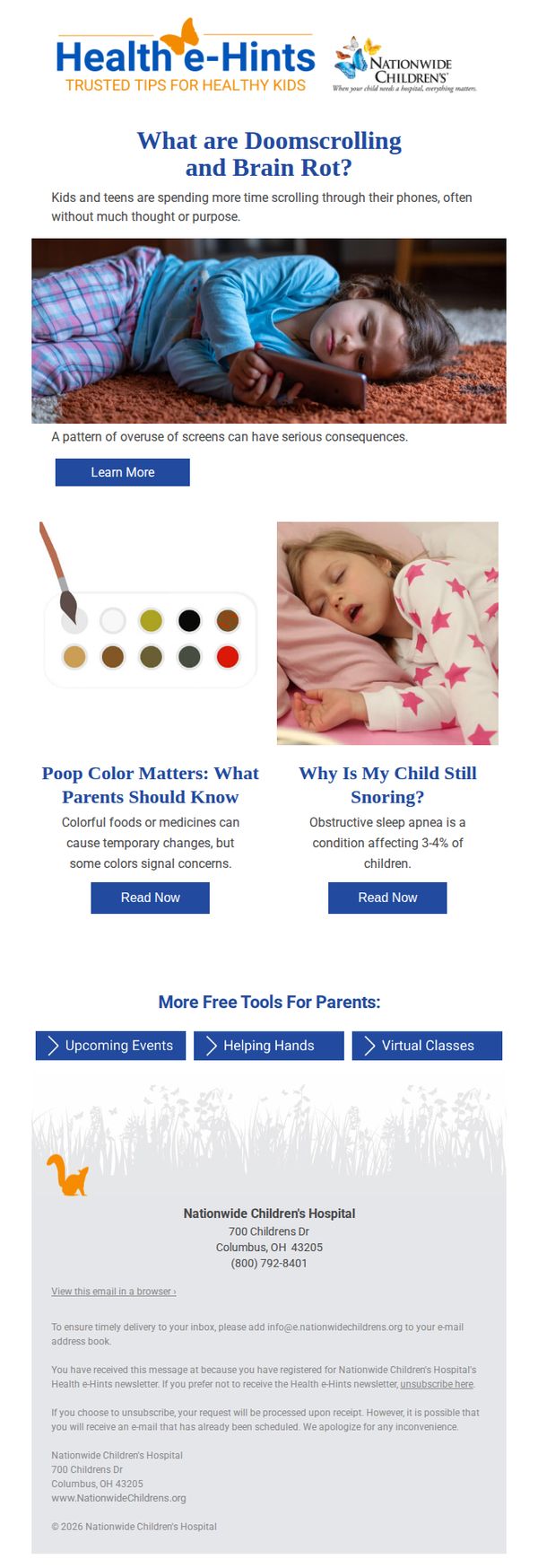


1. Nationwide Children's : Your child & your phone
Objective
This email aims to educate parents about the health risks associated with excessive screen time for children, while positioning Nationwide Children’s Hospital as a trusted resource for pediatric health guidance through engaging, topic-driven content.
Why this works
The email opens with a provocative, emotionally resonant question, 'What are Doomscrolling and Brain Rot?', that immediately captures parental concern while framing screen time as a tangible health issue rather than just a behavioral one.
How to implement
By pairing relatable imagery, a child absorbed in a device, with concise, alarming statistics and clear subheadings, the email transforms complex pediatric health topics into digestible, shareable insights that feel urgent and personal.
Pro Tip
The primary CTA 'Learn More' is generic and doesn’t clearly signal what the user will gain; replacing it with a benefit-driven phrase like 'Discover How Screen Time Affects Your Child’s Brain' would increase click-through intent. • The footer contains redundant contact info and legal text that dilutes the parent-focused tone; consolidating this into a single line with a clear unsubscribe link and a warm sign-off would improve user experience and brand warmth.
2. Nugg MD : Sesh: When Weed Feels Different Than You Remember
Objective
This email aims to educate subscribers on why cannabis effects may feel different over time while gently guiding them toward qualifying for a medical card through NuggMD’s streamlined process. It blends educational content with promotional offers to build trust and drive conversions.
Why this works
The email brilliantly frames cannabis education as a personal wellness journey, making complex topics like tolerance and strain selection feel approachable and relevant to everyday users rather than clinical or intimidating.
How to implement
By embedding a qualifying tool directly within the educational flow, NuggMD removes friction between curiosity and action, transforming passive readers into potential patients without disrupting the content’s natural rhythm or tone.
Pro Tip
The CTA 'Get Your Card' appears too far down the email; relocating it earlier, perhaps after the 'See If You Qualify' section, would capture intent while momentum is high and reduce scroll fatigue. • The 'Weekly Recs' section feels disconnected from the core message; integrating one of those recs (like 'tolerance break') into the main education block would strengthen thematic cohesion and reinforce key takeaways.
3. Lonza: Changes to the Composition of the Lonza Board
Objective
This email aims to formally inform stakeholders and the public about key leadership changes to the Lonza Board, emphasizing continuity, strategic alignment, and governance strength while introducing new members with relevant expertise in healthcare and technology.
Why this works
Lonza strategically frames board changes not as disruption but as evolution, highlighting how new members’ expertise in robotics, AI, and healthcare directly aligns with the company’s core mission and future innovation roadmap.
How to implement
The inclusion of a direct quote from the Chairman adds credibility and emotional resonance, transforming a routine corporate announcement into a narrative of gratitude, transition, and forward momentum that reassures stakeholders.
Pro Tip
The primary CTA 'To immediately delete all the data' is confusing and misaligned with the email’s purpose, it should be replaced with a clear, action-oriented link such as 'Download the Full Press Release' or 'Learn More About Our Leadership'. • The email lacks visual hierarchy and engagement elements, adding a simple graphic of the new board members or a timeline of transitions would improve readability and help readers quickly grasp the scope of changes.
4. Aged Care Decisions: Signs it may be time for residential care
Objective
This email aims to guide families through the emotionally complex decision of transitioning a loved one into residential aged care by offering a clear, compassionate resource that outlines key signs, steps, and support options. It positions Aged Care Decisions as a trusted, obligation-free advisor to reduce anxiety and encourage informed action.
Why this works
The email opens with empathy, acknowledging the emotional weight of the decision, which immediately builds trust and positions the brand as a compassionate guide rather than a sales-driven entity, making families more receptive to the message.
How to implement
By clearly outlining what the article covers, signs, transition steps, and conversation strategies, the email reduces decision paralysis and gives readers a concrete reason to click, increasing engagement through structured, outcome-focused content.
Pro Tip
Add a subtle countdown or urgency element near the 'READ MORE' CTA, such as 'Downloaded by 1,200+ families this week', to gently nudge action without compromising the empathetic tone of the message. • Reposition the 'GET FREE ASSISTANCE' CTA higher in the email, perhaps directly after the hero section, to capture attention while emotional resonance is highest, rather than burying it below the educational content.
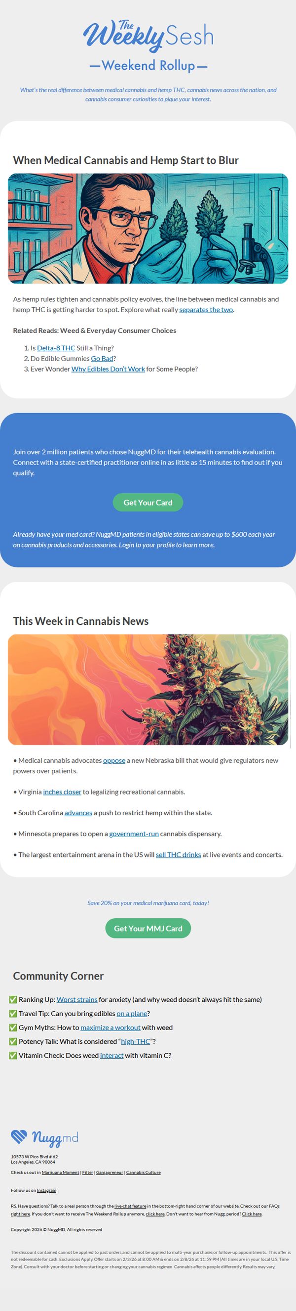
5. Nugg MD : Weekend Rollup: Feb 1 - 7
Objective
This email aims to educate subscribers on evolving cannabis policy and consumer trends while driving conversions to NuggMD’s telehealth evaluation service by highlighting time-sensitive savings and social proof from over 2 million patients.
Why this works
The email smartly blends timely policy updates with consumer curiosity by framing complex legal shifts as relatable, digestible stories, making regulatory news feel personal and actionable for everyday users.
How to implement
By anchoring the CTA in social proof, 'Join over 2 million patients', and pairing it with a tangible financial incentive, '$600 annual savings', the campaign transforms a medical service into a compelling consumer benefit.
Pro Tip
The primary CTA 'Get Your Card' appears twice but lacks visual hierarchy, consider making the second CTA larger or adding a countdown timer to emphasize the 20% discount deadline and create urgency. • The 'This Week in Cannabis News' section uses bolded keywords like 'oppose' and 'inches closer' but doesn’t link them to deeper articles, adding hyperlinks would boost engagement and position NuggMD as a content hub, not just a service provider.
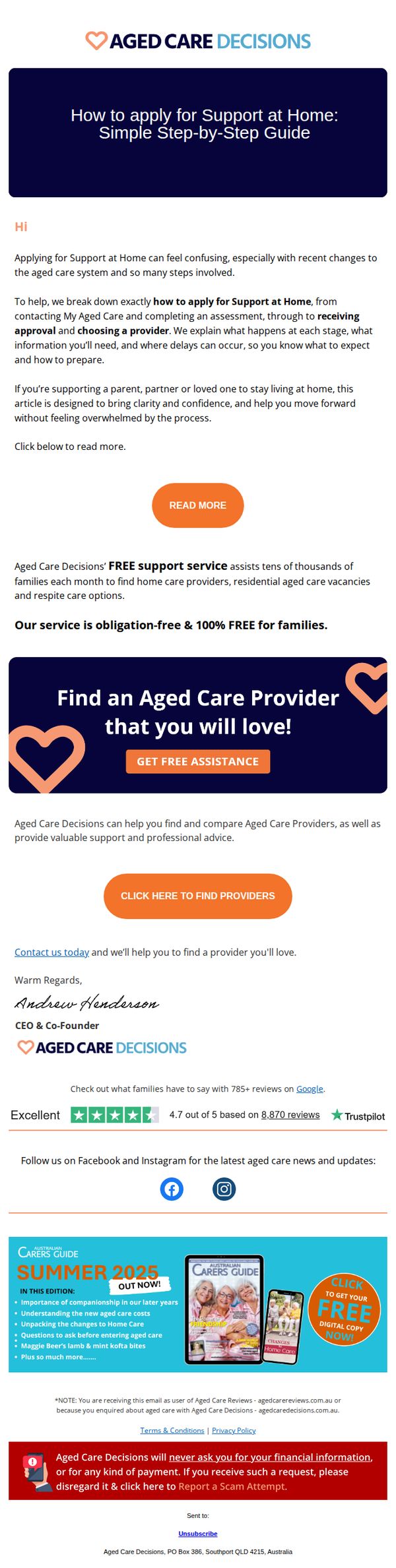
6. Aged Care Decisions: , confused about Support at Home?
Objective
This email aims to reduce confusion for families navigating the Support at Home application process by offering a clear, step-by-step guide and positioning Aged Care Decisions as a trusted, free support service to help them find and compare aged care providers with confidence.
Why this works
The email opens with empathy, acknowledging the emotional overwhelm families feel when applying for Support at Home, which immediately builds trust and positions the brand as a compassionate guide rather than a sales entity.
How to implement
By framing their service as 'obligation-free & 100% FREE for families,' the brand removes financial hesitation and leverages social proof with 785+ Google reviews to reinforce credibility without sounding promotional.
Pro Tip
Add a brief visual timeline or numbered steps under the hero section to visually reinforce the 'step-by-step guide' promise, helping readers instantly grasp the process structure before clicking through. • Include a short testimonial quote from a real family near the first CTA to strengthen emotional resonance and social proof at the point where readers are deciding whether to engage further.
7. Resmed - US: Start the year right: Sleep resolutions for a healthier you
Objective
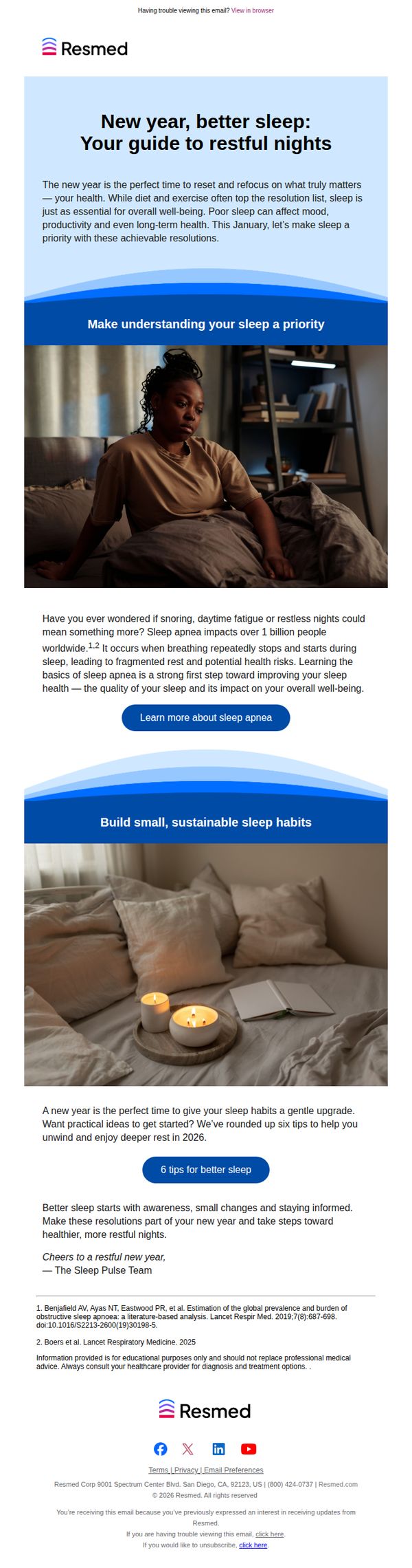
This email aims to position sleep as a foundational health priority for the new year, encouraging recipients to take actionable steps toward better rest while subtly promoting ResMed’s expertise in sleep health. It educates and engages without hard selling, building trust through valuable, non-promotional content.
Why this works
By framing sleep as a New Year’s resolution rather than a medical issue, the email taps into emotional motivation and seasonal behavior change, making health advice feel timely, personal, and empowering rather than clinical or intimidating.
How to implement
The email strategically uses relatable imagery, a woman looking tired in bed and a serene bedroom scene, to visually validate the reader’s experience while subtly suggesting transformation is possible with the right guidance and small, sustainable habits.
Pro Tip
Add a secondary CTA after the '6 tips for better sleep' section that links to a downloadable checklist or printable sleep tracker, this would convert educational engagement into a tangible, shareable asset that reinforces brand value. • Introduce a brief testimonial or patient quote after the sleep apnea education section to humanize the data and create emotional resonance, helping readers envision real-life improvement rather than just abstract health risks.
8. Visiting Angels : Here's Your February 2026 Newsletter
Objective
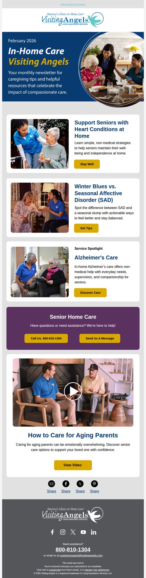
This email aims to engage caregivers and families by delivering valuable, educational content on senior care topics while subtly reinforcing Visiting Angels as a trusted resource and encouraging direct contact for personalized support. It balances information with gentle conversion prompts to nurture leads without aggressive sales tactics.
Why this works
The email strategically positions itself as a helpful monthly resource rather than a sales pitch, building trust by offering practical caregiving tips that resonate emotionally with families navigating senior care challenges.
How to implement
Each content block is paired with a clear, action-oriented CTA button that matches the section’s intent, like 'Get Tips' or 'Discover Care', making it easy for readers to self-select their next step without feeling pressured.
Pro Tip
Add a subtle countdown or urgency element near the 'View Video' CTA, such as 'Watch before March 1st for exclusive caregiver resources', to nudge procrastinators toward immediate engagement without compromising the nurturing tone. • Include a brief 'Why This Matters' subheading under each article preview to clarify the emotional or practical benefit upfront, helping readers quickly self-identify which content is most relevant to their current caregiving situation.
9. Sleep Doctor: Do You Know Your AHI?
Objective
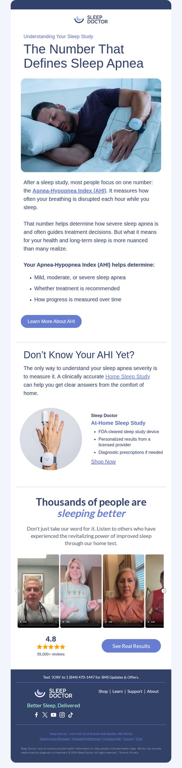
This email aims to educate recipients about the Apnea-Hypopnea Index (AHI) as a critical metric for understanding sleep apnea severity, while encouraging them to take a clinically accurate at-home sleep study to gain personalized insights and improve their sleep health.
Why this works
By anchoring the message around a single, clinically relevant metric, the AHI, the email transforms a complex medical concept into an accessible, personal health benchmark that motivates action without overwhelming the reader.
How to implement
The email smartly bridges education with conversion by positioning the at-home sleep study not as a product, but as a diagnostic gateway to personalized care, making the offer feel necessary and trustworthy rather than promotional.
Pro Tip
The primary CTA 'Learn More About AHI' is educational but lacks urgency or direct conversion intent; consider adding a secondary, benefit-driven CTA like 'Get Your Personalized Sleep Report' near the product offer to guide users toward action. • The testimonial section features video thumbnails but lacks visible captions or quotes; adding short, impactful pull quotes from each testimonial would increase emotional resonance and improve scanability for users who don’t watch videos.
10. Aesthetic Medicine : Scottish Parliament agrees to general principles of Bill to regulate non-surgical procedures industry
Objective
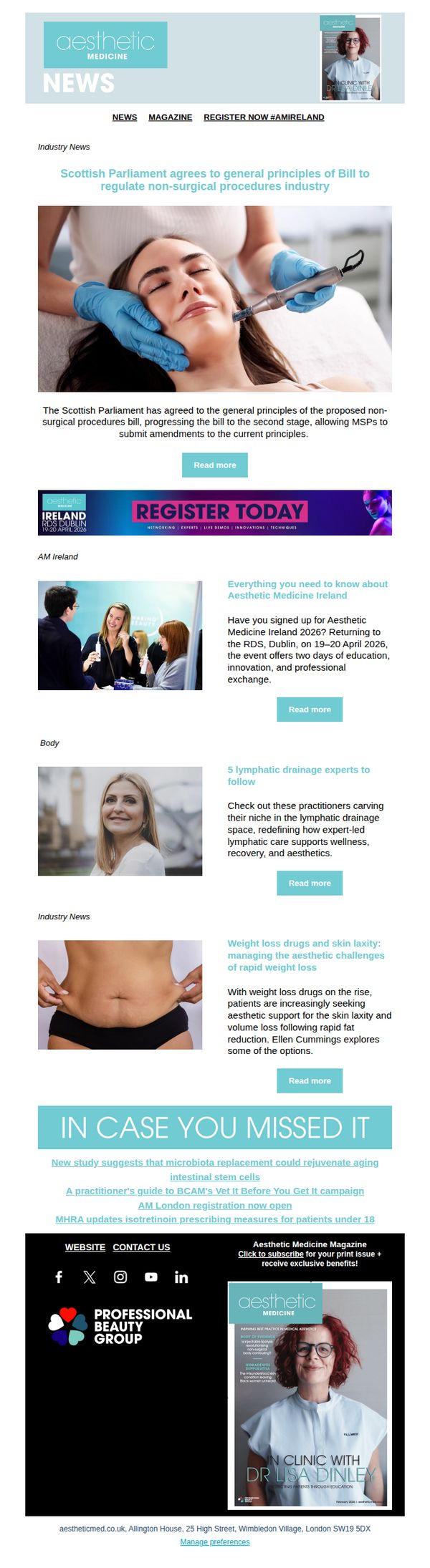
This email aims to inform professionals in the aesthetic medicine industry about legislative developments in Scotland while promoting engagement with upcoming events and educational content. It also seeks to drive registrations and magazine subscriptions by highlighting industry relevance and exclusive benefits.
Why this works
The email effectively anchors its message in timely legislative news, positioning the brand as a thought leader while subtly guiding readers toward professional development opportunities that align with regulatory shifts in the industry.
How to implement
By featuring a visually calming hero image of a patient receiving treatment, the email creates emotional resonance and trust, reinforcing the clinical professionalism of the aesthetic medicine field while encouraging deeper engagement with the content.
Pro Tip
The primary CTA 'Register Today' is visually strong but lacks context, adding a brief value-driven subheading (e.g., 'Join 500+ professionals at Europe’s leading aesthetic medicine event') would clarify the benefit and increase conversion intent. • The footer section, while informative, buries the magazine subscription CTA beneath social links and legal text; elevating it with a contrasting background or icon would improve visibility and drive more print issue sign-ups.