Home Educational email designs from top brands



1. Belledorm: Pet Lovers Rejoice: Durable Bedding & Care Tips Inside🐾
Objective
This email aims to celebrate National Pet Day by positioning Belledorm as a thoughtful, pet-friendly home linens brand that understands the needs of pet owners. It encourages purchases of durable, easy-care bedding while offering practical care tips to strengthen customer trust and drive conversions.
Why this works
The email brilliantly ties a cultural moment, National Pet Day, to product relevance, making the promotion feel timely and emotionally resonant rather than purely transactional, which builds brand affinity with pet-loving customers.
How to implement
By pairing product highlights with actionable care tips, the brand positions itself as a trusted advisor, not just a seller, this educational layer adds perceived value and reduces post-purchase anxiety for pet owners worried about durability.
Pro Tip
Add a subtle countdown timer or urgency cue near the CTA to encourage immediate action, since pet owners may delay purchases without a clear reason to act now, even if emotionally engaged. • Include a customer testimonial or review snippet near the product grid to reinforce social proof, especially since durability and pet-friendliness are key concerns that real user experiences can validate more effectively than brand claims alone.
2. Archiproducts: Maxalto Turns 50 | John Pawson + Herman Miller | Alessandro Stabile for Zilio A&C
Objective
This email aims to engage design professionals and enthusiasts by spotlighting milestone collaborations, emerging design trends, and curated product selections, while reinforcing Archiproducts’ authority as a global hub for architecture and interior design innovation.
Why this works
By anchoring the campaign around Maxalto’s 50th anniversary, the email leverages emotional storytelling and brand legacy to elevate perceived value and draw attention to limited-edition collaborations that feel both exclusive and culturally significant.
How to implement
The seamless integration of editorial content, like studio apartment hacks and bathroom paneling trends, with product showcases transforms the newsletter from a catalog into a trusted design resource, subtly guiding readers toward discovery without overt sales pressure.
Pro Tip
Add a clear, visually distinct CTA button beneath each major editorial section (e.g., 'Explore the Maxalto Collection' or 'See All Bathroom Paneling Ideas') to reduce friction and guide users from inspiration to product exploration. • Introduce a subtle visual hierarchy in the 'Products of the Week' grid by highlighting 2–3 hero items with badges like 'Editor’s Pick' or 'Trending Now' to prevent visual overload and help users prioritize discovery.
3. Jolie Skin: Stop thinking about self care
Objective
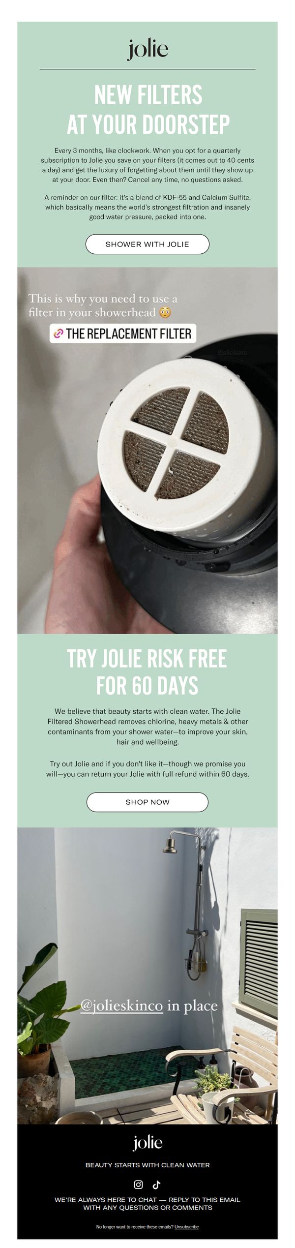
The email aims to convert subscribers into customers by positioning Jolie’s shower filter as an effortless self-care essential, emphasizing convenience, skin benefits, and risk-free trial to reduce purchase hesitation.
Why this works
The email brilliantly reframes a functional product as a self-care luxury by tying clean shower water to visible beauty outcomes, making the filter feel indispensable rather than optional for skincare-conscious consumers.
How to implement
By anchoring the offer in a 60-day risk-free trial with full refund, the campaign removes friction and builds trust, turning skepticism into confidence without requiring upfront commitment from the customer.
Pro Tip
Add a subtle countdown timer or urgency indicator near the CTA to nudge immediate action, since the 60-day trial is generous but doesn’t inherently create time-sensitive motivation. • Include a short customer testimonial or skin transformation quote in the offer section to reinforce the beauty benefit claim with social proof, making the ‘clean water = better skin’ promise more tangible.
4. Rejuvenation: Handcrafted beauty, made by skilled craftswomen
Objective
This email campaign aims to celebrate International Women’s Day by spotlighting female artisans behind Rejuvenation’s handcrafted collections, while driving engagement and sales through emotionally resonant storytelling and direct product links.
Why this works
The email masterfully ties brand values to a cultural moment by spotlighting real women artisans, making each product feel like a story worth owning rather than just an item for sale.
How to implement
By pairing artisan portraits with detailed origin stories, the campaign builds emotional trust and elevates perceived value, transforming functional home goods into meaningful heirlooms with human connection.
Pro Tip
Add a subtle countdown timer or limited-edition badge near the artisan sections to create urgency around these special collections, especially since they’re tied to a time-sensitive holiday theme. • Reposition the ‘Recommended for you’ cross-sell section higher in the flow, perhaps after the first two artisan features, to capitalize on early engagement before users scroll past key conversion opportunities.
5. Weezie: New Weezie at your fingertips 🤌
Objective
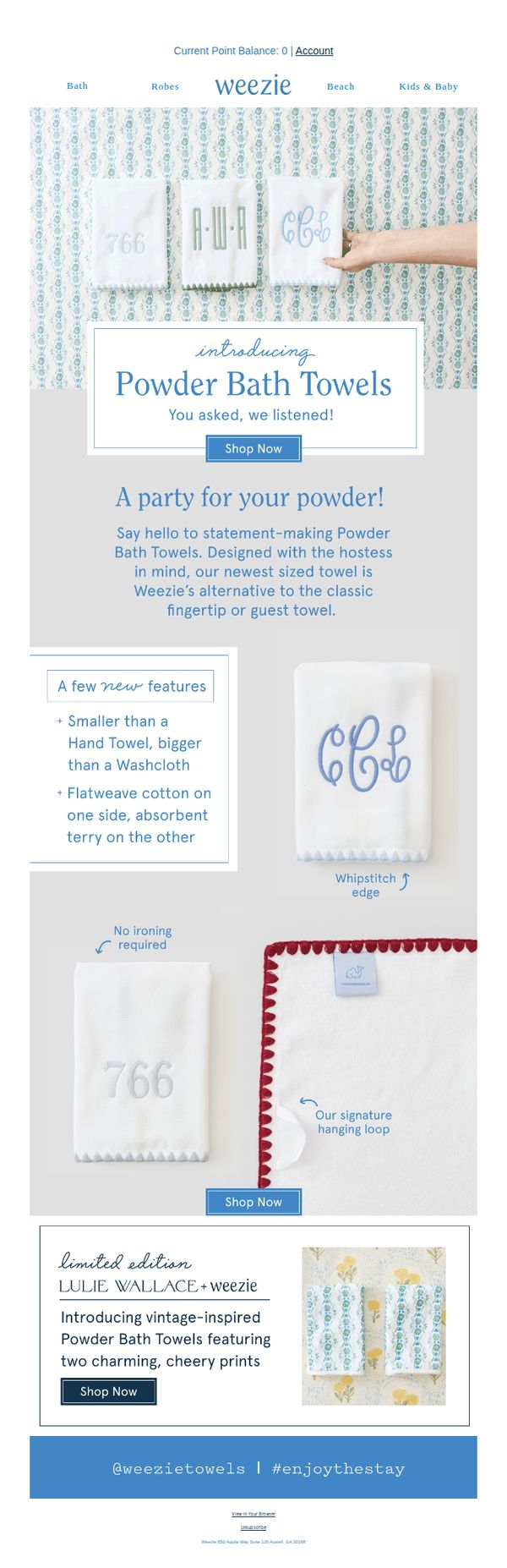
To introduce and drive immediate sales of Weezie’s new Powder Bath Towels by positioning them as a stylish, hostess-friendly alternative to traditional fingertip towels, while leveraging a limited-edition collaboration to create urgency and exclusivity.
Why this works
The email brilliantly frames the new towel as a ‘party for your powder’, a clever, playful hook that transforms a utilitarian product into a lifestyle statement, instantly resonating with hostesses and design-conscious buyers.
How to implement
By clearly defining the towel’s unique sizing and dual-texture construction, the email educates the customer without overwhelming them, turning functional specs into persuasive selling points that justify the premium positioning.
Pro Tip
Add a subtle countdown timer or ‘Limited Stock’ indicator near the limited-edition section to heighten urgency and reduce hesitation among fence-sitting buyers. • Include a short customer testimonial or social proof quote near the product features to reinforce credibility and alleviate concerns about the towel’s size or absorbency before the CTA.
6. Interiors Online: A Softer Way of Living This Summer
Objective
This email aims to inspire customers with summer living aesthetics while driving traffic to the blog and encouraging in-store purchases during the final weekend of the Boxing Day Sale. It blends seasonal storytelling with urgent promotional messaging to convert interest into action.
Why this works
The email masterfully ties seasonal emotion to product discovery by framing summer as a ‘softer way of living,’ making the furniture feel like an experience rather than just an item for sale, which deepens customer connection and desire.
How to implement
By placing a clear, benefit-driven CTA beneath a curated product grid, the email creates a natural journey from inspiration to action, reducing friction and guiding the reader toward the next logical step without overwhelming them with choices.
Pro Tip
Add a countdown timer or urgency indicator next to the Boxing Day Sale message to heighten perceived scarcity and motivate immediate action before the deadline. • Include a brief testimonial or customer review near the product grid to build social proof and reassure shoppers about quality and satisfaction before they click through to shop.
7. Thermomix Australia : Showcasing the best of what we offer
Objective
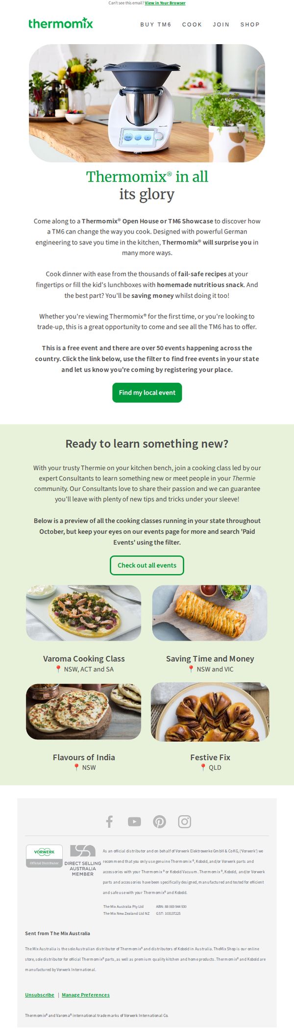
This email aims to drive attendance at Thermomix® Open House and TM6 Showcase events by highlighting the appliance’s time-saving, money-saving, and culinary benefits while encouraging local event registration. It also promotes community engagement through cooking classes led by expert consultants.
Why this works
The email brilliantly positions the Thermomix® not just as a kitchen appliance but as a lifestyle enabler, saving time, money, and stress while delivering gourmet results, which speaks directly to busy modern households seeking convenience without compromise.
How to implement
By segmenting event types with vivid food photography and clear regional tags, the campaign makes local participation feel personal and accessible, turning a national promotion into a hyper-local invitation that increases the likelihood of attendance.
Pro Tip
Add a countdown timer or limited-availability notice near the CTA to create urgency, since the email promotes time-sensitive events and could benefit from psychological triggers to boost immediate registration. • Include a short video testimonial or customer quote in the hero section to humanize the message and reinforce credibility, as social proof would strengthen the emotional appeal before users scroll to the class previews.
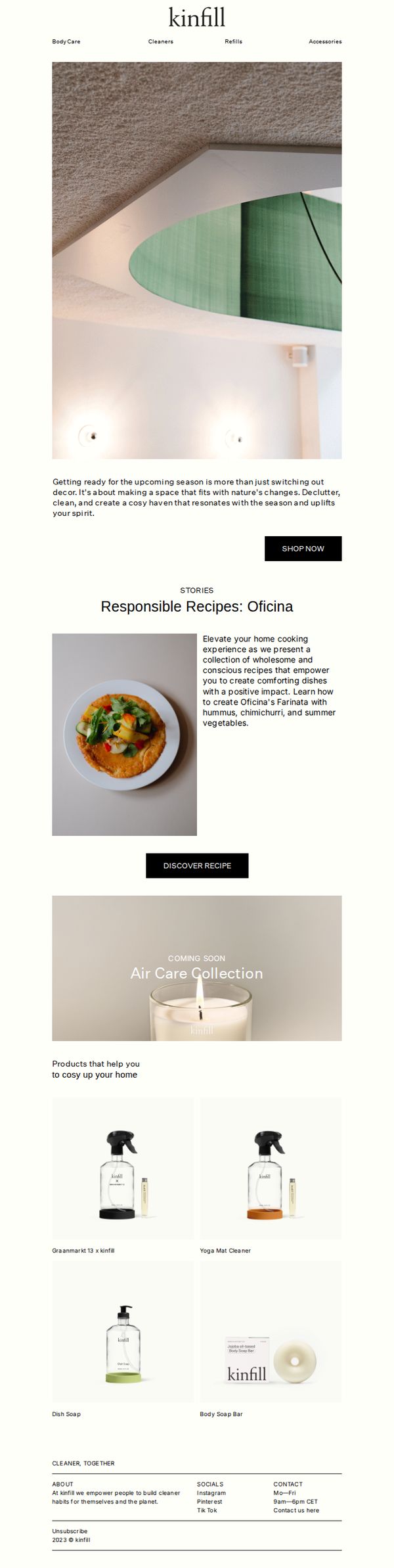
8. Kinfill: Prepare your home for the season ahead
Objective
This email aims to inspire subscribers to refresh their homes in alignment with seasonal changes by promoting Kinfill’s eco-conscious cleaning and lifestyle products, while subtly introducing upcoming collections and educational content to deepen brand engagement.
Why this works
The email frames home preparation as an emotional and spiritual ritual tied to nature’s rhythm, making the act of cleaning feel meaningful rather than mundane, which elevates brand perception beyond utility into lifestyle curation.
How to implement
By integrating a recipe story from Oficina, Kinfill smartly bridges culinary wellness with home care, creating a holistic narrative that positions its products as part of a broader conscious living ecosystem, not just cleaning tools.
Pro Tip
Add a subtle countdown or 'limited stock' indicator near the 'Shop Now' CTA to create urgency around seasonal readiness, especially since the email references preparing for an 'upcoming season' but lacks temporal pressure. • Reposition the 'Discover Recipe' button closer to the hero image or integrate it visually with the product grid to strengthen the connection between the storytelling element and purchasable items, improving narrative-to-action flow.
9. RJ Living : A Softer Way of Living This Summer
Objective
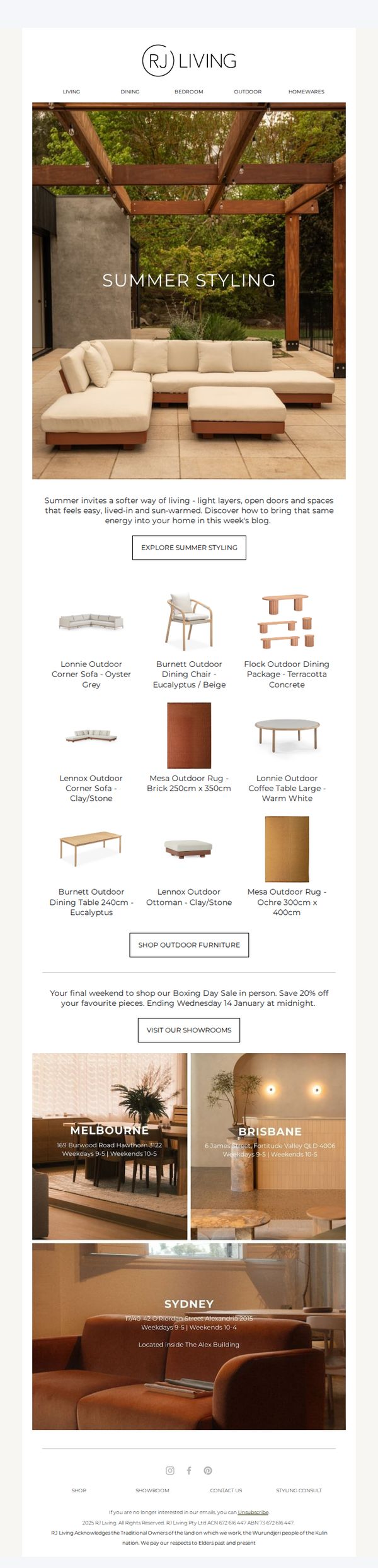
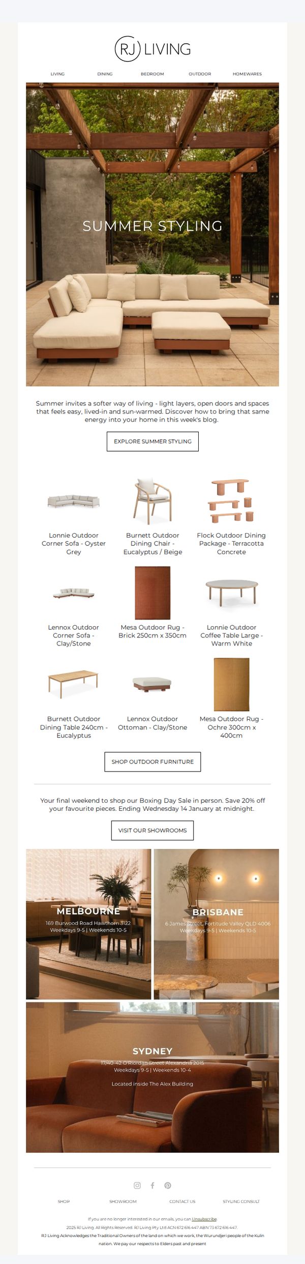
This email aims to inspire customers to embrace a relaxed, sun-warmed summer lifestyle by showcasing curated outdoor furniture and encouraging them to explore styling ideas and visit showrooms before a limited-time sale ends. It blends seasonal storytelling with urgency to drive in-person traffic and conversions.
Why this works
The email opens with a lifestyle-driven headline and evocative imagery that immediately connects emotionally, framing furniture not as products but as gateways to a desired summer experience, a powerful technique for brands selling ambiance over utility.
How to implement
By featuring a clean, grid-based product showcase with consistent naming and color descriptors, the email reduces decision fatigue while subtly guiding customers toward coordinated styling, a smart way to increase average order value without overt upselling.
Pro Tip
Add a countdown timer or bold deadline reminder near the Boxing Day Sale CTA to heighten urgency, the current text is buried and lacks visual emphasis, reducing its persuasive impact on time-sensitive shoppers. • Include a short testimonial or customer photo in the hero or product grid section to build social proof, the current layout feels aspirational but lacks real-world validation that could boost trust and conversion.
10. Léon & George: Deco Minute: How to create a lush bathroom ?
Objective
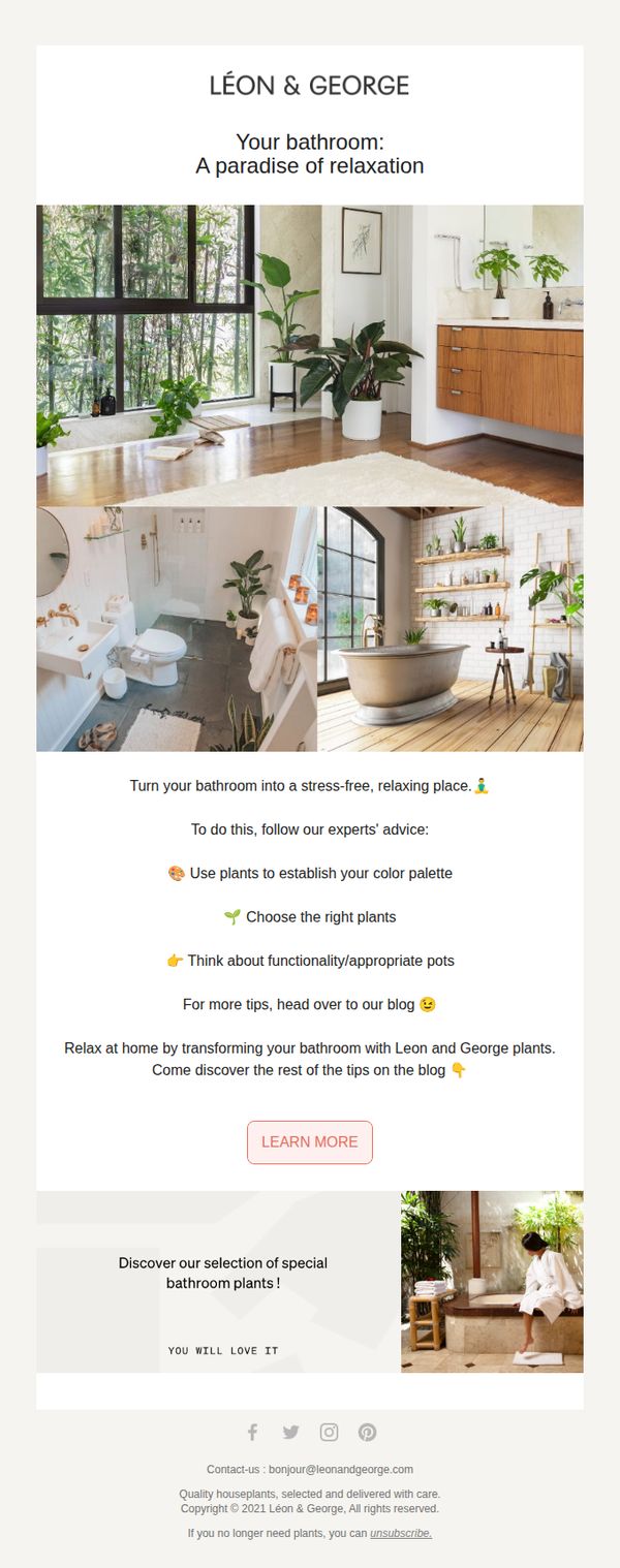
This email aims to inspire subscribers to transform their bathrooms into relaxing, plant-filled sanctuaries by offering expert design tips and subtly guiding them toward Léon & George’s curated plant collection. It blends education with gentle product promotion to nurture brand affinity and drive blog traffic.
Why this works
The email brilliantly frames plant styling as a wellness ritual by calling the bathroom a 'paradise of relaxation,' which emotionally aligns the product with self-care rather than just decoration, making the purchase feel therapeutic and justified.
How to implement
By offering three digestible, emoji-led tips, color palette, plant selection, and pot functionality, the email delivers immediate value without overwhelming the reader, which builds trust and positions the brand as a helpful, authoritative guide in home styling.
Pro Tip
Add a small countdown timer or urgency cue near the 'LEARN MORE' CTA, such as 'Limited stock on bathroom-ready plants', to nudge immediate action instead of passive reading, especially since the email already primes the reader with a problem-solution flow. • Include a mini testimonial or customer photo beneath the education section, e.g., 'Sarah from Portland transformed her bathroom with our ZZ plant and says it’s her daily zen zone', to add social proof and bridge the gap between advice and purchase confidence.