How Personal Care brands do educational email campaigns



1. Bumble and bumble: How to do a super smooth blowout
Objective
This email aims to educate subscribers on achieving a salon-quality blowout at home using Bumble and bumble products, while subtly driving product adoption and purchase through a step-by-step tutorial and limited-time offer.
Why this works
The email brilliantly blends educational content with product placement by turning a common beauty ritual into a branded tutorial, making the products feel essential rather than promotional.
How to implement
By anchoring the tutorial to a seasonal transition, 'effortlessly cool fall hairstyles', the brand creates timely relevance that motivates immediate action without sounding pushy or salesy.
Pro Tip
Add a visual progress bar or numbered checklist next to the blowout steps to improve scannability and encourage completion, especially since the tutorial is the email’s core engagement driver. • Include a short customer testimonial or before/after photo after Step 6 to reinforce credibility and emotional payoff, helping readers visualize success and reducing hesitation to buy.
2. 4.5.6 Skin: For The Men In Your Life... 🫧
Objective
This email aims to position 4.5.6 Skin as a trusted, science-backed solution for men’s skincare by highlighting common concerns and offering targeted product fixes, while encouraging immediate purchase through expert-backed recommendations and clear CTAs.
Why this works
The email smartly frames men’s skincare not as vanity but as a science-backed necessity, using a dermatologist’s authority to validate common concerns and position products as targeted, effective solutions rather than generic beauty items.
How to implement
By breaking down each skin issue with a dedicated product, clear explanation, and price point, the email transforms educational content into a seamless shopping experience that reduces decision fatigue and builds trust through specificity.
Pro Tip
Add a subtle countdown timer or limited-time offer badge near the CTA to create urgency, especially since the email references International Men’s Day, leveraging that date could boost conversion through time-sensitive framing. • Include a small visual icon or badge next to each product indicating its key benefit (e.g., ‘Reduces Pigmentation’, ‘Gentle Exfoliation’) to help skimmers quickly identify relevance without reading full descriptions.
3. Sisley Paris - US: Get your skin ready for New Year's Eve! 🎊
Objective
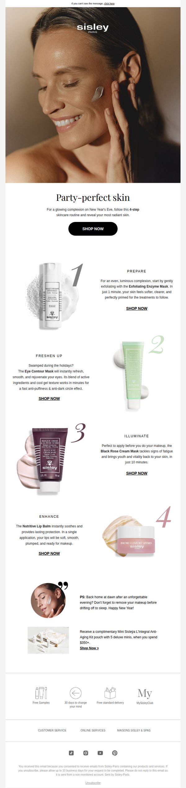
This email aims to drive last-minute New Year’s Eve skincare purchases by guiding customers through a simple 4-step routine that promises radiant, party-ready skin. It also incentivizes higher spending with a gift-with-purchase offer to boost average order value.
Why this works
The email brilliantly ties product usage to a specific, emotionally charged occasion, New Year’s Eve, making the skincare routine feel urgent, celebratory, and personally relevant rather than just another promotional push.
How to implement
By breaking the routine into four numbered, benefit-driven steps with clear product pairings, the email reduces decision fatigue and guides the customer seamlessly from problem to solution, increasing the likelihood of multiple add-to-carts.
Pro Tip
Add a visual progress bar or countdown timer near the offer section to emphasize urgency around the New Year’s Eve deadline and the $350 gift threshold, increasing conversion pressure without being pushy. • Reposition the primary 'SHOP NOW' CTA in the hero section to be sticky or repeated after each of the 4 steps, this reduces friction by letting users convert immediately after being convinced by each product’s benefit.
4. Glossier: Into The Gloss: Foundation Upgrades
Objective
This email aims to educate subscribers on expert foundation application techniques while subtly promoting Glossier’s own foundation products by aligning them with trusted beauty insiders’ routines. It positions Glossier as a curator of professional-grade beauty wisdom.
Why this works
By featuring real beauty insiders with specific, actionable routines, the email builds credibility and trust while making product recommendations feel organic rather than salesy, which enhances subscriber engagement and brand loyalty.
How to implement
The visual storytelling through close-up product shots and skin texture imagery creates an intimate, tactile experience that mirrors the personal nature of makeup application, drawing readers deeper into the content and subtly reinforcing product desirability.
Pro Tip
Add a subtle product highlight or 'Shop This Tip' CTA beneath each expert quote to bridge educational content with commerce without disrupting the editorial tone. • Include a mini visual guide or icon next to each tip (e.g., a brush for 'The Speedy', a droplet for 'The Lock') to enhance scannability and reinforce the unique technique visually.
5. Ren Skincare: Your Exclusive 30% Off Code Is Here
Objective
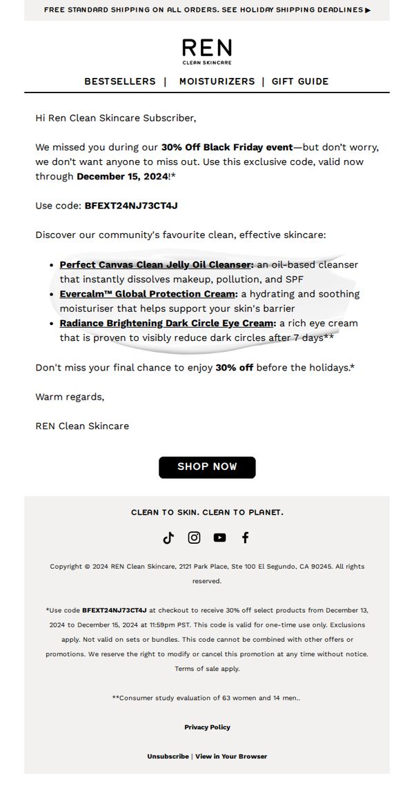
This email aims to re-engage subscribers who missed the Black Friday sale by offering them a time-limited 30% discount, encouraging immediate purchase before the holiday season while reinforcing brand values around clean skincare.
Why this works
The email brilliantly turns a missed sale into a personalized redemption moment, making subscribers feel valued rather than excluded, which builds loyalty while driving urgency through a limited-time code.
How to implement
By spotlighting three top-performing products with clear, benefit-driven descriptions, like dissolving pollution or reducing dark circles, it transforms a discount offer into a curated skincare solution, not just a price cut.
Pro Tip
Add a visual countdown timer near the CTA to reinforce urgency, since the offer expires December 15, this would create psychological pressure without adding text clutter. • Include a small testimonial or star rating next to each featured product to build social proof, especially since the email references a consumer study but doesn’t visually leverage that credibility at the point of decision.
6. BOOM by Cindy Joseph: Get date night ready with Boom Bold…

Objective
This email aims to introduce and drive immediate purchases of BOOM Bold, a new waterproof mascara designed for bold, mature women seeking dramatic volume for special occasions like date night. It combines product education with a clear shopping prompt to convert interest into action.
Why this works
The email brilliantly frames the new mascara not just as a cosmetic product but as a confidence-boosting tool for bold, mature women, aligning the product with identity and occasion rather than just function, which deepens emotional resonance.
How to implement
By breaking down application into five simple, numbered steps, the email transforms a potentially intimidating beauty routine into an approachable, empowering ritual, making the product feel accessible and expertly guided, even for beginners.
Pro Tip
Add a visual step-by-step graphic or short video embed next to the application instructions to reduce cognitive load and increase engagement, especially since makeup application is inherently visual and benefits from demonstration. • Include a customer testimonial or before/after photo from a real user in the hero or education section to build social proof and validate the claim of 'dramatic volume' for mature lashes, which strengthens trust and reduces perceived risk.
7. Coco & Eve: The Hair Wash Mistake To Avoid at All Costs
Objective
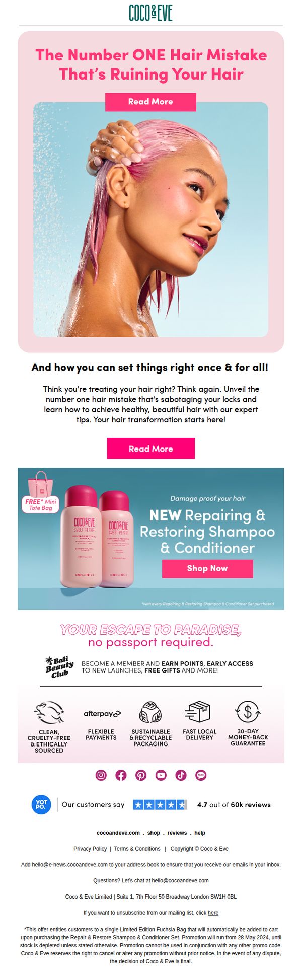
This email aims to educate subscribers on a common hair care mistake while positioning Coco & Eve’s Repairing & Restoring Shampoo & Conditioner as the expert solution, ultimately driving product purchases through urgency and social proof.
Why this works
The email opens with a bold, curiosity-driven headline that frames a common hair mistake as a critical problem, instantly hooking readers by implying they’re unknowingly damaging their hair, a powerful psychological trigger for engagement.
How to implement
By pairing educational content with a visually appealing product shot and a time-sensitive free gift offer, the campaign seamlessly transitions from problem-awareness to solution-selling without feeling pushy or salesy.
Pro Tip
Add a countdown timer or stock depletion indicator near the 'Shop Now' CTA to amplify urgency, since the free tote bag offer is time-limited, this would leverage scarcity psychology more effectively. • Reposition the 'Read More' button in the hero section to appear below the subheadline, not above the image, to avoid visual competition and ensure the CTA doesn’t get overlooked by users scanning top-down.
8. Gussi: Enter the Gussi Back-to-School Giveaway on IG! ✨

Objective
This email aims to drive Instagram engagement by encouraging subscribers to enter a Back-to-School giveaway, while simultaneously promoting Gussi’s core haircare products through a prize bundle that showcases their full range of essentials.
Why this works
The email brilliantly ties the giveaway to a seasonal moment, Back-to-School, making the promotion feel timely and emotionally resonant, which increases urgency and participation without sounding salesy.
How to implement
By listing each prize item with a playful emoji and product name, the email transforms a simple giveaway into a curated experience, subtly educating users on product names and functions while building desire.
Pro Tip
Add a visual countdown timer near the CTA to reinforce urgency, since the contest ends on 08/11/24, this would nudge procrastinators to act before the deadline. • Include a small preview image or icon of the Instagram post within the email to reduce cognitive load, helping users visualize where to go and what to do next without leaving the email.
9. Amp Human / Momentous: Momentous Monthly: April, 2023

Objective
This email aims to engage subscribers by recapping April’s key performance insights, product highlights, and expert collaborations, while reinforcing Momentous as a trusted resource for human optimization and wellness. It seeks to drive traffic to deeper content and nurture long-term community loyalty.
Why this works
The email positions itself as a curated journey rather than a sales pitch, framing content as a monthly recap that honors the reader’s ongoing pursuit of performance, a subtle but powerful way to build trust and habitual engagement.
How to implement
By spotlighting real-world collaborations with elite experts and institutions like the US Air Force, the brand elevates its credibility without overt self-promotion, letting third-party validation do the heavy lifting for audience persuasion.
Pro Tip
Add a visual hierarchy to the CTA buttons, such as color contrast or subtle hover effects, to make them more actionable and reduce the risk of users overlooking them in favor of the surrounding text or images. • Include a brief teaser or pull quote from each article or interview directly under the image to increase click-through rates by giving users a reason to care before they click 'LEARN MORE'.
10. Coco & Eve: How to Max Your Black Friday Glow (and Savings)

Objective
This email aims to drive Black Friday sales by encouraging customers to spend more to unlock tiered discounts, while reinforcing the brand’s tropical, glow-focused identity through aspirational visuals and product storytelling.
Why this works
The email brilliantly ties savings to self-care by framing discounts as a ‘glow-getter’s guide,’ making the promotion feel less transactional and more like a personal beauty ritual worth investing in.
How to implement
Using a tiered discount ladder transforms a simple sale into a game-like experience, encouraging higher cart values by turning spending into a rewarding climb rather than a passive purchase decision.
Pro Tip
Add a dynamic countdown timer near the CTA to create urgency and remind users the tiered discounts are time-sensitive, which could reduce cart abandonment and increase immediate conversions. • Include a mini ‘savings calculator’ or visual progress bar under the offer section to help users instantly see how close they are to unlocking the next discount tier, enhancing motivation to add more items.