Proven Apparel Event Campaign Email Designs You Can Use
1. Alo Yoga: Alo Customer Account Invitation
Objective
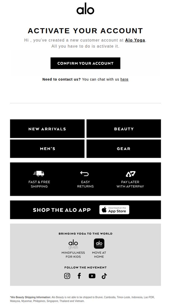
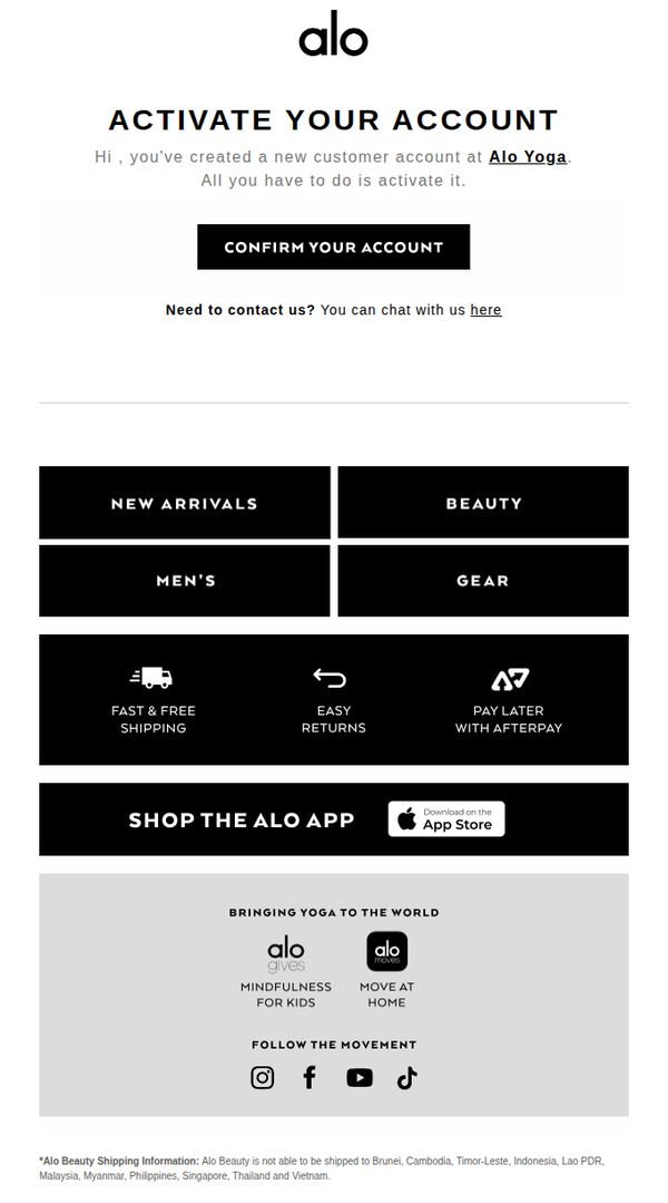
This email aims to guide new customers through account activation to unlock personalized shopping experiences and encourage immediate engagement with Alo Yoga’s product categories and brand ecosystem.
Why this works
The email immediately clarifies the user’s next step with a bold, centered CTA that reduces friction and leverages urgency without being pushy, making activation feel like a natural progression rather than a chore.
How to implement
By organizing product categories into clean, high-contrast blocks, the email visually simplifies navigation for new users, helping them quickly discover relevant sections without overwhelming them with too many options at once.
Pro Tip
Add a subtle countdown timer or expiration notice near the CTA to create gentle urgency, encouraging immediate account activation before the user loses momentum or forgets the email. • Include a personalized product recommendation or curated starter bundle beneath the CTA based on the user’s sign-up source or inferred interests to bridge activation with immediate product discovery.
2. Alo Yoga: Alo Customer Account Invitation
Objective
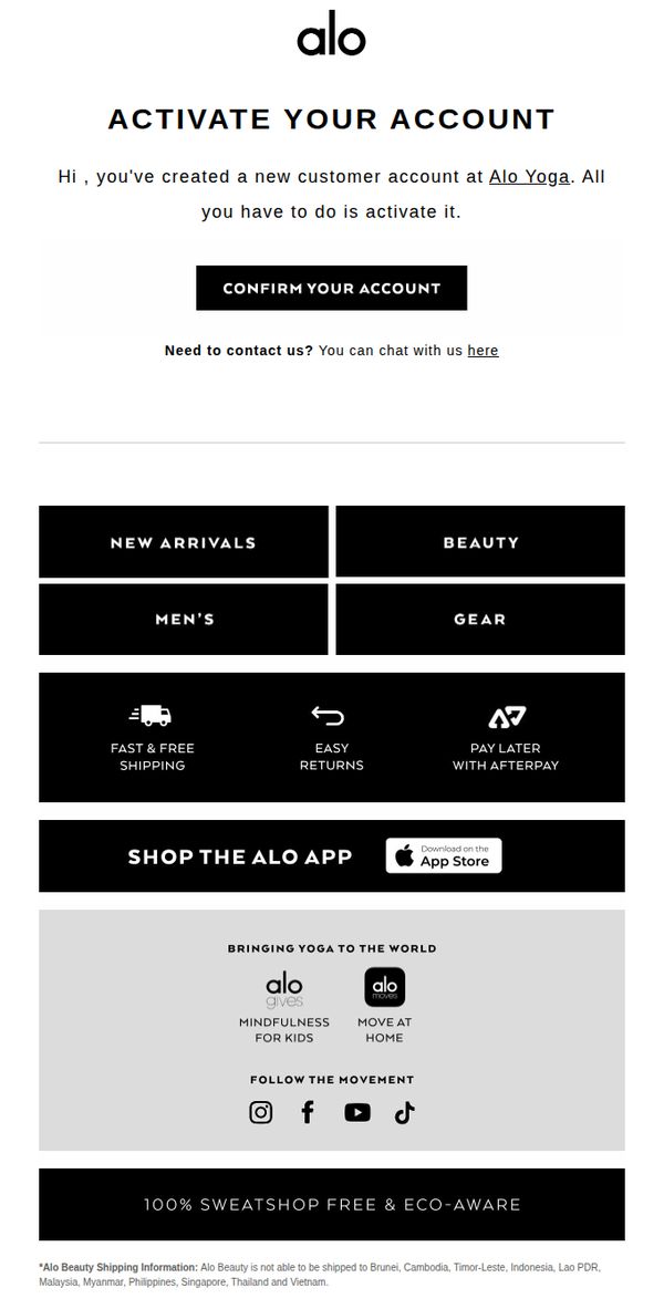
This email aims to guide new customers through account activation to unlock personalized shopping experiences, while subtly reinforcing brand values and encouraging immediate engagement with the Alo Yoga ecosystem.
Why this works
The email opens with a warm, personal greeting that immediately acknowledges the user’s action, creating an account, making the activation feel like a natural next step rather than a chore, which boosts completion rates.
How to implement
By placing the primary CTA front and center with high contrast and minimal surrounding text, the design eliminates decision fatigue and funnels attention exactly where it needs to go: account confirmation.
Pro Tip
Add a brief benefit statement under the CTA (e.g., 'Unlock early access, personalized recommendations, and faster checkout') to increase perceived value and motivate immediate action. • Include a subtle visual cue or progress indicator near the CTA to imply that account activation is a quick, one-step process, reducing perceived friction for hesitant users.
3. Alo Yoga: Alo Customer Account Invitation
Objective
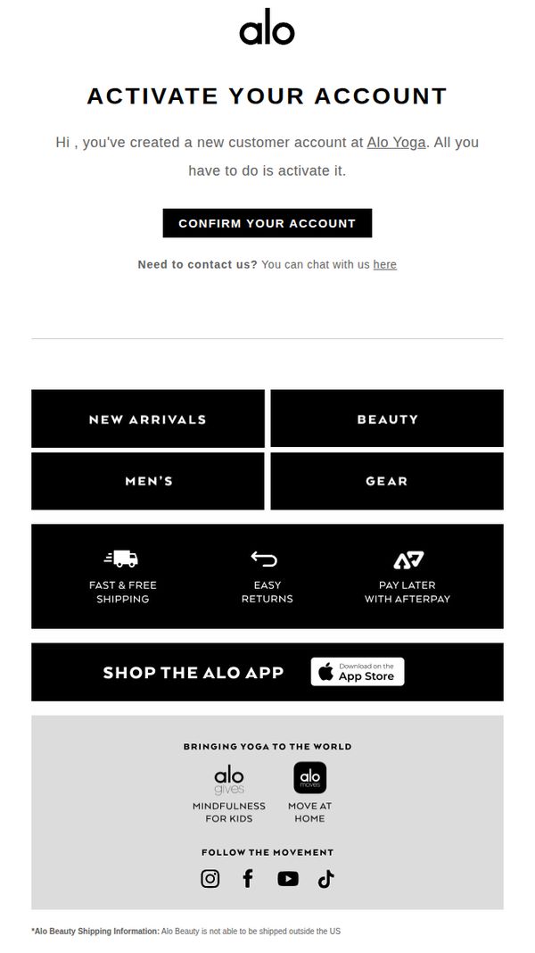
This email aims to guide new customers through account activation while subtly reinforcing brand engagement by highlighting key shopping categories and value-added services. It seeks to convert a newly created account into an active, loyal shopper by reducing friction in the onboarding process.
Why this works
The email immediately validates the user’s action by acknowledging their new account creation, which builds trust and reduces uncertainty, this psychological reinforcement encourages immediate engagement with the CTA.
How to implement
By organizing product categories and customer benefits like free shipping and Afterpay into clean, bold blocks, the email visually prioritizes decision-making without overwhelming the reader, making it easier to transition from activation to browsing.
Pro Tip
Add a brief personalized welcome message or first-name placeholder above the CTA to increase perceived relevance and warmth, helping reduce abandonment during the activation step. • Include a small visual cue or icon next to 'CONFIRM YOUR ACCOUNT', such as a checkmark or lock, to reinforce security and completion, which can boost conversion by reducing cognitive friction.
4. Alo Yoga: Alo Customer Account Invitation
Objective
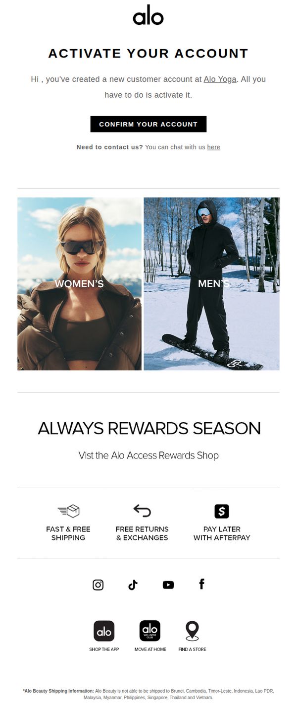
This email aims to guide new customers through account activation while immediately introducing them to Alo Yoga’s loyalty program and core brand benefits to encourage engagement and first purchase. It also subtly promotes gender-specific product lines to personalize the onboarding experience.
Why this works
The email smartly pairs account activation with immediate value by highlighting the Alo Access Rewards Shop, turning a functional step into an engaging brand introduction that primes users for future purchases.
How to implement
By visually splitting the hero section into Women’s and Men’s categories with lifestyle imagery, Alo Yoga personalizes the onboarding experience without requiring user input, making new customers feel seen from the first click.
Pro Tip
Add a countdown timer or urgency cue near the 'CONFIRM YOUR ACCOUNT' CTA to increase activation rates by creating a subtle sense of time-sensitive value tied to the rewards program. • Include a brief personalized welcome message (e.g., 'Welcome, [First Name]!') above the activation prompt to strengthen emotional connection and increase perceived relevance of the account setup step.
5. Alo Yoga: Alo Customer Account Invitation
Objective
This email aims to guide new customers through account activation by clearly instructing them to confirm their account, while simultaneously introducing key brand offerings and encouraging immediate engagement through app downloads and category browsing.
Why this works
The email immediately reduces friction by framing account activation as a simple, one-step action, 'All you have to do is activate it', which lowers perceived effort and increases conversion likelihood for new users.
How to implement
By embedding category tiles like 'New Arrivals' and 'Beauty' directly beneath the CTA, the email turns a functional step into a discovery moment, subtly guiding users toward browsing without interrupting the primary goal.
Pro Tip
Add a visual progress indicator or micro-copy like 'Step 1 of 2: Confirm your email to unlock rewards' to frame activation as part of a larger onboarding journey, increasing perceived value and completion rates. • Reposition the 'Shop the Alo App' section higher, perhaps right after the CTA, to capitalize on post-activation momentum, since users are most likely to download the app immediately after confirming their account.
6. Alo Yoga: Alo Customer Account Invitation
Objective
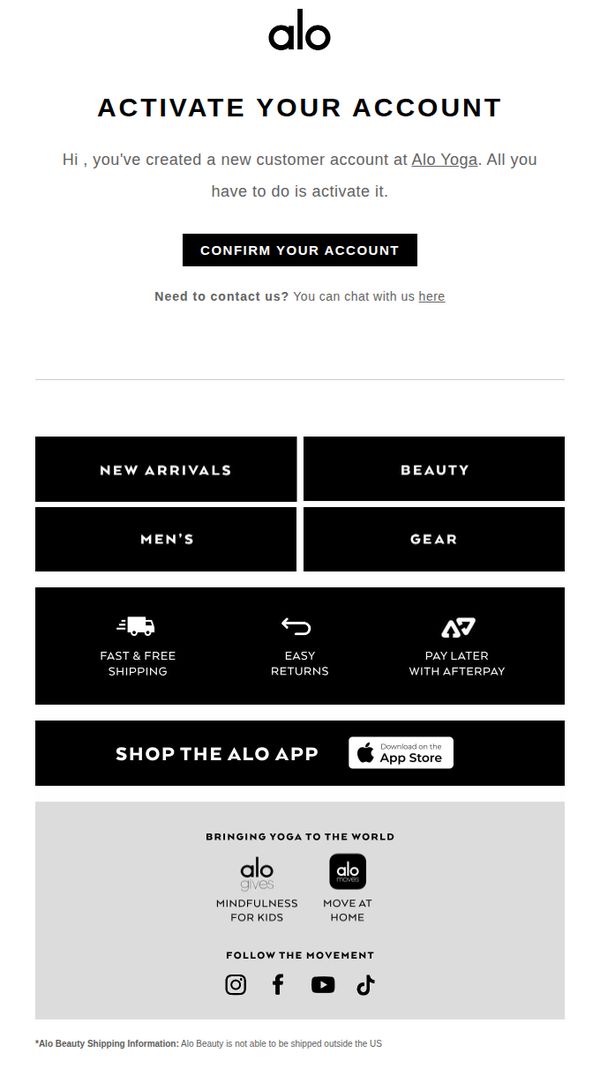
This email aims to guide new customers through account activation while subtly introducing them to key product categories and brand values, encouraging immediate engagement and future purchases.
Why this works
The email opens with a warm, personal greeting that immediately acknowledges the user’s action, making the activation feel like a natural next step rather than a chore, which reduces friction and increases completion rates.
How to implement
By organizing product categories into clean, high-contrast blocks beneath the CTA, the email turns a simple confirmation into a discovery moment, subtly guiding users toward browsing without overwhelming them.
Pro Tip
Add a brief value statement after the CTA (e.g., 'Unlock exclusive access to member-only sales and personalized recommendations') to reinforce why activation matters beyond just confirming identity. • Replace the static 'Shop the Alo App' banner with a dynamic visual or short video snippet showing the app experience, which could increase app downloads by demonstrating tangible benefits rather than just prompting action.
7. Aurate: FINAL EVENT OF 2023

Objective
This email aims to drive urgency and conversions by promoting Aurate’s final sale of 2023 with a 23% discount, encouraging customers to purchase top-performing gold jewelry before the year ends. It leverages emotional nostalgia and social proof to position the sale as a celebratory, must-not-miss event.
Why this works
The email brilliantly ties the sale to the emotional milestone of closing out the year, framing the 23% discount as a celebratory farewell to 2023 rather than just another promotion, which makes the offer feel more personal and timely.
How to implement
By curating a 'Top 5' collection with playful, relatable copy, like comparing jewelry to a song played 2,017 times, Aurate transforms product highlights into memorable storytelling moments that resonate emotionally while driving product discovery.
Pro Tip
Add a visible countdown timer in the hero section to amplify urgency, the current static '00 00 00 00' placeholder should be replaced with a live timer to dynamically pressure users into acting before the sale ends. • Include a short testimonial or customer review snippet under the 'Top 5' product grid to build social proof directly alongside high-performing items, reinforcing trust and reducing hesitation at the point of decision.
8. Merchology: 'Tis the Season to Plan Ahead: Get Holiday Event & Gift Inspo!
Objective
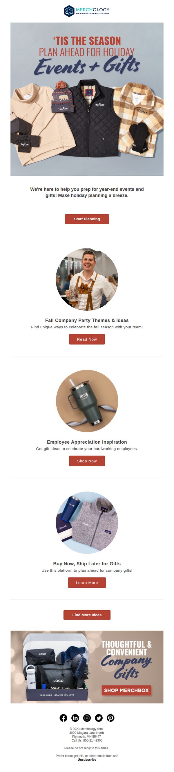
This email aims to position Merchology as a strategic partner for holiday event and gift planning by offering inspiration and solutions for corporate gifting and team celebrations. It encourages early engagement to drive future sales through curated content and product showcases.
Why this works
The email brilliantly frames holiday gifting not as a last-minute chore but as a strategic, stress-free planning opportunity, which reframes the customer’s mindset from reactive to proactive and positions the brand as a helpful partner rather than just a vendor.
How to implement
By using real-world, branded product examples like the Amazon tumbler and Patagonia-style jacket, the campaign builds instant credibility and visualizes outcomes, helping corporate buyers imagine how these items would look in their own gifting programs with minimal mental effort.
Pro Tip
The hero section’s headline uses a generic holiday phrase; replacing it with a more specific benefit like 'Plan Your 2024 Holiday Gifts & Events in 10 Minutes' would increase clarity and urgency while better aligning with the 'Start Planning' CTA. • The 'Find More Ideas' CTA at the bottom lacks context and feels disconnected; replacing it with a benefit-driven button like 'See 50+ Corporate Gift Bundles' would better guide users toward the next logical step and reinforce the email’s planning theme.
9. Alo Yoga: Alo Customer Account Invitation
Objective
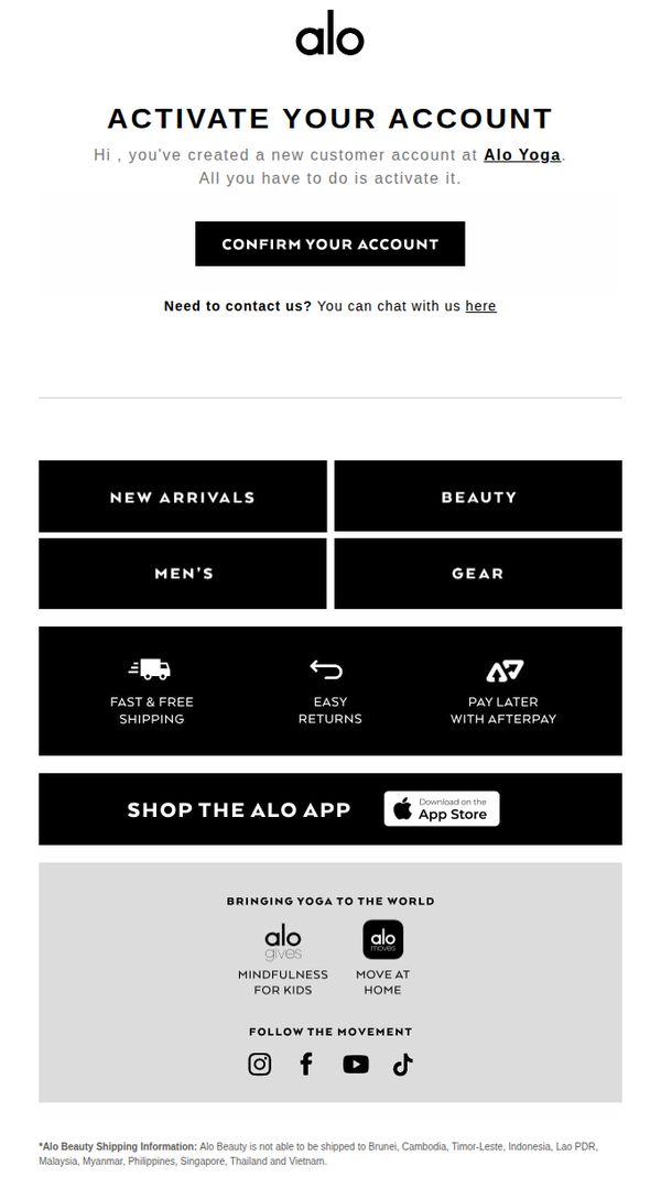
This email aims to guide new customers through account activation by clearly instructing them to confirm their account, while simultaneously introducing key brand offerings and navigation paths to encourage immediate engagement and future purchases.
Why this works
The email opens with a direct, action-oriented subject line and headline that immediately tells the recipient what to do next, reducing friction and increasing the likelihood of account activation through clear, minimal instruction.
How to implement
By embedding category tiles like 'New Arrivals' and 'Beauty' directly beneath the CTA, the email smartly bridges account activation with product discovery, turning a functional step into an opportunity for early engagement and browsing intent.
Pro Tip
Add a brief, personalized welcome message or first-name greeting above the CTA to increase emotional connection and perceived relevance, making the activation feel less transactional and more like a brand welcome. • Include a small visual cue or icon next to the 'CONFIRM YOUR ACCOUNT' button, such as a checkmark or envelope, to reinforce the action’s purpose and improve visual scanning for users who skim the email quickly.
10. Kenny Flowers: Your Personal Invitation ⛵️
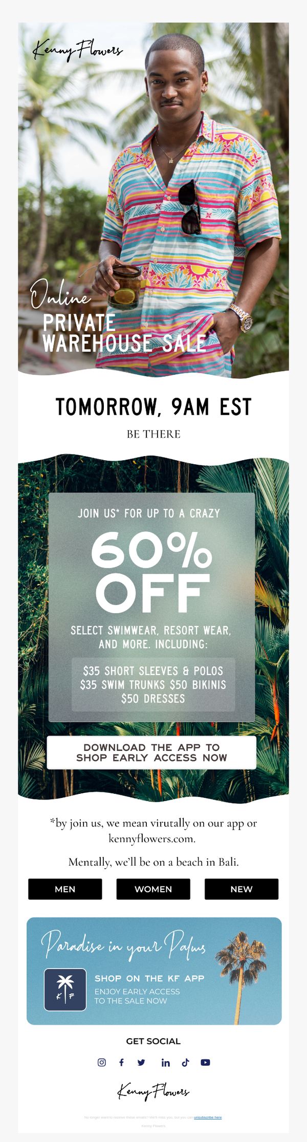
Objective
This email aims to drive immediate app downloads and early access to a limited-time private warehouse sale by creating urgency and exclusivity around a 60% discount on resort wear and swimwear. It positions the sale as a virtual beach escape to emotionally engage recipients.
Why this works
The email brilliantly frames a warehouse sale as an exclusive, tropical escape, using vivid imagery and aspirational language like 'mentally, we’ll be on a beach in Bali' to emotionally connect with customers and elevate a discount into a lifestyle experience.
How to implement
By anchoring the CTA around app download rather than direct purchase, the brand strategically builds long-term engagement and mobile-first shopping habits, turning a one-time sale into a channel acquisition opportunity with lasting customer value.
Pro Tip
Add a countdown timer above the CTA to visually reinforce urgency and scarcity, especially since the sale starts 'tomorrow at 9AM EST', this would increase FOMO and drive immediate app downloads before the sale begins. • Include a small testimonial or social proof snippet near the offer section, such as 'Over 10,000 customers shopped last year’s sale', to build trust and validate the exclusivity claim, reducing hesitation for first-time buyers.