Proven Lifestyle exclusive sneak peek email designs you can use



1. Away: Just landed: new limited edition bags
Objective
To drive immediate engagement and sales by announcing new limited edition outdoor bags while reinforcing product versatility and travel readiness. The email aims to convert interest into action by highlighting seasonal relevance and cross-category pairing opportunities.
Why this works
The email brilliantly ties seasonal outdoor activities to product utility, making the new F.A.R. Collection feel timely and essential rather than just another drop, this emotional alignment boosts perceived value and urgency.
How to implement
By visually pairing backpacks with suitcases and explaining the functional synergy, the campaign transforms a single product into a travel system, encouraging higher average order value through smart cross-selling without feeling pushy.
Pro Tip
Add a subtle countdown timer or 'Limited Stock' indicator near the 'SHOP NOW' CTA in the hero section to amplify urgency, especially since the email promotes limited edition colors that benefit from scarcity messaging. • Include a short customer testimonial or social proof snippet under the product grid to reinforce trust, especially since the email targets new arrivals, social validation can reduce hesitation for first-time buyers.
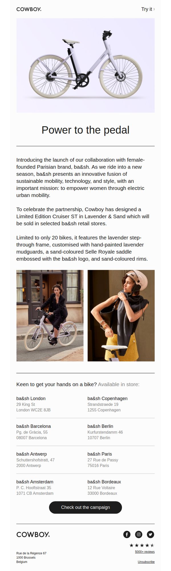
2. Cowboy - EN: New limited edition bike drop
Objective
This email aims to generate excitement and urgency around a limited-edition electric bike collaboration with ba&sh, driving in-store visits by highlighting exclusivity and design details while targeting style-conscious urban riders who value sustainability and empowerment.
Why this works
The email brilliantly frames the limited-edition bike not just as a product but as a cultural moment, a fusion of sustainable mobility, feminine design, and urban empowerment, making it emotionally resonant beyond its functional appeal.
How to implement
By showcasing real women riding the bike in stylish urban settings, the campaign visually reinforces the lifestyle aspiration it sells, turning product imagery into storytelling that subtly aligns with the target audience’s identity and values.
Pro Tip
Add a countdown timer or 'Only X bikes left' indicator near the CTA to amplify urgency, since the email mentions scarcity but doesn’t visually reinforce it in a way that triggers immediate action. • Include a short testimonial or quote from a ba&sh founder or designer to deepen the emotional connection to the collaboration and validate the mission of empowering women through mobility.
3. CostumeBox: GIVEAWAY TIME! 🎁 WIN A LIMITED EDITION POP VINYL
Objective
This email aims to drive engagement and sales by highlighting upcoming themed events and holidays while incentivizing social media interaction through a giveaway for a limited edition Pop Vinyl. It also promotes seasonal costume collections to align with cultural moments.
Why this works
The email brilliantly ties each major cultural event to a specific costume collection, making the content feel timely and personally relevant, this emotional alignment boosts conversion by connecting celebration with self-expression.
How to implement
By embedding two distinct giveaways, one for a collectible vinyl and another for a gift card via social tagging, the campaign creates multiple entry points for engagement without diluting focus, effectively broadening its audience appeal.
Pro Tip
Add a countdown timer next to the giveaway section to create urgency, since entries close on March 4th, visual scarcity would significantly boost immediate participation without requiring additional copy. • Include a short testimonial or user-generated photo from past winners near the CTA to build trust and social proof, especially since the giveaway relies on Instagram tagging which may feel less tangible to new customers.
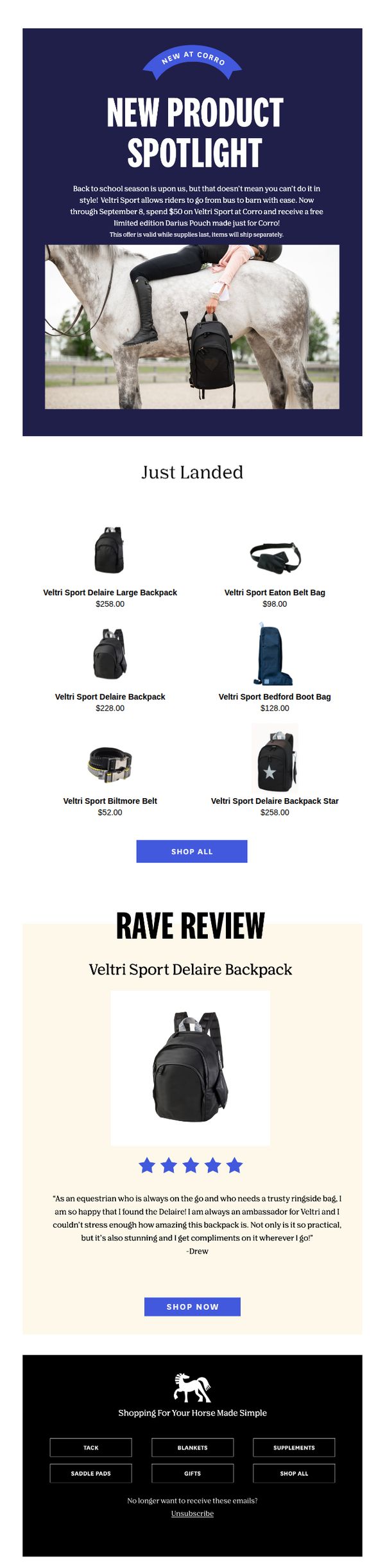
4. Corro: Go from Bus to Barn in style!
Objective
To drive immediate sales of the new Veltri Sport equestrian collection by highlighting its stylish functionality and offering a limited-time free gift with purchase, while reinforcing brand loyalty through social proof and curated product discovery.
Why this works
The email brilliantly bridges seasonal transitions by positioning equestrian gear as both practical for riders and stylish enough for everyday wear, making the products feel indispensable beyond the barn.
How to implement
Including a time-sensitive free gift offer tied to a specific spending threshold creates urgency without discounting the core product, preserving perceived value while boosting average order value through smart bundling.
Pro Tip
Add a countdown timer beneath the hero offer to visually reinforce urgency and encourage faster decision-making before the September 8 deadline. • Reposition the 'SHOP ALL' button under the product grid to immediately follow the visual browsing experience, reducing friction between discovery and action.
5. YETI - US: Veterans Day Drinkware Is Back
Objective
This email aims to honor Veterans Day by promoting a limited-edition Rambler tumbler while supporting the Folds of Honor organization, encouraging purchases that contribute to educational scholarships for families of disabled or fallen veterans. It blends emotional storytelling with product promotion to drive sales and brand purpose.
Why this works
The email masterfully ties product launch to a meaningful cause by spotlighting a real veteran family, making the purchase feel like an act of honor rather than just consumption, which deepens emotional resonance and brand loyalty.
How to implement
By featuring customizable tumblers with names etched on them, the campaign transforms a functional product into a personal tribute, encouraging buyers to invest in sentimental value while reinforcing the brand’s rugged, personalized identity.
Pro Tip
Add a subtle countdown timer or 'Limited Stock' indicator near the 'SHOP NOW' button in the hero section to create urgency around the limited-edition release, which is currently implied but not visually reinforced. • Include a small icon or badge next to the product grid indicating that a portion of proceeds supports Folds of Honor, this visual reinforcement would strengthen the cause-driven message without requiring users to scroll back to the story section.
6. Away: New limited editions: Orchid & Navy Gloss ✨

Objective
To drive immediate sales of limited-edition Orchid and Navy Gloss suitcases by highlighting their premium finish and updated features, while encouraging in-store visits for exclusive accessories.
Why this works
The email brilliantly leverages scarcity by labeling the new colors as a 'Gloss Drop,' creating urgency without aggressive countdowns, which aligns with Away’s premium, minimalist brand voice while still prompting action.
How to implement
By visually pairing each suitcase size with its own 'Shop now' link beneath a clean product grid, the email removes friction for decision-making, making it effortless for travelers to select the exact size that fits their journey needs.
Pro Tip
Add a subtle visual indicator (e.g., 'Limited Stock' badge) near each suitcase image to reinforce scarcity without cluttering the layout, helping undecided shoppers tip toward purchase. • Include a short customer testimonial or social proof near the hero section to validate the 'high-shine finish' claim, this builds trust and reduces perceived risk for first-time buyers.
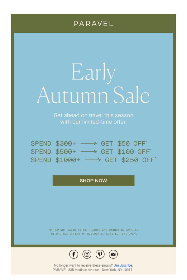
7. Paravel: Early Autumn Sale: Get Up To $250 Off
Objective
This email aims to drive immediate purchases by promoting a limited-time Early Autumn Sale with tiered discounts, encouraging customers to spend more to unlock greater savings while creating urgency around the seasonal travel theme.
Why this works
The email brilliantly ties seasonal timing to customer behavior by framing the sale as a way to 'get ahead on travel this season,' making the discount feel like a strategic advantage rather than just a price cut.
How to implement
Tiered spending thresholds with escalating discounts create a psychological nudge toward higher cart values, turning a simple sale into a game-like incentive that rewards customers for spending more without feeling pushy.
Pro Tip
Add a subtle countdown timer beneath the offer tiers to visually reinforce the 'limited-time' urgency and nudge procrastinators toward immediate action. • Include a small hero image or icon of a popular Paravel bag near the CTA to visually anchor the offer to a tangible product, helping customers imagine the reward of their purchase.
8. Topo Designs: Still shopping for back to school?

Objective
This email aims to convert last-minute back-to-school shoppers by highlighting a limited-time Labor Day Sale with up to 50% off popular backpacks, while also encouraging sign-ups for text alerts and promoting flexible payment options to reduce purchase friction.
Why this works
The email brilliantly ties seasonal urgency to a specific product category, backpacks, by framing the Labor Day Sale as the final chance for back-to-school shoppers, making the discount feel timely and personally relevant rather than generic.
How to implement
Each product tile uses a consistent visual rhythm with bold pricing, crossed-out original values, and a clear 'Shop Now' button, which reduces cognitive load and trains the eye to scan quickly while reinforcing the value proposition with every glance.
Pro Tip
Add a countdown timer near the promo disclaimer to visually reinforce urgency, since the current text-only deadline (9/5/23) lacks emotional impact and may be overlooked by skimmers. • Reposition the 'Shop Men’s / Women’s' category buttons higher, perhaps below the hero section, to help users self-segment faster, since the current placement at the bottom may cause drop-off before users find their preferred category.
9. OwlCrate: Announcing HEARTS THAT CUT!

Objective
This email aims to generate excitement and drive immediate pre-orders for OwlCrate’s limited edition release of 'Hearts That Cut' by Kika Hatzopoulou, while rewarding loyal subscribers with early access and reinforcing community through pet-themed book recommendations.
Why this works
The email brilliantly leverages exclusivity by highlighting limited-edition design elements like a clear vinyl dust jacket and author-signed pages, turning a book into a collectible artifact that fans can’t resist owning.
How to implement
By tying early access to past subscribers and June 2023 box buyers, OwlCrate transforms customer loyalty into tangible privilege, making readers feel seen and rewarded while subtly encouraging future subscription retention.
Pro Tip
The primary CTA is buried in the footer and lacks urgency, replace it with a bold, time-sensitive button like 'Grab Your Signed Copy Before It’s Gone!' above the sale timeline to drive immediate action. • The pet recommendation section, while charming, lacks visual hierarchy, add a subtle divider or icon to separate it from the main offer, ensuring readers don’t miss the limited-edition details while enjoying the fun content.
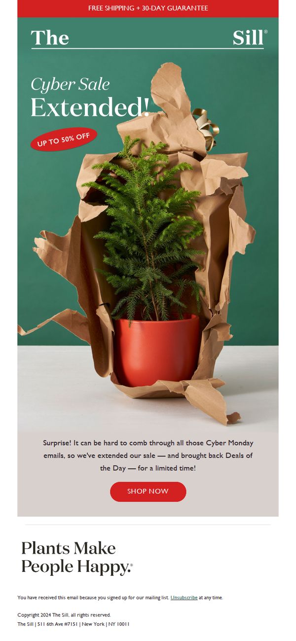
10. The Sill: Surprise! Up to 50% OFF Extended 🎉
Objective
The email aims to re-engage subscribers by extending a limited-time Cyber Sale with up to 50% off, capitalizing on post-Cyber Monday fatigue while reviving popular 'Deals of the Day' to drive immediate purchases.
Why this works
The email brilliantly reframes post-holiday overwhelm as a customer benefit by extending the sale, making subscribers feel seen and rewarded rather than pressured, which builds emotional loyalty alongside urgency.
How to implement
Using a single, beautifully wrapped plant as the hero visual ties the brand’s core identity, plants as joy, to the sale, making the discount feel like a gift rather than a clearance, elevating perceived value.
Pro Tip
Add a countdown timer beneath the CTA to reinforce urgency, since the email mentions ‘limited time’ but provides no visual cue to trigger immediate action. • Include a small ‘Deals of the Day’ preview grid or badge near the CTA to visually remind users what’s returning, increasing perceived value and reducing the need to click just to discover what’s on sale.