The complete Fjällräven fashion email collection




1. Yes!
Objective
To announce and drive excitement around Fjällräven’s new GTX collection made with PFAS-free GORE-TEX technology, positioning it as a durable, functional, and environmentally responsible upgrade for outdoor enthusiasts.
Why this works
The email brilliantly frames the product launch as a moral and technical milestone, not just new gear, but a bold stand against PFAS, aligning performance with environmental responsibility to deepen brand loyalty among conscious adventurers.
How to implement
By pairing dramatic outdoor imagery with clear product labels and gender-specific sizing, the email creates an immersive, aspirational experience that speaks directly to the identity of its target audience, serious hikers and mountaineers who value both function and ethics.
Pro Tip
Add a visual countdown timer or limited-availability badge near the 'See more' CTA to create urgency, since the email positions this as a milestone launch rather than a routine product drop. • Include a short customer testimonial or quote from an outdoor influencer beneath the product grid to build social proof and validate the performance claims before users scroll to the educational section.
2. First look at new arrivals
Objective
This email aims to generate excitement and drive early sales for Fjällräven’s new fall and winter collection by showcasing high-performance, sustainably engineered gear designed for outdoor adventurers. It positions the brand as a trusted leader in durable, functional outdoor apparel through product storytelling and technical credibility.
Why this works
Fjällräven masterfully blends technical product specs with emotional outdoor storytelling, making functional gear feel aspirational and adventure-ready without sacrificing credibility or clarity for the discerning outdoor enthusiast.
How to implement
By spotlighting GORE-TEX® and PFAS-free engineering upfront, the email builds trust through transparency, turning material science into a compelling brand differentiator that appeals to eco-conscious and performance-driven customers alike.
Pro Tip
Add a subtle countdown timer or 'Limited Stock' indicator near the 'Shop now' buttons for new arrivals to create urgency and encourage immediate action, especially since this is a 'first look' campaign. • Include a short customer testimonial or review snippet under one of the new products (e.g., Keb GTX Jacket) to reinforce social proof and validate the performance claims made in the product copy.
3. Daypacks big and small
Objective
This email aims to guide customers toward selecting the right daypack by showcasing top-selling models and highlighting their real-world use cases, while also introducing technical trekking backpacks to deepen engagement with adventure-focused buyers.
Why this works
The email smartly bridges product specs with real-life utility by showing how each daypack fits into daily routines or adventures, helping customers visualize ownership and reducing decision paralysis through relatable context.
How to implement
By featuring both compact and technical backpacks in the same flow, the campaign subtly upsells by positioning the brand as a one-stop solution for casual and serious outdoor enthusiasts without overwhelming the reader.
Pro Tip
Add a visual comparison chart or size guide near the product grid to help customers quickly differentiate between daypack capacities and use cases, reducing friction in the selection process. • Reposition the 'Shop daypacks' CTA button higher in the email or repeat it after the product grid to capture attention from scroll-heavy users who may miss the initial call-to-action.
4. Let nature light the way
Objective
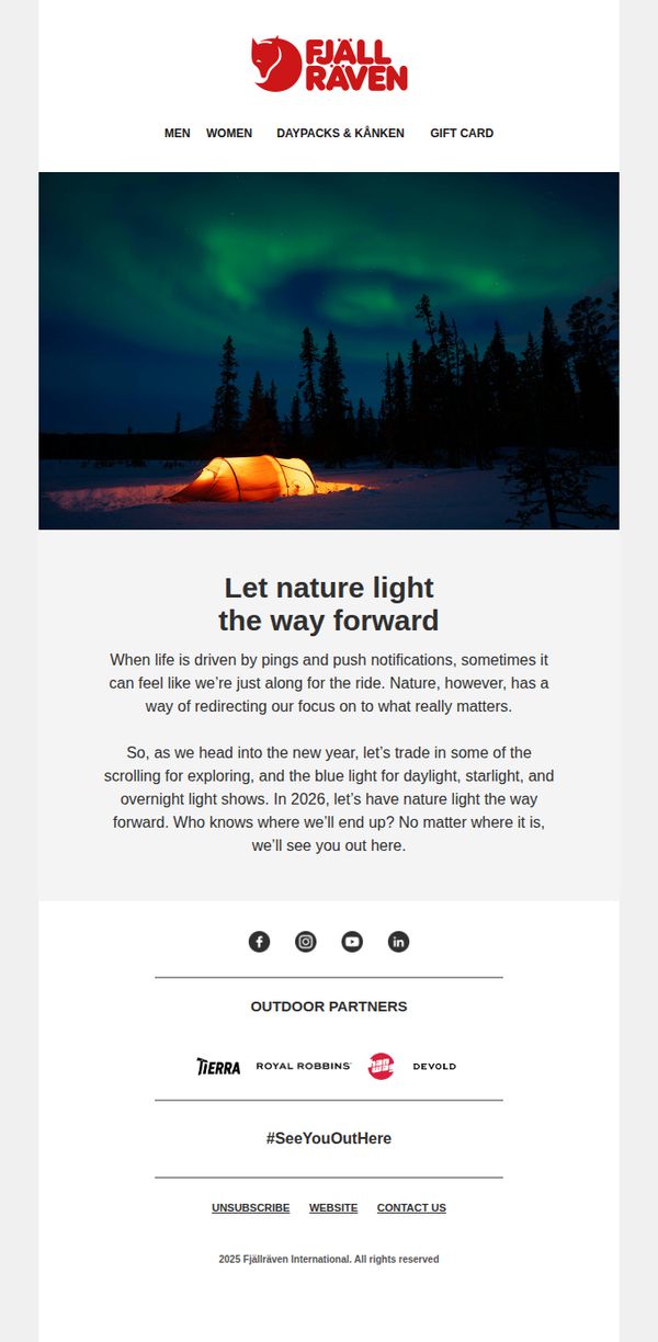
This email aims to inspire recipients to reconnect with nature in the new year by shifting focus away from digital distractions and toward authentic outdoor experiences, while subtly reinforcing Fjällräven’s brand identity as a companion for meaningful exploration.
Why this works
The email masterfully reframes the new year not as a time for resolutions but as an invitation to rediscover presence through nature, aligning brand values with emotional human needs in a way that feels poetic, not promotional.
How to implement
By contrasting the fatigue of digital overload with the quiet wonder of auroras and glowing tents, the message creates a visceral emotional pivot that positions outdoor gear not as equipment, but as a gateway to reconnection and renewal.
Pro Tip
Add a subtle CTA button beneath the hero image, such as 'Explore Our Gear for 2026', to guide inspired readers toward action without disrupting the contemplative tone, bridging emotion to commerce more intentionally. • Include a micro-testimonial or user-generated photo beneath the main copy (e.g., 'Last winter, Sarah pitched her tent under the auroras, here’s what she saw') to ground the poetic message in real customer stories and boost relatability.
5. Buy trousers that last
Objective
This email aims to drive sales of durable, high-performance trousers by positioning them as long-term investments for outdoor enthusiasts, while reinforcing Fjällräven’s brand values of quality, functionality, and thoughtful design tailored to both men and women.
Why this works
Fjällräven brilliantly reframes the purchase of trousers not as a seasonal fashion decision but as a long-term investment in durability and performance, appealing directly to outdoor lovers who value gear that endures real-world conditions.
How to implement
By featuring both men’s and women’s models in authentic outdoor settings and then explicitly calling out gender-specific design philosophy, the brand builds trust with audiences who care about thoughtful, body-conscious engineering rather than just scaled-down versions of men’s styles.
Pro Tip
Add a subtle countdown timer or limited-edition badge near the 'New Colour' product (Vidda Pro Lite Trousers M) to create urgency and highlight novelty, encouraging faster decision-making without disrupting the email’s calm, premium tone. • Reposition the 'Explore' CTA button under the 'Trekking trousers for life' section to be more visually prominent, perhaps with a contrasting color or larger size, to better guide users from emotional storytelling to immediate action, reducing friction in the conversion path.
6. It’s not too late to save

Objective
This email aims to drive immediate winter jacket sales by reminding customers of a limited-time 10% discount while reinforcing brand storytelling through adventure narratives and community experiences. It also seeks to convert interest into action by requiring account login to redeem the offer.
Why this works
The email smartly ties urgency to product relevance by positioning the discount as a last-chance opportunity for winter readiness, making the promotion feel timely and personally valuable rather than generic or pushy.
How to implement
By embedding authentic outdoor stories like Foxtail’s ‘When nature is your classroom,’ the brand deepens emotional resonance without interrupting the sales flow, turning transactional messaging into shared values that build loyalty beyond the cart.
Pro Tip
Add a visual countdown timer near the CTA to reinforce urgency, since the expiration date (Nov 14) is buried in fine print at the bottom, this would strengthen psychological pressure to act immediately. • Place the primary CTA button (“Log in now”) directly beneath the discount code instead of after an explanatory paragraph, reducing friction and aligning with user intent to redeem quickly.
7. New flagship trekking jacket

Objective
To introduce and drive interest in Fjällräven’s new Keb GTX Jacket, highlighting its partnership with GORE-TEX and emphasizing durability, repairability, and performance for outdoor enthusiasts seeking long-term gear investment.
Why this works
The email brilliantly positions the Keb GTX Jacket not just as a product, but as a legacy item, leveraging its award-winning past and GORE-TEX partnership to build trust and emotional investment in long-term outdoor performance.
How to implement
By embedding repair guides and emphasizing gear longevity, Fjällräven transforms a product launch into a values-driven narrative, appealing to eco-conscious adventurers who prioritize sustainability and durability over disposable fashion.
Pro Tip
Add a clear, action-oriented CTA button directly under the hero image, such as 'Shop Keb GTX Jacket', to reduce friction and capitalize on initial engagement before the reader scrolls to secondary content. • Include a short customer testimonial or review snippet near the product description to reinforce social proof and validate the jacket’s performance claims, especially since the campaign targets experienced trekkers who rely on peer validation.
8. Choose your Expedition

Objective
This email aims to drive exploration and purchase of Fjällräven’s Expedition jacket lineup by highlighting their heritage, versatility across winter conditions, and emotional connection through real customer stories, encouraging recipients to find their ideal jacket for personal adventures.
Why this works
The email brilliantly anchors product appeal in legacy by referencing the 1974 original design, then pivots to modern versatility, this storytelling technique transforms a product catalog into a narrative of enduring innovation that resonates with heritage-conscious outdoor enthusiasts.
How to implement
By organizing jackets along a 'warm to warmest' spectrum with clear gender-specific CTAs, the email reduces decision fatigue and empowers users to self-select based on personal need, turning a broad product range into a guided, confidence-building shopping journey.
Pro Tip
The primary CTA 'Explore Expedition jackets from warm to warmest' is buried beneath two paragraphs of copy; moving it directly under the hero image or making it a sticky button would increase conversion by reducing scroll friction for motivated users. • The 'Foxtrail' testimonial section uses a generic 'Read more' button that doesn’t signal emotional payoff, rephrasing it to 'Read Karin & Göran’s love story' would increase click-through by aligning the CTA with the narrative hook already established in the headline.
9. First look! New Bergtagen

Objective
To introduce and generate excitement for Fjällräven’s new Bergtagen collection by connecting it to Scandinavian mountain culture and real alpine use, while driving immediate engagement through layered product discovery and storytelling that inspires outdoor adventure above the treeline.
Why this works
The email brilliantly anchors the new Bergtagen collection in Scandinavian folklore, transforming a product launch into a cultural narrative that resonates emotionally with outdoor enthusiasts who value heritage and authenticity in their gear choices.
How to implement
By breaking down the collection into functional layering systems, base, insulation, work, and shell, the email educates the customer while subtly guiding them toward complete outfit purchases, turning casual browsers into intentional buyers with clear next steps.
Pro Tip
Add a subtle countdown timer or limited-edition badge near the 'Discover Bergtagen' CTA to create urgency, especially since this is a 'first look' launch, this would nudge hesitant shoppers toward immediate action without disrupting the narrative flow. • Include a small 'Shop the Look' carousel beneath the video or testimonial section that visually bundles complementary items (e.g., jacket + pants + backpack) to reduce decision fatigue and increase average order value through intuitive cross-selling.
10. Trousers: A wise investment

Objective
This email aims to position Fjällräven trousers as a durable, high-value investment for winter outdoor enthusiasts by highlighting their long-term performance, technical features, and emotional legacy. It encourages recipients to explore and purchase trousers designed to last through many seasons of adventure.
Why this works
The email brilliantly frames trousers not as seasonal apparel but as a lifelong investment, tapping into the customer’s desire for enduring quality and emotional connection to gear that outlasts trends and weather alike.
How to implement
By spotlighting specific technical features like G-1000 Stretch and zippered ventilation alongside real-world use cases, the campaign builds credibility and answers the unspoken question: 'Why should I pay more for these?'
Pro Tip
The primary CTA 'Read more' is too passive for a product-focused campaign; replace it with action-oriented language like 'Shop Winter Trousers' or 'Find Your Perfect Pair' to better drive conversions. • The product grid lacks pricing or key differentiators (e.g., 'Best for Skiing' or 'Most Durable'), adding brief value tags under each product would help users quickly compare and decide without clicking through.