How fashion brands do routine emails that drive repeat visits

1. Lookiero - UK: Have you already got your perfect jeans?
Objective
The email aims to drive conversions by helping subscribers discover their ideal jeans based on body shape, positioning Lookiero as a personalized styling solution that removes the guesswork from denim shopping.
Why this works
By anchoring the entire campaign around body morphology, Lookiero transforms a generic product category into a personalized experience, making the customer feel seen and understood before they even click through.
How to implement
The email smartly uses visual pairings of real models with clear, concise copy to educate customers on fit types, turning what could be a confusing decision into an empowering, confidence-building moment.
Pro Tip
Add a subtle countdown timer or urgency indicator near the CTA to nudge procrastinators, since the email’s goal is conversion, a time-sensitive element could boost immediate action without disrupting the educational tone. • Include a short testimonial or social proof snippet under the hero section to reinforce trust, for example, '92% of customers found their perfect fit on their first box', to reduce perceived risk before the user dives into body-type education.
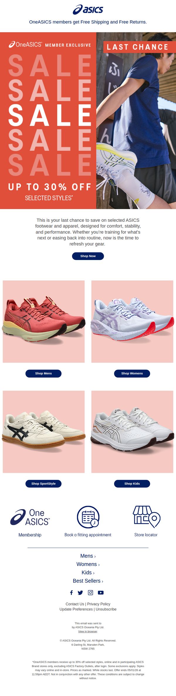
2. ASICS - AU: 🚨OneASICS Boxing Day Sale ends soon🚨
Objective
This email aims to drive urgency and conversions by reminding OneASICS members that the Boxing Day Sale is ending soon, encouraging them to take advantage of up to 30% off selected styles before the offer expires. It targets both new and returning customers with personalized member benefits and clear category navigation.
Why this works
The email leverages urgency with a bold 'LAST CHANCE' banner and repeated 'SALE' typography to create visual momentum, making the time-sensitive offer impossible to ignore while reinforcing the member-exclusive value proposition.
How to implement
By segmenting product categories into clearly labeled quadrants, Mens, Womens, SportStyle, Kids, the email reduces decision fatigue and guides users intuitively to their preferred section, increasing the likelihood of immediate clicks and conversions.
Pro Tip
Add a visible countdown timer near the hero section to quantify the urgency, e.g., 'Sale ends in 23h 59m', which would increase perceived scarcity and drive faster click-throughs than the static 'LAST CHANCE' text alone. • Include a small testimonial or social proof snippet under the hero copy, such as 'Over 10,000 members shopped this sale', to reinforce FOMO and validate the offer’s popularity, making hesitant shoppers more confident in acting.
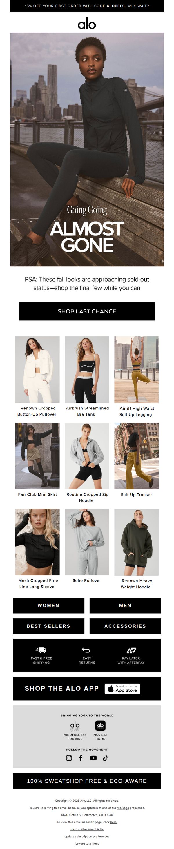
3. Alo Yoga: Almost Gone: The best of fall is going fast
Objective
This email aims to create urgency around dwindling fall inventory, encouraging immediate purchases by highlighting nearly sold-out items and offering a first-order discount to convert new customers.
Why this works
The email masterfully combines scarcity messaging with aspirational imagery, using 'Almost Gone' as a headline to trigger FOMO while visually anchoring the campaign in urban, active lifestyles that resonate with the brand’s core audience.
How to implement
By featuring a curated grid of nine high-performing fall items with clear product names, the email reduces decision fatigue and guides shoppers toward immediate action without overwhelming them with too many choices or vague categories.
Pro Tip
Add a dynamic countdown timer beneath the 'Almost Gone' headline to visually reinforce urgency and encourage immediate clicks, especially since the email’s goal is to drive last-chance purchases before items sell out. • Include a short testimonial or social proof snippet near the product grid, such as 'Loved by 10K+ yogis this season', to build trust and validate the popularity of the nearly sold-out items, enhancing conversion potential.
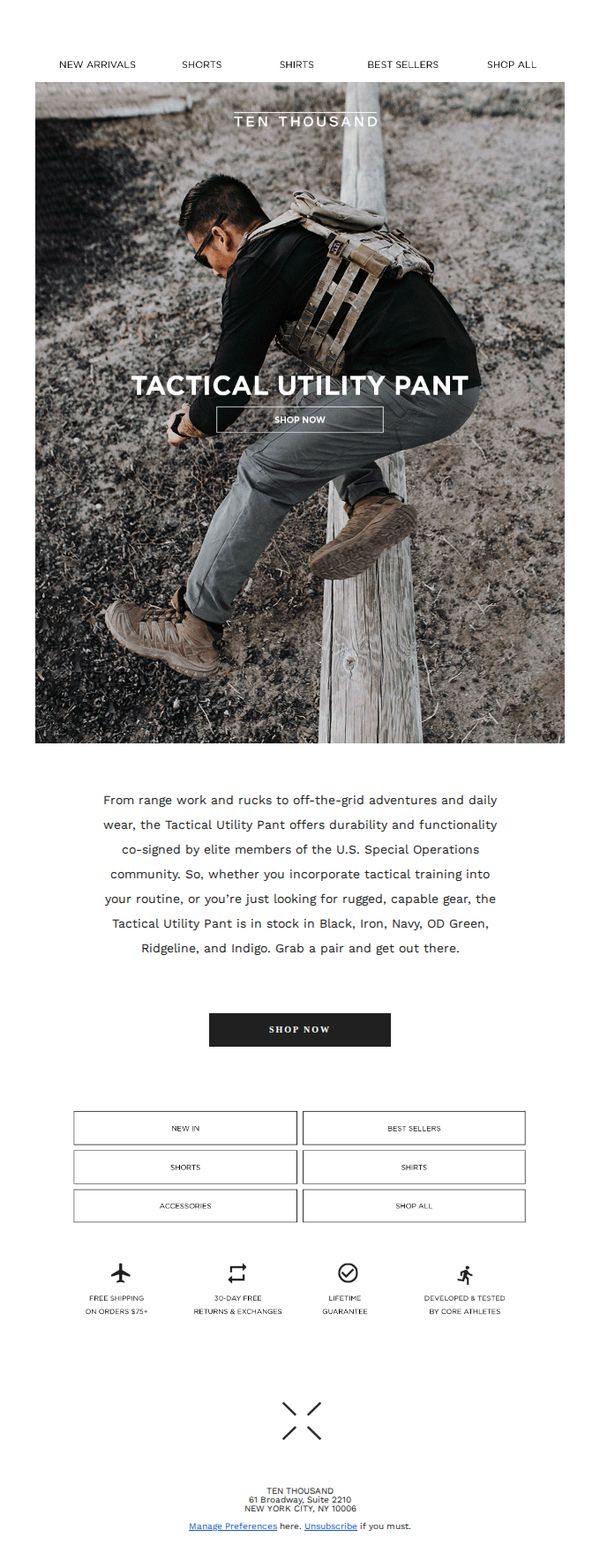
4. Ten Thousand: Featuring: The Tactical Utility Pant
Objective
To drive immediate purchases of the Tactical Utility Pant by highlighting its rugged functionality and elite military co-sign, while positioning it as essential gear for both tactical training and everyday adventure.
Why this works
The email brilliantly bridges tactical credibility with everyday utility by anchoring the product’s value in real-world use cases, from range work to off-the-grid adventures, making it feel indispensable rather than just another pant.
How to implement
By explicitly naming the U.S. Special Operations community as co-signers, the campaign leverages authoritative social proof that resonates deeply with performance-driven consumers seeking gear validated by elite operators.
Pro Tip
Add a limited-time urgency element like a countdown timer or 'Low Stock' indicator near the CTA to reduce hesitation and drive faster conversion, especially since the product appeals to mission-oriented buyers who respond to scarcity. • Include a short testimonial or quote from a Special Operations member directly under the hero image to amplify credibility and emotional resonance, making the co-sign feel more personal and less abstract.
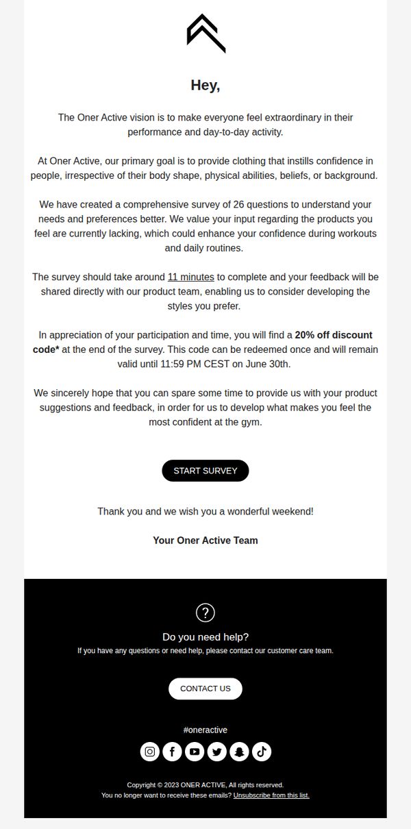
5. Oner Active: Oner Active Sportswear Inclusivity and Modesty Survey
Objective
Oner Active aims to gather customer feedback through a 26-question survey to better understand needs around inclusivity and modesty in sportswear, ultimately guiding product development that boosts confidence for all body types and backgrounds.
Why this works
The email opens with a clear brand vision that emotionally anchors the reader, making everyone feel extraordinary, which transforms a simple survey into a mission-driven collaboration rather than a transactional request.
How to implement
By explicitly stating the survey’s 11-minute time commitment and promising direct product team access to feedback, Oner Active reduces perceived effort and increases trust, making customers feel their voice will genuinely shape future collections.
Pro Tip
Add a progress bar or visual indicator near the CTA to reduce survey abandonment by showing users how far along they are, especially since 11 minutes may feel long without visual feedback. • Include a brief testimonial or quote from a past survey participant who saw their feedback turned into a product, to strengthen social proof and reinforce that customer input leads to real change.
6. Lookiero - UK: Tips for a perfect return to the routine
Objective
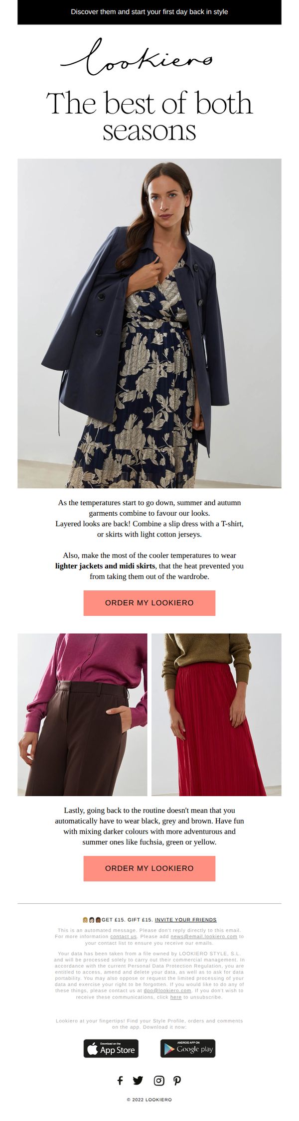
To encourage subscribers to restart their fashion routine by ordering a personalized styling box, using seasonal transition tips as a persuasive hook to drive immediate action.
Why this works
The email brilliantly frames seasonal wardrobe transitions as an opportunity for reinvention rather than a chore, making the styling service feel essential and timely for readers re-entering daily routines.
How to implement
By pairing aspirational imagery with practical styling advice, like layering slip dresses or mixing bold colors, it transforms fashion guidance into a compelling reason to engage with the brand’s core offering.
Pro Tip
Add a subtle countdown timer near the CTA to create urgency around seasonal styling, leveraging the 'return to routine' theme to imply limited-time relevance for the curated looks. • Include a mini testimonial or social proof snippet under each outfit example to reinforce trust and show real users successfully adopting these transitional styles with Lookiero’s help.
7. Saint James - US: Back to school 📚

Objective
This email aims to drive back-to-school shopping by showcasing stylish, confidence-boosting kids' apparel and accessories while subtly addressing safety concerns with face masks. It positions Saint James as a trusted heritage brand helping families transition smoothly into the new school year with curated, colorful essentials.
Why this works
The email brilliantly ties emotional reassurance to product utility by framing kids’ clothing as tools for confidence during routine transitions, making functional apparel feel aspirational and emotionally resonant for parents.
How to implement
By placing face masks under a ‘safety and style’ header, the campaign reframes a pandemic-era necessity into a fashion statement, aligning with parent values without sounding clinical or fear-driven, which elevates perceived brand sensitivity.
Pro Tip
Add a time-sensitive element like a countdown timer or ‘limited stock’ indicator near the ‘Shop Now’ CTA to create urgency, especially since back-to-school is a seasonal window with high purchase intent. • Include a short customer testimonial or parent quote under the ‘Embrace the Routine’ section to reinforce social proof and emotional validation, making the transition narrative feel more authentic and relatable.
8. Western Rise: This 4th of July, Go Beyond the Backyard BBQ

Objective
This email aims to inspire customers to plan adventurous 4th of July getaways beyond typical backyard BBQs by showcasing curated travel destinations paired with purpose-built apparel, while subtly driving sales through destination-specific product recommendations and a closing warehouse sale.
Why this works
The email brilliantly reframes the holiday as an invitation to adventure rather than obligation, using evocative destination storytelling to emotionally align the brand with freedom, exploration, and elevated experiences that resonate with the target traveler’s identity.
How to implement
Each destination is paired with a specific product recommendation that solves a real environmental or activity-based need, like UPF protection for desert sun or trail-ready pants, making the gear feel essential rather than promotional, which builds trust and relevance.
Pro Tip
The 'Warehouse Sale' section at the bottom feels disconnected from the adventure narrative; reposition it as a 'Travel Prep Bonus' with a countdown timer to create urgency while maintaining thematic alignment with the getaway theme. • Add a subtle visual indicator (like a small icon or badge) next to each 'Shop' button showing the product’s key benefit (e.g., 'UPF 50+', 'Lightweight') to reinforce value at the point of decision without requiring extra clicks.
9. Ten Thousand: Layer ⬆️
Objective
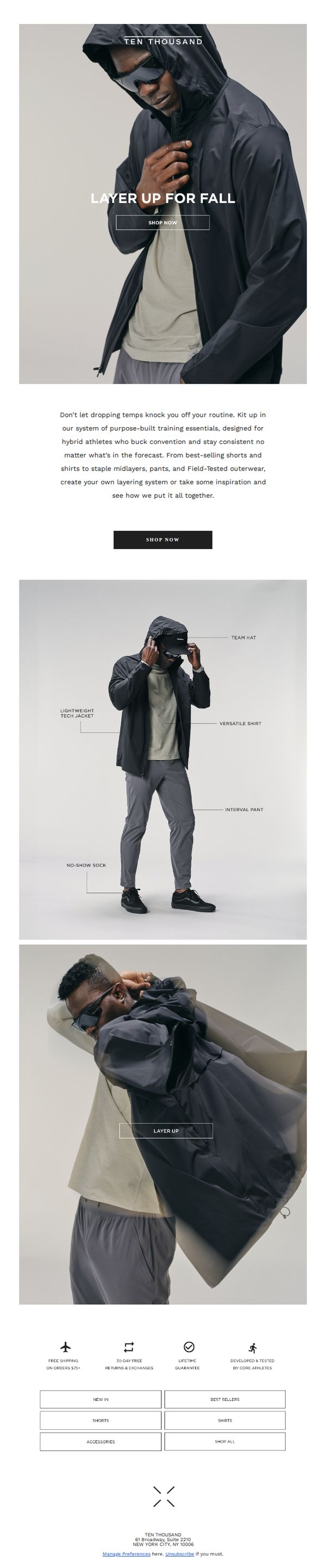
This email aims to drive fall apparel sales by encouraging hybrid athletes to layer up with Ten Thousand’s purpose-built training essentials, positioning the brand as a solution for maintaining consistency despite changing weather.
Why this works
The email brilliantly frames layering not as a seasonal chore but as a performance strategy, aligning apparel choices with athletic identity and consistency, a powerful emotional hook for goal-driven customers.
How to implement
By visually deconstructing a complete outfit with labeled components, the email transforms product browsing into an educational experience, helping customers understand how pieces work together to solve real-world training challenges.
Pro Tip
Add a subtle countdown timer or seasonal urgency cue near the CTA to nudge immediate action, since fall layering is time-sensitive and the current design lacks temporal motivation. • Include a short testimonial or athlete quote near the product grid to humanize the layering system and reinforce social proof, especially since the brand emphasizes 'core athletes' as developers.
10. Prada: Rethinking beauty

Objective
This email aims to introduce Prada Beauty’s new skincare-to-complexion product line while positioning the brand as a luxury innovator that harmonizes beauty with responsibility. It seeks to drive traffic to the online shop through curated visuals and minimalist messaging.
Why this works
Prada masterfully blends editorial minimalism with luxury product storytelling, using tight close-ups and negative space to elevate each item as a design object rather than just a cosmetic.
How to implement
The email strategically frames beauty as an intellectual and ethical pursuit by pairing phrases like 'luxury and responsibility in harmonious conversation' with clean visuals, subtly appealing to conscious consumers without overt moralizing.
Pro Tip
Add a subtle countdown or limited-edition badge near the hero CTA to create urgency, especially since luxury beauty audiences respond well to scarcity cues that reinforce exclusivity. • Integrate a short testimonial or editorial quote from a beauty editor or influencer near the product grid to build social proof without disrupting the minimalist aesthetic.