Home Get Social campaign ideas that work
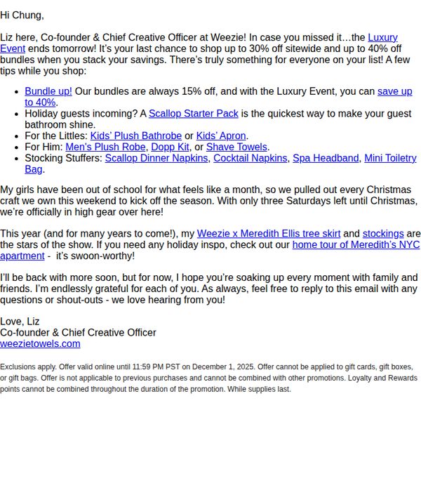

1. Weezie: Sunday Towel Times 💙
Objective
The email aims to create urgency for the final day of the Luxury Event sale, encouraging immediate purchases by highlighting discounts up to 40% and curated gift bundles for different recipients, while reinforcing brand personality through a personal, conversational tone from the founder.
Why this works
The email leverages personal storytelling by having the founder address the reader directly, which builds trust and transforms a promotional message into a warm, human conversation that feels less transactional and more relational.
How to implement
By segmenting product recommendations into categories like 'For the Littles' and 'For Him,' the email simplifies decision-making for gift shoppers, reducing cognitive load and increasing the likelihood of conversion through targeted, thoughtful curation.
Pro Tip
Add a visual countdown timer near the CTA to reinforce urgency more dynamically than text alone, especially since the offer ends tomorrow, this would increase perceived scarcity and drive faster action. • Include a small hero image or product collage showcasing the 'Weezie x Meredith Ellis tree skirt and stockings' mentioned in the body, since visual proof of the 'stars of the show' would strengthen desire and reduce the need for external clicks.
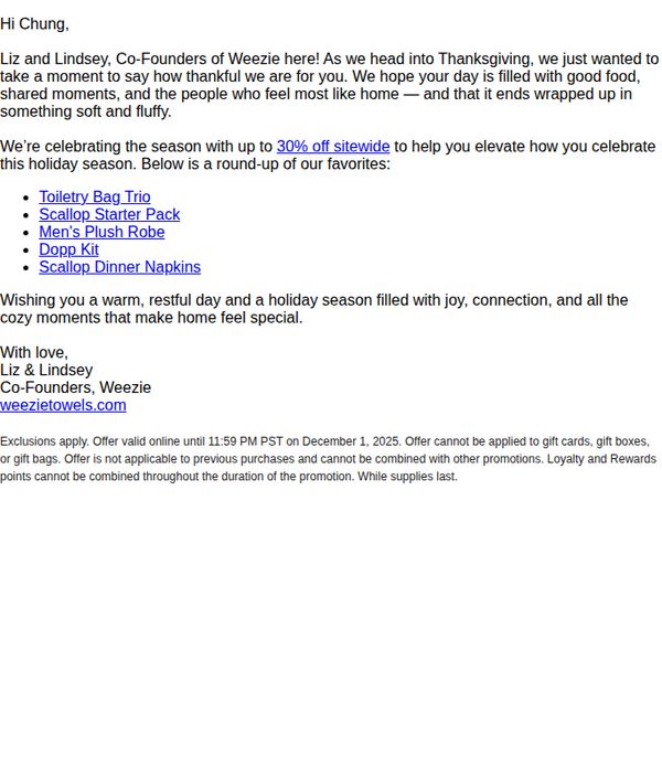
2. Weezie: Thankful for You ❤️
Objective
This email aims to express gratitude to customers during the Thanksgiving season while driving holiday sales through a limited-time sitewide discount. It personalizes the message with a note from the founders to foster emotional connection and encourage immediate purchase.
Why this works
The email opens with a warm, personal note from the founders that humanizes the brand and frames the promotion as a gesture of appreciation, making the discount feel like a gift rather than a sales tactic.
How to implement
By tying the discount to the Thanksgiving season and using emotionally resonant language like 'cozy moments that make home feel special,' the campaign aligns the offer with the customer’s emotional state and holiday values.
Pro Tip
Add a visual hero banner or product image grid to break up text-heavy content and immediately showcase the promoted items, increasing visual appeal and reinforcing the emotional tone with cozy, homey imagery. • Include a countdown timer or urgency indicator near the CTA to emphasize the limited-time nature of the offer, which could boost conversion by creating a stronger sense of scarcity and prompting faster action.
3. Beliani: Get one of the six flower vases for free! 👀💐
Objective
This email aims to drive immediate purchases by offering a free flower vase with any £180+ order, while also showcasing themed product collections to inspire browsing and cross-category sales ahead of Friendship Day.
Why this works
The email brilliantly leverages a high-perceived-value freebie, a curated selection of six stylish vases, to incentivize a minimum spend, turning a simple discount into an emotionally appealing gift-with-purchase that feels exclusive and personal.
How to implement
By organizing products into themed lifestyle sections like 'Cosy Movie Night' and 'Backyard Barbecue,' the campaign subtly guides shoppers through aspirational scenarios, making it easier for them to envision products in their own homes and increasing the likelihood of multiple-category purchases.
Pro Tip
The 'Get the code' CTA is visually underwhelming and buried beneath product images; it should be redesigned as a bold, contrasting button with a clear value proposition like 'Claim Your Free Vase Now' to increase conversion rates. • The email lacks a countdown timer or visual urgency indicator near the offer section, adding one would reinforce the August 4th deadline and nudge procrastinators toward immediate checkout.
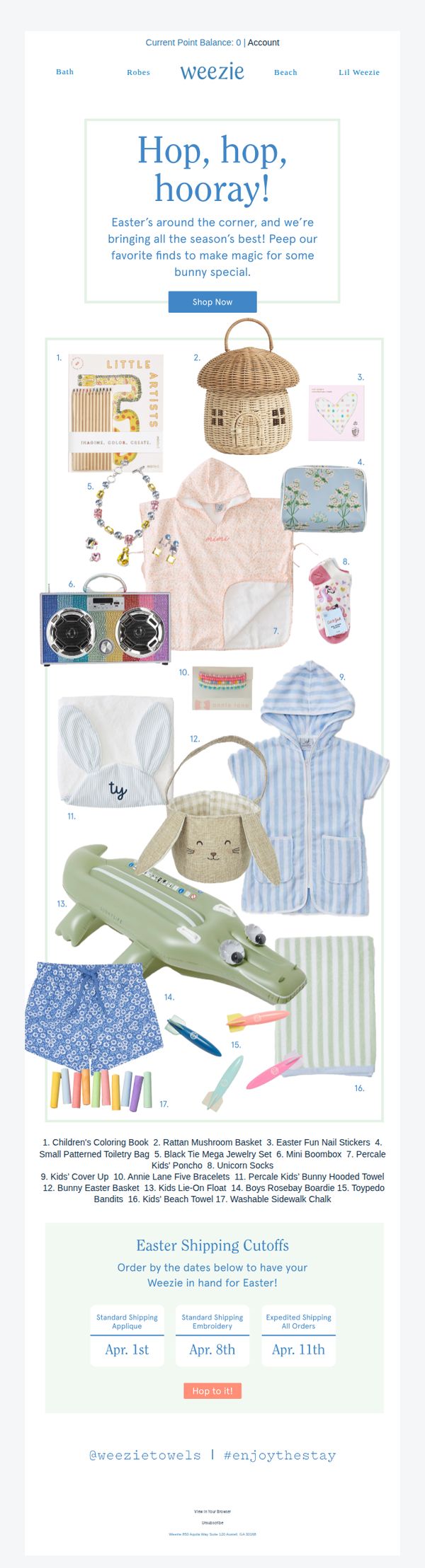
4. Weezie: Peep this 🐥
Objective
This email aims to drive Easter-themed product sales by showcasing a curated collection of seasonal items for kids and families, encouraging immediate shopping with urgency-driven shipping cutoffs. It positions Weezie as a go-to source for festive, thoughtful gifts that make Easter memorable.
Why this works
The email brilliantly ties seasonal excitement to product discovery by using playful, Easter-themed copy like 'Hop, hop, hooray!' to emotionally engage parents while visually clustering 17 curated items in a numbered grid that feels like a treasure hunt for gift ideas.
How to implement
Including clear, date-based shipping cutoffs with visual buttons transforms passive browsing into time-sensitive action, subtly nudging customers to prioritize ordering now to ensure Easter delivery, a smart urgency tactic that aligns perfectly with holiday gifting behavior.
Pro Tip
Add a brief testimonial or social proof near the product grid (e.g., 'Loved by 5,000+ Easter families') to build trust and reduce hesitation, especially since many items are novelty or seasonal purchases where buyers may seek validation. • Reposition the 'Hop to it!' CTA button directly beneath the product grid, not after the shipping cutoffs, to reduce friction and capture intent immediately after visual inspiration, rather than making users scroll past logistical info first.
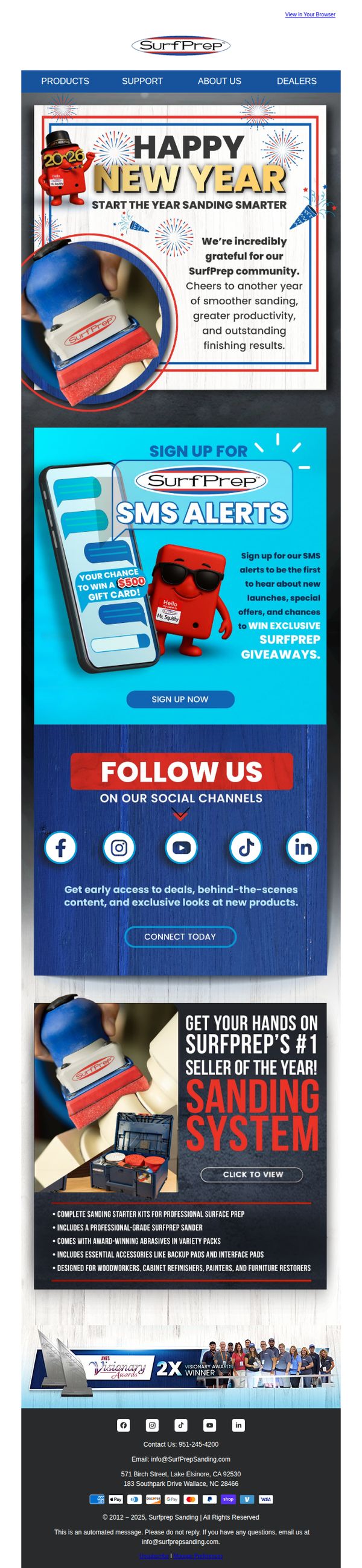
5. SurfPrep Sanding: Happy New Year from the SurfPrep Family!
Objective
This email aims to celebrate the New Year with the SurfPrep community while driving engagement through SMS sign-ups and promoting their top-selling sanding system. It seeks to strengthen brand loyalty and convert festive goodwill into product interest and social media follows.
Why this works
The email opens with a warm, community-focused New Year message that humanizes the brand and frames the product as part of a shared journey toward better results, making the promotion feel personal rather than transactional.
How to implement
By tying the SMS alert sign-up to a tangible reward, a $500 gift card, the campaign transforms passive subscribers into active participants, leveraging urgency and exclusivity without overwhelming the reader with multiple offers.
Pro Tip
The hero section’s CTA ‘SIGN UP NOW’ is visually buried beneath the SMS alert graphic; repositioning it above or beside the phone image would improve click-through by aligning with the user’s natural eye flow from headline to action. • The product section lacks a direct ‘Add to Cart’ or ‘Shop Now’ button, adding a secondary CTA beneath the ‘Click to View’ would capture intent from users ready to buy immediately, rather than forcing them to navigate away to find purchasing options.
6. Weezie: Sunday Towel Times 💙
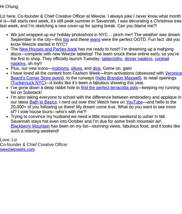
Objective
To build brand connection and anticipation for new spring product launches by sharing behind-the-scenes updates and personal stories from the founder, while subtly driving traffic to the website through curated product mentions and event highlights.
Why this works
The email opens with a warm, personal voice that feels like a note from a friend, blending humor, seasonal nostalgia, and brand history to create emotional resonance before ever mentioning a product.
How to implement
Strategic product placement is woven naturally into storytelling, mentioning new icons, tablecloths, and napkins as part of a lifestyle moment rather than a sales pitch, making discovery feel organic and aspirational.
Pro Tip
Add a visual hero banner or product image near the top to anchor the 'spring break' theme and showcase the new tablecloths or napkins mentioned, this would strengthen visual appeal and reduce reliance on text-only persuasion. • Include a secondary CTA button or link near the product mentions (e.g., 'Shop the New Icons') to reduce friction for readers ready to act, rather than forcing them to scroll to the footer for the only clickable link.
7. Rooted: Re: Cyber Sale Extension
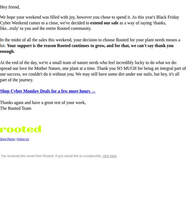
Objective
To extend the Cyber Monday sale as a gesture of gratitude to customers, reinforcing community loyalty while driving last-minute conversions before the promotion ends.
Why this works
The email frames the sale extension not as a sales tactic but as a heartfelt thank-you, which humanizes the brand and deepens emotional connection with the audience.
How to implement
By acknowledging the customer’s role in the brand’s growth, the message transforms a transactional promotion into a shared celebration of community and mutual success.
Pro Tip
Add a visual countdown timer near the CTA to create urgency and reinforce the limited-time nature of the extended sale, which is currently implied but not visually emphasized. • Include a small product grid or featured deal preview beneath the CTA to reduce friction, customers shouldn’t have to click through to discover what’s on sale.
8. Bambu: Happy Lunar New Year from bambu
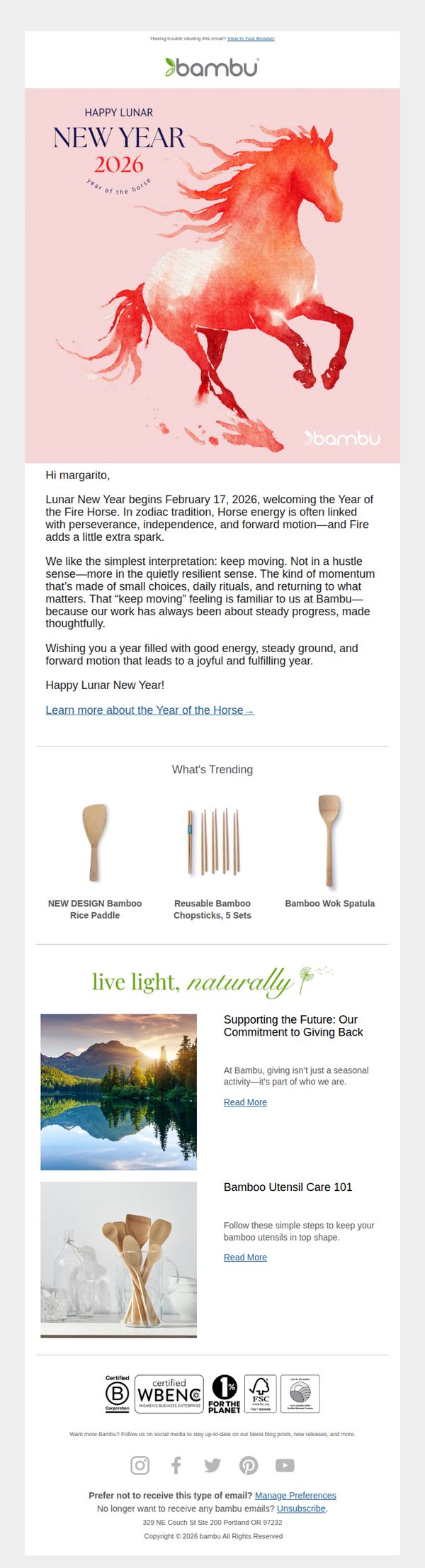
Objective
This email aims to celebrate Lunar New Year 2026 with a personalized, culturally resonant message while subtly reinforcing Bambu’s brand values of mindful progress and sustainability. It also gently introduces trending products and educational content to nurture customer engagement without aggressive sales pressure.
Why this works
Bambu brilliantly ties the Year of the Horse to its brand ethos of thoughtful, steady progress, transforming a cultural moment into a meaningful brand story that feels authentic, not opportunistic, and invites emotional alignment from the reader.
How to implement
Instead of pushing discounts, the email highlights trending products through a clean, visual grid that feels editorial rather than promotional, making discovery feel organic and aligned with the reader’s lifestyle rather than a sales tactic.
Pro Tip
Add a secondary CTA button beneath the ‘What’s Trending’ section, such as ‘Shop the Collection’, to convert passive interest into action, since the current single CTA is buried and doesn’t align with the product showcase’s intent. • Include a small visual indicator or badge next to trending products (e.g., ‘New Design’ or ‘Bestseller’) to create urgency or social proof, helping readers prioritize items without adding clutter or disrupting the email’s calm aesthetic.
9. Weezie: Sunday Towel Times 💙
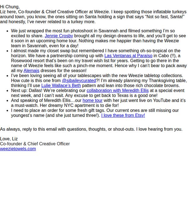
Objective
To build brand connection and excitement by sharing personal, behind-the-scenes updates from the founder, while subtly promoting upcoming collaborations, product collections, and events that align with seasonal moments like Thanksgiving and holiday gifting.
Why this works
The founder’s personal storytelling, like swapping closets and spotting inflatable turkeys, creates emotional resonance by making the brand feel like a trusted friend sharing real-life moments, not just pushing products.
How to implement
Strategically weaving in product mentions through lifestyle context (e.g., ‘I’m already planning my Thanksgiving table…’) makes promotions feel organic and aspirational, rather than salesy or interruptive to the narrative flow.
Pro Tip
Add a visual hero section with a photo from the Jennie Crosby photoshoot or the Las Ventanas al Paraiso partnership to anchor the emotional story with imagery and increase visual engagement. • Include a secondary CTA button or link next to the ‘I love these from Etsy!’ line to drive traffic directly to the gift tag product page, capitalizing on the spontaneous product mention.
10. Yellowpop: Happy International Women's Day!
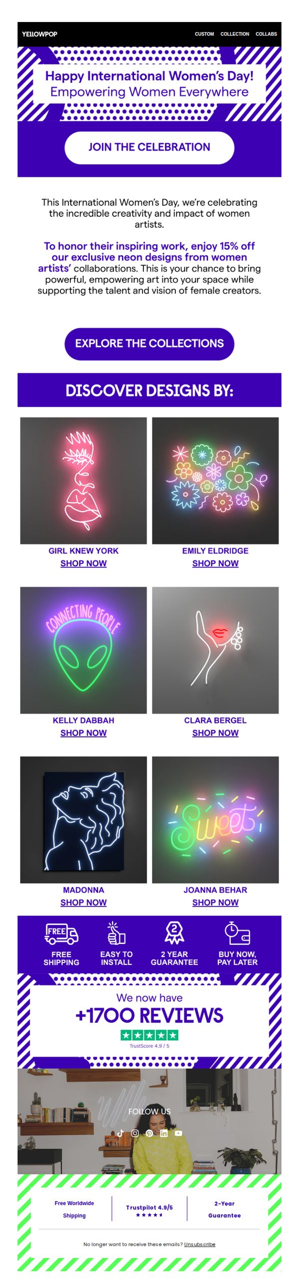
Objective
This email aims to celebrate International Women’s Day by honoring female artists through a special discount on their exclusive neon designs, while driving sales and reinforcing brand values of empowerment and creative support.
Why this works
The campaign brilliantly ties a cultural moment to product promotion by offering a discount on women artists’ designs, making the sale feel purposeful and emotionally resonant rather than purely transactional.
How to implement
Highlighting individual artist names with dedicated visuals and 'Shop Now' links turns a generic product grid into a curated gallery experience, which elevates perceived value and encourages deeper engagement with each creator’s story.
Pro Tip
Add a countdown timer near the CTA to create urgency around the 15% discount, since limited-time offers significantly boost click-through rates during holiday-themed campaigns like this one. • Include a short artist quote or mission statement beneath each designer’s name to deepen emotional connection, this would transform the product grid from a shopping list into a storytelling experience that aligns with the empowerment theme.