How Feals Does Health & Wellness Email Campaigns
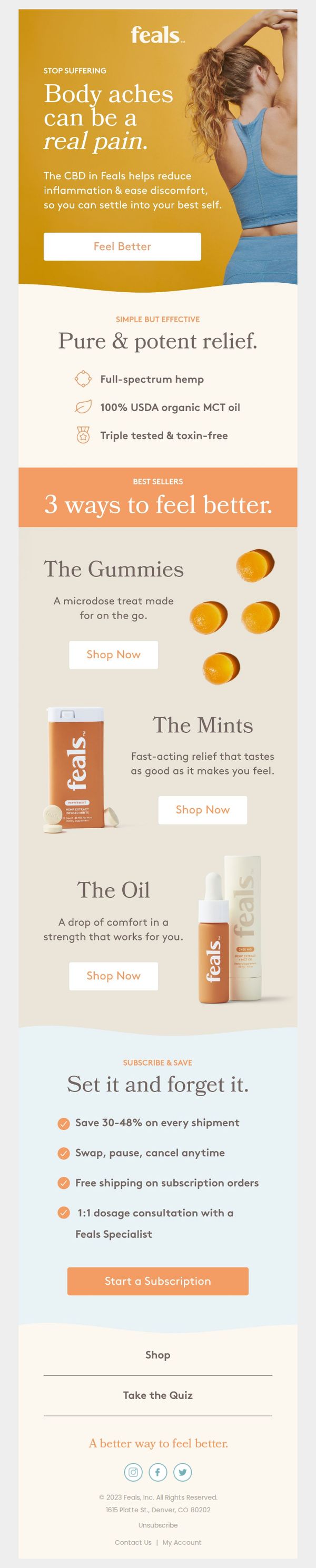



1. “Ahhhh, that’s better.”
Objective
This email aims to convert readers into customers by addressing body pain with Feals’ CBD products, emphasizing relief, simplicity, and subscription convenience to encourage immediate purchase or sign-up.
Why this works
The email opens with a visceral, empathetic headline that mirrors the customer’s internal monologue, 'Ahhhh, that’s better', immediately validating their pain and positioning Feals as the intuitive solution they’ve been searching for.
How to implement
By framing each product as a distinct 'way to feel better,' the email simplifies decision-making without overwhelming the reader, turning complex CBD options into intuitive, lifestyle-aligned choices that match different user needs and routines.
Pro Tip
Add a subtle countdown timer or limited-availability badge near the 'Start a Subscription' CTA to create urgency, especially since the 30–48% savings is a strong motivator that benefits from time-sensitive framing. • Include a micro-testimonial or user rating directly under each product (e.g., 'Rated 4.8/5 by 2,300+ users') to build social proof at the point of decision, reinforcing trust without requiring the reader to scroll further.
2. Find your Feals the easy way
Objective
This email aims to guide new customers into the Feals ecosystem by introducing a curated starter bundle that simplifies their first purchase while highlighting the benefits of each included product for stress relief, focus, and calm. It seeks to convert curiosity into immediate action through value-driven messaging and clear product education.
Why this works
The email brilliantly reduces decision fatigue by framing the starter pack as a curated, no-guesswork solution, positioning it not just as a product bundle, but as a personalized wellness onboarding experience that builds trust from the first click.
How to implement
Each product is given its own mini-story with usage recommendations and emotional benefits, turning functional descriptions into lifestyle moments, like adding oil to morning coffee or popping a mint during midday chaos, which makes the products feel indispensable rather than optional.
Pro Tip
Add a subtle countdown timer or urgency indicator near the 'Shop the Starter Pack' CTA to nudge hesitant buyers, since the offer is framed as a value-driven intro, a time-sensitive element could boost conversion without compromising the calm, stress-free tone. • Include a short customer testimonial or social proof badge near the product grid to reinforce credibility, while the email explains benefits well, real user validation would strengthen trust for first-time buyers considering a wellness investment.
3. “8-9 hours of very restful sleep” 😴
Objective
This email aims to convert readers into customers by showcasing real user testimonials that highlight improved sleep quality and reduced pain after using Feals products, while guiding them toward specific product purchases based on their preferred format, oil, gummies, or mints.
Why this works
The email brilliantly leverages authentic, detailed customer stories that tie specific dosages and product formats to tangible outcomes like deeper sleep and reduced neck pain, making the benefits feel personal and scientifically grounded rather than generic.
How to implement
Each testimonial is paired with a visually distinct product image and a dedicated CTA button, creating a seamless path from emotional resonance to purchase decision without forcing the reader to scroll or search for the next step.
Pro Tip
Add a subtle countdown timer or limited-time offer badge near the hero CTA to create urgency, since the current design lacks any time-sensitive incentive that could nudge hesitant readers toward immediate action. • Include a brief comparison table or icon-based feature grid under each testimonial to quickly highlight key differentiators (e.g., onset time, dosage, flavor) between oil, gummies, and mints, helping readers choose faster without needing to click through.
4. Aches & pains end here ❌
Objective
This email aims to convert readers into customers by positioning Feals Oil as the definitive solution for chronic and acute pain, using emotional storytelling, social proof, and a risk-free guarantee to drive immediate purchases.
Why this works
The email opens with a visceral, empathetic hook that names specific pain points, like sleepless nights and joint pain, to instantly resonate with sufferers and position the product as the emotional and physical antidote they’ve been searching for.
How to implement
By featuring real customer testimonials with specific conditions like fibromyalgia and post-root canal recovery, the campaign builds authentic credibility and subtly reassures prospects that even complex, personal pain can be managed with this single solution.
Pro Tip
Add a visual progress bar or countdown timer near the CTA to create urgency around the 30-day guarantee, subtly implying limited-time access to risk-free relief and encouraging faster decision-making. • Include a small 'How It Works' visual or icon grid beneath the product image to clarify application method or absorption time, reducing hesitation for first-time users unfamiliar with topical hemp oil usage.
5. Tired of being tired?
Objective
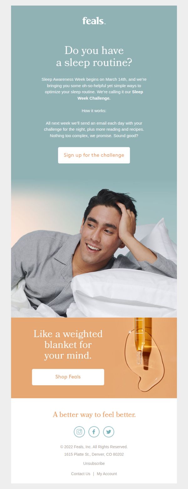
This email aims to engage subscribers who struggle with sleep by inviting them to join a 7-day Sleep Week Challenge, positioning Feals as a supportive guide to better rest while subtly promoting their products as part of a holistic wellness solution.
Why this works
The email opens with a relatable, empathetic question, 'Do you have a sleep routine?', that immediately resonates with tired audiences, making them feel seen and priming them for a solution without sounding salesy or clinical.
How to implement
By framing the campaign as a 'challenge' with daily emails, Feals transforms passive consumption into active participation, creating anticipation and habit-forming engagement that increases the likelihood of long-term brand loyalty and product trial.
Pro Tip
Add a subtle countdown timer or urgency cue near the CTA to encourage immediate sign-up, since the challenge begins on a specific date (March 14th) and users may delay action without a visual nudge. • Include a short testimonial or user result snippet under the hero section, e.g., '92% of participants reported falling asleep faster', to build social proof and reduce perceived risk before the user commits to the challenge.
6. What is microdosing, anyway?
Objective
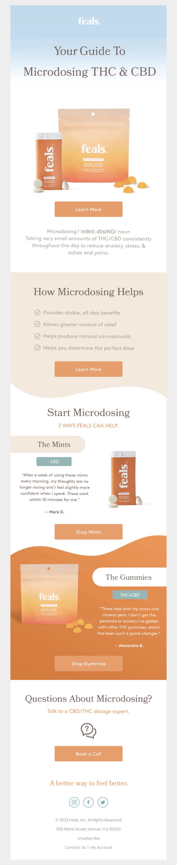
This email aims to educate new or curious customers about microdosing THC and CBD while positioning Feals as a trustworthy, science-backed guide. It gently leads readers toward product exploration by framing microdosing as a practical, everyday wellness tool.
Why this works
The email brilliantly opens with a clear, dictionary-style definition of microdosing, instantly demystifying a complex topic and building trust by speaking to beginners without jargon or intimidation.
How to implement
By separating product offerings into distinct, benefit-driven categories, The Mints for mental clarity and The Gummies for stress relief, it creates intuitive pathways for different customer needs, making selection feel personalized and effortless.
Pro Tip
Add a subtle countdown timer or limited-availability tag near the 'Shop Mints' and 'Shop Gummies' CTAs to create urgency without disrupting the educational tone, encouraging immediate action from interested readers. • Include a short FAQ snippet under 'Questions About Microdosing?' addressing common concerns like legality, dosage frequency, or side effects, this reduces friction for first-time users and preempts abandonment.
7. Tired of waking up tired?

Objective
This email aims to help tired, sleep-deprived customers feel more energized in the morning by offering practical wake-up hacks and positioning Feals Morning Melts as the ideal solution for sustained, crash-free energy. It builds trust through social proof and gently guides readers toward a purchase.
Why this works
The email brilliantly reframes the product as a lifestyle enhancer rather than just a supplement, using relatable morning struggles to build emotional resonance before introducing the solution in a non-pushy, educational tone.
How to implement
Customer testimonials are strategically placed after educational content to validate the product’s effectiveness without interrupting the flow, making social proof feel organic and persuasive rather than promotional.
Pro Tip
Add a subtle countdown timer or limited-time offer badge near the CTA to create urgency, since the current design lacks any time-sensitive incentive that could nudge hesitant readers to act immediately. • Include a small visual comparison between Morning Melts and coffee (e.g., side-by-side icons showing energy vs. jitters) to reinforce the unique value proposition more vividly and reduce perceived risk for first-time buyers.
8. Confused by weed terms?

Objective
This email aims to reduce customer confusion around cannabis terminology by offering clear, simple definitions, while positioning Feals as a trustworthy, educational guide to encourage product exploration and purchase.
Why this works
Feals brilliantly reframes customer confusion not as a barrier but as an invitation to learn, using warm, non-intimidating language that positions the brand as a compassionate educator rather than just a seller.
How to implement
By defining complex cannabis terms with phonetic spellings and plain-language explanations, Feals lowers the entry barrier for new users while building credibility through transparency and scientific grounding without overwhelming the reader.
Pro Tip
Add a brief visual icon or color-coded tag next to each term (e.g., 'Science', 'Safety', 'Experience') to help users quickly categorize concepts and improve scanability for those skimming the education section. • Include a micro-interaction or toggle (e.g., 'Show Pronunciation') next to each term’s phonetic spelling to enhance accessibility and engagement without cluttering the layout, especially for mobile users.
9. Last chance: 50% off The Oil
Objective
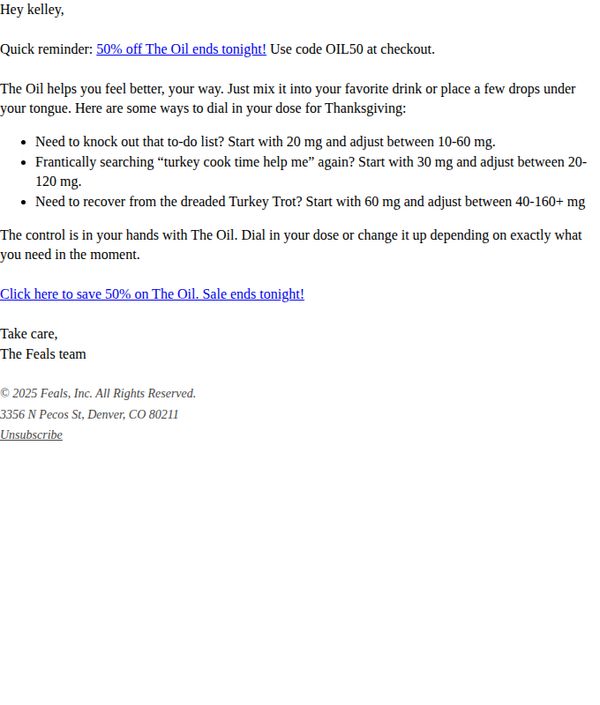
This email aims to create urgency and drive immediate purchases by reminding the recipient that a 50% discount on The Oil ends tonight, while also offering practical dosing guidance to reduce hesitation and encourage confident use during Thanksgiving.
Why this works
The email brilliantly ties product usage to real-life Thanksgiving stressors, like turkey cooking and to-do lists, making the benefit feel immediate, relatable, and emotionally resonant rather than purely transactional.
How to implement
By offering specific, scenario-based dosing suggestions, the brand reduces buyer anxiety and positions itself as a helpful guide, not just a seller, which builds trust and lowers the barrier to purchase.
Pro Tip
Add a visual element like a countdown timer or bold red banner near the CTA to amplify urgency and make the time-sensitive offer impossible to miss, especially for skimmers. • Include a short testimonial or social proof near the dosing tips to validate the suggested usage and reinforce that others have successfully used The Oil in similar high-stress situations.
10. Need a little lift?
Objective
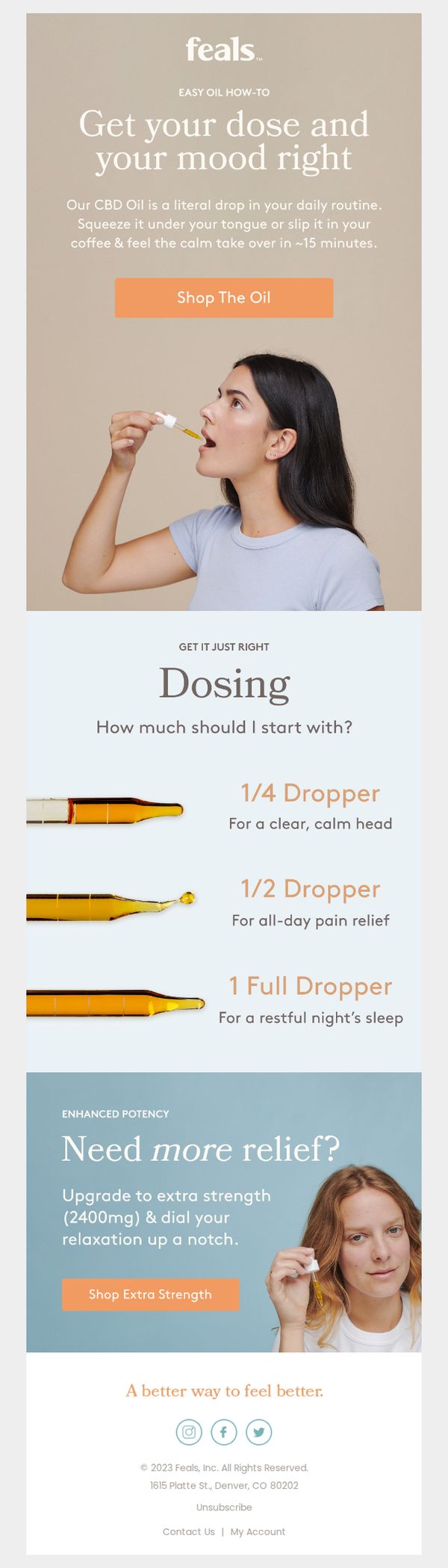
This email aims to guide new or curious users toward purchasing Feals CBD oil by simplifying dosing decisions and positioning the product as an effortless mood enhancer that fits into daily routines. It also encourages upsells to higher-potency formulas for users seeking stronger relief.
Why this works
The email brilliantly reduces decision fatigue by visually mapping dropper amounts to specific emotional and physical outcomes, turning a complex dosing question into an intuitive, benefit-driven choice that feels personalized and trustworthy.
How to implement
By framing CBD as a 'literal drop in your daily routine' that works in 15 minutes, the campaign taps into modern consumers’ desire for instant, seamless wellness solutions without requiring lifestyle overhauls or long-term commitments.
Pro Tip
Add a subtle countdown timer or limited-stock indicator near the 'Shop The Oil' CTA to create urgency without disrupting the calm, educational tone, especially effective for users who may need a nudge to convert after reading dosing guidance. • Include a micro-testimonial or user stat (e.g., '87% of new users feel calmer within 15 mins') beneath the dosing section to reinforce social proof and reduce skepticism around efficacy, especially for first-time CBD buyers.