Tom Wood Project jewelry email designs from top brands



1. Chunky Ear Pieces l Satin and Polished
Objective
To showcase Tom Wood Project’s chunky ear cuffs and earrings with a focus on bold, sculptural design, encouraging viewers to explore and purchase statement jewelry that embodies individuality and craftsmanship.
Why this works
The email masterfully balances editorial photography with product shots, using diverse models to convey emotional resonance and inclusivity while keeping the focus on the jewelry’s sculptural form and luxurious finish.
How to implement
By pairing minimalist product grids with lifestyle imagery, the campaign creates a visual rhythm that guides the eye naturally from inspiration to purchase, reinforcing the brand’s ethos of wearable art without overwhelming the viewer.
Pro Tip
Add a subtle countdown or limited-availability indicator near the CTA to create urgency, especially since the ‘Made to order’ note implies scarcity, this would nudge hesitant buyers toward immediate action. • Include a short customer testimonial or styling tip beneath one of the hero images to humanize the product and provide social proof, helping new visitors visualize how the pieces fit into real-life occasions.
2. Discover the Arch Rings l Sharp and raw design
Objective
This email aims to introduce and drive interest in the Arch Rings collection by highlighting its architectural inspiration and minimalist aesthetic, encouraging recipients to explore and shop the new designs as part of the broader Vault collection.
Why this works
The email masterfully ties product design to a compelling narrative, brutalist architecture, giving the Arch Rings emotional and cultural weight that elevates them beyond mere accessories into wearable art with a story.
How to implement
By featuring both male and female models wearing the rings in moody, editorial-style photography, the campaign subtly communicates gender-neutral appeal and lifestyle integration, making the product feel aspirational yet accessible.
Pro Tip
Add a subtle countdown timer or limited-edition badge near the 'SHOP NOW' CTA to create urgency, especially since the Vault collection implies exclusivity, this would nudge hesitant shoppers toward immediate action. • Include a small testimonial or customer review snippet near the product grid to reinforce social proof, as the current layout relies heavily on visuals and narrative without third-party validation.
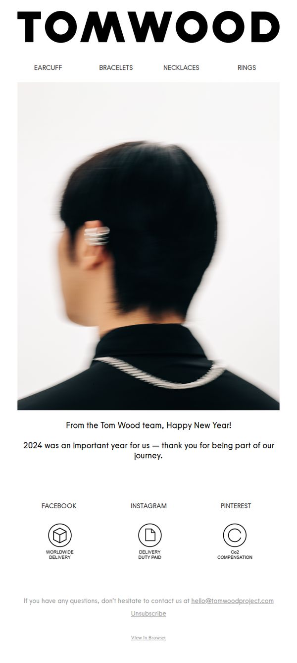
3. Happy New Year!
Objective
To express gratitude to customers for their support in 2024 while reinforcing brand identity and trust through a minimalist, emotionally resonant New Year message that subtly encourages continued engagement without overt sales pressure.
Why this works
The email opens with a clean, high-impact visual of a model wearing the product from behind, creating intrigue and elegance without overwhelming the viewer, a masterclass in minimalist luxury storytelling that lets the jewelry speak for itself.
How to implement
By framing 2024 as 'an important year for us, thank you for being part of our journey,' the brand transforms a generic holiday greeting into a personalized, emotionally intelligent moment that fosters loyalty through shared narrative rather than transactional messaging.
Pro Tip
Replace the passive 'Unsubscribe' link in the footer with a more engaging secondary CTA like 'Explore Our New Arrivals' or 'Shop the Look' to gently guide users toward product discovery while maintaining the email’s elegant tone. • Add a subtle hero section CTA button, even something as simple as 'See What’s New in 2025', to convert emotional goodwill into measurable engagement, leveraging the goodwill of the New Year message to drive traffic without compromising the minimalist aesthetic.
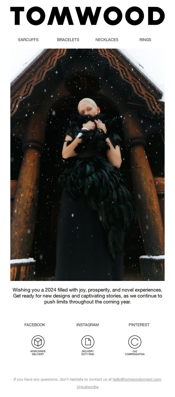
4. Happy New Year!
Objective
To warmly welcome subscribers into the new year while reinforcing brand identity and anticipation for upcoming collections. The email aims to nurture customer relationships by aligning emotional well-wishes with the brand’s creative vision for 2024.
Why this works
The email masterfully blends seasonal warmth with brand mystique by using a moody, snow-dusted architectural backdrop that subtly reinforces the brand’s artisanal, boundary-pushing identity without overt sales pressure.
How to implement
By anchoring the message in emotional resonance, wishing joy, prosperity, and novel experiences, the brand positions itself not as a seller but as a curator of meaningful moments, which deepens emotional loyalty beyond transactional relationships.
Pro Tip
Replace the passive 'Unsubscribe' CTA with a forward-looking invitation like 'Explore New Arrivals' or 'Be First to See 2024 Designs' to convert goodwill into engagement and align with the campaign’s goal of building anticipation. • Add a minimalist hero CTA button, such as 'Discover the Collection', overlaying or beneath the image to guide the eye toward action, transforming the aesthetic moment into a conversion opportunity without disrupting the tone.
5. Oval polished l 925 Sterling silver
Objective
This email aims to showcase the elegance and versatility of the Oval Polished signet ring, positioning it as a minimalist luxury essential while driving direct sales through visual storytelling and product variety. It also reinforces brand values around design innovation and craftsmanship.
Why this works
The email masterfully uses gender-neutral modeling to broaden appeal, showing both male and female wearers in sophisticated, editorial-style poses that elevate the ring from accessory to statement piece without over-explaining its value.
How to implement
By placing the product grid immediately after the hero shot, the email capitalizes on initial emotional engagement and smoothly transitions the viewer into exploration mode, making it effortless to imagine the ring in different styles and stone variations.
Pro Tip
Add a subtle countdown timer or limited-stock indicator near the 'SHOP NOW' CTA to create urgency, especially since the ring is presented as a signature piece, scarcity would nudge hesitant buyers toward immediate action. • Include a short testimonial or customer review snippet under the hero image to reinforce social proof; luxury buyers often rely on peer validation, and even one sentence from a verified buyer could significantly boost conversion confidence.
6. Orb collection | Layers and Stones

Objective
This email aims to introduce and drive interest in the new Orb collection by showcasing its design philosophy and versatility through lifestyle imagery, while teasing an upcoming Pokémon collaboration to build anticipation and encourage immediate exploration of the collection.
Why this works
The email masterfully uses gender-fluid modeling to position the Orb collection as universally wearable, subtly expanding its appeal beyond traditional gendered jewelry marketing while reinforcing the brand’s modern, inclusive identity.
How to implement
By embedding a teaser for the Pokémon collaboration at the bottom, the campaign leverages pop culture excitement to re-engage subscribers who may have scrolled past the product shots, turning passive viewers into curious return visitors.
Pro Tip
Add a subtle hover or tap animation to the product grid thumbnails to reveal pricing or material details, reducing friction for users who want quick specs before clicking through to the product page. • Reposition the Pokémon collaboration teaser above the 'SHOP ORB COLLECTION' CTA to capitalize on the emotional hook earlier in the scroll, increasing the likelihood that users will click through before losing interest.
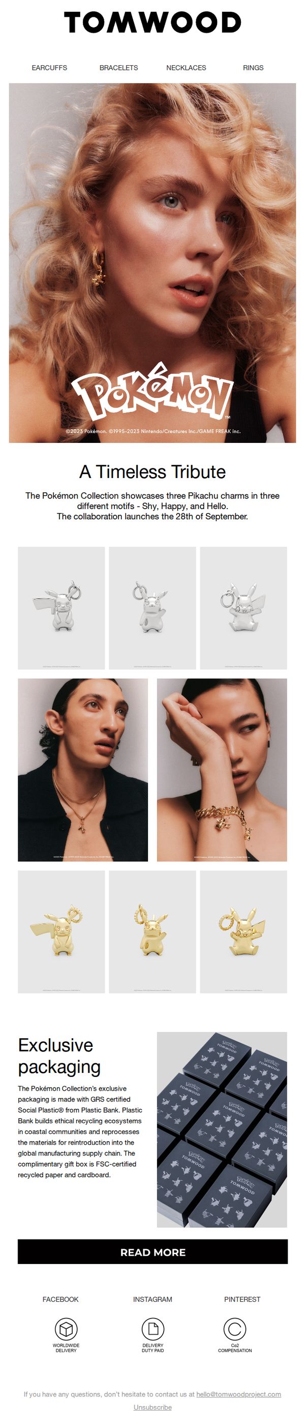
7. Tom Wood x Pokémon l Launching in 5 days
Objective
To generate excitement and anticipation for the upcoming Tom Wood x Pokémon collaboration launch by highlighting the unique Pikachu charms and ethical packaging, while driving traffic to learn more ahead of the September 28th release.
Why this works
The email brilliantly leverages nostalgia and pop culture by centering the campaign around Pikachu’s emotional motifs, Shy, Happy, and Hello, making the jewelry feel personal and collectible rather than just decorative.
How to implement
By spotlighting the sustainable packaging made from GRS-certified Social Plastic®, the brand elevates its eco-conscious values without overshadowing the product, subtly aligning luxury with responsibility in a way that resonates with modern consumers.
Pro Tip
Add a countdown timer above the CTA to visually reinforce urgency and the 5-day launch window, which would increase conversion by anchoring the reader’s attention to the time-sensitive nature of the drop. • Include a short testimonial or influencer quote near the product grid to build social proof, especially since this is a crossover collection, leveraging fan excitement or early reviewer sentiment would amplify credibility and FOMO.
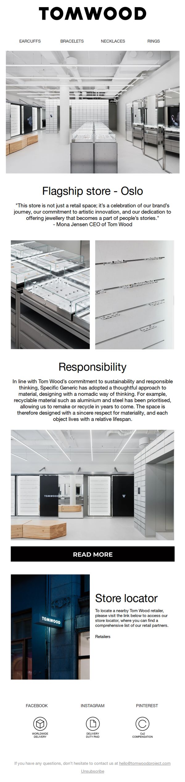
8. Flagship store | Re-opening
Objective
To announce the re-opening of Tom Wood’s flagship store in Oslo and position it as a meaningful brand experience that reflects artistic innovation and sustainability, encouraging visits and deeper engagement with the brand’s values.
Why this works
The email frames the store not as a transactional space but as a narrative destination, a celebration of brand heritage and emotional connection, which elevates the customer’s perception beyond mere retail.
How to implement
By featuring a CEO quote that ties the physical space to artistic innovation and storytelling, the campaign humanizes the brand and gives customers a reason to care beyond product features or price points.
Pro Tip
Add a clear, visually distinct CTA button near the top, such as 'Visit Our Oslo Store', to drive immediate action, since the current 'READ MORE' is buried and doesn’t signal urgency or intent to visit. • Include a map snippet or clickable store address in the 'Store locator' section to reduce friction for local customers, rather than forcing them to click through to an external page for basic location info.
9. Tom Wood x Pokémon launching soon
Objective
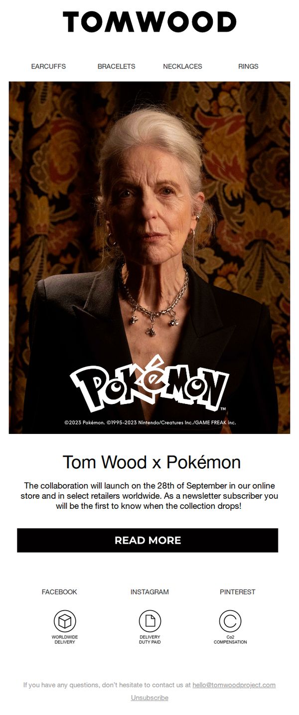
To build anticipation and exclusivity around the upcoming Tom Wood x Pokémon collaboration by notifying subscribers of the September 28th launch date and positioning them as the first to know, thereby driving early engagement and potential conversions.
Why this works
The email leverages nostalgia and cultural relevance by featuring a mature model wearing the collection, subtly signaling that Pokémon isn’t just for kids, it’s a lifestyle statement for discerning adults who appreciate craftsmanship and storytelling.
How to implement
By explicitly stating that subscribers will be the first to know about the drop, the campaign transforms passive readers into privileged insiders, creating urgency and emotional investment without resorting to aggressive sales tactics or artificial scarcity.
Pro Tip
Add a subtle countdown timer beneath the launch date to visually reinforce urgency and give subscribers a tangible reason to return before September 28th, increasing pre-launch engagement and reducing the risk of forgotten intent. • Include a teaser image or micro-preview of one product (e.g., a close-up of a Pokémon-themed necklace) in the hero section to spark curiosity and give subscribers a tangible reason to click ‘READ MORE’ beyond just text.
10. Limited edition: Snakeskin ring
Objective
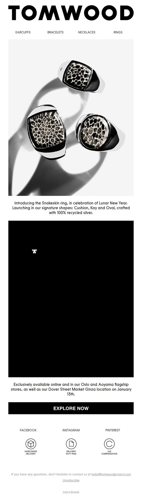
To generate urgency and exclusivity around the launch of the limited-edition Snakeskin ring by highlighting its cultural significance, sustainable materials, and limited availability across select physical and online channels.
Why this works
The email brilliantly ties product launch to cultural relevance by anchoring the Snakeskin ring to Lunar New Year, creating emotional resonance while subtly signaling exclusivity and timely desirability for collectors and trend-conscious buyers.
How to implement
By specifying exact launch locations, including flagship stores in Oslo, Aoyama, and Dover Street Market Ginza, the brand elevates perceived value through geographic scarcity, encouraging both local foot traffic and global online urgency among fashion-forward consumers.
Pro Tip
Add a countdown timer or 'Limited Stock' indicator near the CTA to amplify urgency, since the email mentions exclusivity but doesn’t visually reinforce scarcity or time sensitivity beyond the launch date. • Include a brief testimonial or influencer quote near the product image to build social proof, especially valuable for luxury items where trust and peer validation heavily influence purchase decisions.