How agencies do launch campaign emails that win clients


1. Thrive Internet Marketing Agency: How Negative Online Word-of-Mouth Can Hurt Businesses in 2026 📉
Objective
This email aims to educate businesses on the risks of negative online word-of-mouth while positioning Thrive as the solution through reputation management and PPC expertise. It drives conversions by offering free resources and demos to capture leads and build trust.
Why this works
The email opens with a fear-based but data-backed hook about negative word-of-mouth, immediately creating urgency and relevance for business owners who rely on public perception to drive sales and retention.
How to implement
Each content block is paired with a highly specific, benefit-driven CTA that matches the reader’s inferred intent, whether they’re worried about reviews, ad fatigue, or agency selection, making the journey feel personalized and frictionless.
Pro Tip
The primary CTA 'Get My Free Proposal' appears only once at the bottom; adding a sticky or repeated CTA button after each major section would capture attention earlier and reduce drop-off for readers who don’t scroll fully. • The 'Education Section' on PPC ad fatigue lacks a visual hierarchy, using bullet points or icons to break down symptoms (e.g., falling CTR, rising CPC) would make the content scannable and increase retention for time-poor business owners.
2. Good & Gold Marketing: Good & Gold Joins Graybox
Objective
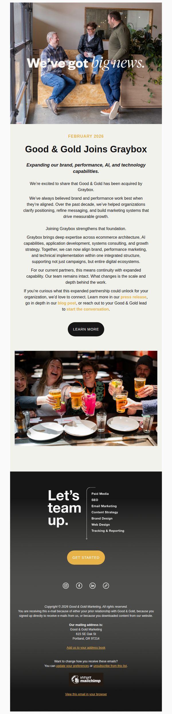
This email announces the acquisition of Good & Gold by Graybox, aiming to reassure existing clients of continuity while positioning the combined entity as a more powerful, full-service marketing and technology partner capable of delivering integrated digital ecosystems.
Why this works
The email opens with a warm, human-centered hero image and headline that immediately signals positive change without overwhelming the reader, making the acquisition feel like a celebration rather than a disruption.
How to implement
It strategically frames the acquisition as an expansion of capability, not a replacement, reassuring current clients that their relationships and team continuity remain intact while hinting at greater value through integrated services.
Pro Tip
Add a subtle countdown or time-sensitive language near the 'LEARN MORE' CTA to create urgency, such as 'Schedule a briefing before March 1st to unlock a free audit of your current marketing stack.' • Include a short testimonial or quote from a current client or Graybox executive to reinforce credibility and emotional resonance, especially since the announcement hinges on trust and continuity.
3. Tetra Marketing (eHouse) : New Year, New Insights: ehouse 2026 Updates
Objective
This email aims to position ehouse as a forward-thinking commerce partner by sharing timely, high-value insights from NRF 2026 and showcasing real client success, while encouraging engagement through content downloads and event attendance to nurture leads and strengthen brand authority.
Why this works
The email smartly anchors its value in a timely cultural moment, the start of 2026, to frame its content as essential, forward-looking intelligence rather than generic marketing fluff, which immediately elevates perceived relevance for busy commerce professionals.
How to implement
By leading with a high-impact blog on 'Agentic Commerce', a trending, complex topic, and pairing it with a downloadable infosheet, the campaign creates a natural progression from awareness to deeper education, subtly guiding readers toward becoming qualified leads without overt sales pressure.
Pro Tip
The CTA 'Read the blog' appears only once and is visually underwhelming; adding a second, more action-oriented CTA like 'Download the Agentic Commerce Guide' above the fold would better capture attention and drive conversions from skimmers. • The event section lists dates but lacks urgency or personalization; adding a countdown timer for eTail Palm Springs or a personalized note like 'We saved you a seat!' would increase FOMO and encourage direct outreach to Derek Satley.
4. Monday Creative Inc : My 2026 brand and marketing predictions 🔮
Objective
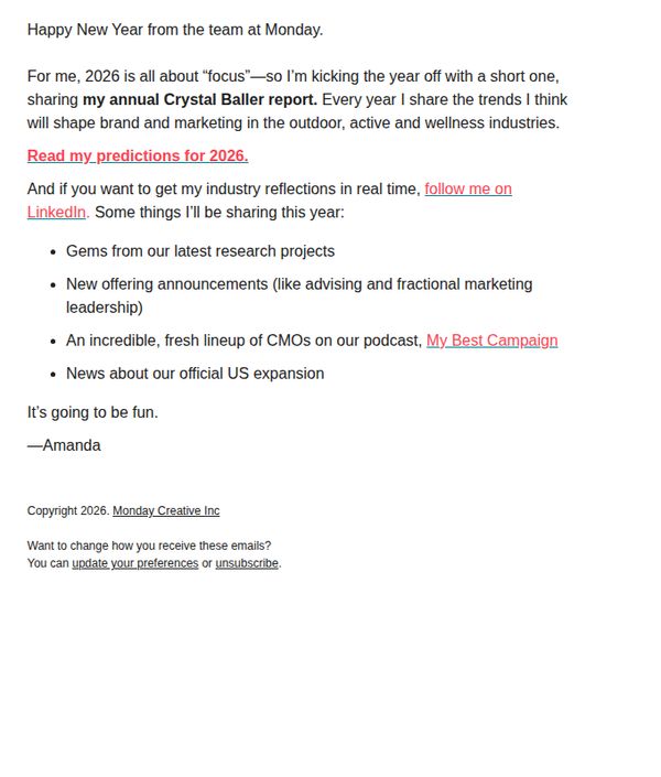
This email aims to position Amanda as a forward-thinking industry leader by sharing her 2026 brand and marketing predictions, while encouraging recipients to engage with her content across platforms and stay informed about company developments.
Why this works
By framing the email as a 'Crystal Baller report,' the brand injects personality and intrigue, turning a routine industry forecast into a memorable, branded experience that readers look forward to annually.
How to implement
The inclusion of multiple content hooks, research gems, new offerings, podcast guests, and expansion news, creates layered value, giving subscribers multiple reasons to stay engaged beyond the initial prediction read.
Pro Tip
Add a visual element like a mini infographic or icon set next to each bullet point to break up text density and increase scannability, especially since the email relies heavily on list-based content. • Include a secondary CTA button or link near the bottom encouraging readers to reply with their own predictions, this would boost engagement and create a feedback loop that strengthens community connection.
5. Hawke Media: We're Google’s 1st International Growth Certified Partner
Objective
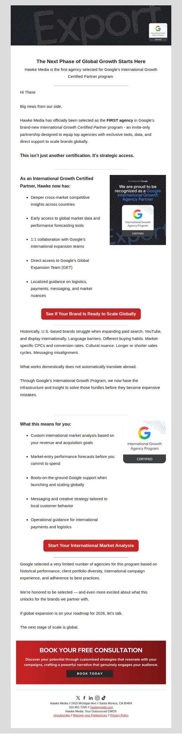
This email aims to position Hawke Media as a strategically privileged partner with Google’s International Growth program, leveraging exclusivity to attract brands planning global expansion by offering tailored market analysis and early access to global tools and support.
Why this works
By framing the Google certification not as a badge but as 'strategic access,' the email transforms a credential into a competitive advantage, making it irresistible to growth-focused brands seeking exclusive leverage in international markets.
How to implement
The email masterfully anticipates pain points, like language barriers and misaligned messaging, then positions Hawke Media as the solution with infrastructure and insight, turning abstract challenges into tangible, solvable opportunities for the reader.
Pro Tip
Add a subtle countdown timer or urgency indicator near the 'BOOK TODAY' CTA to reinforce exclusivity and prompt faster action, especially since the email targets strategic decision-makers who may delay without a clear temporal nudge. • Include a short, embedded testimonial or client result (e.g., 'Brand X scaled into 3 markets in 6 months using our framework') under the 'What this means for you' section to strengthen social proof and reduce perceived risk for new prospects.
6. Netflights: Important update regarding your Netflights personal data
Objective
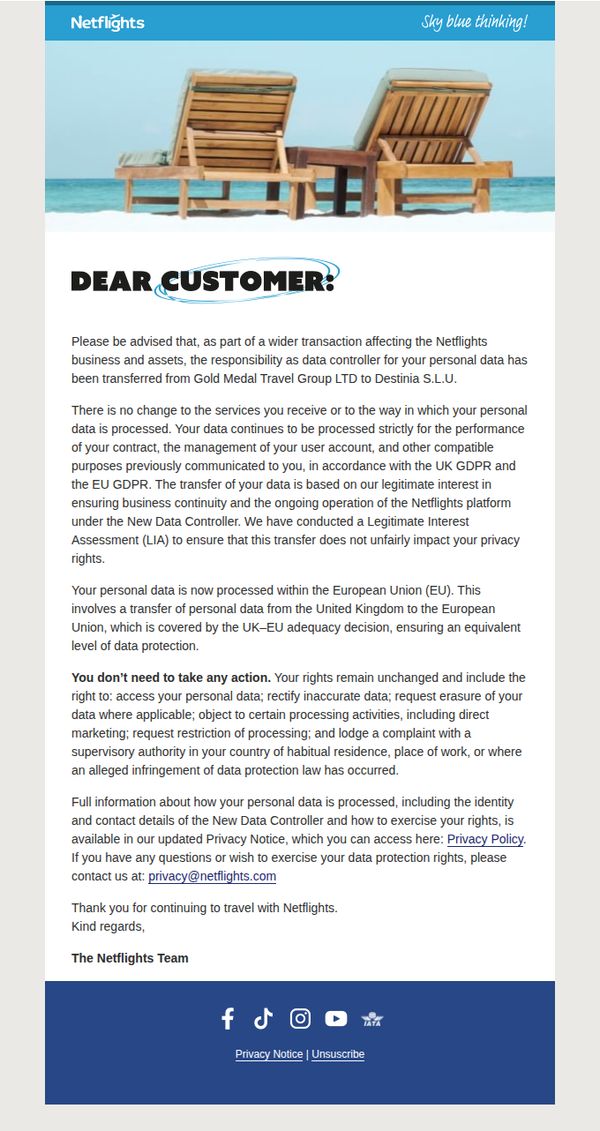
To inform customers of a legal data controller transfer while reassuring them that their services, privacy rights, and data handling remain unchanged, thereby maintaining trust and compliance transparency.
Why this works
The email opens with a calm, reassuring tone that immediately addresses potential customer anxiety by clarifying that services and data handling won’t change, which is critical for maintaining trust during legal transitions.
How to implement
It strategically anchors compliance by referencing both UK GDPR and EU GDPR, subtly reinforcing legitimacy and cross-border legal alignment without overwhelming the reader with jargon or legalese.
Pro Tip
Add a visual indicator, like a checkmark icon or green badge, next to the phrase 'You don’t need to take any action' to reinforce reassurance and improve scannability for skimming readers. • Include a brief, bolded summary line at the top (e.g., 'Your data is safe. No action needed.') to immediately communicate the core message before the detailed explanation, improving clarity for time-pressed users.
7. We Are Social - US: The Influencer Chronicles #8
Objective
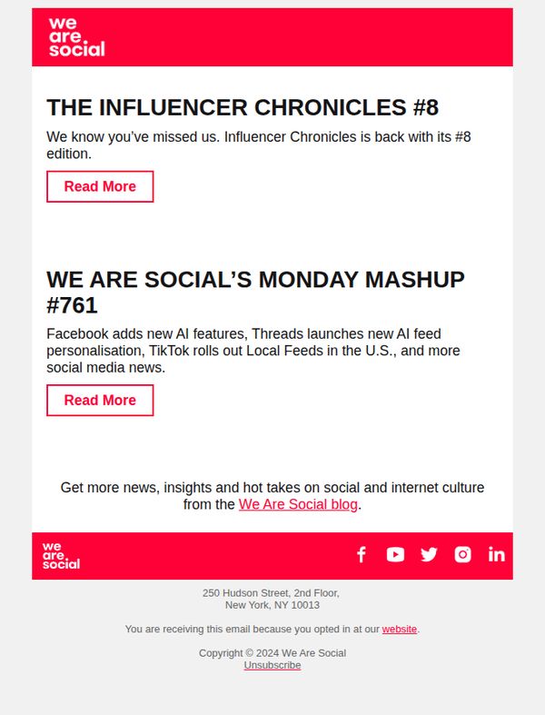
To re-engage subscribers by announcing the return of 'The Influencer Chronicles' newsletter and drive traffic to the latest edition and blog content. It aims to reinforce brand authority in social media insights while encouraging ongoing readership.
Why this works
The email opens with a warm, conversational tone that acknowledges subscriber absence, creating emotional reconnection before delivering value, a smart way to reduce unsubscribe rates and reignite engagement.
How to implement
By bundling two distinct content pieces under one email, it maximizes click-through potential without overwhelming the reader, offering both depth (Chronicles) and breadth (Mashup) to cater to varied audience interests.
Pro Tip
Add a visual thumbnail or icon next to each 'Read More' button to increase clickability and help users quickly distinguish between the two content types at a glance. • Include a brief teaser sentence under each headline to clarify what readers will gain, for example, 'Discover how AI is reshaping creator monetization', to boost conversion by reducing decision friction.
8. 5 & Vine: The Unmistakable Brands Review

Objective
This email introduces 'The Unmistakable Brands Review,' a year-long editorial series designed to help impact-driven brands build trust, relevance, and integrity by tackling quarterly brand challenges. It invites readers to engage by nominating brands and following the journey.
Why this works
The email brilliantly frames brand-building as a quarterly journey with clear thematic pillars, Clarity, Resonance, Alignment, Leadership, giving readers a structured, digestible roadmap to follow rather than overwhelming them with abstract theory.
How to implement
By inviting readers to nominate brands, the campaign transforms passive subscribers into active participants, fostering community ownership and creating a feedback loop that deepens engagement while sourcing real-world case studies for future content.
Pro Tip
The primary CTA 'Submit a Brand' is buried mid-email and visually underwhelming; it should be repeated above the fold with stronger visual contrast and urgency cues to increase conversion from interested readers. • The 'Why now?' section lacks emotional anchoring, adding a brief customer quote or statistic about brand confusion in 2026 would strengthen the rationale and make the problem feel more immediate and relatable.
9. Tinuiti: Benchmarking your Q4 performance
Objective
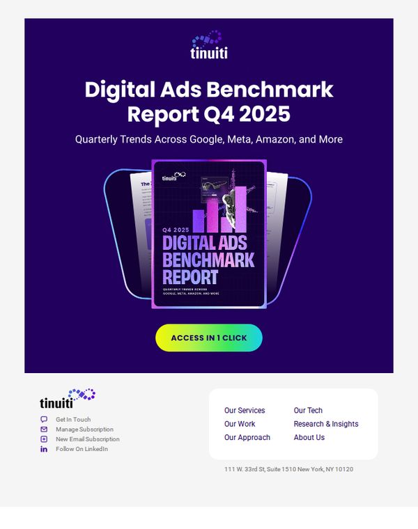
This email aims to drive engagement with Tinuiti’s Q4 2025 Digital Ads Benchmark Report by positioning it as an essential resource for understanding cross-platform advertising trends, encouraging immediate access with a frictionless CTA.
Why this works
The email immediately establishes authority by naming specific platforms, Google, Meta, Amazon, so recipients instantly recognize the report’s relevance to their own advertising ecosystems and feel compelled to benchmark against peers.
How to implement
Using a bold, gradient CTA button labeled 'ACCESS IN 1 CLICK' removes psychological friction by implying speed and simplicity, which is critical for time-strapped marketers evaluating whether to invest attention in the report.
Pro Tip
Add a brief bullet list under the headline highlighting 1–2 key insights from the report (e.g., 'Meta ROAS dropped 12% YoY') to create urgency and prove value before the CTA, reducing bounce risk. • Include a small testimonial or client logo near the CTA to build social proof, since this is a B2B report, even one line like 'Used by 87% of Fortune 500 digital teams' would boost credibility and conversion.
10. Tinuiti: Every industry has a story.
Objective
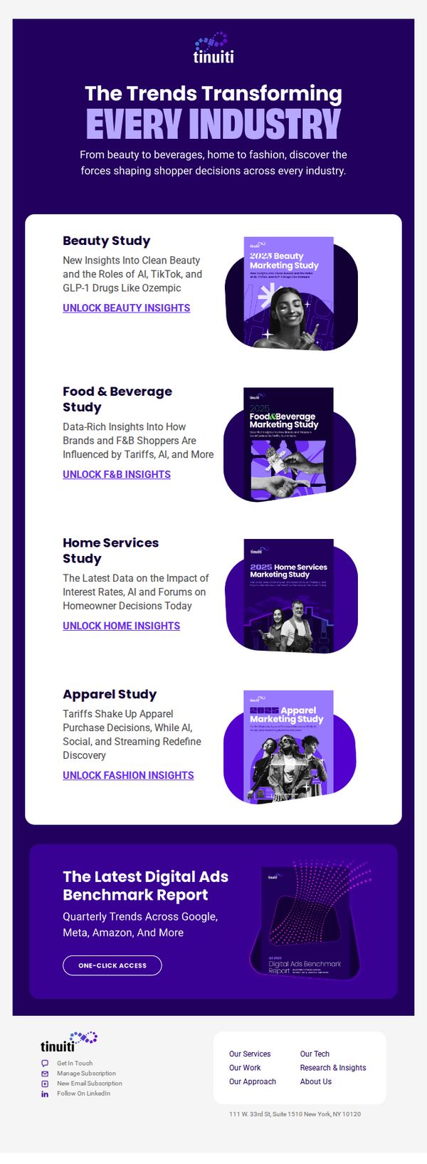
This email aims to position Tinuiti as a thought leader by showcasing industry-specific marketing insights that help brands understand evolving shopper behavior, while driving engagement through downloadable reports across key verticals.
Why this works
By organizing insights into distinct industry verticals with bold, clickable CTAs like 'Unlock Beauty Insights,' the email creates a personalized, self-serve experience that invites exploration without overwhelming the reader.
How to implement
The strategic use of branded report covers as visual anchors next to each study title builds credibility and curiosity, turning dry data into desirable, magazine-style content that feels both professional and accessible.
Pro Tip
Add a brief testimonial or client logo near the top to reinforce social proof before the reader dives into the studies, increasing trust before they commit to clicking through. • Include a subtle progress indicator or 'Most Popular' badge on one of the study tiles to create urgency or FOMO, nudging readers toward the most relevant or high-performing report first.