Launch Campaign email designs from top bag brands


1. Cotopaxi: Can’t Miss These Hip Packs 👀
Objective
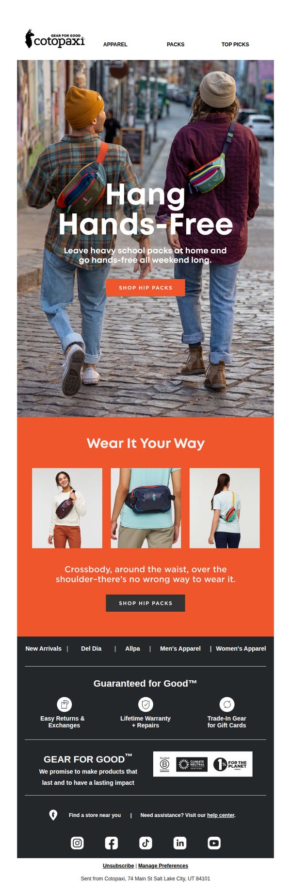
This email aims to drive immediate engagement and conversions by showcasing Cotopaxi’s hip packs as versatile, hands-free alternatives to bulky backpacks, encouraging weekend-ready styling and impulse purchases through lifestyle imagery and clear CTAs.
Why this works
The email brilliantly positions hip packs not just as accessories but as liberating lifestyle tools, emphasizing freedom from heavy backpacks to emotionally resonate with urban adventurers seeking practicality without sacrificing style.
How to implement
By visually demonstrating three distinct ways to wear the same product, crossbody, waist, shoulder, the email reduces perceived risk and increases perceived value, helping customers envision personal use and boosting conversion confidence.
Pro Tip
Add a subtle countdown timer or limited-time badge near the CTA to create urgency, since the current design lacks temporal pressure despite promoting a ‘can’t miss’ offer. • Include a short customer quote or social proof beneath the ‘Wear It Your Way’ section to reinforce credibility and social validation, especially since the product’s versatility is a key selling point.
2. Baggu : Zip It Up
Objective
This email aims to introduce and drive sales of the new Zip Duck Bag by highlighting its updated design feature, the top zip closure, while showcasing its versatility across multiple colors and patterns to appeal to a broad, style-conscious audience.
Why this works
The email smartly positions the Zip Duck Bag as an evolved classic, not a completely new product, which leverages existing brand loyalty while emphasizing a functional upgrade that solves a real user pain point: keeping contents secure.
How to implement
By displaying each colorway with clean, minimalist product shots and consistent labeling, the email reduces decision fatigue and lets the design speak for itself, making it easy for shoppers to visualize the bag in their own lives without overwhelming them with options.
Pro Tip
Add a short testimonial or user quote near the hero section to build social proof, for example, 'I never leave home without my Zip Duck, it’s the only bag that holds my laptop, snacks, and keys without spilling!', to strengthen trust and urgency. • Include a subtle visual cue like a small badge or icon next to the 'Wavy Gingham Brown' variant indicating it’s a bestseller or limited edition, to create perceived scarcity and guide attention toward high-converting SKUs.
3. Lazy Oaf: NEW ARRIVALS: Business Casual-core
Objective
This email aims to drive immediate engagement and sales by showcasing Lazy Oaf’s new 'Business Casual-core' collection, blending playful aesthetics with wearable silhouettes to appeal to fashion-forward customers seeking personality in professional settings.
Why this works
Lazy Oaf brilliantly redefines 'business casual' by injecting bold prints and oversized silhouettes, making the collection feel rebellious yet wearable, a smart emotional hook for Gen Z and millennial shoppers tired of corporate conformity.
How to implement
The email uses consistent visual storytelling by repeating the 'business casual' motif across product shots and typography, reinforcing the theme without overwhelming the viewer, a subtle but effective branding technique that builds thematic cohesion.
Pro Tip
Add a limited-time offer or countdown timer near the hero section to create urgency, currently, the email lacks temporal pressure, which could boost conversion rates for a new arrivals campaign. • Include a short customer testimonial or social proof near the product grid to validate the collection’s wearability and style, especially since the theme challenges traditional dress codes and may benefit from social reinforcement.
4. Baboon To The Moon: ALL NEW COLORS COMING SOON
Objective
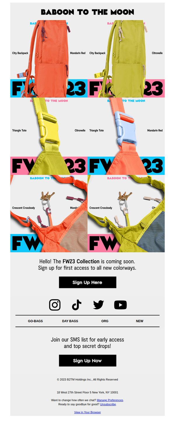
The email aims to build anticipation and drive early sign-ups for the upcoming FW23 collection by teasing new colorways and offering exclusive access to subscribers. It positions the brand as trend-forward while incentivizing immediate engagement through scarcity and exclusivity.
Why this works
The email masterfully uses bold, high-contrast color blocking to spotlight new product hues while maintaining visual rhythm, turning a simple product reveal into a dynamic, gallery-like experience that feels both editorial and urgent.
How to implement
By framing the FW23 launch as an exclusive ‘first access’ opportunity, the campaign taps into FOMO without being pushy, making subscribers feel like insiders rather than just customers, a subtle but powerful psychological lever for conversion.
Pro Tip
Add a countdown timer or ‘limited spots’ indicator near the CTA to heighten urgency and reduce hesitation, the current ‘coming soon’ message lacks temporal pressure that could boost immediate sign-ups. • Include a brief testimonial or social proof snippet (e.g., ‘Join 10K+ early adopters’) near the sign-up button to reduce perceived risk and increase trust, especially since the collection isn’t yet available for viewing.
5. Cotopaxi: Fuego Down Pants Have Entered The Chat
Objective
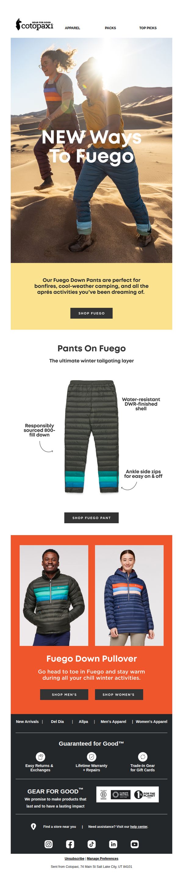
This email aims to introduce and drive immediate sales of Cotopaxi’s new Fuego Down Pants by positioning them as essential gear for cold-weather adventures and après activities, while reinforcing brand values around durability and sustainability.
Why this works
The email brilliantly frames the Fuego Down Pants not just as apparel but as an experience enabler, tying them to bonfires, camping, and après fun, which emotionally resonates with outdoor enthusiasts seeking comfort after adventure.
How to implement
By visually highlighting key product features like the water-resistant shell and ankle zips directly on the product image, the email reduces cognitive load and instantly communicates functional value without requiring users to scroll or read dense specs.
Pro Tip
Add a limited-time offer or urgency trigger (e.g., 'First 50 buyers get free shipping') near the hero CTA to convert interest into immediate action, since the current design lacks any time-sensitive incentive. • Include a short customer testimonial or social proof near the product grid to build trust, especially since the email highlights durability and sustainability, which benefit from real-user validation.
6. Mansur Gavriel: Shop our NYFW show 🌻

Objective
This email aims to drive immediate sales by capitalizing on the buzz of Mansur Gavriel’s 10-year anniversary celebration and New York Fashion Week show, encouraging recipients to shop the featured bags and shoes seen on the runway. It blends event storytelling with product discovery to create urgency and emotional connection.
Why this works
The email brilliantly ties product promotion to a real-world milestone, the brand’s 10-year anniversary, making the shopping experience feel like participating in a cultural moment rather than just browsing items.
How to implement
By using vibrant, sunflower-filled imagery and candid street-style shots, the campaign evokes warmth and authenticity, subtly positioning Mansur Gavriel as both fashion-forward and emotionally resonant with everyday life.
Pro Tip
Add a subtle countdown timer or 'Limited Stock' indicator near the hero CTA to heighten urgency, since the email references a recent live event, this would reinforce the exclusivity of the show-featured items. • Include a short testimonial or quote from a guest or influencer who attended the Orchard Street party to add social proof and deepen emotional engagement beyond just product visuals.
7. Paravel: VIP Early Access to our New Product Launch
Objective
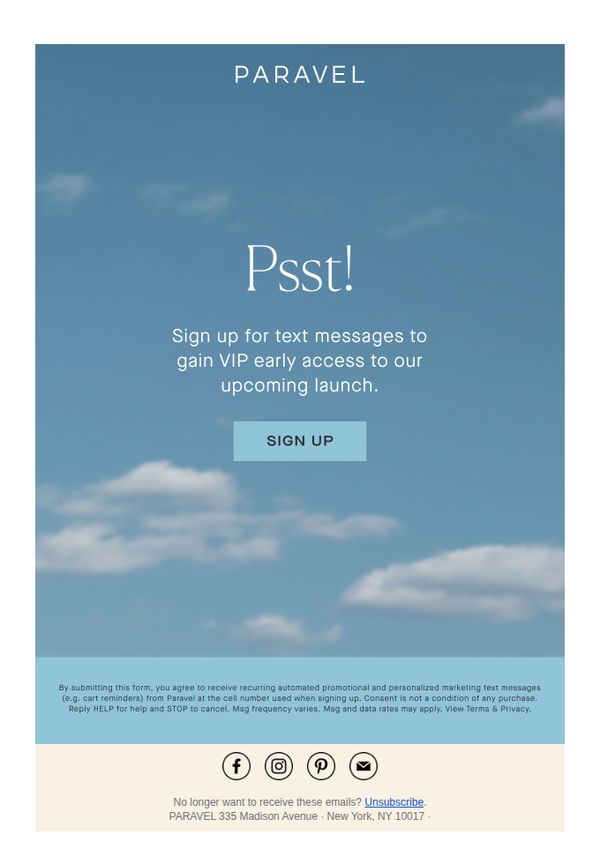
This email aims to build anticipation and exclusivity by inviting subscribers to sign up for text message alerts to gain VIP early access to Paravel’s upcoming product launch, thereby driving engagement and pre-launch conversions.
Why this works
The email leverages psychological scarcity and exclusivity by using the playful 'Psst!' opener to create a sense of insider access, making subscribers feel personally invited rather than marketed to.
How to implement
By focusing on text message signups instead of email alone, the campaign strategically meets customers where they’re most active, increasing the likelihood of real-time engagement and conversion during the launch window.
Pro Tip
Add a brief, compelling product teaser, like 'Our lightest carry-on yet', to the hero section to give subscribers a tangible reason to opt in, increasing perceived value beyond just 'early access.' • Include a countdown timer or launch date below the CTA to create urgency and help users mentally prioritize when to act, strengthening the psychological trigger behind the VIP offer.
8. Cotopaxi: Check Off Your Corporate Gift List Early This Year
Objective
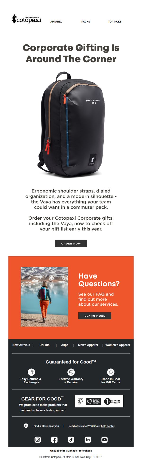
This email aims to prompt corporate buyers to purchase branded gifts early by highlighting the Vaya backpack’s practical features and customization options, positioning Cotopaxi as a thoughtful, impact-driven gifting partner for teams.
Why this works
The email smartly ties product functionality, like ergonomic straps and modern silhouette, to corporate gifting needs, making the Vaya backpack feel like a purpose-built solution rather than just another promotional item.
How to implement
By embedding the phrase 'YOUR LOGO HERE' directly on the product image, the email visually reinforces customization, helping corporate buyers instantly envision their brand on the gear and accelerating decision-making.
Pro Tip
Add a subtle countdown timer or 'Early Bird Pricing' note near the CTA to create urgency and incentivize immediate action, since the email’s goal is to get buyers to act early. • Include a short testimonial or client logo from a recognizable company that used Cotopaxi for corporate gifting to build social proof and reduce perceived risk for new buyers.
9. Peak Design: Pixelate? 🟥🟨🟦🟩⬛️

Objective
This email aims to drive pre-orders for Peak Design’s new Everyday Case for Pixel 8 and 8 Pro by highlighting its color variety and compatibility features, while also cross-promoting iPhone 15 cases and discounting older models to clear inventory.
Why this works
The email brilliantly leverages color psychology by naming each case hue with evocative, nature-inspired names like Sun, Sage, and Redwood, making the product feel more personal and emotionally resonant rather than just a functional accessory.
How to implement
By immediately acknowledging non-Pixel users and redirecting them to iPhone 15 cases and older model discounts, the campaign avoids alienating a large segment of its audience and turns potential drop-offs into conversion opportunities with smart, inclusive messaging.
Pro Tip
The hero section’s CTA 'SHOP NOW' appears twice with identical styling and placement, creating visual redundancy; one should be removed or repositioned below the color grid to guide the eye naturally through the product options before prompting action. • The email lacks a clear visual hierarchy between the Pixel 8 case launch and the cross-sell offers; adding a subtle divider or contrasting background behind the iPhone 15/older model section would help users distinguish primary from secondary offers without confusion.
10. Cotopaxi: Gear For Good Helps ROMP Guatemala!
Objective
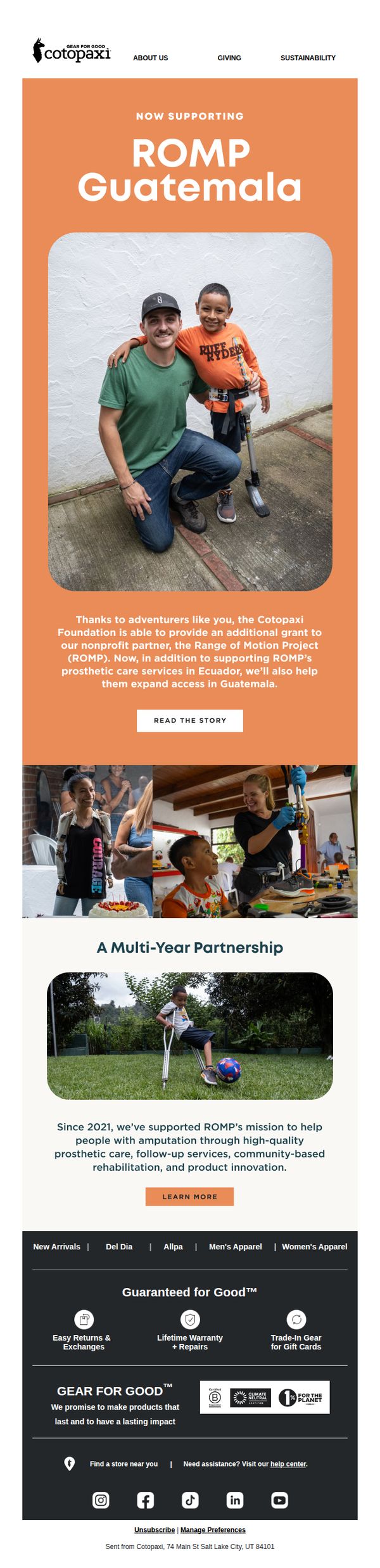
This email aims to inform subscribers about Cotopaxi’s expanded support for ROMP Guatemala, highlighting the brand’s social impact while reinforcing customer loyalty through storytelling and emotional connection. It also subtly encourages continued engagement with the brand’s mission-driven products.
Why this works
The email masterfully blends emotional storytelling with brand purpose by featuring real beneficiaries and partners, making the impact tangible and human-centered rather than abstract or transactional.
How to implement
By anchoring the campaign in a multi-year partnership, Cotopaxi builds credibility and long-term trust, signaling that their social mission is deeply integrated into their business model, not just a fleeting marketing tactic.
Pro Tip
Add a visual progress bar or impact counter (e.g., 'X lives changed in Guatemala') to quantify the partnership’s reach and make the social impact more tangible for readers. • Include a secondary CTA near the footer, such as 'Shop Gear That Gives Back', to gently guide readers from inspiration to action without disrupting the narrative flow.