Launch Campaign email examples & ideas for brand engagement


1. Wynn Resorts: New Form 4 for Wynn Resorts, Limited
Objective
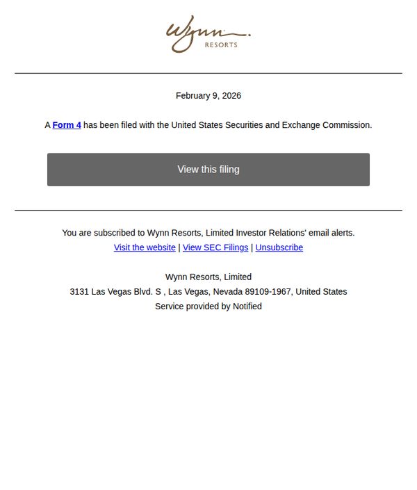
To inform investors and subscribers that Wynn Resorts, Limited has filed a Form 4 with the SEC and to drive them to view the official filing through a clear, direct call-to-action.
Why this works
The email immediately establishes credibility by naming the specific regulatory filing and the governing authority, which reassures investors that the communication is official and trustworthy.
How to implement
By placing a single, centered, high-contrast CTA button immediately after the key announcement, the design eliminates friction and directs attention exactly where the brand wants it, to the filing itself.
Pro Tip
Add a brief one-sentence explanation of what a Form 4 filing means for investors, to increase context and reduce confusion for less experienced subscribers without cluttering the message. • Consider adding a subtle visual indicator, such as a small icon or timestamp, next to the CTA to reinforce urgency or recency, since regulatory filings often carry time-sensitive implications.
2. VanEd: 🏡 New in Real Estate? Discover Listing Secrets!
Objective
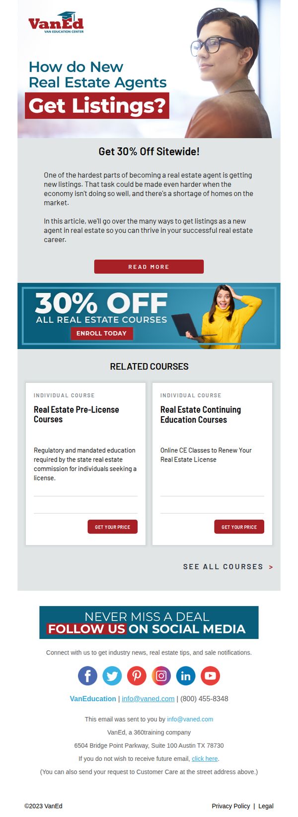
This email aims to attract new real estate agents by addressing their biggest pain point, getting listings, and converting them into course enrollees through a time-sensitive 30% discount offer. It positions VanEd as a trusted educational partner for career success in real estate.
Why this works
The email opens with a bold, empathetic question that immediately resonates with new agents’ biggest fear, getting listings, creating instant relevance and emotional pull before introducing the solution.
How to implement
By anchoring the discount to a real-world challenge (market conditions and inventory shortages), the offer feels less like a sales tactic and more like a strategic career investment tailored to the recipient’s current reality.
Pro Tip
Add a brief testimonial or success story from a new agent who used VanEd’s courses to land their first listing, this would build social proof and reinforce the email’s core promise with real-world validation. • Include a subtle countdown timer or urgency indicator near the 'ENROLL TODAY' CTA to amplify the perceived scarcity of the 30% discount and encourage immediate action rather than delayed consideration.
3. PharmaLex: Register Now: Decoding 2025–2026 Policy Shifts Across U.S. and EU Markets
Objective
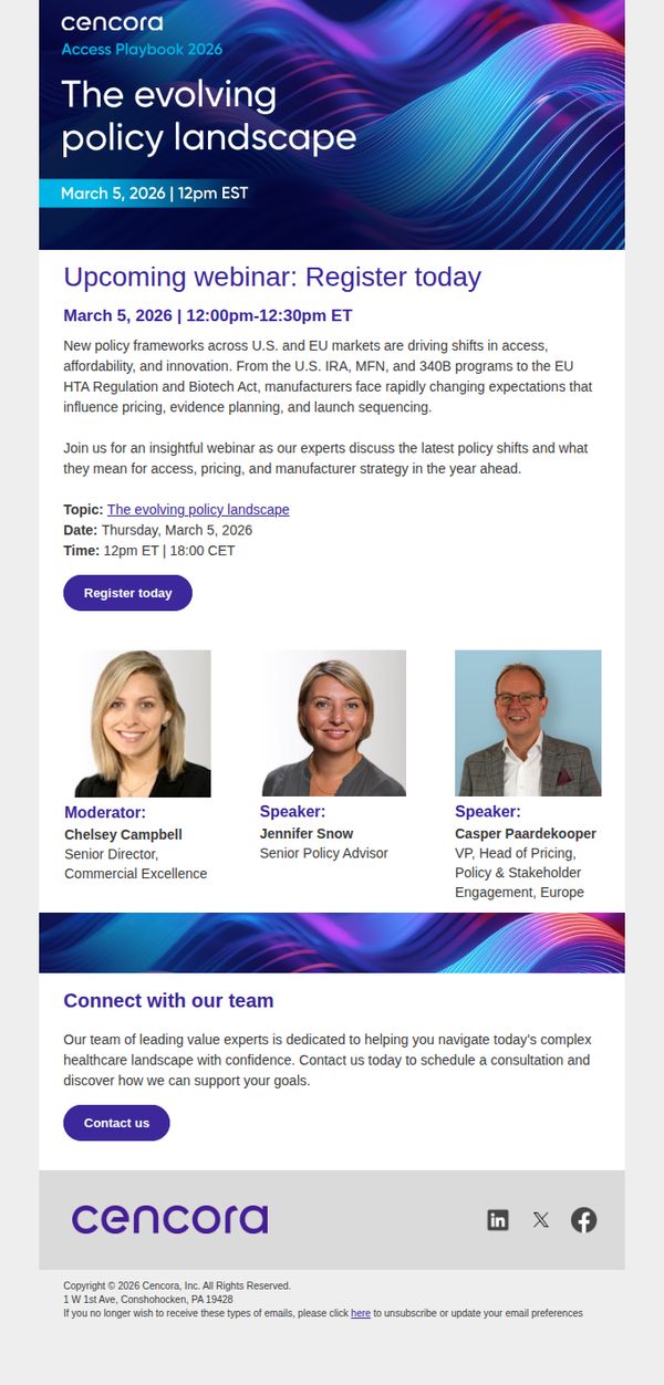
This email aims to drive registrations for a webinar that unpacks emerging policy changes in U.S. and EU healthcare markets, positioning PharmaLex as a trusted advisor for manufacturers navigating regulatory complexity and strategic planning in 2025–2026.
Why this works
The email effectively anchors urgency and relevance by naming specific, high-impact regulations like the U.S. IRA and EU HTA Act, giving readers immediate context for why this webinar matters to their strategic planning and compliance workflows.
How to implement
By featuring headshots and clear titles of the moderator and speakers, the campaign builds instant credibility and personalizes the experience, subtly signaling that attendees will hear from seasoned industry insiders rather than generic corporate presenters.
Pro Tip
Add a subtle countdown timer near the CTA to visually reinforce urgency, especially since the webinar is scheduled for a specific date and time, which can nudge procrastinators to act immediately. • Include a short bullet list of key takeaways or learning outcomes under the topic description to clarify value proposition and help readers quickly assess relevance before committing to register.
4. Lazy Oaf: NEW SEASONS ≠ NEW WARDROBE
Objective
The email aims to encourage customers to creatively restyle their existing wardrobe for the new season rather than buying entirely new outfits, promoting sustainable fashion habits while showcasing Lazy Oaf’s versatile pieces.
Why this works
Lazy Oaf brilliantly reframes seasonal shopping by teaching customers how to remix existing pieces with new arrivals, turning wardrobe refreshes into creative styling challenges instead of consumption sprees.
How to implement
The visual equation format, pairing one existing item with a new piece to create a complete look, makes styling advice instantly digestible and encourages immediate experimentation without overwhelming the reader.
Pro Tip
Add a subtle countdown or urgency cue near the CTA to nudge immediate action, since the email’s educational tone risks diluting conversion momentum without a time-sensitive trigger. • Include a mini ‘Style Your Own’ interactive element or clickable outfit builder in the product grid to deepen engagement and personalize the styling experience for each recipient.
5. Bombas: Shop the Drop: Cozy New Slippers
Objective
To drive immediate sales of Bombas’ new slipper collection by highlighting comfort, design, and social impact, while encouraging visitors to shop by gender-specific categories and reinforcing brand trust through guarantees and donation messaging.
Why this works
Bombas masterfully combines product storytelling with social proof by featuring both tactile details, like memory foam footbeds, and their one-for-one donation model, making comfort feel purposeful and emotionally resonant.
How to implement
The email uses clean, gender-specific CTAs early on to reduce decision fatigue, guiding users directly to relevant collections while visually reinforcing product variety through lifestyle imagery that feels personal and inviting.
Pro Tip
Add a subtle countdown timer or limited-quantity indicator near the ‘Shop Now’ CTA to create urgency, especially since the subject line implies a ‘drop’, this would better align with the scarcity psychology implied by the campaign theme. • Include a short customer testimonial or star rating under each slipper type (Sunday and Gripper) to reinforce credibility and reduce perceived risk, especially since comfort claims are central to the product’s appeal.
6. Aesop: A new fragrance
Objective
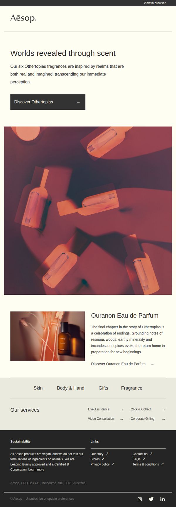
To introduce and drive interest in Aesop’s new Othertopias fragrance collection by evoking emotional storytelling and inviting exploration of scent as a portal to imagined realms. The campaign aims to convert curiosity into product discovery and purchase.
Why this works
The email masterfully frames fragrance not as a product but as a narrative device, using poetic language to position each scent as a doorway to a unique, emotionally resonant world that transcends the ordinary.
How to implement
By spotlighting a single fragrance, Ouranon Eau de Parfum, with rich sensory storytelling, the email creates an intimate, almost cinematic experience that invites the reader to emotionally invest before even seeing the bottle.
Pro Tip
Add a subtle countdown timer or limited-edition badge near the CTA to create urgency, especially since the Othertopias collection implies exclusivity and storytelling that could benefit from temporal scarcity. • Include a short customer testimonial or review snippet under the featured fragrance to build social proof and reduce perceived risk, since luxury fragrance purchases often rely on peer validation.
7. Air Europa: 💚 Introducing FLIGHT 2030
Objective
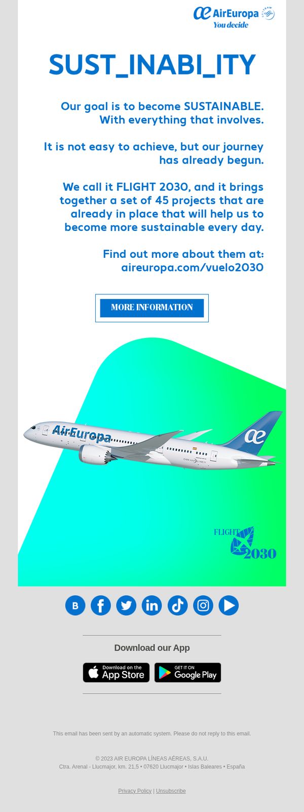
To introduce Air Europa’s sustainability initiative, FLIGHT 2030, and inspire customer trust by showcasing 45 active projects aimed at achieving long-term environmental responsibility. The email encourages readers to learn more through a direct link, aligning brand values with customer expectations.
Why this works
The email brilliantly frames sustainability as an active, ongoing journey rather than a distant goal, making the brand’s commitment feel immediate, credible, and grounded in real action rather than vague promises.
How to implement
By naming the initiative FLIGHT 2030 and tying it to 45 concrete projects, the brand transforms abstract environmental goals into tangible, trackable progress that customers can emotionally connect with and trust.
Pro Tip
Add a brief testimonial or quote from a sustainability officer or partner organization to humanize the initiative and reinforce credibility, especially since the email lacks third-party validation or personal voices. • Include a small visual indicator, like a progress bar or milestone counter, to show how many of the 45 projects are already implemented, helping readers grasp tangible progress rather than just future intent.
8. Toptal: Getting started with Toptal
Objective
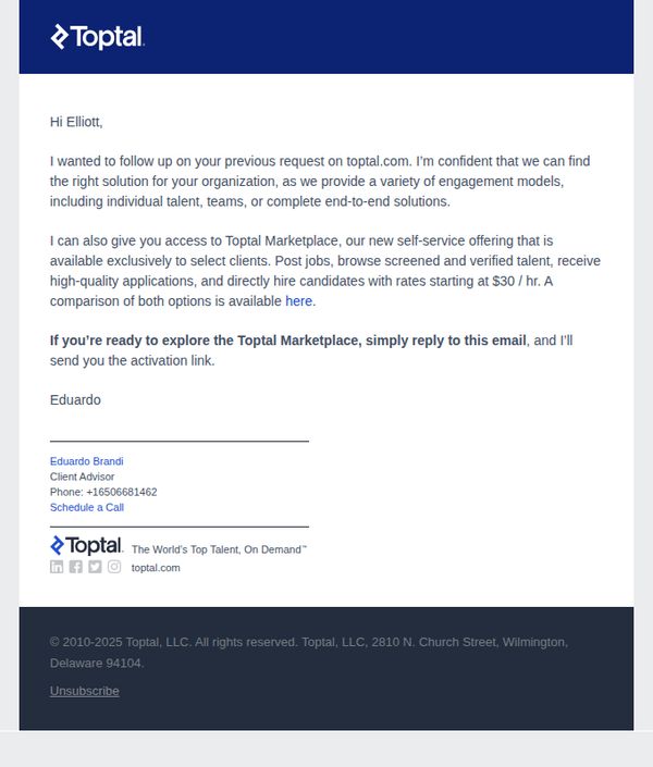
This email aims to re-engage a prospect by reinforcing Toptal’s value proposition and guiding them toward the self-serve Marketplace, encouraging immediate action through a personalized reply-to-CTA that triggers a direct response from the advisor.
Why this works
The email leverages personalization by addressing the recipient by name and referencing their prior interest, which builds trust and signals that Toptal treats each prospect as an individual rather than a generic lead.
How to implement
By positioning the Marketplace as an exclusive, self-serve option with transparent pricing starting at $30/hr, Toptal reduces friction and appeals to cost-conscious decision-makers who value autonomy and clarity in hiring.
Pro Tip
Add a brief bullet-point summary of Marketplace benefits (e.g., 'Post jobs in minutes', 'Access vetted talent', 'No long-term contracts') above the CTA to reinforce value before prompting action. • Include a small visual element, even a simple icon or divider, between Eduardo’s signature and the footer to visually separate personal touch from legal/branding content, improving scannability.
9. CheapCaribbean : A Beach Vacay Is Always In Season
Objective
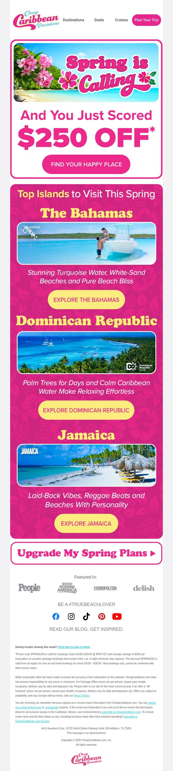
This email aims to drive immediate vacation bookings by leveraging a time-sensitive $250 discount offer, while inspiring wanderlust through curated destination highlights that align with spring travel desires.
Why this works
The email brilliantly ties seasonal emotion to urgency by pairing 'Spring is Calling' with a bold, personalized discount, making the offer feel both timely and uniquely rewarding for the recipient.
How to implement
Each destination is presented with vivid sensory language, like 'Stunning Turquoise Water' or 'Reggae Beats and Beaches With Personality', which transforms generic listings into emotionally resonant invitations that spark immediate desire.
Pro Tip
Add a countdown timer beneath the $250 OFF offer to amplify urgency, since the promo end date (2/26/26) is buried in fine print and doesn’t visually pressure immediate action. • Include a small map or icon next to each island name to reinforce geographic context and help users quickly visualize proximity or plan multi-destination trips, enhancing decision-making ease.
10. Aged Care Guide : Robots, redevelopment and the unexpected Olympic legacy twist
Objective
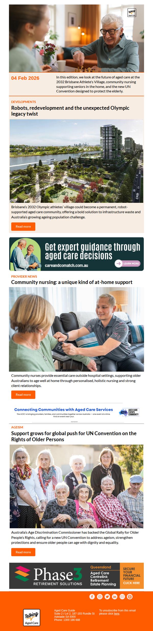
This email aims to inform subscribers about emerging trends and policy developments in aged care, including tech-driven solutions and global advocacy efforts, while subtly guiding them toward expert guidance and financial planning services through embedded CTAs.
Why this works
The email masterfully frames aged care innovation through unexpected cultural hooks, like the Brisbane Olympics legacy, making complex policy and tech topics feel timely, relatable, and emotionally resonant for families navigating eldercare decisions.
How to implement
By embedding a service CTA within a visually distinct banner featuring real human connection, the campaign bridges editorial content with commercial intent without disrupting trust, subtly positioning expert guidance as the natural next step after learning about systemic challenges.
Pro Tip
The primary CTA 'Read more' is generic and underwhelming, it should be action-oriented and benefit-driven, such as 'Discover how robots could transform your loved one’s care' to increase click-through by aligning with the reader’s emotional or practical motivation. • The layout lacks visual hierarchy between editorial content and promotional banners, the 'Get expert guidance' ad blends too much with article sections; it should be visually separated with a contrasting background or border to clarify intent and reduce cognitive friction.