Proven Easter launch campaign email designs you can use
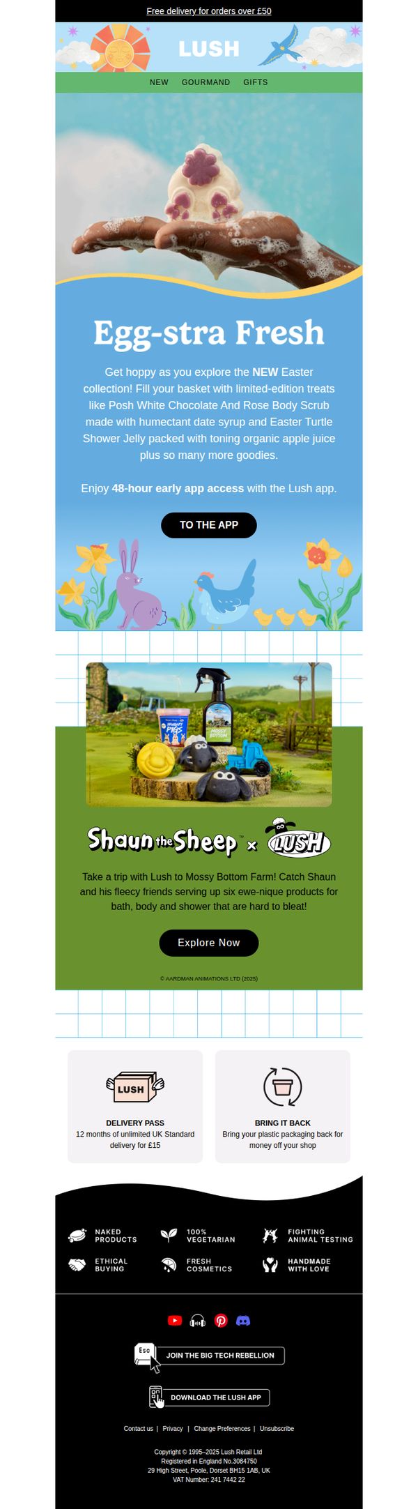


1. Lush - EN: Egg-stra fresh 🐣
Objective
To drive engagement and early app access for Lush’s limited-edition Easter collection by highlighting festive, whimsical products while leveraging the Shaun the Sheep collaboration to attract families and nostalgic fans. The email aims to convert curiosity into immediate app downloads and purchases.
Why this works
The email brilliantly ties seasonal excitement to product storytelling by naming Easter treats like 'Posh White Chocolate And Rose Body Scrub', making them feel indulgent, exclusive, and emotionally resonant rather than just seasonal novelties.
How to implement
Lush smartly uses the Shaun the Sheep collaboration not just as a visual gimmick but as a narrative gateway, inviting customers to 'take a trip to Mossy Bottom Farm', transforming product discovery into a playful, immersive experience that appeals across generations.
Pro Tip
The CTA 'TO THE APP' lacks persuasive urgency or benefit, rephrase to 'Unlock Early Easter Treats, Download Now' to clarify the reward and motivate immediate action aligned with the 48-hour window. • The Shaun the Sheep section visually dominates but doesn’t link directly to the Easter collection; add a subtle visual cue or micro-copy like 'Also available in our Easter Basket' to bridge the collaboration with the main offer and reduce cognitive friction.
2. Indigo: Wellness reads with real impact
Objective
This email aims to drive engagement and sales by curating wellness-themed books that resonate with readers seeking personal growth, mental health support, and evidence-based self-improvement, while reinforcing Indigo’s brand as a thoughtful, curated destination for meaningful reading.
Why this works
The email smartly leverages cultural relevance by spotlighting books tied to popular podcasts and media figures, creating instant credibility and tapping into existing audience trust to drive curiosity and conversion.
How to implement
Each book is paired with a concise, emotionally resonant hook that speaks directly to the reader’s inner struggle or aspiration, transforming passive browsing into purposeful discovery and making the content feel personally curated.
Pro Tip
Add a subtle countdown timer or urgency indicator near the 'Shop All' CTA in the hero section to nudge immediate action, especially since the campaign promotes time-sensitive wellness trends and seasonal relevance. • Reposition the 'Shop by Category' section higher in the email, just after the hero, to give users a clear navigation anchor early on, this reduces friction for readers who already know what type of wellness content they’re seeking.
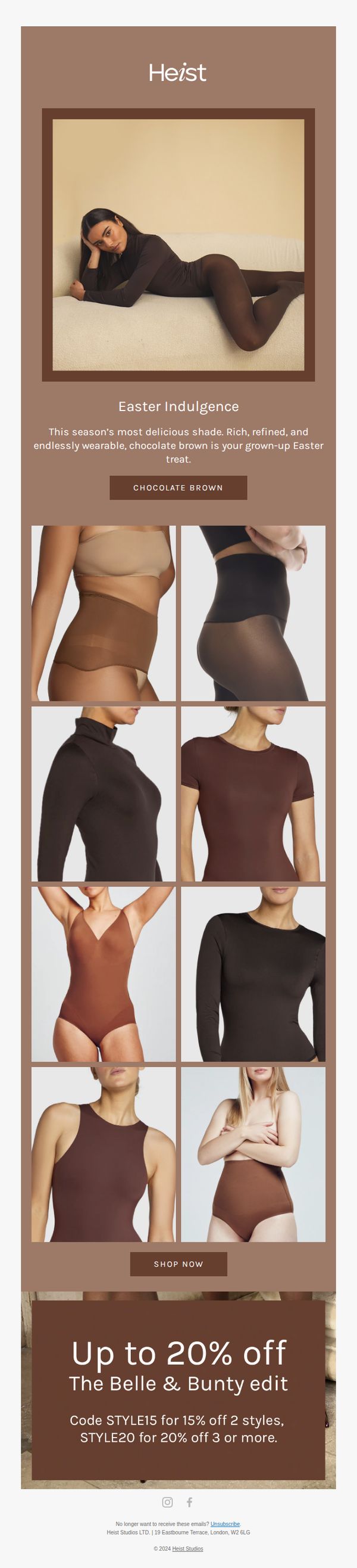
3. Heist: Brown is the new black
Objective
To drive immediate sales of Heist’s chocolate brown lingerie and shapewear collection by positioning it as a sophisticated Easter indulgence, while incentivizing bulk purchases through tiered discount codes.
Why this works
The email brilliantly reframes a seasonal color trend as a luxurious, grown-up indulgence, elevating chocolate brown from a basic shade to an Easter treat that feels both timely and emotionally rewarding.
How to implement
By using a grid of real-body imagery across multiple product types, the campaign visually demonstrates versatility and inclusivity without needing to explain it, making the collection feel accessible and desirable at a glance.
Pro Tip
Add a subtle countdown timer under the offer section to create urgency around the Easter-themed promotion, encouraging faster decision-making without disrupting the elegant aesthetic. • Include a short testimonial or social proof snippet near the product grid to reinforce trust, especially since the campaign relies on color confidence, which benefits from peer validation.
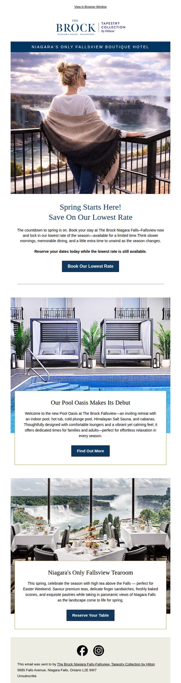
4. The Brock Niagara Falls-Fallsview: Visit Niagara This Spring & Book Our Lowest Rate!
Objective
This email aims to drive immediate bookings for The Brock Niagara Falls-Fallsview by promoting their lowest seasonal rate, while highlighting unique spring experiences like the new Pool Oasis and Fallsview Tearoom to entice travelers to plan their visit before the offer expires.
Why this works
The email brilliantly ties seasonal emotion to urgency by framing the lowest rate as a fleeting springtime gift, making the offer feel exclusive and time-sensitive without relying on aggressive sales tactics.
How to implement
By spotlighting two distinct experiences, the serene Pool Oasis and the elegant Fallsview Tearoom, the campaign successfully appeals to different traveler personas, subtly expanding the perceived value beyond just a hotel stay.
Pro Tip
Add a countdown timer beneath the 'Book Our Lowest Rate' CTA to amplify urgency and reduce decision latency, especially since the offer is explicitly time-limited and tied to the spring season. • Include a brief testimonial or guest quote near the Pool Oasis or Tearoom section to build social proof and credibility, as the current copy relies heavily on descriptive language without third-party validation.
5. Hawaii Business Magazine: Today's Hawai‘i News A.M. 10/4 - Hawai‘i governor sticks to reopening West Maui to tourists next week
Objective
This email aims to deliver timely, curated news updates to subscribers while reinforcing Hawaii Business Magazine’s role as a trusted source for local business and community developments across the Hawaiian islands. It also subtly promotes engagement with their content, events, and publications.
Why this works
The email strategically opens with a high-impact, emotionally resonant headline about West Maui’s reopening, immediately anchoring readers in the most relevant local issue while signaling the publication’s authority on island-wide policy and tourism dynamics.
How to implement
By segmenting news by island, O‘ahu, Hawai‘i Island, Maui County, Kaua‘i, the email delivers hyper-localized value that caters to readers’ geographic interests, increasing relevance and encouraging deeper engagement with stories that directly affect their communities.
Pro Tip
The primary CTA ‘Click here to jump to the 2023 Most Profitable list!’ is buried mid-email and visually underwhelming; reposition it as a bold, color-contrasted button in the hero section to increase conversion and align with the magazine’s business-focused branding. • The footer’s social media links are presented as plain text without icons or visual hierarchy, reducing their discoverability; replacing them with branded, clickable social icons would improve engagement and reinforce cross-platform presence.
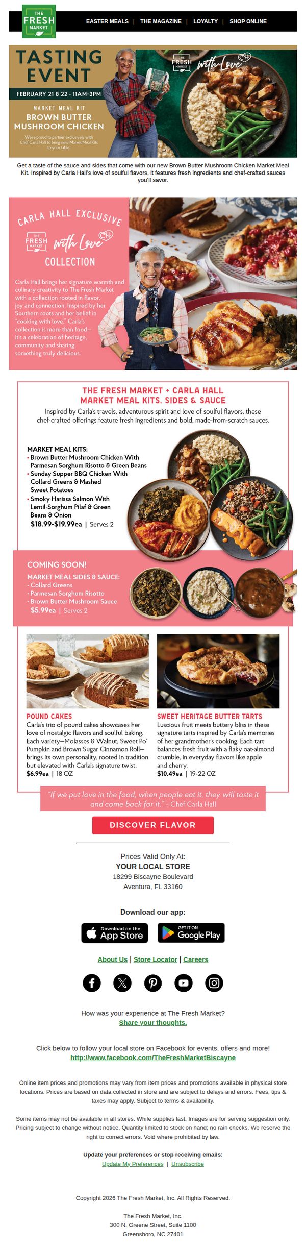
6. The Fresh Market: From the kitchen with Chef Carla Hall
Objective
This email aims to drive in-store traffic and sales by promoting a limited-time tasting event and exclusive meal kits co-created with Chef Carla Hall, while reinforcing brand warmth and culinary authenticity through her personal story and recipes.
Why this works
The email brilliantly leverages Chef Carla Hall’s personal brand and Southern culinary heritage to create emotional resonance, turning a product launch into a story of love, tradition, and community that customers feel invited to join, not just buy from.
How to implement
By structuring the offer around a live tasting event with clear dates and times, the campaign creates urgency and experiential FOMO, encouraging immediate store visits while positioning the meal kits as something to be experienced, not just purchased online.
Pro Tip
Add a countdown timer above the CTA to visually reinforce the limited-time nature of the tasting event, increasing urgency and reducing the cognitive load for customers deciding when to act. • Include a small map or clickable store locator link directly under the store address to reduce friction for first-time visitors, especially since the campaign targets local foot traffic and the store’s location isn’t immediately obvious on a mobile screen.
7. Adsum: The Diamond Vest

Objective
This email aims to introduce and drive sales of Adsum’s new Diamond Vest by highlighting its functional design, weather-resistant features, and versatility across seasons, positioning it as a practical yet stylish outerwear essential for fall and winter.
Why this works
The email smartly anchors the product in a real-world context by referencing Northeastern construction workwear, giving the vest instant credibility and rugged appeal without sacrificing modern style or comfort.
How to implement
By breaking down technical features into numbered, visually supported sections, like the drizzle-proof exterior and hidden rear stow pocket, the email transforms specs into tangible benefits that resonate with practical, detail-oriented shoppers.
Pro Tip
Add a subtle urgency element like 'Limited Stock' or 'FW23 Release' near the CTA to nudge immediate action, since the current layout lacks any time-sensitive motivation despite promoting a seasonal product. • Include a short testimonial or user quote near the product details to build social proof, especially since the vest is positioned as functional workwear, real-user validation would strengthen trust and perceived durability.
8. Practical Boat Owner : Wally's new TP52 beater, Grand Soleil 34.1 on test, Orca deterrent device to be tested

Objective
This email aims to engage marine enthusiasts by delivering curated, high-interest content including boat reviews, industry news, and adventure stories, while subtly promoting brand partnerships and encouraging newsletter subscriptions through value-driven content and targeted offers.
Why this works
The email masterfully blends editorial credibility with commercial intent by placing high-value content like sea trials and expert reviews front and center, making ads feel like natural extensions of the reader’s interests rather than interruptions.
How to implement
By featuring real-world adventures like sailing to Easter Island and testing cutting-edge tech like orca deterrents, the campaign taps into the aspirational and exploratory mindset of boaters, turning passive readers into emotionally invested followers.
Pro Tip
The primary CTA 'Read More' is repetitive and lacks urgency or differentiation; customizing CTAs per section (e.g., 'See the Sea Trials', 'Meet Wally’s New Racer') would better reflect content value and improve click-through intent. • The subscription offer buried in the 'Used Boats' section lacks visual prominence; relocating it to a dedicated hero or sticky banner with a countdown timer would create scarcity and increase conversion without disrupting content flow.
9. The Atlantic: When ‘main characters’ commandeer Congress

Objective
This email aims to engage readers with a thought-provoking cultural and political analysis, positioning The Atlantic as a trusted voice on the intersection of media, personality, and governance. It also subtly drives newsletter retention and site traffic through curated content links.
Why this works
The email masterfully frames political chaos through the lens of pop culture tropes, making complex congressional dysfunction feel instantly relatable and emotionally resonant to a broad audience familiar with cinematic storytelling.
How to implement
By weaving in cultural references like TikTok trends and Goodfellas scenes, the campaign elevates political commentary into a shared cultural conversation, subtly reinforcing The Atlantic’s brand as both intellectually rigorous and culturally fluent.
Pro Tip
The primary CTA 'Learn More' is too generic and buried at the bottom; it should be rephrased to reflect urgency or curiosity (e.g., 'See Why This Matters') and placed immediately after the main article teaser to capture attention before readers scroll. • The 'Most Popular' section at the bottom lacks visual hierarchy, adding thumbnail images or bolding article titles would increase click-through rates by making top-performing content more scannable and emotionally compelling.
10. Kuiu: Super Down: Do Your Research for Results

Objective
This email aims to drive sales of KUIU’s Super Down collection by highlighting its premium insulation technology and performance benefits for serious hunters, while encouraging product exploration through compelling visuals and targeted CTAs.
Why this works
The email opens with a powerful hero image and headline that immediately communicates product superiority through the phrase 'Legendary Quixdown Insulation,' creating instant credibility and desire among performance-driven outdoor enthusiasts.
How to implement
Each product is presented with a focused benefit-driven description that ties technical specs to real-world hunting conditions, helping customers visualize performance and justifying premium pricing through tangible, mission-critical advantages.
Pro Tip
Add a subtle countdown timer or limited-quantity indicator near the 'Up to $100 Off Full Pack Systems' offer to create urgency and reduce hesitation among high-intent shoppers. • Reposition the 'Sign Up for Text Alerts' section higher in the email, perhaps after the hero or before the product grid, to capture attention from engaged users before they scroll past, increasing opt-in conversions.