Fashion launch campaign email examples & ideas



1. Pepper: Keep your eyes peeled 😎
Objective
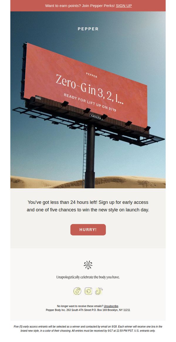
This email aims to create urgency and excitement around the upcoming launch of Pepper’s new 'Zero-G' style by offering early access and a chance to win the product, encouraging immediate sign-ups before the 24-hour window closes.
Why this works
The email leverages a bold, cinematic billboard visual to instantly communicate the product’s launch energy, making the campaign feel like a cultural moment rather than just a product drop.
How to implement
By framing the offer as 'one of five chances to win' with a hard 24-hour deadline, the email taps into scarcity and exclusivity psychology without sounding pushy or salesy.
Pro Tip
Add a micro-copy line under the CTA button clarifying what happens after clicking, e.g., 'Join now to lock in your entry + early access', to reduce friction and increase conversion confidence. • Include a small visual cue or icon next to the 'SIGN UP' link in the header to reinforce the action and create visual continuity with the main CTA, helping users connect the top and bottom of the email.
2. Michael Kors: New Season, New Preppy Energy
Objective
To introduce Michael Kors’ new season collection with a preppy, modern aesthetic, encouraging immediate engagement through curated product categories and a festive Lunar New Year promotion that ties seasonal energy to gift-giving and brand loyalty.
Why this works
The email masterfully blends seasonal storytelling with product curation by framing preppy fashion as a modern, wearable lifestyle rather than just clothing, making the collection feel instantly relevant and aspirational to the target audience.
How to implement
By integrating a culturally specific Lunar New Year promotion with a limited-edition horse-themed handbag, the campaign creates emotional resonance and urgency without alienating non-celebrating customers through tasteful, inclusive visual storytelling.
Pro Tip
The CTA 'SHOP NOW' in the red Lunar New Year section feels disconnected from the rest of the email’s aesthetic; replacing it with a more seasonally aligned phrase like 'Gift the Joy of Horse' or 'Celebrate in Style' would strengthen thematic cohesion and emotional pull. • The product grid for handbags lacks descriptive context or styling cues; adding a one-line benefit (e.g., 'Perfect for work-to-weekend transitions') beneath each bag would elevate perceived value and reduce decision fatigue for shoppers.
3. Marine Layer: New jackets just dropped (!)
Objective
To drive immediate traffic and sales for newly launched outerwear by showcasing versatile, high-quality jackets with clear product benefits and a strong visual narrative that aligns with Marine Layer’s casual, functional aesthetic.
Why this works
The email opens with a bold, lifestyle-driven hero image and tagline that instantly communicates the brand’s philosophy, layering as both style and function, making the product feel essential rather than optional.
How to implement
Each product is presented with a clean, scannable bullet list of key features that speak directly to practicality and comfort, helping shoppers quickly understand value without needing to click through to product pages.
Pro Tip
Add a subtle countdown timer or 'New Arrivals' badge near the hero section to reinforce urgency and highlight the freshness of the drop, encouraging faster decision-making. • Include a short testimonial or social proof snippet under one of the top products to build trust and reduce perceived risk for first-time buyers.
4. Fjällräven: Sweater Weather
Objective
This email campaign aims to promote Fjällräven’s autumn sweater collection by highlighting the functional, durable, and timeless design of their wool knits while subtly reinforcing the brand’s sustainability values to build emotional resonance and drive product exploration.
Why this works
Fjällräven brilliantly anchors its product storytelling in core design principles, functionality, durability, and timelessness, giving customers a clear, values-driven reason to choose their sweaters over fast fashion alternatives.
How to implement
The email strategically blends lifestyle photography with detailed product close-ups and subtle branding elements like the fox logo, creating an immersive experience that feels authentic, not promotional, while reinforcing product quality.
Pro Tip
The primary CTA 'Explore fleece' is misaligned with the email’s subject 'Sweater Weather' and hero product focus, it should be changed to 'Shop Sweaters' or 'Discover Wool Knits' to maintain message consistency and reduce cognitive friction. • The 'Sustainability and CSR' section, while valuable, interrupts the product flow; relocating it to the footer or adding a collapsible 'Learn More' toggle would preserve momentum and prioritize the shopping journey.
5. Vessi: Spoiler Alert 🚨
Objective
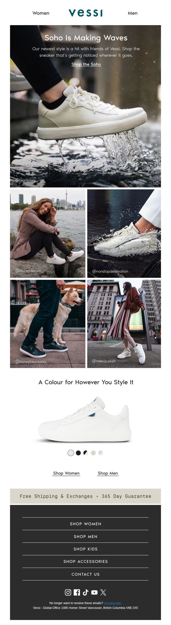
This email aims to generate excitement and drive immediate sales for Vessi’s new Soho sneaker by showcasing its stylish, water-resistant design through real-life social proof and emphasizing its versatility across genders and settings.
Why this works
The email brilliantly leverages authentic user-generated content to demonstrate real-world wearability, turning customer photos into compelling social proof that subtly reassures prospects about fit, style, and performance in everyday settings.
How to implement
By positioning the Soho sneaker as a lifestyle staple rather than just footwear, the campaign taps into emotional branding, suggesting that owning these shoes means joining a community of stylish, active, and confident individuals who move effortlessly through urban environments.
Pro Tip
Add a subtle countdown timer or limited-quantity indicator near the CTA to create urgency, especially since the subject line teases a ‘spoiler’, this would align the visual strategy with the email’s tone and drive faster conversions. • Include a short testimonial quote or star rating directly beneath the hero image to reinforce credibility instantly, rather than relying solely on Instagram handles, which require users to mentally connect the dots between photo and endorsement.
6. Lululemon: Meet Soft Jersey, our softest men's collection

Objective
This email aims to introduce Lululemon’s new Soft Jersey men’s collection by emphasizing its unmatched softness and encouraging immediate exploration through targeted CTAs, while also promoting membership perks to drive app engagement and loyalty.
Why this works
The email brilliantly anchors its entire message around a single sensory promise, 'softest ever', making the product’s tactile appeal the hero, which emotionally resonates more than technical specs ever could.
How to implement
By visually segmenting the collection into intuitive categories like hoodies, shorts, and pants, the email reduces decision fatigue and guides the customer through a natural browsing journey without overwhelming them with options.
Pro Tip
Add a subtle countdown timer or 'limited stock' indicator near the 'Shop What’s New' CTA to create urgency, especially since the email promotes a new collection that benefits from perceived scarcity. • Include a short testimonial or quote from a real customer or athlete about the Soft Jersey fabric’s comfort to build social proof, since tactile claims like 'softest ever' are more believable when validated by others.
7. SPOKE: Drop The Ball
Objective
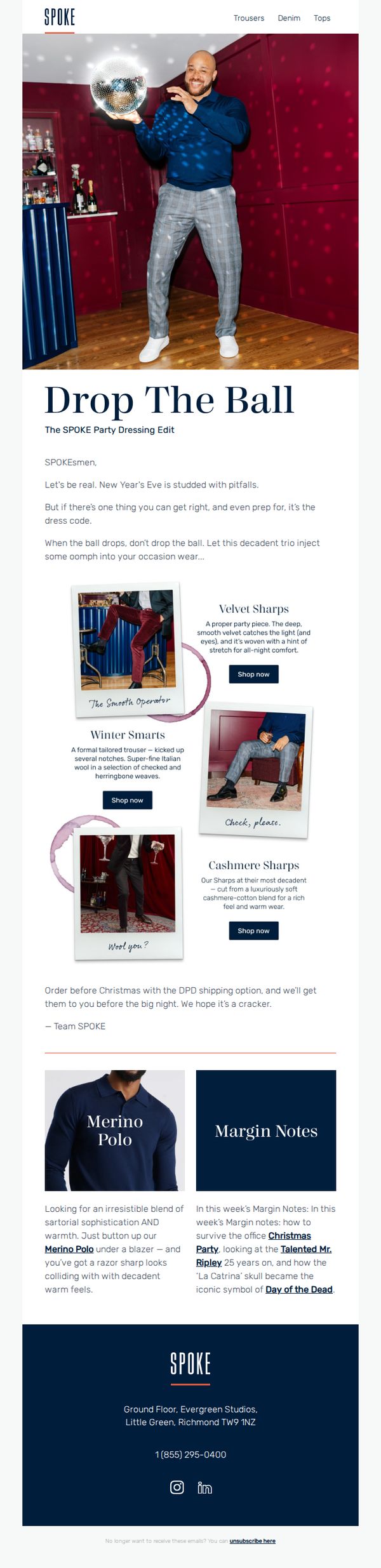
This email aims to inspire SPOKE’s audience to elevate their New Year’s Eve attire with curated, festive menswear while driving immediate purchases ahead of the holiday deadline. It positions the brand as a stylish, reliable guide for occasion dressing with a playful, confident tone.
Why this works
The email brilliantly reframes New Year’s Eve dressing as a strategic, confidence-boosting opportunity rather than a stressful chore, using witty copy and bold visuals to make the reader feel prepared and stylish before the night even begins.
How to implement
By naming each product collection with playful, personality-driven titles like 'The Smooth Operator' and 'Check, please.', the brand turns simple trousers into narrative-driven style moments, helping customers envision themselves in the look and emotionally connect with the purchase.
Pro Tip
Add a visual countdown timer or shipping deadline badge near the CTA to reinforce urgency, especially since the email mentions Christmas delivery, this would reduce cognitive load and increase conversion likelihood. • Integrate a small testimonial or customer photo near the product grid to build social proof; since the email focuses on confidence and occasion dressing, real customer validation would amplify trust and reduce purchase hesitation.
8. END. Clothing: Launching soon | Air Jordan 4 "Black Cat"
Objective
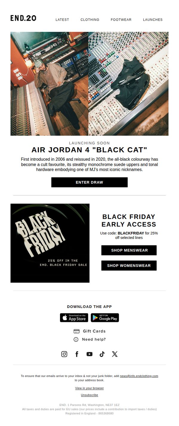
This email aims to build anticipation and drive engagement for the upcoming release of the Air Jordan 4 'Black Cat' by inviting subscribers to enter a draw, while simultaneously promoting early Black Friday discounts to boost immediate sales across menswear and womenswear categories.
Why this works
The email masterfully blends hype-driven product storytelling with immediate commercial incentives, using the cultural weight of the 'Black Cat' sneaker to draw attention while anchoring it to a time-sensitive Black Friday discount to convert interest into action.
How to implement
By placing the 'Enter Draw' CTA directly beneath a compelling product narrative and high-impact imagery, the email creates a natural emotional-to-action journey that respects the audience’s sneakerhead sensibilities while guiding them toward participation.
Pro Tip
Add a countdown timer or limited-availability indicator near the 'Enter Draw' button to create urgency and increase conversion rates by signaling scarcity around the sneaker drop. • Include a brief testimonial or social proof snippet from past draw winners or sneaker community influencers to build trust and reinforce the exclusivity and desirability of the Air Jordan 4 'Black Cat' release.
9. Everlane: New Colors, Classic Cashmere

Objective
This email aims to drive sales of Everlane’s new cashmere sweater collection by highlighting sustainable innovation and fresh color options, while encouraging customers to explore complementary outfits and learn about the brand’s eco-conscious ReCashmere initiative.
Why this works
Everlane brilliantly frames sustainability as a luxury upgrade, emphasizing that their cashmere delivers classic elegance while cutting over 90% of carbon emissions, turning eco-consciousness into a desirable, high-end selling point rather than a compromise.
How to implement
The email strategically showcases product versatility by pairing sweaters with tailored pants and statement shoes, subtly guiding customers toward complete looks without overwhelming them, which increases average order value through aspirational styling cues.
Pro Tip
Add a subtle countdown timer or limited-edition badge near the 'SHOP NOW' CTA to create urgency around new colors, especially since the email highlights seasonal relevance but lacks time-sensitive motivation to act immediately. • Include a small customer testimonial or review snippet under the product grid to reinforce social proof, especially since the email emphasizes quality and sustainability, which benefit from third-party validation to reduce perceived risk.
10. Shona Joy: New Styles Added
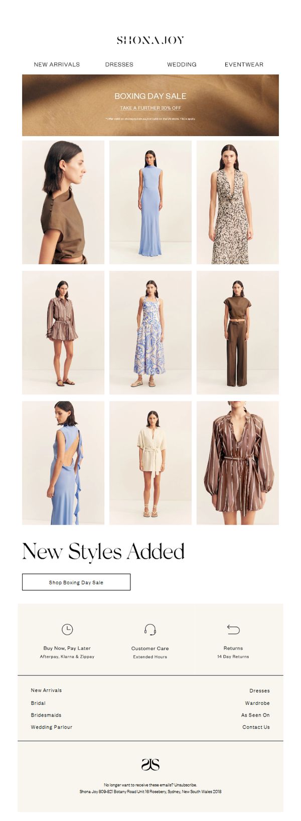
Objective
This email aims to drive immediate sales by highlighting newly added styles during the Boxing Day Sale, encouraging recipients to shop the discounted collection while reinforcing brand trust through post-purchase support features.
Why this works
The email masterfully combines urgency with elegance by anchoring the Boxing Day Sale message in a warm, minimalist aesthetic that feels premium rather than pushy, making the discount feel like an exclusive invitation.
How to implement
By featuring nine diverse, full-body product shots in a clean grid, the email visually communicates variety and fit without overwhelming the viewer, subtly guiding the eye toward the CTA while showcasing styling versatility.
Pro Tip
Add a countdown timer beneath the hero banner to reinforce urgency, since the sale is time-sensitive, a visible timer would create psychological pressure without requiring users to click through to the site. • Integrate a short customer testimonial or star rating near the CTA button to build social proof, especially since the email features new arrivals, a quick endorsement would validate quality and reduce perceived risk.