Fjällräven launch campaign emails worth copying





1. Summer of opportunities
Objective
This email aims to inspire recipients to embrace summer outdoor adventures by showcasing versatile, seasonally appropriate gear while encouraging immediate exploration of the product lineup. It positions Fjällräven as the essential companion for active, nature-centered experiences from June to August.
Why this works
The email brilliantly ties seasonal urgency to emotional aspiration by framing summer not just as a season but as a window of ‘opportunities’, a subtle yet powerful psychological nudge that transforms shopping into planning for meaningful experiences.
How to implement
By curating a tight grid of six hero products with clear naming and gender-specific labeling, the email reduces decision fatigue while still offering variety, making it easy for users to visualize themselves using each item in real outdoor contexts.
Pro Tip
Add a subtle countdown timer or seasonal urgency indicator near the CTA to reinforce the ‘Summer of Opportunities’ theme and nudge faster action without disrupting the serene tone. • Include a small testimonial or user-generated photo snippet near the product grid to humanize the gear and provide social proof that these items are trusted by real adventurers.
2. New flagship trekking jacket
Objective
To introduce and drive interest in Fjällräven’s new Keb GTX Jacket, highlighting its partnership with GORE-TEX and emphasizing durability, repairability, and performance for outdoor enthusiasts seeking long-term gear investment.
Why this works
The email brilliantly positions the Keb GTX Jacket not just as a product, but as a legacy item, leveraging its award-winning past and GORE-TEX partnership to build trust and emotional investment in long-term outdoor performance.
How to implement
By embedding repair guides and emphasizing gear longevity, Fjällräven transforms a product launch into a values-driven narrative, appealing to eco-conscious adventurers who prioritize sustainability and durability over disposable fashion.
Pro Tip
Add a clear, action-oriented CTA button directly under the hero image, such as 'Shop Keb GTX Jacket', to reduce friction and capitalize on initial engagement before the reader scrolls to secondary content. • Include a short customer testimonial or review snippet near the product description to reinforce social proof and validate the jacket’s performance claims, especially since the campaign targets experienced trekkers who rely on peer validation.
3. Heads up!
Objective
This email aims to re-engage subscribers by highlighting Fjällräven’s hat collection as essential trekking gear while subtly promoting broader product categories through storytelling and visual discovery. It seeks to drive traffic to product pages and video content that reinforce brand heritage and outdoor lifestyle values.
Why this works
The email brilliantly positions hats not as accessories but as essential trekking heroes, tying product utility to emotional storytelling, which elevates perceived value and justifies purchase through functional necessity and brand-aligned adventure identity.
How to implement
By embedding a compelling human story, two friends reuniting on a 110km trek, the campaign transforms a product showcase into an emotional journey, making the brand feel authentic and relatable while naturally guiding users toward video and apparel exploration.
Pro Tip
Add a subtle countdown or limited-edition badge near the 'Find your hat' CTA to create urgency around new arrivals, especially since 'NEW' tags are already used, this would convert passive browsing into immediate action without compromising brand tone. • Reposition the 'Explore trekking clothes' CTA to appear directly beneath the '65 years of trekking' section instead of after the video, so users who resonate with heritage messaging are immediately funneled toward product discovery before emotional momentum fades.
4. Yes!
Objective
To announce and drive excitement around Fjällräven’s new GTX collection made with PFAS-free GORE-TEX technology, positioning it as a durable, functional, and environmentally responsible upgrade for outdoor enthusiasts.
Why this works
The email brilliantly frames the product launch as a moral and technical milestone, not just new gear, but a bold stand against PFAS, aligning performance with environmental responsibility to deepen brand loyalty among conscious adventurers.
How to implement
By pairing dramatic outdoor imagery with clear product labels and gender-specific sizing, the email creates an immersive, aspirational experience that speaks directly to the identity of its target audience, serious hikers and mountaineers who value both function and ethics.
Pro Tip
Add a visual countdown timer or limited-availability badge near the 'See more' CTA to create urgency, since the email positions this as a milestone launch rather than a routine product drop. • Include a short customer testimonial or quote from an outdoor influencer beneath the product grid to build social proof and validate the performance claims before users scroll to the educational section.
5. Keep your cool this summer
Objective
This email aims to drive summer apparel sales by showcasing Fjällräven’s versatile, nature-ready shorts and trousers while positioning the brand as a trusted guide for warm-weather outdoor adventures. It encourages exploration of new products and educational content to build engagement and conversion.
Why this works
The email brilliantly ties product utility to emotional outdoor experiences, using scenic imagery and aspirational copy to make shorts feel like essential gear for summer adventures, not just clothing items.
How to implement
By featuring both men’s and women’s products side-by-side with clear labels and newness indicators, the email creates an inclusive, easy-to-navigate shopping experience that reduces decision fatigue and encourages cross-gender browsing.
Pro Tip
The primary CTA 'Explore accessories' is misaligned with the email’s focus on shorts and trousers; it should be changed to 'Shop Summer Shorts' or 'Find Your Perfect Fit' to match user intent and improve conversion clarity. • The product grid lacks pricing or discount cues, which could reduce urgency; adding subtle price tags or 'New Arrival' badges with limited-time offers would better incentivize immediate clicks and purchases.
6. Sweater Weather

Objective
This email campaign aims to promote Fjällräven’s autumn sweater collection by highlighting the functional, durable, and timeless design of their wool knits while subtly reinforcing the brand’s sustainability values to build emotional resonance and drive product exploration.
Why this works
Fjällräven brilliantly anchors its product storytelling in core design principles, functionality, durability, and timelessness, giving customers a clear, values-driven reason to choose their sweaters over fast fashion alternatives.
How to implement
The email strategically blends lifestyle photography with detailed product close-ups and subtle branding elements like the fox logo, creating an immersive experience that feels authentic, not promotional, while reinforcing product quality.
Pro Tip
The primary CTA 'Explore fleece' is misaligned with the email’s subject 'Sweater Weather' and hero product focus, it should be changed to 'Shop Sweaters' or 'Discover Wool Knits' to maintain message consistency and reduce cognitive friction. • The 'Sustainability and CSR' section, while valuable, interrupts the product flow; relocating it to the footer or adding a collapsible 'Learn More' toggle would preserve momentum and prioritize the shopping journey.
7. Must-have mid layers

Objective
This email aims to drive engagement and sales by highlighting Fjällräven’s essential mid-layer apparel for fall and winter, while also introducing new GORE-TEX gear and educating customers on proper layering techniques to enhance outdoor performance.
Why this works
The email brilliantly ties seasonal urgency to product utility by framing mid-layers as essential for transitioning weather, making the purchase feel timely and necessary rather than optional.
How to implement
By featuring both new arrivals and color variants with clear visual tags, the campaign creates a sense of freshness and discovery, encouraging users to explore beyond their usual favorites.
Pro Tip
Add a subtle countdown timer or limited-availability tag near the 'Explore' CTA for the GORE-TEX section to create urgency and nudge immediate action, especially since the gear is positioned as new and high-performance. • Reposition the 'How to layer' video higher in the email, perhaps after the product grid, to capitalize on initial interest and reinforce product value before users scroll to the footer.
8. New layers for the season

Objective
This email aims to introduce Fjällräven’s new fall layering collection by highlighting functional, nature-inspired apparel designed for outdoor adventures, while reinforcing brand values around sustainability and performance through GORE-TEX technology and storytelling.
Why this works
The email masterfully ties seasonal outdoor experiences to product utility, framing each new layer not just as clothing but as an essential companion for autumn adventures, which emotionally aligns with the customer’s desire to connect with nature.
How to implement
By spotlighting GORE-TEX technology alongside a bold 'GUARANTEED TO KEEP YOU DRY' promise, the campaign transforms technical specs into a compelling trust signal that reassures customers their investment will perform under real-world conditions.
Pro Tip
Add a subtle countdown timer or limited-availability tag near the 'Buy now' CTAs to create urgency, especially since the email promotes new seasonal arrivals that benefit from perceived scarcity. • Reposition the 'Learn more' button under the GORE-TEX section to be more visually prominent, perhaps as a secondary CTA beside the product grid, to better guide users from feature awareness to deeper engagement without interrupting the shopping flow.
9. What’s new in parkas
Objective
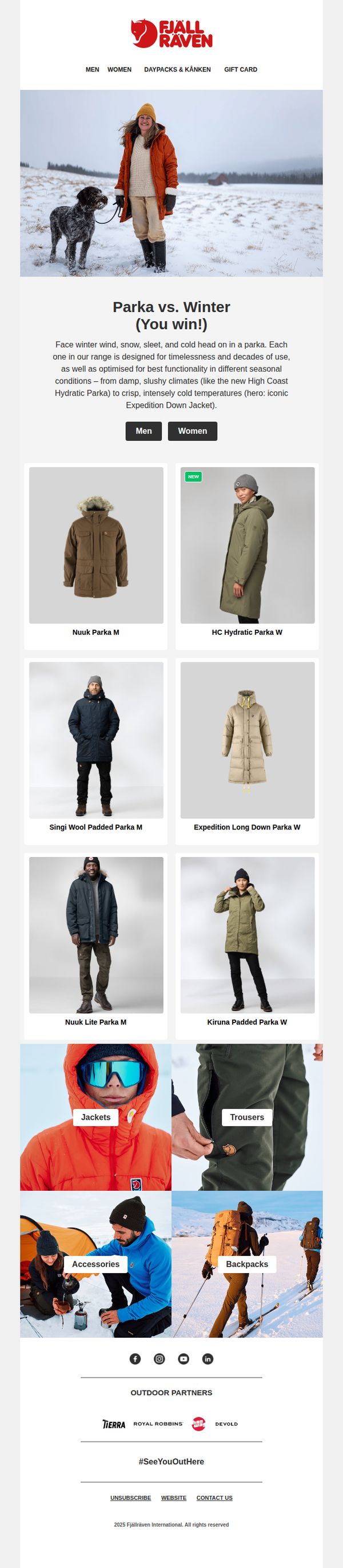
This email aims to introduce and drive interest in Fjällräven’s latest parka collection by highlighting their versatility across winter conditions, while guiding recipients to explore gender-specific options and related outdoor gear through clear product visuals and category links.
Why this works
The email brilliantly frames parkas not just as outerwear but as essential tools for conquering specific winter challenges, which transforms product features into emotional and functional benefits that resonate with outdoor enthusiasts.
How to implement
By using real-world imagery of models in snowy environments alongside clear product names and gender tags, the campaign builds instant relatability and reduces decision fatigue, making it easier for shoppers to self-select the right style.
Pro Tip
Add a secondary CTA button next to 'Men' labeled 'Women' with equal visual weight to avoid implying gender hierarchy and ensure both audiences feel equally prioritized from the first scroll. • Include a short testimonial or customer review snippet under the hero section to build social proof early, especially since the email positions parkas as high-investment, performance-driven gear where trust matters.
10. Back to reality

Objective
This email aims to re-engage customers returning to daily routines by showcasing practical, staff-recommended bags ideal for work and school, while subtly reinforcing brand values through sustainability storytelling and community-driven product narratives.
Why this works
The email brilliantly humanizes product selection by featuring real staff members with personal stories, transforming functional gear into emotionally resonant companions that reflect individual lifestyles and needs.
How to implement
By framing backpacks as solutions for daily transitions, like commuting or returning to campus, the campaign taps into a universal emotional moment, making the products feel essential rather than optional.
Pro Tip
Add a subtle countdown or urgency indicator near the 'Shop' CTAs for staff picks to nudge immediate action, especially since the email targets a time-sensitive back-to-routine audience. • Reorder the product grid to place the most versatile or best-selling item (like the Kånken) at the top of the grid, leveraging visual hierarchy to guide attention toward high-conversion products.