How furniture brands do Launch Campaign emails





1. Burrow: New kids on the block
Objective
This email aims to introduce Burrow’s latest product launches across multiple categories, positioning the brand as innovating beyond its original sofa roots while driving immediate traffic to new collections through clear, category-specific CTAs.
Why this works
Burrow brilliantly frames its expansion as a natural evolution, not a departure, by anchoring new categories in its core values of smart design, durability, and ease, which reassures loyal customers while inviting newcomers.
How to implement
Each new product is introduced with a distinct personality and purpose, like Mambo’s ‘dynamic’ vibe or Shift’s ‘sleeps as well as it sits’ promise, making it easy for shoppers to emotionally connect and self-select based on lifestyle needs.
Pro Tip
Add a subtle countdown or 'limited stock' indicator beneath the 'SHOP NEW ARRIVALS' CTA in the hero section to create urgency and encourage immediate clicks, especially since the email teases 'even more' arriving next week. • Include a short customer testimonial or social proof snippet under one or two of the new product blocks, especially for Shift or Opera, to reinforce credibility and reduce perceived risk for first-time buyers in unfamiliar categories.
2. Burrow: Introducing our all-new outlet shop
Objective
This email aims to drive traffic to Burrow’s new outlet shop by highlighting discounted open-box, returned, and refurbished furniture with a 25% price reduction, while positioning the offer as environmentally responsible and budget-friendly to appeal to conscious consumers.
Why this works
Burrow frames its outlet furniture not as damaged goods but as ‘better karma’ items, turning sustainability and affordability into an emotional benefit that resonates with eco-conscious shoppers seeking value without guilt.
How to implement
The email uses a clean, category-based product grid with clear labels like ‘Sofas’ and ‘Sectionals’ to reduce decision fatigue, making it easy for users to browse by type rather than scroll through a cluttered list of random discounted items.
Pro Tip
Add a subtle countdown timer or ‘limited stock’ indicator near the ‘Shop Outlet’ CTA to create urgency, since outlet inventory is inherently finite and time-sensitive, which could boost immediate click-through rates. • Include a short testimonial or customer review snippet under the hero section to build trust, since outlet items may raise quality concerns, social proof can reassure buyers that ‘refurbished’ doesn’t mean ‘compromised.’
3. CB2: LAUNCHING NOW | This exclusive Le Creuset color is a *mood*
Objective
This email aims to drive immediate sales of the new Le Creuset thyme collection by highlighting its exclusive availability at Crate & Barrel and pairing it with lifestyle-driven content that inspires cooking and seasonal entertaining. It also seeks to cross-sell complementary kitchen items and promote brand loyalty through community engagement and design services.
Why this works
The email brilliantly frames the new Le Creuset thyme color as a seasonal mood rather than just a product, tapping into emotional buying triggers by associating it with the cozy, herb-garden-inspired feeling of fall that resonates year-round with home cooks and design lovers alike.
How to implement
By embedding a simple, one-pot recipe directly into the product narrative, the campaign transforms a cookware launch into an experiential moment, subtly guiding the customer from aspiration to action by showing exactly how the Dutch oven enhances everyday meals with minimal effort and maximum flavor.
Pro Tip
The 'save up to 40%' offer section lacks urgency or time-bound framing, adding a countdown timer or 'limited stock' indicator would heighten perceived scarcity and encourage faster decision-making, especially since the sale is tied to a new product launch. • The transition from the recipe section to the Thanksgiving promotion feels abrupt and disjointed; integrating a brief connecting phrase like 'Perfect for your holiday table' would create a smoother narrative flow and better align the recipe with the seasonal shopping intent.
4. The Invisible Collection - FR: The Cultural Dispatch
Objective
This email aims to position The Invisible Collection as a culturally attuned curator by sharing monthly editorial picks across global art, design, and music events, fostering brand affinity through intellectual and aesthetic engagement rather than direct sales.
Why this works
The email brilliantly frames cultural curation as a personal, opinionated gift, not a generic roundup, which transforms passive readers into invested cultural companions who feel trusted and understood by the brand’s editorial voice.
How to implement
By weaving together global exhibitions, fashion retrospectives, and live music moments under a single thematic umbrella, the campaign creates a cohesive cultural narrative that elevates the brand beyond commerce into the realm of tastemaker and cultural guide.
Pro Tip
Add a subtle visual hierarchy or iconography to distinguish event types (e.g., art, music, film) so readers can quickly scan and prioritize content based on personal interest without reading every description. • Include a secondary CTA after each major section, such as 'Save to Calendar' or 'Share with a Friend', to increase engagement depth and encourage social amplification beyond the initial read.
5. Burrow: New in: Vesper + Performance Rugs
Objective
This email aims to drive traffic and sales for Burrow’s newly launched Vesper Lounge Chair colorways and Performance Rugs by highlighting customer-inspired design updates and functional benefits. It also promotes in-store celebration events to boost local engagement and conversions.
Why this works
Burrow smartly ties new product launches to customer feedback, making the update feel collaborative and personalized rather than just another inventory drop, which builds emotional investment before the first click.
How to implement
By emphasizing performance features like stain-resistance and anti-shedding alongside aesthetic appeal, the email speaks to both emotional and practical buyer motivations, widening its persuasive reach across different customer segments.
Pro Tip
The 'Shop New Arrivals' product grid lacks descriptive context or hero imagery, adding a short headline or benefit-driven tagline above the grid would reinforce why these items matter now, not just that they’re new. • The CTA 'SHOP NEW ARRIVALS' appears twice with identical wording but different contexts, differentiate them by tailoring the text to the section (e.g., 'Explore Vesper Colors' vs. 'Discover Performance Rugs') to reduce confusion and improve intent alignment.
6. Burrow: Introducing our all-new outlet shop
Objective
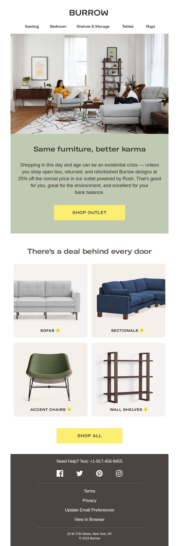
This email aims to introduce Burrow’s new outlet shop by positioning it as a sustainable, budget-friendly alternative to traditional furniture shopping, encouraging recipients to explore discounted open-box, returned, and refurbished items while highlighting environmental and financial benefits.
Why this works
Burrow brilliantly reframes discounted furniture as ‘better karma’, turning what could feel like a compromise into a values-driven win for the customer, the planet, and their wallet, which elevates the emotional appeal of the outlet experience.
How to implement
The email uses a clean, category-driven product grid with clear visual labels like ‘Sofas’ and ‘Sectionals’ to reduce decision fatigue and guide users intuitively toward specific deals, making the outlet feel curated rather than chaotic.
Pro Tip
Add a subtle countdown timer or ‘limited stock’ indicator near the ‘SHOP OUTLET’ CTA to create urgency, since the outlet model thrives on scarcity and immediacy, this would nudge hesitant shoppers to act now rather than browse later. • Include a short testimonial or customer quote under the hero section, even one line like ‘I saved 25% and got a like-new sofa!’, to build social proof and reduce perceived risk around buying refurbished furniture.
7. Pedersen + Lennard : See Your Space in a New Light

Objective
This email aims to introduce the new Atlas Lamp as a sculptural, ambient lighting solution that enhances home spaces, while driving traffic to both physical stores and the online shop during Cape Town Furniture Week.
Why this works
The email masterfully frames the Atlas Lamp not just as a product, but as an emotional experience, a 'moth to flame' that draws you in with warmth and sculptural elegance, making the functional feel deeply aspirational.
How to implement
By tying the product launch to Cape Town Furniture Week, the campaign creates urgency and cultural relevance, transforming a simple product drop into a community event with hands-on experiences, giveaways, and local store engagement.
Pro Tip
Add a countdown timer or 'Limited Stock' indicator near the CTA to create urgency, especially since the lamp is launching during a time-bound event like Furniture Week, which naturally lends itself to scarcity messaging. • Include a short customer testimonial or designer quote near the product description to build social proof, since the lamp is positioned as a design-forward piece, third-party validation would strengthen perceived value and trust.
8. Outer: New Showrooms Added Weekly!

Objective
This email aims to drive in-person engagement by encouraging recipients to visit Outer’s neighborhood showrooms, where they can experience products firsthand before purchasing, thereby reducing buyer hesitation and increasing conversion confidence.
Why this works
The email brilliantly bridges online browsing with real-world experience by positioning neighborhood showrooms as trusted, peer-hosted spaces, turning hesitant shoppers into confident buyers through tactile, social proof-driven discovery.
How to implement
By framing the showroom visit as a four-step journey, find, request, try, then buy, the email simplifies decision-making and reduces friction, making the path to purchase feel guided, safe, and personalized rather than overwhelming or salesy.
Pro Tip
Add a subtle countdown or urgency indicator near the CTA (e.g., 'New showrooms added weekly, visit before your neighborhood fills up!') to nudge immediate action without compromising the relaxed, experiential tone. • Include a small visual map or icon next to 'Find a Showroom' to reinforce geographic relevance and help users instantly recognize proximity, enhancing the personalization of the neighborhood-based model.
9. Incanda: Our Latest Canvas Art Collection

Objective
This email aims to introduce Incanda’s new canvas art collection by highlighting its ability to transform interior spaces with warm, textured, and moody designs. It encourages immediate purchase through clear product visuals and direct CTAs while subtly cross-promoting sustainable leather accessories.
Why this works
The email opens with a strong emotional hook, 'New Art, Instant Atmosphere', that positions the product not as decor but as a mood-shaping experience, making it feel essential rather than optional for interior design enthusiasts.
How to implement
Each canvas is presented with a clean, consistent layout that includes the name, price, and a dedicated 'Shop Now' button, reducing friction and decision fatigue by making every product equally actionable and visually comparable.
Pro Tip
Add a subtle countdown timer or limited-edition badge near the hero section to create urgency around the new collection, since the current design lacks any time-sensitive incentive to act immediately. • Include a short testimonial or customer review snippet under the hero image to build social proof, as the current layout relies solely on product visuals without leveraging user validation to reinforce purchase confidence.
10. Incanda: Introducing the Elderweave Collection

Objective
To introduce and drive interest in the new Elderweave Collection by highlighting its authentic, handcrafted design and encouraging immediate exploration through a clear call to action. The email aims to convert curiosity into visits, both online and in-store, by emphasizing the collection’s unique character and heritage.
Why this works
The email masterfully blends emotional storytelling with product presentation by describing the Elderweave Collection as ‘lived-in beauty’, a phrase that evokes nostalgia and authenticity, making the furniture feel like a natural extension of the customer’s home rather than just another purchase.
How to implement
By anchoring the collection in craftsmanship, specifically ‘reclaimed timber with a greywash finish’, the brand positions itself as both eco-conscious and design-forward, appealing to discerning buyers who value sustainability without compromising on aesthetic boldness or character.
Pro Tip
Add a subtle countdown timer or limited-edition badge near the CTA to create urgency, since the collection is positioned as unique and handcrafted, this would leverage scarcity psychology to nudge hesitant shoppers toward immediate action. • Include a short customer testimonial or designer quote in the hero section to add social proof and authority, helping new audiences trust the ‘raw authenticity’ claim by grounding it in real-world endorsement rather than brand assertion alone.