Halloween Launch Campaign campaign ideas that work




1. MeUndies: New Halloween Print: Bats Night Out
Objective
This email aims to drive immediate sales of MeUndies’ limited-edition Halloween 'Bats Night Out' print by creating urgency and showcasing the fun, festive designs across multiple product types. It also encourages exploration of other seasonal prints and bundle options to increase average order value.
Why this works
The email brilliantly ties the product launch to a playful, seasonal theme, 'Bats Night Out', making the underwear feel like a must-have costume accessory rather than just apparel, which elevates perceived value and emotional appeal.
How to implement
By featuring both men’s and women’s styles in the same campaign, MeUndies subtly promotes inclusivity and shared celebration, encouraging couples or friends to shop together and increasing the likelihood of multiple purchases per household.
Pro Tip
Add a countdown timer near the 'Shop Print' CTA to visually reinforce the limited-edition nature of the 'Bats Night Out' collection, increasing urgency and reducing hesitation among indecisive shoppers. • Include a short customer testimonial or social proof snippet under the product grid (e.g., 'Over 5,000 customers loved this print last year') to build trust and validate the product’s popularity before users scroll to the cross-sell section.
2. Homesick: A new collaboration collection is coming…
Objective
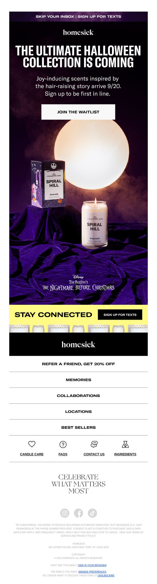
To generate anticipation and early sign-ups for Homesick’s upcoming Halloween collaboration collection by teasing limited-edition scents tied to a beloved film, encouraging immediate engagement through a waitlist CTA.
Why this works
The email brilliantly leverages nostalgia and pop culture by tying scent launches to iconic films, creating emotional resonance that transforms a product drop into a cultural moment worth anticipating.
How to implement
By using dramatic visual storytelling, moody purple velvet, glowing moonlight, and cinematic packaging, the brand elevates candles from home goods to collectible experiences that feel exclusive and emotionally rich.
Pro Tip
Add a subtle countdown timer under the CTA to create urgency around the 9/20 launch date, reinforcing FOMO without cluttering the minimalist design. • Include a short teaser video or animated GIF in the hero section showing the candle being lit or packaging opening to enhance sensory appeal and increase dwell time.
3. Savage X: NEW DROP: Swirly Girl
Objective
This email aims to drive immediate sales of the new 'Swirly Girly' bra collection by highlighting a limited-time 2-for-$29 offer while encouraging new customers to join the Rewards program to unlock exclusive pricing and avoid membership fees. It also promotes the new men’s line to broaden audience appeal.
Why this works
The email brilliantly anchors attention with a bold, benefit-driven headline, '2 FOR $29 BRAS', that immediately communicates value while tying it to a new, emotionally resonant product line called 'Swirly Girly,' making the offer feel both urgent and desirable.
How to implement
By visually segmenting the campaign into distinct product zones, women’s bras, vintage-inspired sets, and men’s loungewear, the email caters to multiple customer segments without clutter, subtly expanding the perceived relevance of the brand beyond its core lingerie audience.
Pro Tip
Add a subtle countdown timer or 'Limited Stock' indicator near the 2-for-$29 offer to amplify urgency, since the current design relies solely on text and lacks visual scarcity cues that could boost conversion. • Reposition the men’s section higher or give it equal visual weight with the women’s hero section, currently, it feels like an afterthought, which underutilizes the opportunity to cross-sell to partners or gift shoppers.
4. Thread: Halloween starts here 🎃
Objective
This email aims to drive Halloween-themed food purchases by creating a festive, immersive experience that highlights seasonal products and encourages immediate exploration through curated categories and product showcases. It also seeks to personalize future communications by capturing dietary preferences at the end.
Why this works
The email brilliantly blends seasonal storytelling with product discovery by framing Halloween as an experience, not just a sale, using playful character names like Colin the Caterpillar to build emotional connection before driving action.
How to implement
Each product section is visually anchored by a high-impact hero image and paired with a concise, benefit-driven description that highlights flavor, texture, or novelty, making it easy for customers to imagine enjoying the treat, which boosts conversion potential.
Pro Tip
Add a subtle countdown timer near the hero section to create urgency around Halloween availability, since the email references a specific date (Friday 31 October) but doesn’t visually reinforce time sensitivity to drive faster action. • Reposition the 'Did you like this email?' feedback section higher, perhaps after the first product grid, to capture sentiment while the user is still engaged, rather than burying it at the bottom where attention has likely waned.
5. Meow Meow Tweet: A note from Tara
Objective
This email aims to humanize the Meow Meow Tweet brand by sharing a vulnerable, personal reflection from co-founder Tara about imposter syndrome, while gently weaving in seasonal product inspiration and community engagement opportunities to deepen emotional connection without hard-selling.
Why this works
The email masterfully turns personal vulnerability into brand intimacy by letting the founder openly discuss imposter syndrome, which builds trust and positions the brand as authentically human rather than polished and distant, making customers feel like insiders in the brand’s journey.
How to implement
Instead of pushing products, the campaign uses seasonal themes like Halloween and Scorpio season to organically frame product mentions, like witch hazel and deodorant scent launches, making the offerings feel like natural extensions of a shared cultural moment rather than sales pitches.
Pro Tip
The CTA 'CONNECT ME →' is vague and underwhelming for a campaign that builds emotional momentum, rephrase it to reflect the invitation to engage, such as 'Join Our NYC Shoot →' or 'Share Your Costume Story →' to match the personal tone and drive action. • The 'Ritual' section featuring the cat and candle is visually charming but lacks a clear link to product or brand value, add a micro-copy line like 'Our Lavender Balm helps set the mood for moments like this' to subtly tie ambiance back to offerings without breaking the mood.
6. beehiiv : 🔴 Introducing the Creator Spotlight Monetization Trend Report

Objective
This email aims to introduce the Creator Spotlight Monetization Trend Report while gathering reader insights through a survey to shape the final research. It also promotes Google AdSense as a solution for creators seeking clean, controlled ad experiences.
Why this works
The email brilliantly frames monetization not as a side hustle but as a strategic career evolution, positioning creators as consultants and executives, a narrative shift that elevates their perceived value and justifies premium pricing or equity models.
How to implement
By embedding real creator case studies like Jayde Powell and Adam Biddlecombe, the email transforms abstract trends into tangible, relatable success stories that inspire action while subtly validating the report’s credibility through peer validation.
Pro Tip
The CTA 'Share your experience here' is buried in the header and repeated only in the footer; it should be visually emphasized with a contrasting button near the survey graphic to reduce friction and increase conversion. • The Google AdSense ads, while relevant, interrupt the narrative flow twice, consider placing both ads in a single, clearly labeled 'Sponsor Spotlight' section to preserve editorial integrity and reduce visual fragmentation.
7. The Sill: 👻 New plants just dropped
Objective
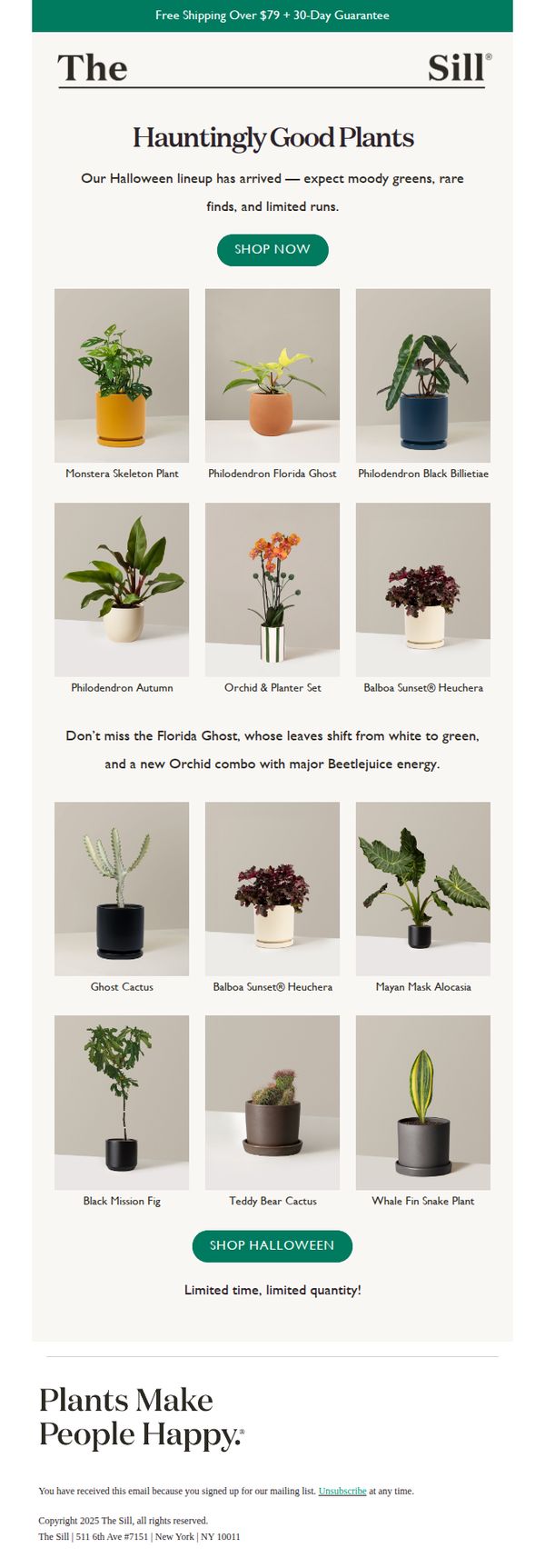
This email aims to drive immediate sales by promoting The Sill’s limited-edition Halloween plant collection, leveraging seasonal urgency and playful naming to attract plant lovers seeking unique, moody decor. It positions the new arrivals as rare and time-sensitive to encourage quick browsing and purchasing.
Why this works
The email brilliantly ties seasonal excitement to product names, like 'Florida Ghost' and 'Beetlejuice energy', creating emotional resonance and curiosity that transforms ordinary plants into must-have Halloween decor with personality and story.
How to implement
By emphasizing 'limited runs' and 'limited time, limited quantity,' the campaign taps into FOMO without being pushy, making the urgency feel authentic and aligned with the curated, collector-worthy nature of the plants being offered.
Pro Tip
Add a brief educational blurb or care tip under 1–2 standout plants (like the Florida Ghost) to subtly reinforce value and reduce purchase hesitation by helping customers feel confident they can keep the plant alive. • Include a small countdown timer or 'X units left' indicator near the CTA to amplify urgency visually, especially since the campaign relies heavily on scarcity, this would make the 'limited quantity' claim feel more tangible and immediate.
8. Connecticut Magazine: Brainard Airport should stay open, consultants say

Objective
To inform readers about the consultants’ recommendation to keep Brainard Airport open while closing one runway, and to drive engagement with local news and sponsored financial content through curated articles and a retirement guide CTA.
Why this works
The email opens with a strong, localized news hook that immediately captures attention by framing the airport debate as a high-stakes civic issue, making readers feel informed and invested in the outcome.
How to implement
By embedding a sponsored financial offer within a trusted editorial context, the campaign subtly positions the advertiser as a solution to a reader’s potential life-stage concern, retirement planning, without disrupting the news experience.
Pro Tip
The primary CTA for the retirement guide is buried below multiple news stories; repositioning it immediately after the lead story would capitalize on reader momentum and increase conversion rates. • The email lacks visual hierarchy between editorial content and sponsored ads, adding subtle dividers or background shading to distinguish ad blocks would improve user experience and reduce accidental clicks.
9. Lush - EN: Shake up your shower 🚿

Objective
This email aims to drive engagement and sales by inviting subscribers to explore Lush’s playful, limited-edition shower products and seasonal Halloween collection, positioning them as magical, sensory experiences worth trying immediately.
Why this works
Lush brilliantly turns functional shower products into magical, story-driven experiences by giving them whimsical names and vivid sensory descriptions that tap into emotion and fantasy, making routine hygiene feel like an adventure.
How to implement
The email strategically uses bold, contrasting color blocks for each product to create visual rhythm and instant recognition, helping shoppers quickly scan and emotionally connect with items without getting lost in text-heavy descriptions.
Pro Tip
The CTA 'SHOWER EXCLUSIVES' is visually strong but lacks urgency or benefit, rewording it to 'Grab Your Magic Shower Now, Limited Stock!' would better align with the campaign’s seasonal, exclusive tone and drive faster clicks. • The product grid lacks price visibility or 'new' badges, which could reduce conversion, adding subtle price tags or 'New!' indicators next to each item would help shoppers compare value and prioritize novelty without extra clicks.
10. ColourPop: NEW! Halloween Shadow Stix 🎃
Objective
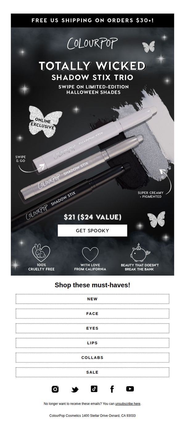
To drive immediate sales of the limited-edition Halloween Shadow Stix Trio by highlighting its exclusivity, value, and seasonal appeal while reinforcing brand values like cruelty-free beauty and affordability.
Why this works
The email leverages urgency and exclusivity by labeling the product as 'Online Exclusive' and tying it to a seasonal theme, which taps into FOMO while aligning with holiday-driven consumer behavior.
How to implement
It smartly frames the value proposition not just as a price but as a $24 value for $21, making the discount feel more substantial and psychologically rewarding to the shopper.
Pro Tip
Add a countdown timer or 'Limited Stock' indicator near the CTA to amplify urgency, since the product is labeled 'limited-edition' but lacks real-time scarcity cues to drive faster decisions. • Include a mini testimonial or user-generated content snippet (e.g., 'Loved by 5K+ spooksters!') near the product image to build social proof, especially since the email lacks any customer validation despite promoting a new launch.