Health & Wellness launch campaign email designs from top brands



1. Organifi: Now Available: Food For Life Protein
Objective
This email aims to introduce and drive early adoption of Organifi’s new Food For Life Protein by positioning it as a premium, nutrient-dense meal replacement co-created with wellness experts, while encouraging immediate purchase through urgency and social proof.
Why this works
The email brilliantly leverages co-creator credibility by spotlighting Angi and Arlynd Fletcher, transforming a product launch into a trusted wellness moment that feels less like marketing and more like a personal recommendation from experts you already admire.
How to implement
By contrasting Food For Life Protein against ‘compromising’ competitors, the copy creates a clear value hierarchy that positions the product not just as another shake, but as the only truly complete, real-food solution for people who refuse to sacrifice nutrition for convenience.
Pro Tip
Add a short video or animated GIF in the hero section showing the protein shake being prepared or consumed, this would increase perceived authenticity and sensory appeal, making the ‘delicious organic shake’ claim more tangible and emotionally compelling. • Include a micro-testimonial or user stat (e.g., ‘92% of early testers felt fuller longer’) near the ‘Formulated with’ bullet points to reinforce credibility and reduce perceived risk for first-time buyers hesitant about a new product line.
2. Kate Farms: Here’s Your Kate Farms Newsletter! 📬
Objective
This email aims to celebrate International Women’s Day and Registered Dietitian Nutritionist Day while highlighting Kate Farms’ commitment to women’s leadership and nutrition expertise. It also promotes the new Kids Nutrition line at Target and encourages SMS sign-ups and career engagement.
Why this works
The email masterfully ties brand values to cultural moments, celebrating women leaders and RDNs, not just as a marketing tactic, but as a genuine reflection of company culture, which builds deeper emotional resonance with socially conscious audiences.
How to implement
By spotlighting specific stats like '70% of our team are women' and '60% of leadership,' the brand transforms abstract diversity claims into tangible, credible proof points that reinforce trust and authenticity without sounding boastful.
Pro Tip
The primary CTA 'Sign Up' is buried mid-email and visually underwhelming; reposition it above the fold with stronger contrast and urgency (e.g., 'Join 10K+ Parents Getting Nutrition Tips') to boost SMS opt-ins. • The Kids Nutrition section lacks social proof, adding a short testimonial or pediatrician endorsement would strengthen credibility and reduce perceived risk for parents considering a new nutrition product.
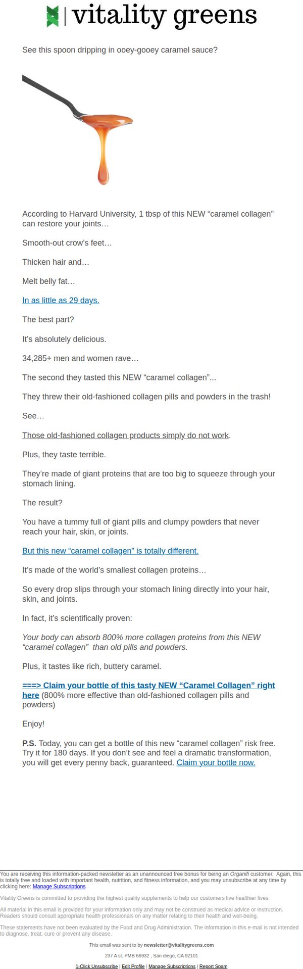
3. Organifi: 1 tbsp of THIS caramel restores joints
Objective
To persuade readers to try and purchase the new 'caramel collagen' supplement by highlighting its superior absorption, delicious taste, and science-backed joint, skin, and hair benefits compared to traditional collagen products.
Why this works
The email brilliantly hooks readers by comparing a luxurious caramel sauce to a health supplement, instantly making the product feel indulgent rather than medicinal, which lowers psychological resistance to trying it.
How to implement
By citing Harvard University and a specific 800% absorption advantage, the campaign lends scientific credibility to the product while simplifying complex bioavailability claims into an emotionally resonant, easy-to-digest benefit.
Pro Tip
Add a visual comparison graphic showing the molecular size difference between traditional collagen pills and the new 'caramel collagen' to reinforce the absorption claim and make the science more digestible. • Place the primary CTA button directly under the scientific claim about 800% better absorption to capitalize on peak credibility momentum, rather than burying it after the P.S. section.
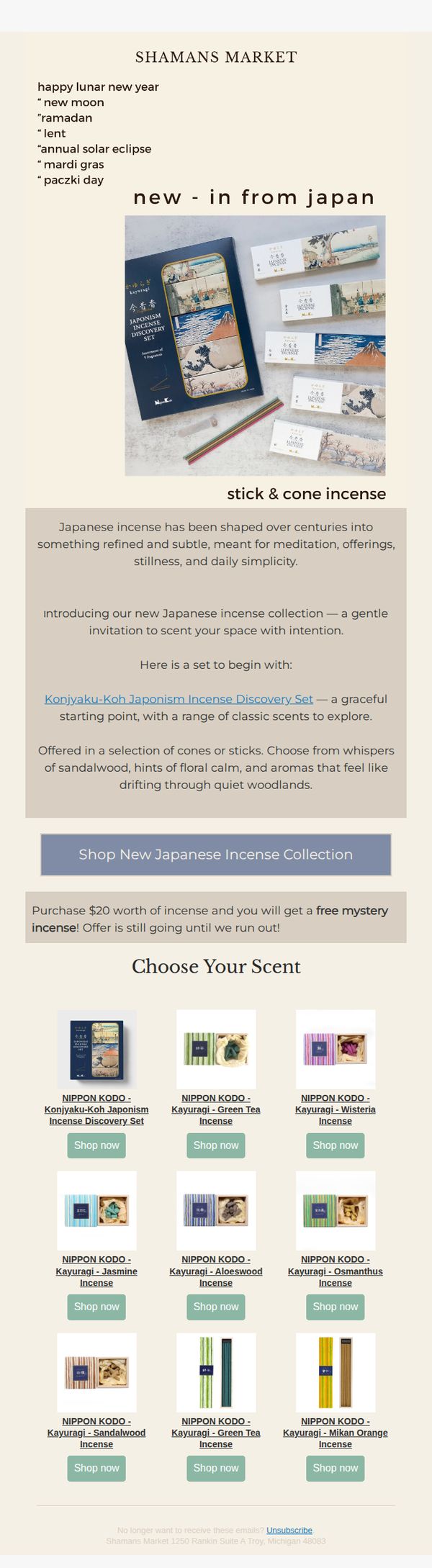
4. Shamans Market : Embrace New Beginnings 🌑🏮
Objective
This email aims to introduce and drive sales for Shamans Market’s new Japanese incense collection by tying it to cultural moments like the lunar new year and other global observances, while encouraging immediate purchase through a limited-time mystery gift offer.
Why this works
The email brilliantly anchors a product launch to culturally resonant moments like the lunar new year and Ramadan, making the incense feel timely, meaningful, and spiritually aligned rather than just another retail item.
How to implement
By framing the incense as a tool for meditation, stillness, and daily simplicity, the copy elevates the product beyond scent into a ritual experience, appealing to customers seeking mindfulness and intentionality in their routines.
Pro Tip
Add a subtle countdown timer next to the mystery gift offer to heighten urgency and reinforce the 'while supplies last' message without cluttering the layout. • Include one short customer testimonial or quote near the product grid to build social proof and reassure new buyers about scent quality and meditative benefits.
5. Maude: a new device is coming soon.
Objective
The email aims to build anticipation and exclusivity around an upcoming product launch by inviting subscribers to be the first to know, while reinforcing Maude’s brand values of inclusivity, safety, and modern intimacy.
Why this works
Maude masterfully creates intrigue by teasing a new device without revealing details, turning curiosity into a powerful motivator for sign-ups while aligning the mystery with their brand ethos of thoughtful, intentional design.
How to implement
The minimalist visual hierarchy, dark background, bold white text, and a single CTA, eliminates distraction and funnels attention directly to the core action, proving that restraint in design can amplify emotional impact and conversion intent.
Pro Tip
Add a subtle countdown timer or 'limited spots' indicator near the CTA to heighten urgency and FOMO, encouraging immediate sign-ups instead of passive interest. • Include a micro-testimonial or user quote beneath the hero section to build social proof early, reassuring new subscribers that the brand’s promises are backed by real customer experiences.
6. Maude: "giving shared pleasure new meaning."

Objective
To introduce and drive interest in Maude’s new vibrating ring, 'band,' by highlighting its editorial acclaim and redefining shared pleasure through minimalist, inclusive messaging that aligns with the brand’s mission of modern intimacy.
Why this works
Maude masterfully positions its new vibrating ring not just as a product but as a cultural shift, using editorial praise to validate its innovation while subtly reframing intimacy as inclusive, modern, and deeply personal.
How to implement
The email’s minimalist aesthetic and strategic use of dark tones create a mood of sophistication and discretion, allowing the product’s form and the testimonials’ emotional weight to take center stage without visual clutter or distraction.
Pro Tip
Add a subtle countdown timer or limited-availability note near the 'shop band' CTA to create urgency without compromising the email’s calm, elevated tone, this would nudge hesitant readers toward immediate action. • Include a small visual comparison or size reference for the 'band' device in the hero section to reduce uncertainty for first-time buyers, helping them visualize fit and form before clicking through.
7. beam: *NEW* Take a bite out of this fall flavor
Objective
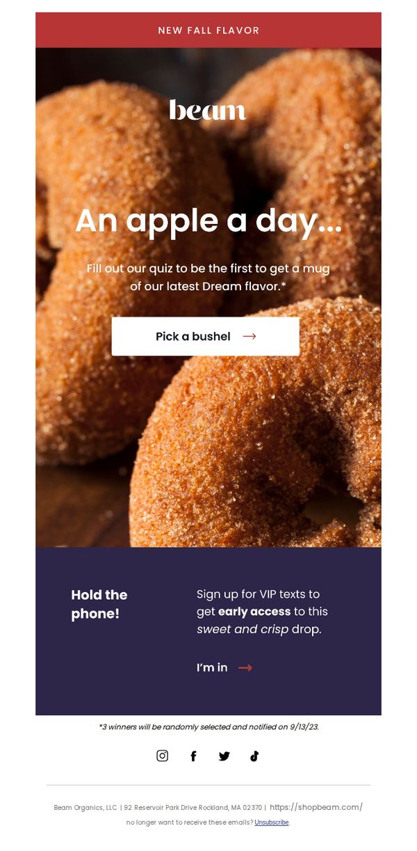
The email aims to generate excitement and early engagement for Beam’s new fall flavor by inviting subscribers to participate in a quiz for a chance to win a limited-edition product, while also encouraging SMS sign-ups for exclusive access.
Why this works
The email brilliantly ties seasonal nostalgia to product launch by using the familiar phrase 'An apple a day' to instantly evoke fall comfort while teasing a new flavor, making the offer feel both timely and emotionally resonant.
How to implement
Instead of a generic 'Shop Now,' the CTA 'Pick a bushel' leans into the autumnal theme with playful, product-aligned language that transforms a simple action into a whimsical, immersive experience, making the user feel like they’re part of the harvest story.
Pro Tip
Add a subtle countdown timer or urgency indicator near the quiz CTA to reinforce the limited nature of the offer, since the 9/13/23 winner notification date is buried in fine print and doesn’t create immediate FOMO. • Include a small visual cue or icon next to the 'I’m in' SMS sign-up button to clarify what users are opting into, like a phone icon or 'Text Alerts' label, since the current design doesn’t visually communicate the SMS channel’s value or mechanics.
8. Milky: Introducing Milky's Lunar New Year Sleeve! 🧧
Objective
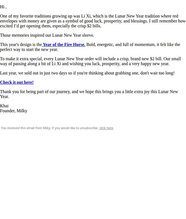
This email aims to introduce Milky’s limited-edition Lunar New Year sleeve by connecting it to a personal cultural tradition (Li Xi) and drive immediate purchases by highlighting scarcity and a unique bonus, a crisp $2 bill included with every order.
Why this works
The email opens with a heartfelt personal story about Li Xi, instantly creating emotional resonance and cultural relevance that transforms a product launch into a meaningful tradition worth participating in.
How to implement
Including a tangible, unexpected bonus, a crisp $2 bill, with every order turns a simple purchase into a memorable experience, leveraging nostalgia and surprise to boost conversion without discounting the product.
Pro Tip
Add a visual of the actual sleeve design and the $2 bill in the email body to reduce cognitive load and increase desire, seeing the product and bonus together strengthens the emotional and transactional appeal. • Reposition the CTA button to appear immediately after the offer description (before the founder’s sign-off) to reduce friction and capture intent while the reader is still emotionally engaged.
9. Sons: Sonsday Newsletter: All About Minoxidil

Objective
This email aims to educate subscribers about Sons’ Oral Minoxidil as a convenient alternative to topical spray, while reinforcing trust through FAQs and scientific backing to drive conversions. It also subtly promotes tablet-only plans for users who prefer non-spray options.
Why this works
The email smartly positions Oral Minoxidil not just as an alternative but as a lifestyle-friendly upgrade, framing convenience as a core benefit that resonates with busy men who struggle with twice-daily sprays.
How to implement
By directly comparing Oral vs. Topical Minoxidil with clear visuals and a dedicated section, the campaign reduces decision fatigue and empowers readers to self-select the solution that fits their routine, a powerful educational nudge toward conversion.
Pro Tip
Add a countdown timer or urgency cue near the CTA buttons to encourage immediate action, especially since the email is education-focused and risks losing momentum without a behavioral trigger. • Include a small testimonial quote or star rating next to the 'Why buy from Sons' benefits to reinforce social proof alongside logistical perks like free delivery and physician support.
10. For Youth : Double Launch Alert: Another new product is here ⚡
Objective
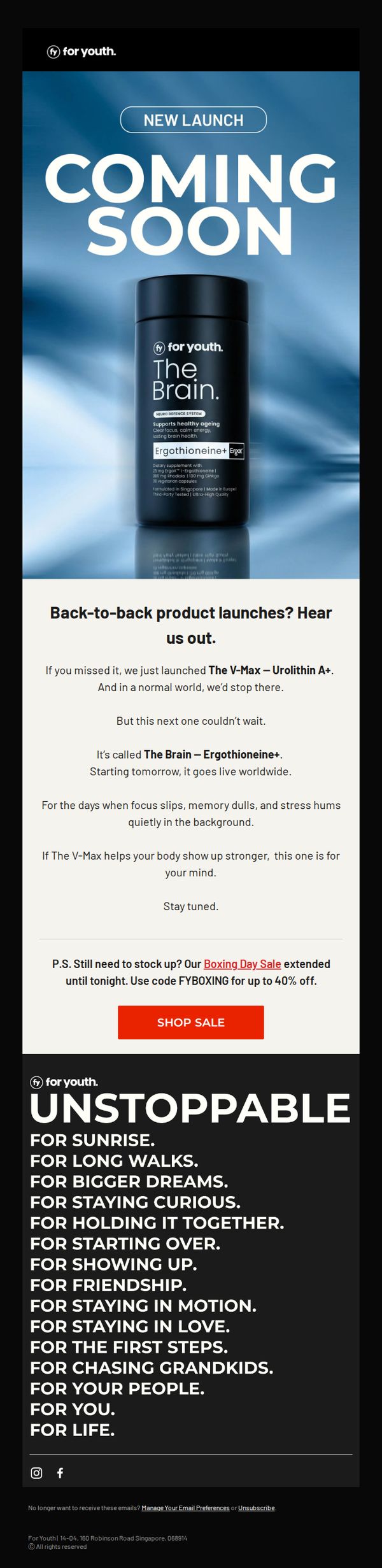
This email aims to build anticipation for the imminent global launch of 'The Brain – Ergothioneine+' while reminding subscribers of the recent 'V-Max – Urolithin A+' release, encouraging immediate purchase through an extended Boxing Day Sale offer.
Why this works
The email brilliantly leverages momentum by framing two product launches as a back-to-back event, creating urgency and positioning the brand as innovative and fast-moving without overwhelming the reader with too many new items at once.
How to implement
By clearly differentiating the new product’s purpose, 'for your mind' versus the previous one’s focus on the body, the campaign smartly segments benefits to appeal to holistic wellness seekers while avoiding feature overlap confusion.
Pro Tip
Add a subtle countdown timer or 'launch in X hours' indicator beneath the hero image to heighten urgency and give subscribers a tangible reason to return before the product goes live. • Include a brief testimonial or social proof snippet near the product description to build trust for the new 'The Brain' supplement, especially since it’s targeting cognitive benefits which require higher consumer confidence.