How Home brands do launch campaign emails


1. Ruggable: Just In: This Month’s Top Picks
Objective
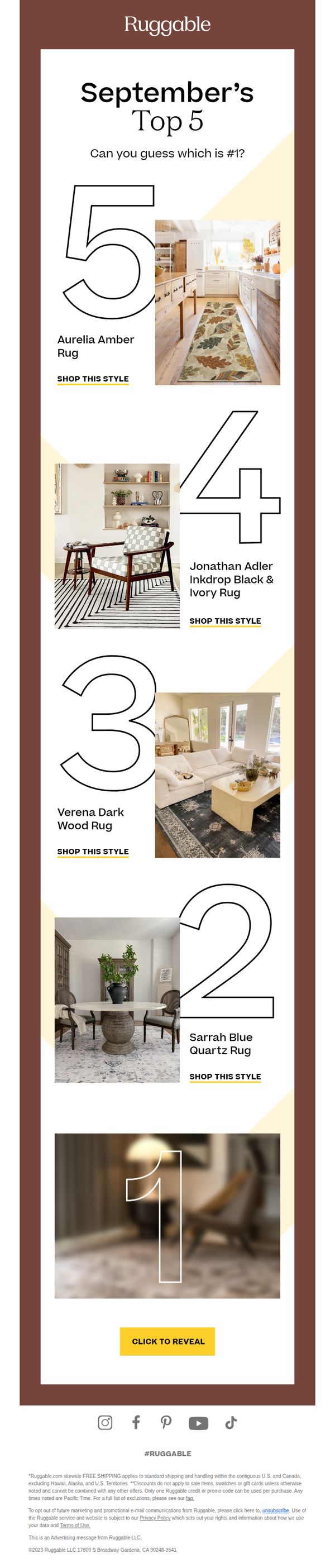
This email aims to drive engagement and sales by teasing a ranked list of September’s top-selling rugs, encouraging recipients to click through to discover the #1 pick and shop the collection. It leverages curiosity and social proof to convert interest into action.
Why this works
The email brilliantly uses a countdown-style ranking to create suspense and encourage scrolling, turning product discovery into an interactive experience that feels like a game rather than a sales pitch.
How to implement
Each rug is showcased in a realistic, styled room setting, which helps customers visualize the product in their own space, a powerful emotional trigger that boosts perceived value and purchase intent.
Pro Tip
Add a subtle countdown timer or 'limited stock' indicator near the #1 reveal CTA to create urgency and prevent procrastination, especially since the top pick is teased but not immediately available. • Include a short customer testimonial or star rating next to each rug’s name to reinforce social proof throughout the list, not just at the end, this builds trust incrementally as users scroll.
2. Our Place: PSA: The Party Coupes are here 🎉
Objective
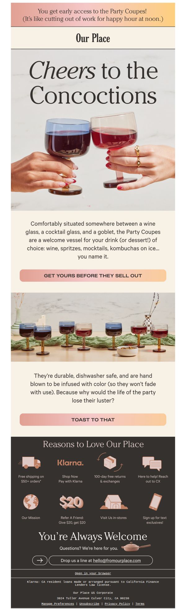
This email aims to generate immediate excitement and urgency around the launch of Our Place’s new Party Coupes by positioning them as the must-have vessel for social gatherings, while encouraging early purchase before stock runs out.
Why this works
The email brilliantly frames the Party Coupes not just as drinkware but as social catalysts, positioning them as the perfect bridge between wine, cocktails, and dessert glasses to elevate any gathering with effortless style and function.
How to implement
By using playful, conversational copy like 'It’s like cutting out of work for happy hour at noon,' the brand injects personality and relatability, making the product feel less like a purchase and more like an invitation to celebrate life’s small moments.
Pro Tip
Add a subtle countdown timer near the primary CTA to amplify urgency, since the email’s goal is to drive early access purchases before stock depletion, this would visually reinforce the 'before they sell out' message. • Include a short customer testimonial or social proof near the product grid (e.g., 'Over 5,000 Party Coupes claimed in 48 hours') to validate demand and reduce perceived risk for first-time buyers.
3. Parachute Home: So. Much. Newness.
Objective
This email aims to drive engagement and sales by showcasing Parachute Home’s latest product arrivals for August, encouraging subscribers to explore and purchase new bedding, bath, and home items through curated product highlights and clear CTAs.
Why this works
The email effectively uses a clean, minimalist layout to spotlight each new product with high-quality visuals and concise, evocative copy that ties emotional appeal to tangible features like texture, color, and seasonal relevance.
How to implement
By organizing products into a scrollable grid with consistent formatting, image, title, short description, and 'Shop Now' link, the email creates a seamless, magazine-like browsing experience that reduces friction and encourages impulse exploration.
Pro Tip
Add a subtle countdown timer or limited-availability indicator next to the 'Shop New Arrivals' CTA to create urgency, especially since the email promotes a monthly drop, this would nudge procrastinators to act immediately. • Include a customer testimonial or star rating snippet beside one or two top-performing new items to build social proof and credibility, helping undecided shoppers overcome hesitation by seeing real user validation.
4. Homesick: August Recap 🍹
Objective
This email aims to recap Homesick’s August product launches while teasing upcoming September arrivals, encouraging customers to explore new collections and stay engaged through text reminders and seasonal promotions.
Why this works
By framing new candle collections around seasonal transitions and nostalgic memories, Homesick transforms product launches into emotional experiences that resonate deeply with customers seeking comfort and connection through scent.
How to implement
The email strategically blends urgency with anticipation, highlighting past sales while teasing future arrivals, to keep subscribers engaged across multiple purchase cycles without overwhelming them with pressure or redundancy.
Pro Tip
Add a subtle countdown timer or 'limited stock' indicator near the 'Shop Fall' CTA to increase urgency for seasonal items, since fall scents are time-sensitive and benefit from FOMO-driven behavior. • Reposition the 'Sign Up for Texts' CTA to appear earlier in the flow, perhaps beneath the hero section, since SMS opt-ins are critical for retention and should be surfaced before users scroll past the initial engagement window.
5. Coop: The mattress topper everyone’s talking about
Objective
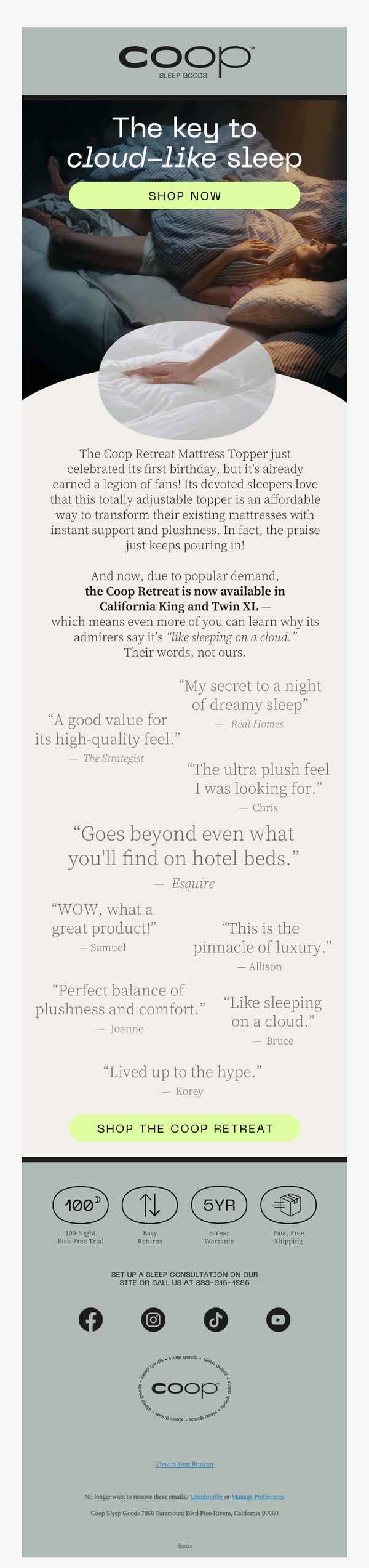
This email aims to drive immediate purchases of the Coop Retreat Mattress Topper by highlighting its popularity, customer praise, and newly expanded size availability, positioning it as a must-have upgrade for cloud-like sleep.
Why this works
The email brilliantly leverages social proof by featuring real customer quotes that mirror aspirational sleep experiences, turning subjective comfort into tangible, relatable benefits that resonate emotionally with sleep-deprived readers.
How to implement
By announcing the product’s first birthday and expanded sizing, the campaign creates urgency and inclusivity, subtly signaling that this isn’t just another mattress topper, it’s a proven, evolving solution trusted by a growing community of satisfied sleepers.
Pro Tip
Add a subtle countdown timer or limited-availability badge near the CTA to amplify urgency, especially since the email references ‘popular demand’, this would convert passive interest into immediate action. • Include a brief comparison graphic or bullet list showing how the Coop Retreat differs from standard mattress toppers (e.g., adjustability, material density) to clarify its unique value beyond testimonials.
6. Cotton Bird: They are FINALLY back ! 🎄🤩

Objective
To re-engage past customers and drive immediate sales by announcing the return of the popular photo Advent calendar for 2023, leveraging nostalgia and emotional connection through personalized photo memories leading up to Christmas.
Why this works
The email brilliantly taps into emotional nostalgia by reminding customers they loved the product last year, creating instant familiarity and reducing purchase hesitation through social proof and personal memory triggers.
How to implement
By framing the calendar as a daily emotional journey, '24 photographic memories for each day to share', the campaign transforms a product into an experience, making it feel indispensable for holiday bonding and storytelling.
Pro Tip
Add a subtle countdown timer near the CTA to create urgency, especially since the product is tied to a seasonal deadline, this would nudge procrastinators to act before the holiday rush. • Include a short customer testimonial or user-generated photo next to the 'Surprise!' section to reinforce trust and visualize the emotional payoff of the final framed poster.
7. Wylde Brigade: The February Edit: Bringing new energy home
Objective
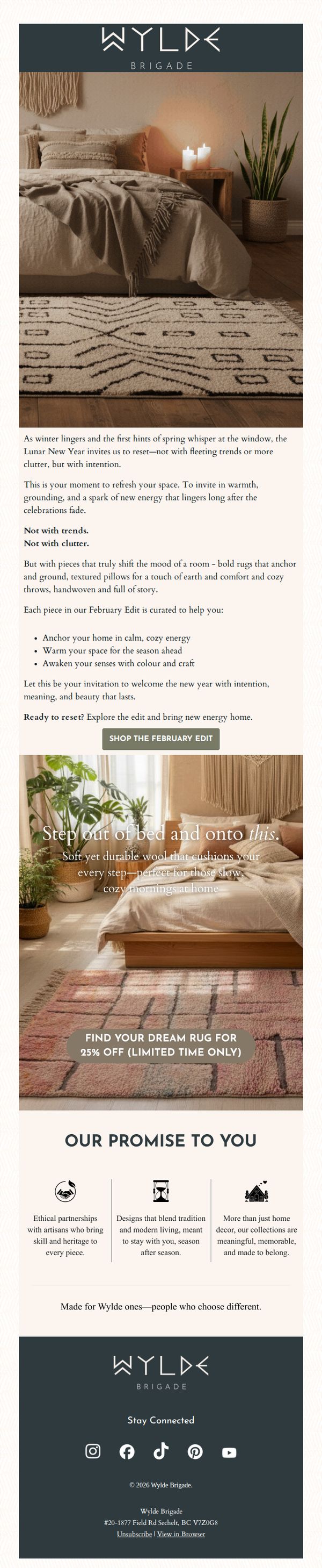
This email aims to inspire subscribers to refresh their home spaces with intentional, seasonally grounded decor that evokes warmth and calm, while driving traffic to the February Edit collection through a limited-time discount. It positions Wylde Brigade as a curator of meaningful, artisan-made pieces for mindful living.
Why this works
The campaign brilliantly ties seasonal transition to emotional renewal by framing home decor not as trend-chasing but as intentional mood-setting, making the purchase feel like self-care rather than consumption.
How to implement
By anchoring the promotion in cultural moments like Lunar New Year, the brand creates narrative depth that transforms a product launch into a lifestyle invitation, subtly elevating perceived value without overt sales pressure.
Pro Tip
Add a subtle countdown timer near the '25% OFF' offer to amplify urgency without cluttering the layout, leveraging psychological scarcity to boost conversion during the limited-time window. • Integrate a small 'Shop by Room' or 'Style Quiz' CTA beneath the main button to guide users who may feel overwhelmed by choice, improving navigation and personalizing the path to purchase.
8. Outer: New Showrooms Added Weekly!

Objective
This email aims to drive in-person engagement by encouraging recipients to visit Outer’s neighborhood showrooms, where they can experience products firsthand before purchasing, thereby reducing buyer hesitation and increasing conversion confidence.
Why this works
The email brilliantly bridges online browsing with real-world experience by positioning neighborhood showrooms as trusted, peer-hosted spaces, turning hesitant shoppers into confident buyers through tactile, social proof-driven discovery.
How to implement
By framing the showroom visit as a four-step journey, find, request, try, then buy, the email simplifies decision-making and reduces friction, making the path to purchase feel guided, safe, and personalized rather than overwhelming or salesy.
Pro Tip
Add a subtle countdown or urgency indicator near the CTA (e.g., 'New showrooms added weekly, visit before your neighborhood fills up!') to nudge immediate action without compromising the relaxed, experiential tone. • Include a small visual map or icon next to 'Find a Showroom' to reinforce geographic relevance and help users instantly recognize proximity, enhancing the personalization of the neighborhood-based model.
9. Clare: Tired of your home office setup?

Objective
This email aims to inspire homeowners to refresh their work-from-home spaces by showcasing curated paint color palettes that enhance both aesthetics and productivity, ultimately driving clicks to shop specific shades and explore more design ideas.
Why this works
Clare brilliantly ties seasonal timing, fall, with emotional motivation, positioning a home office refresh not as a chore but as a timely, uplifting ritual that blends beauty and function to support modern work-life balance.
How to implement
By pairing each paint color with a lifestyle benefit, like ‘banish boring vibes’ or ‘promote relaxation’, the campaign transforms paint from a commodity into a mood-altering, productivity-boosting tool that speaks directly to the emotional needs of remote workers.
Pro Tip
Add a subtle countdown timer or limited-time offer tag near the 'Find Your Color' CTA to create urgency, since the email’s seasonal framing (fall) already implies a window of relevance that could be leveraged more actively. • Include a quick 2-question interactive quiz (e.g., 'What’s your WFH vibe? Calm or Bold?') above the color grid to personalize the experience and guide users toward the most relevant shade before they scroll, increasing engagement and conversion likelihood.
10. Parachute Home: September Drops

Objective
This email aims to showcase Parachute Home’s September new arrivals by highlighting curated products with evocative descriptions that emphasize texture, mood, and lifestyle appeal, encouraging immediate exploration and purchase through clear CTAs.
Why this works
The email masterfully uses sensory-rich product descriptions, like 'lived-in texture reminiscent of quaint European towns', to transform functional home goods into emotionally resonant lifestyle experiences that invite tactile imagination.
How to implement
Each product is presented with a minimalist visual layout and a dedicated 'Shop Now' CTA, creating a clean, distraction-free browsing experience that reduces friction and encourages immediate action without overwhelming the reader.
Pro Tip
Add a subtle countdown timer or 'Limited Stock' indicator beneath high-demand items like the Patina Linen Quilt to create urgency and nudge hesitant shoppers toward faster decisions. • Include a short testimonial or customer review snippet next to 1–2 top products to build social proof and reinforce the emotional claims made in the product copy, increasing perceived trust and value.