International Women’s Day launch campaign email examples & ideas





1. Fjällräven: Yes!
Objective
To announce and drive excitement around Fjällräven’s new GTX collection made with PFAS-free GORE-TEX technology, positioning it as a durable, functional, and environmentally responsible upgrade for outdoor enthusiasts.
Why this works
The email brilliantly frames the product launch as a moral and technical milestone, not just new gear, but a bold stand against PFAS, aligning performance with environmental responsibility to deepen brand loyalty among conscious adventurers.
How to implement
By pairing dramatic outdoor imagery with clear product labels and gender-specific sizing, the email creates an immersive, aspirational experience that speaks directly to the identity of its target audience, serious hikers and mountaineers who value both function and ethics.
Pro Tip
Add a visual countdown timer or limited-availability badge near the 'See more' CTA to create urgency, since the email positions this as a milestone launch rather than a routine product drop. • Include a short customer testimonial or quote from an outdoor influencer beneath the product grid to build social proof and validate the performance claims before users scroll to the educational section.
2. Fjällräven: Don’t wait on winter trousers
Objective
This email aims to drive immediate consideration and purchase of Fjällräven’s winter trousers by positioning them as essential, durable gear for cold-weather adventures, while also encouraging exploration of complementary accessories and brand storytelling to deepen emotional engagement.
Why this works
The email brilliantly frames winter trousers not as seasonal apparel but as essential gear for enduring real-world conditions, from deep snow to slushy commutes, making the product feel indispensable rather than optional for outdoor enthusiasts.
How to implement
By spotlighting the new Keb GTX Trousers with GORE-TEX and PFAS-free construction, the campaign leverages technical credibility and eco-conscious innovation to appeal to discerning buyers who value both performance and sustainability in their outdoor gear.
Pro Tip
The primary CTA 'Explore' is too vague for a product-focused campaign; replacing it with action-oriented text like 'Shop Winter Trousers' or 'See Keb GTX Details' would better align with the goal of driving direct product engagement. • The hero section’s headline 'Timeless trousers for winter after winter' lacks urgency; adding a subtle time-sensitive hook like 'Limited Stock' or 'Gear Up Before the Snow Falls' would better support the 'Don’t wait' subject line.
3. Fjällräven: Routine ready? Gear up today
Objective
This email aims to re-engage customers returning to daily routines by positioning Fjällräven daypacks as stylish, functional companions for work, school, or commuting. It also promotes new GORE-TEX products and customization options to drive both immediate clicks and long-term brand loyalty.
Why this works
The email brilliantly reframes everyday routines as adventures worth equipping for, using emotionally resonant language that transforms mundane commutes into moments of personal expression and purpose.
How to implement
By spotlighting both new colorways and limited-edition items alongside lifestyle imagery, the campaign creates urgency while appealing to both trend-conscious shoppers and loyalists seeking exclusivity.
Pro Tip
The CTA 'Shop daypacks' appears too early and lacks urgency; consider adding a time-sensitive incentive or benefit-driven micro-copy like 'Find Your Perfect Fit, Limited Colors Available' to increase conversion intent. • The product grid lacks consistent visual hierarchy, some items have badges, others don’t, and image backgrounds vary; standardizing presentation with uniform lighting and badge placement would improve scannability and perceived professionalism.
4. Fjällräven: New flagship trekking jacket
Objective
To introduce and drive interest in Fjällräven’s new Keb GTX Jacket, highlighting its partnership with GORE-TEX and emphasizing durability, repairability, and performance for outdoor enthusiasts seeking long-term gear investment.
Why this works
The email brilliantly positions the Keb GTX Jacket not just as a product, but as a legacy item, leveraging its award-winning past and GORE-TEX partnership to build trust and emotional investment in long-term outdoor performance.
How to implement
By embedding repair guides and emphasizing gear longevity, Fjällräven transforms a product launch into a values-driven narrative, appealing to eco-conscious adventurers who prioritize sustainability and durability over disposable fashion.
Pro Tip
Add a clear, action-oriented CTA button directly under the hero image, such as 'Shop Keb GTX Jacket', to reduce friction and capitalize on initial engagement before the reader scrolls to secondary content. • Include a short customer testimonial or review snippet near the product description to reinforce social proof and validate the jacket’s performance claims, especially since the campaign targets experienced trekkers who rely on peer validation.
5. Fjällräven: Gear for low-key summers
Objective
This email aims to inspire customers to embrace low-key summer adventures by showcasing versatile, everyday outdoor essentials that blend style and function. It encourages exploration and gifting by highlighting new arrivals and curated product categories for casual outdoor living.
Why this works
The email brilliantly frames summer not as a season of grand expeditions but as a time for quiet, everyday adventures, making the brand feel accessible and emotionally resonant for casual outdoor lovers who value simplicity and comfort.
How to implement
By featuring both men’s and women’s apparel in a unified grid with clear labeling and ‘NEW’ tags, the campaign subtly reinforces inclusivity and product freshness without overwhelming the viewer, encouraging browsing across categories with minimal friction.
Pro Tip
Add a subtle countdown timer or urgency indicator near the 'Explore Everyday Outdoor' CTA to nudge immediate action, especially since the email promotes seasonal items that benefit from time-sensitive framing. • Reposition the 'Summer accessories' CTA to appear directly beneath the product grid it references, currently, it’s visually disconnected, reducing its effectiveness in guiding users from browsing to exploring complementary items.
6. Flipboard: Images of London's lively pub scene

Objective
This email aims to engage subscribers by showcasing visually compelling, globally relevant photojournalism curated by The Associated Press, while subtly promoting Flipboard’s app as the best way to stay informed and inspired through personalized storytelling.
Why this works
The email masterfully balances editorial depth with visual rhythm, using bold headlines and full-bleed photography to draw readers into global stories without overwhelming them with text or clutter.
How to implement
By embedding advertisements within thematic photo sections rather than interrupting the narrative flow, the campaign maintains credibility while monetizing attention, a smart compromise between journalism and commerce.
Pro Tip
Add a time-sensitive CTA like 'Download Now, First 1,000 users get exclusive access to AP’s London Pub Series' to create urgency and tie the app download directly to the featured content. • Integrate a small interactive element such as a ‘Tap to Explore More Photos from London’ hover effect on the pub scene image to increase engagement before prompting the app download.
7. Fjällräven: Just in case...

Objective
This email aims to re-engage customers by positioning lightweight jackets as essential summer-to-fall transition pieces, encouraging exploration of gender-specific collections while subtly promoting accessory and care product upsells through lifestyle storytelling and video content.
Why this works
The email brilliantly reframes seasonal apparel by focusing on transitional utility, not just weather protection, but enhancing spontaneous adventures, making lightweight jackets feel indispensable even in summer’s waning days.
How to implement
By embedding a short educational video on garment care within the flow, the brand transforms a simple product push into a value-driven experience that builds trust and subtly reinforces long-term product ownership and maintenance.
Pro Tip
The primary CTA 'Explore accessories' is buried below the product grid and lacks visual hierarchy; it should be moved above the accessories section and styled with a contrasting color or icon to match the urgency of the 'Just in case...' subject line. • The hero section’s copy mentions 'cooler evenings' and 'light rain' but doesn’t visually reinforce those conditions, adding a subtle weather icon or atmospheric overlay (e.g., mist, drizzle) would strengthen emotional resonance and product relevance.
8. Sunny Health & Fitness: Is Sitting Really the New Smoking?
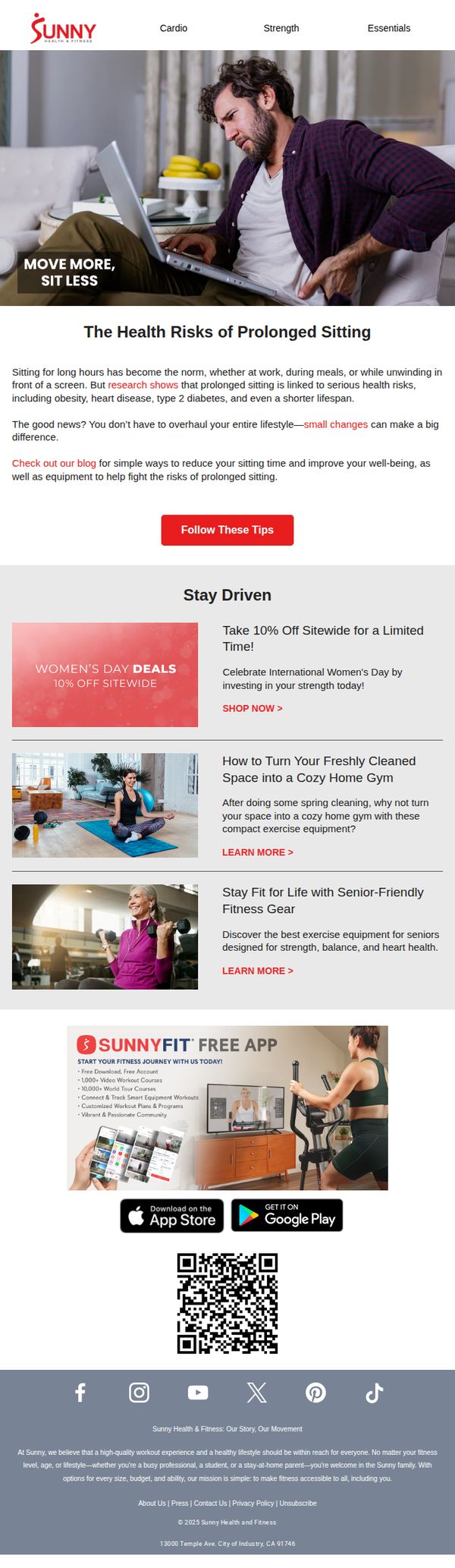
Objective
This email aims to educate subscribers on the health risks of prolonged sitting while positioning Sunny Health & Fitness as a solution through actionable tips, product recommendations, and a limited-time discount. It seeks to drive engagement, app downloads, and immediate purchases by tying health awareness to accessible fitness tools.
Why this works
The email brilliantly frames a common daily habit, sitting, as a health crisis, then immediately offers hope and agency through small, actionable changes, making the reader feel empowered rather than overwhelmed by the problem.
How to implement
By tying the Women’s Day promotion to a broader wellness narrative, ‘investing in your strength’, the campaign transforms a discount into an emotionally resonant gift, encouraging self-care while subtly reinforcing brand values around empowerment and accessibility.
Pro Tip
The primary CTA ‘Follow These Tips’ lacks urgency and doesn’t clearly lead to the most valuable conversion path, like the Women’s Day sale or app download, so it should be replaced or supplemented with a more action-oriented button like ‘Shop Women’s Day Deals’ or ‘Download the App Now’. • The layout places the app promotion and QR code below multiple content blocks, reducing visibility; repositioning it directly after the hero or alongside the main CTA would increase app installs by capitalizing on peak engagement.
9. Fjällräven: 2025’s best new beanies

Objective
This email aims to drive early adoption of Fjällräven’s 2025 beanie collection by positioning them as essential, season-ready gear for both everyday wear and outdoor adventures. It also cross-promotes GORE-TEX apparel and inspires engagement through storytelling around Arctic expeditions.
Why this works
The email brilliantly ties seasonal urgency to product utility by framing beanies not just as fashion items but as essential armor against fall and winter conditions, making the purchase feel proactive rather than impulsive.
How to implement
By spotlighting GORE-TEX technology alongside new beanies, the campaign elevates perceived value through association with high-performance materials, subtly reinforcing durability and weather-readiness without overloading technical jargon.
Pro Tip
Add a countdown timer or limited-availability tag near the 'Shop now' CTA to create urgency around the new fall/winter releases, encouraging immediate action instead of passive browsing. • Integrate customer testimonials or review snippets under each beanie image in the product grid to build social proof and reduce hesitation for first-time buyers unfamiliar with fit or warmth performance.
10. Fjällräven: Back to reality

Objective
This email aims to re-engage customers returning to daily routines by showcasing practical, staff-recommended bags ideal for work and school, while subtly reinforcing brand values through sustainability storytelling and community-driven product narratives.
Why this works
The email brilliantly humanizes product selection by featuring real staff members with personal stories, transforming functional gear into emotionally resonant companions that reflect individual lifestyles and needs.
How to implement
By framing backpacks as solutions for daily transitions, like commuting or returning to campus, the campaign taps into a universal emotional moment, making the products feel essential rather than optional.
Pro Tip
Add a subtle countdown or urgency indicator near the 'Shop' CTAs for staff picks to nudge immediate action, especially since the email targets a time-sensitive back-to-routine audience. • Reorder the product grid to place the most versatile or best-selling item (like the Kånken) at the top of the grid, leveraging visual hierarchy to guide attention toward high-conversion products.