Magazine Launch Campaign email gallery from real brands
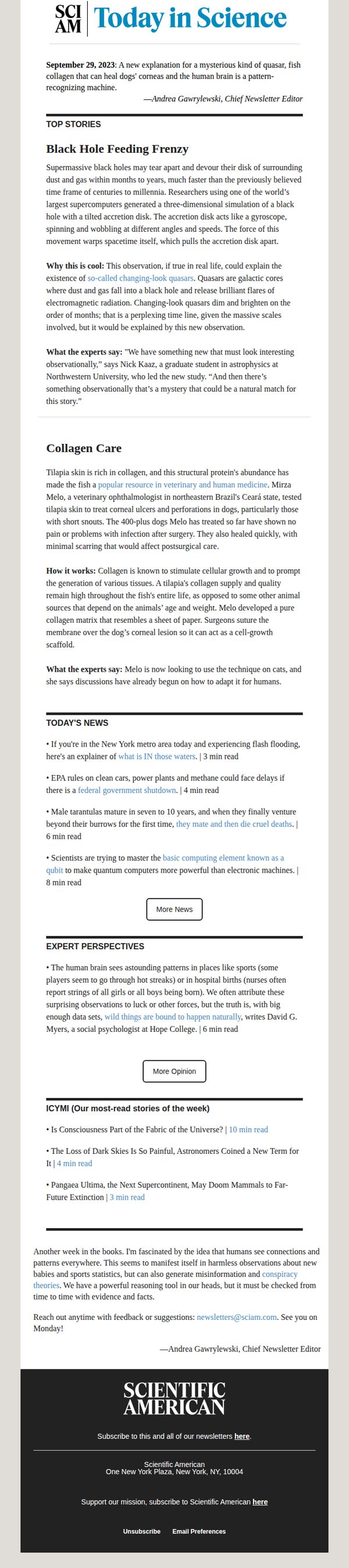



1. Scientific American : Today in Science: Fish collagen heals dogs' eyes
Objective
To inform subscribers of the latest scientific discoveries and developments in an engaging, digestible format while reinforcing Scientific American’s authority as a trusted science news source. The email encourages continued engagement through curated story sections and direct calls to action.
Why this works
The email opens with a surprising, emotionally resonant headline about fish collagen healing dogs’ eyes, a clever hook that blends novelty, animal welfare, and scientific innovation to instantly capture attention and set the tone for curiosity-driven reading.
How to implement
By structuring content into clearly labeled sections like 'Top Stories,' 'Today’s News,' and 'Expert Perspectives,' the email guides readers through a logical, digestible journey that mirrors how people naturally consume news, from breaking updates to deeper analysis, without overwhelming them.
Pro Tip
Add a secondary CTA button beneath 'More News' that says 'Subscribe to All Newsletters', this would capitalize on high engagement moments by offering deeper commitment options without disrupting the primary reading flow. • Incorporate a subtle visual cue, like a small icon or color highlight, next to each article’s read time to help readers quickly assess time investment, increasing the likelihood they’ll click based on perceived value and availability.
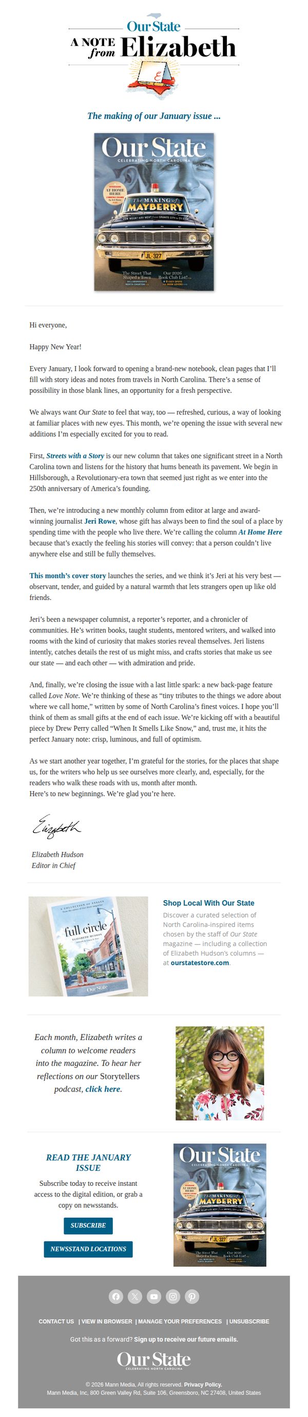
2. Our State: A Note From Elizabeth ✏️
Objective
This email aims to personally welcome readers into the new year while introducing fresh editorial features in the January issue, fostering emotional connection through the editor’s voice and encouraging subscription or newsstand purchase to sustain engagement with the magazine’s storytelling mission.
Why this works
The editor’s handwritten note creates an intimate, trustworthy tone that transforms a standard issue announcement into a personal invitation, making readers feel like they’re being let in on a behind-the-scenes conversation rather than just receiving promotional content.
How to implement
By spotlighting new columns like 'Streets with a Story' and 'At Home Here,' the email strategically frames editorial innovation as emotional discovery, not just content updates, which taps into readers’ nostalgia and curiosity about place, people, and local identity.
Pro Tip
Add a visual countdown or limited-time offer badge near the 'SUBSCRIBE' button to create urgency, since the January issue is time-sensitive and readers may delay action without a clear temporal nudge. • Reposition the 'Shop Local With Our State' section higher in the email, perhaps after the editor’s note, to leverage emotional momentum from her personal message and convert sentiment into immediate commerce before readers scroll to the footer.
3. National Geographic: Does faith help health? Plus: Marijuana’s bad news; stress and superhuman strength; the new magic number for steps?
Objective
This email aims to engage readers with science-backed, curiosity-driven stories about health, belief, and human potential while subtly promoting National Geographic’s brand authority and driving traffic to deeper content. It also includes a promotional offer to convert interest into subscriptions.
Why this works
The email opens with a bold, question-driven subject line and immediately follows up with a punchy summary that teases multiple high-interest topics, creating instant curiosity and giving readers multiple reasons to keep scrolling.
How to implement
Each article section is anchored by a powerful, emotionally resonant image paired with a tight, benefit-focused headline and a single, action-oriented CTA button, making it effortless for readers to self-select their next deep dive without decision fatigue.
Pro Tip
The CTA 'SUBSCRIBE' at the bottom is visually underwhelming compared to the vibrant yellow article CTAs above it; it should be redesigned with higher contrast, larger size, or a more urgent label like 'Claim Your Free Tote Now' to match the promotional value offered. • The email lacks a clear visual hierarchy guiding the reader from curiosity to conversion, adding a subtle progress bar or 'Top 3 Stories You Can’t Miss' badge near the top would help funnel attention toward the most conversion-friendly content sections.
4. Good Housekeeping: Heading Off to College? This Electric Cooker Will Be Your New Best Friend
Objective
This email aims to drive engagement and clicks by showcasing practical, budget-friendly products ideal for college students, while also promoting lifestyle content and affiliate offers that align with Good Housekeeping’s trusted, solution-oriented brand voice.
Why this works
The email opens with a highly relatable pain point, heading off to college, and immediately positions the electric cooker as an emotional and practical solution, making the product feel indispensable rather than optional.
How to implement
By mixing product recommendations with lifestyle content and financial advice, the email builds trust through variety, subtly guiding readers from entertainment to action without feeling overly promotional or salesy.
Pro Tip
The primary CTA 'Read More' is generic and doesn’t reflect urgency or benefit; replacing it with action-driven text like 'Grab Yours Before Dorm Move-In' would better align with the college student audience’s timeline and motivation. • The repeated '9 Reasons to Avoid Annuities' ad disrupts the product-focused flow; replacing one instance with a relevant college-themed tip or dorm essentials roundup would maintain thematic consistency and improve user experience.
5. Horse & Hound: First HOYS 2023 winner crowned
Objective
To engage equestrian enthusiasts by highlighting the first winner of HOYS 2023 and driving subscriptions through compelling storytelling and product recommendations. The email also promotes magazine content and horse sales to deepen reader loyalty and conversion.
Why this works
The email masterfully opens with a high-impact sports moment, the first HOYS 2023 winner, immediately capturing attention by tapping into the emotional pride and competitive spirit of the equestrian community.
How to implement
By weaving in human-interest stories like the saddle fitter’s obituary and Scott Brash’s historic win, the campaign builds emotional resonance that goes beyond transactional content, making readers feel part of a larger, meaningful narrative.
Pro Tip
The primary CTA 'Subscribe' appears mid-email without visual hierarchy or urgency; adding a countdown timer or limited-time discount above the fold would increase conversion pressure and align with the campaign’s goal of driving immediate sign-ups. • The footer’s 'Horses for Sale' section feels disconnected from the editorial flow; integrating a short testimonial or success story from a recent seller would build trust and motivate users to click 'Book your advert' by showing real outcomes.
6. Condé Nast Traveler: The Asia Hotels Our Editors Keep Going Back To

Objective
To engage luxury travelers by showcasing Asia’s top hotels curated by editors, while subtly promoting digital subscriptions and travel gear through editorially-driven content that blends inspiration with commercial intent.
Why this works
The email leverages editorial authority by framing hotel picks as ‘Gold List 2026’ selections from global editors, which builds trust and positions the brand as a curator of elite travel experiences rather than just a publisher.
How to implement
By embedding product recommendations like the Samsonite luggage set within a ‘What We’re Packing’ section, the campaign seamlessly blends lifestyle content with commerce, making promotional placements feel organic and useful rather than interruptive.
Pro Tip
The primary CTA ‘READ MORE’ is repeated identically across multiple articles, diluting urgency and specificity; tailoring CTAs to each story (e.g., ‘See the Gold List Hotels’ or ‘Explore Portugal’s Hidden Trails’) would better guide user intent and improve click-through clarity. • The digital subscription offer at the bottom feels disconnected from the editorial content above; integrating a teaser like ‘Unlock the full Gold List + 100+ expert guides with a subscription’ directly under the hero section would strengthen conversion alignment.
7. 425 Magazine: Sip & Savor

Objective
This email aims to engage readers with curated local food, drink, and event experiences around the New Year, while encouraging deeper interaction through story sharing and print magazine subscriptions. It blends community storytelling with promotional content to strengthen reader loyalty and drive conversions.
Why this works
The email masterfully blends seasonal celebration with local flavor by spotlighting hyper-relevant events like Vinbero’s New Year’s Eve dinner, making readers feel connected to their community while subtly promoting premium experiences worth attending or sharing.
How to implement
By inviting readers to ‘Spill the Cheer’ with personal holiday traditions, the campaign transforms passive subscribers into active contributors, fostering emotional investment and user-generated content that deepens brand affinity far beyond a typical newsletter read.
Pro Tip
The primary CTA 'SUBSCRIBE TODAY' appears only in the footer and lacks visual hierarchy; relocating a more prominent, color-contrasted version above the fold, perhaps tied to the 'Spill the Cheer' section, would capture attention earlier and boost conversion intent. • The email lacks a clear visual or textual transition between event highlights and the community story prompt; adding a brief bridging sentence like 'Your traditions inspire ours' would improve narrative flow and reinforce the campaign’s community-driven theme.
8. The New Yorker: Goings On: The Surreal Nudes of Heji Shin

Objective
This email aims to inform readers about culturally rich events, exhibitions, and media across New York City and beyond, while subtly encouraging subscription through a value-driven closing offer. It positions The New Yorker as a curator of intelligent, offbeat, and emotionally resonant experiences.
Why this works
The email masterfully blends highbrow cultural critique with accessible, human-centered storytelling, like describing a pig’s portrait as both surreal and emotionally evocative, to make avant-garde art feel personally relevant and worth exploring.
How to implement
By curating not just events but emotional experiences, from the exhaustion of watching ‘Oldboy’ to the tenderness in Iris DeMent’s music, the newsletter transforms passive consumption into active cultural participation, deepening reader loyalty through shared feeling.
Pro Tip
Add a visual hierarchy to the 'Pick Three' section by using icons or numbered badges next to each item to guide attention and improve scannability for mobile users who may miss the curated nature of the list. • Reposition the subscription CTA higher in the email, perhaps after the first major cultural highlight, to capture interest at peak engagement rather than waiting until the end when reader momentum may have waned.
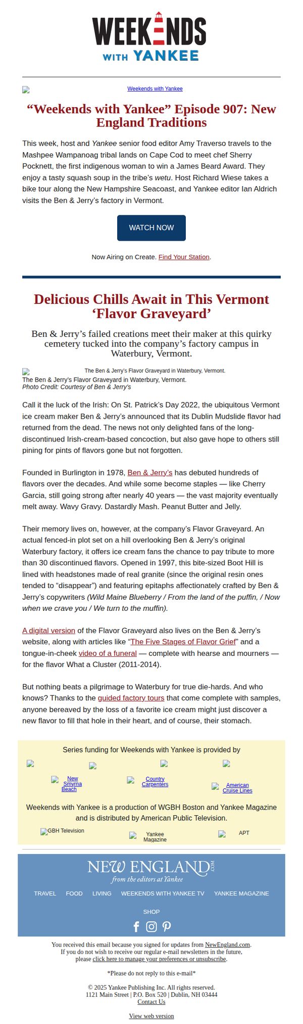
9. Yankee: Episode 907 of Weekends with Yankee: New England Traditions
Objective
This email aims to drive engagement with the latest episode of 'Weekends with Yankee' by highlighting its cultural and culinary themes, while also promoting Ben & Jerry’s Flavor Graveyard as a nostalgic and experiential destination for fans of discontinued flavors.
Why this works
The email masterfully blends regional storytelling with product nostalgia by connecting a TV episode’s cultural exploration to Ben & Jerry’s Flavor Graveyard, turning a discontinued product into an emotional pilgrimage rather than a marketing loss.
How to implement
By weaving in humor and cultural references, like the 'Five Stages of Flavor Grief' and epitaphs for lost flavors, the email transforms a simple product update into a memorable, shareable narrative that deepens brand loyalty through personality and wit.
Pro Tip
Add a countdown timer or limited-time offer for guided factory tours to create urgency, since the email mentions tours but doesn’t incentivize immediate action beyond curiosity. • Include a short embedded video preview or audio clip from Episode 907 directly in the email to reduce friction for users who may not click through, increasing engagement without requiring external navigation.
10. Flipboard: Axed fed workers face their cheering families

Objective
To inform and inspire daily readers by curating a digest of top global, political, cultural, and sports stories while subtly encouraging app downloads through embedded CTAs. The email positions Flipboard as a trusted source for thoughtful, diverse perspectives.
Why this works
The email brilliantly balances hard news with human-interest angles, making complex global events feel personal and emotionally resonant without sacrificing journalistic integrity or depth.
How to implement
Strategic placement of advertisements between editorial content mimics a magazine’s natural flow, reducing friction and increasing the likelihood that users will engage with sponsored material as part of their reading experience.
Pro Tip
Add a subtle countdown timer or urgency cue near the 'Get the App' CTA to increase conversion, especially since the email is time-sensitive and curated for today’s headlines. • Include a personalized subject line or opening line (e.g., 'Because you read about politics last week...') to leverage behavioral data and boost open rates without compromising editorial tone.