How ecommerce brands run launch campaign emails with range clarity



1. Chivas Regal: 🔮 Reveal your Lunar New Year zodiac cocktail…
Objective
This email aims to engage recipients by personalizing their Lunar New Year celebration through a zodiac-themed cocktail experience, while driving product discovery and encouraging participation in a sweepstakes to win a limited-edition cocktail kit.
Why this works
The campaign brilliantly merges cultural celebration with personalization by linking each zodiac sign to a unique cocktail, making the recipient feel seen and celebrated while subtly guiding them toward product discovery and emotional connection with the brand.
How to implement
By featuring a visually rich product grid that showcases Chivas, Glenlivet, and Martell together under a unified Lunar New Year theme, the email elevates perceived value and encourages cross-brand exploration without diluting the campaign’s festive narrative.
Pro Tip
Add a subtle countdown timer or 'X kits remaining' indicator near the 'Enter Now' CTA to amplify urgency and scarcity, especially since the sweepstakes ends 2/28/26 and only 50 kits are available, this would strengthen conversion psychology without disrupting the festive tone. • Include a brief testimonial or user-generated photo from a past winner or zodiac cocktail enthusiast near the sweepstakes section to build social proof and emotional resonance, making the prize feel more tangible and desirable to potential entrants.
2. Bass Pro: The New Under Armour Collection Is Here
Objective
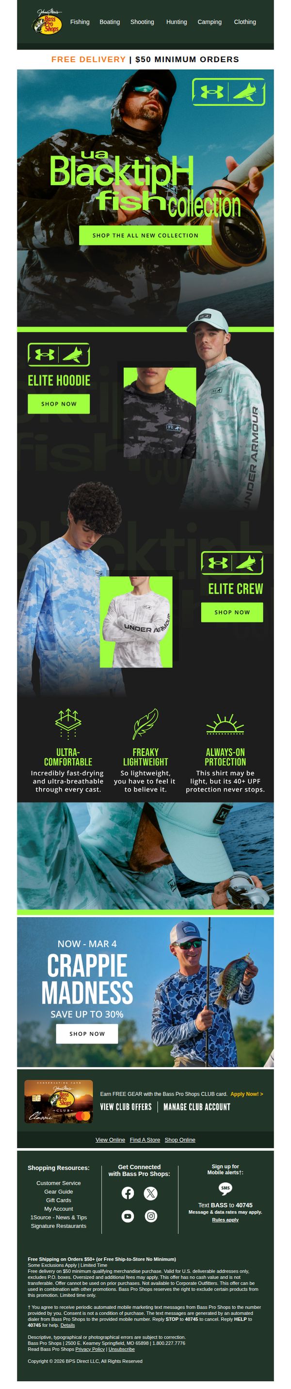
To drive immediate engagement and sales for the new Under Armour BlacktipH fishing collection by highlighting its performance features and exclusive availability at Bass Pro Shops, while also promoting a seasonal Crappie Madness sale to cross-sell related gear.
Why this works
The email brilliantly ties the new Under Armour collection to a specific outdoor activity, fishing, using lifestyle imagery and product-specific benefits like 'ultra-comfortable' and 'always-on protection' to speak directly to the target audience’s functional needs and emotional aspirations.
How to implement
By anchoring the campaign with a bold hero visual and a single, high-contrast CTA button, the email eliminates decision fatigue and funnels attention exactly where it needs to go: straight to the new collection, making the user journey intuitive and conversion-focused.
Pro Tip
Add a small countdown timer beneath the Crappie Madness CTA to reinforce urgency and encourage immediate action, since the offer ends March 4 and visual time pressure significantly boosts conversion rates for limited-time promotions. • Include a customer testimonial or review snippet near the product grid to build social proof around the Under Armour collection, especially since performance claims like '40+ UPF protection' are more persuasive when validated by real users.
3. Le Collectionist: // Just landed...
Objective
To showcase newly added luxury villas across elite European destinations, enticing high-net-worth travelers to explore and book their next exclusive getaway through curated, visually rich property highlights.
Why this works
The email masterfully uses location-specific storytelling to elevate each villa beyond a mere property listing, turning destinations like Lake Como and Formentera into aspirational experiences defined by architecture, ambiance, and exclusivity.
How to implement
By pairing striking, high-resolution imagery with concise, evocative copy that emphasizes guest capacity and design philosophy, the campaign creates an emotional pull that speaks directly to discerning travelers seeking both space and sophistication.
Pro Tip
Add a subtle countdown timer or 'limited availability' indicator beneath each villa to create urgency, especially since these are high-end, exclusive properties that benefit from perceived scarcity. • Include a short testimonial or guest quote under one or two featured villas to build social proof, luxury travelers often rely on peer validation before committing to premium experiences.
4. Watchfinder : New arrivals featuring our finest watches
Objective
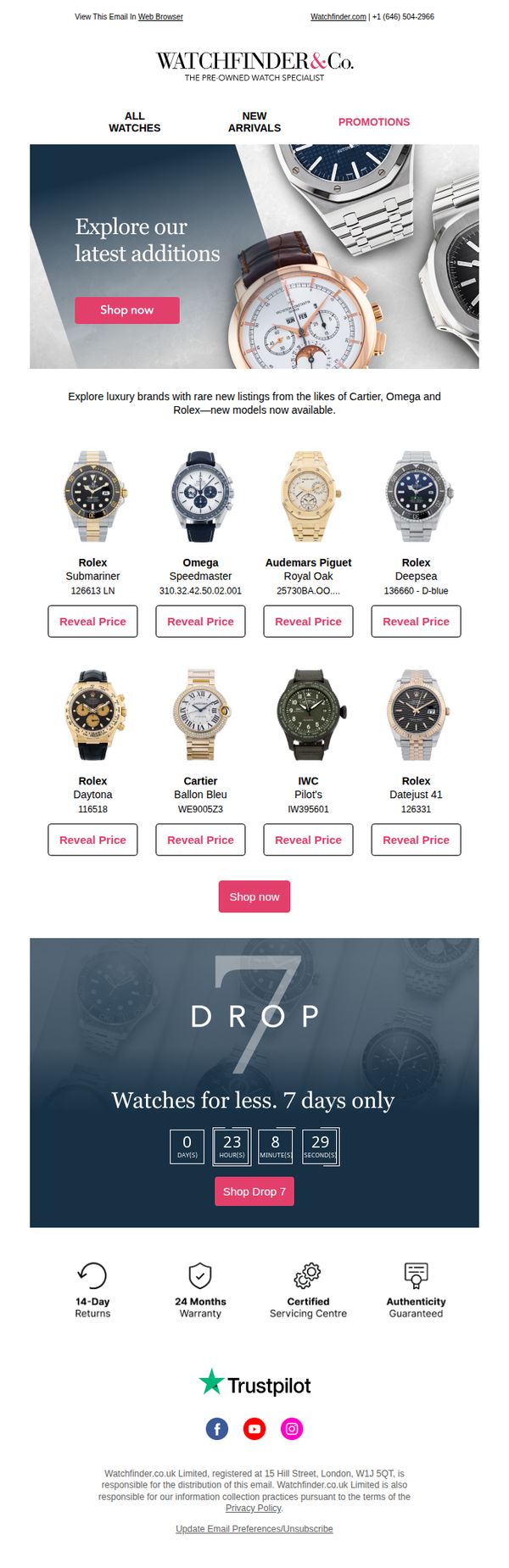
This email aims to drive immediate engagement and sales by showcasing newly arrived luxury watches from top-tier brands, while leveraging urgency through a limited-time 'Drop 7' promotion to encourage quick browsing and purchasing.
Why this works
The email masterfully combines aspirational luxury branding with urgency by spotlighting rare new arrivals from elite watchmakers like Rolex and Cartier, then anchoring the offer with a time-sensitive 'Drop 7' countdown that compels immediate action without feeling pushy.
How to implement
By using 'Reveal Price' buttons instead of displaying prices outright, the campaign creates curiosity and perceived exclusivity, turning price discovery into an interactive experience that increases click-through rates while maintaining the premium positioning of the watches.
Pro Tip
Add a brief testimonial or customer review snippet near the product grid to reinforce social proof, especially since luxury watch buyers often rely on peer validation before committing to high-value purchases. • Include a subtle visual indicator (like a 'New' badge or animated sparkle) on each watch image in the grid to reinforce the 'New Arrivals' theme and help users quickly identify fresh inventory without reading model numbers.
5. Pandora: Jessie, caught feelings? Catch these 💕
Objective
This email aims to drive Valentine’s Day gift purchases by showcasing Pandora’s colorful, heart-themed charms and rings, encouraging recipients to treat loved ones, or themselves, with personalized, emotionally resonant jewelry.
Why this works
The email brilliantly ties emotional gifting to product variety by framing charms and rings as tokens of love for every ‘Galentine and Valentine,’ making self-purchase feel just as valid as gifting to others.
How to implement
By grouping products into themed sections like ‘Colorful Charms’ and ‘Colorful Rings,’ Pandora simplifies discovery and encourages browsing, turning a promotional email into a visual catalog that invites exploration without overwhelming the shopper.
Pro Tip
Add a subtle countdown timer or urgency cue near the ‘SHOP NOW’ CTA in the hero section to nudge procrastinators, since Valentine’s Day is time-sensitive and the current design lacks any temporal pressure. • Include a small ‘Bestseller’ or ‘Customer Favorite’ badge on 1–2 top-performing charms or rings to leverage social proof, as the current product grid lacks any visual indicators of popularity or trust signals.
6. Tiffany & Co.: Just In: Our Latest Designs for the Home

Objective
This email aims to introduce and drive sales for Tiffany & Co.’s new home collection by showcasing tableware, home decor, and drinkware through aspirational imagery and curated category CTAs, while subtly cross-promoting jewelry as gifts for her.
Why this works
The email masterfully segments its home collection into emotionally resonant themes, like 'Welcome Home' and 'Raise a Glass', which transform functional products into experiential storytelling moments that align with luxury lifestyle aspirations.
How to implement
Each product category is introduced with a concise, evocative headline and supporting copy that emphasizes atmosphere and delight, making even everyday items feel exclusive and emotionally rewarding without relying on discounts or urgency.
Pro Tip
Add a subtle visual cue or icon next to each CTA button (e.g., a small plate, candle, or wine glass) to reinforce category identity and improve scannability, especially since all CTAs use identical black button styling. • Include a short testimonial or editorial quote under one of the product sections, such as from a designer or lifestyle influencer, to add social proof and elevate perceived value beyond just aesthetics.
7. Nike: Drops you don't wanna miss 🔥
Objective
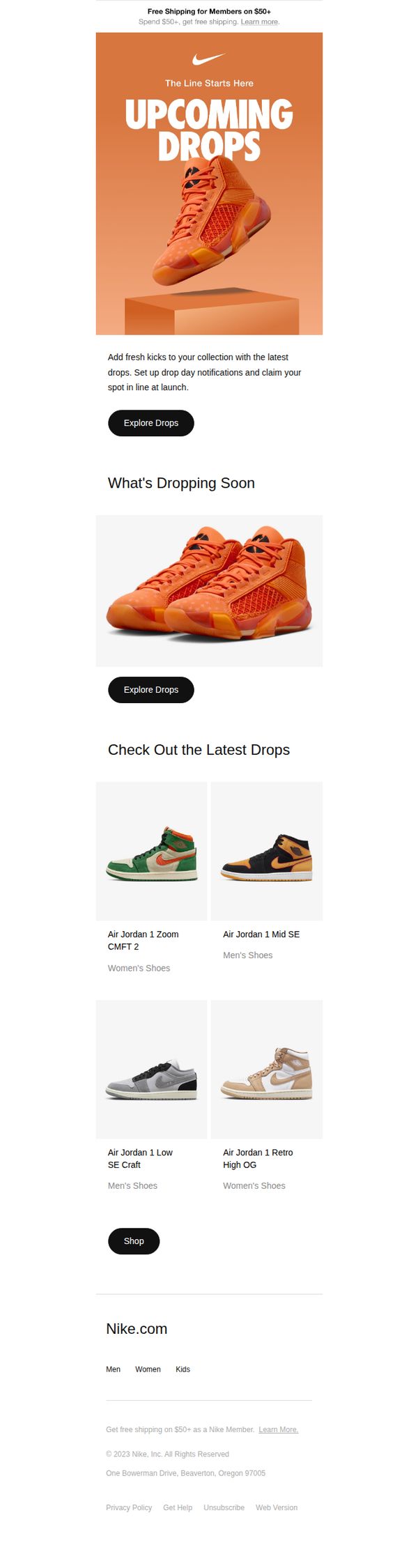
This email aims to drive urgency and excitement around upcoming sneaker releases by highlighting exclusive drops and encouraging members to set up notifications to secure early access. It also promotes product discovery through curated visuals and direct shopping links.
Why this works
The email leverages FOMO by framing new releases as exclusive 'drops' and encouraging users to claim their spot early, which taps into sneaker culture’s urgency-driven buying behavior and boosts conversion intent.
How to implement
Using bold, high-contrast visuals of limited-edition sneakers against a warm, energetic background creates instant emotional resonance, making the products feel aspirational and worth pursuing immediately.
Pro Tip
Add a countdown timer or 'limited stock' indicator near the hero section to amplify urgency and encourage immediate action instead of passive browsing. • Include a short testimonial or social proof snippet (e.g., '10K+ members already signed up for alerts') to build trust and validate the exclusivity claim around upcoming drops.
8. Tiffany & Co.: Just In: Our Latest Designs for the Home

Objective
This email aims to introduce and drive sales for Tiffany & Co.’s new home collection by showcasing tableware, home decor, and drinkware through aspirational imagery and targeted CTAs, while subtly cross-promoting gift-worthy jewelry to expand purchase intent.
Why this works
The email masterfully frames home goods as emotional upgrades, not just products, by tying them to atmosphere, experience, and personal space transformation, which elevates perceived value beyond utility and into lifestyle aspiration.
How to implement
Each product category is given its own visual and textual spotlight with a dedicated CTA, creating a clear, scannable journey that guides the reader from discovery to decision without overwhelming them with choice or clutter.
Pro Tip
Add a subtle countdown or limited-edition tag near the hero section to create urgency around the ‘Just In’ launch, since new designs inherently carry novelty value that’s underutilized without time-sensitive framing. • Include a short testimonial or editorial quote under one of the product sections, such as ‘Raise a Glass’, to add social proof and reinforce the emotional payoff of owning these pieces, especially for gifting or entertaining.
9. Fjällräven: Heads up!

Objective
This email aims to re-engage subscribers by highlighting Fjällräven’s hat collection as essential trekking gear while subtly promoting broader product categories through storytelling and visual discovery. It seeks to drive traffic to product pages and video content that reinforce brand heritage and outdoor lifestyle values.
Why this works
The email brilliantly positions hats not as accessories but as essential trekking heroes, tying product utility to emotional storytelling, which elevates perceived value and justifies purchase through functional necessity and brand-aligned adventure identity.
How to implement
By embedding a compelling human story, two friends reuniting on a 110km trek, the campaign transforms a product showcase into an emotional journey, making the brand feel authentic and relatable while naturally guiding users toward video and apparel exploration.
Pro Tip
Add a subtle countdown or limited-edition badge near the 'Find your hat' CTA to create urgency around new arrivals, especially since 'NEW' tags are already used, this would convert passive browsing into immediate action without compromising brand tone. • Reposition the 'Explore trekking clothes' CTA to appear directly beneath the '65 years of trekking' section instead of after the video, so users who resonate with heritage messaging are immediately funneled toward product discovery before emotional momentum fades.
10. Nike: Don’t miss these superstar drops 🌟
Objective
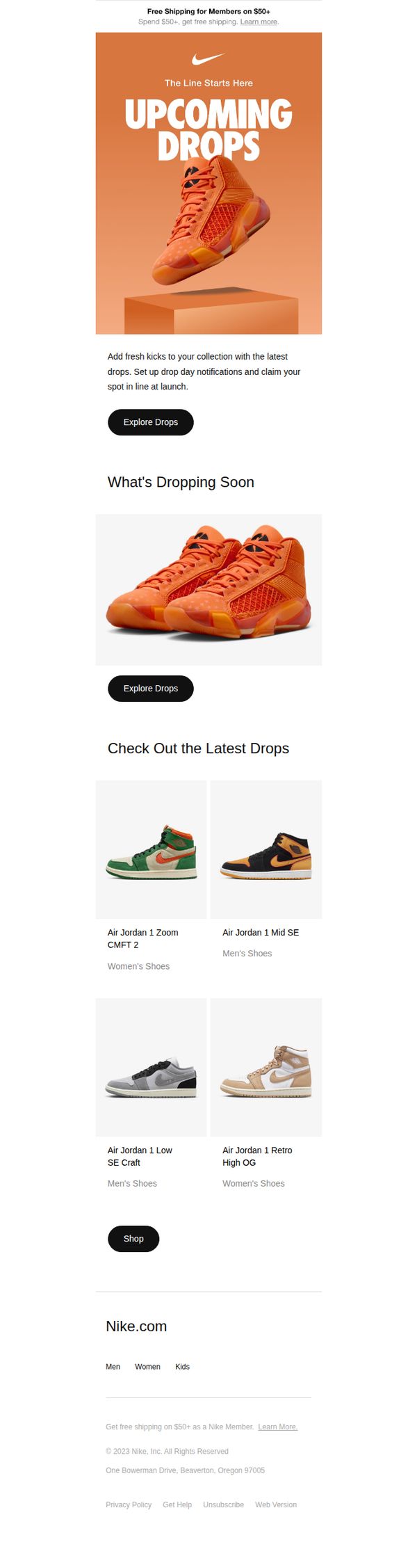
This email aims to drive urgency and excitement around upcoming sneaker releases by highlighting exclusive drops and encouraging members to set up notifications to secure early access. It also promotes product discovery through curated visuals and direct shopping links.
Why this works
The email leverages FOMO by framing upcoming sneaker releases as exclusive 'drops' and encourages early action through personalized notifications, making the customer feel like an insider with privileged access to limited inventory.
How to implement
Visual hierarchy is expertly managed with bold hero imagery and consistent CTA buttons that guide the eye from headline to product grid, ensuring users never lose sight of the primary action, exploring or shopping the latest releases.
Pro Tip
Add a countdown timer or 'limited stock' indicator near the hero section to amplify urgency and convert passive scrollers into immediate clickers by visualizing scarcity. • Include a short testimonial or social proof snippet (e.g., '10K+ members already set alerts') near the 'Explore Drops' CTA to reinforce trust and motivate action through peer validation.