Launch Campaign email gallery from real brands
1. Release Clause
Objective
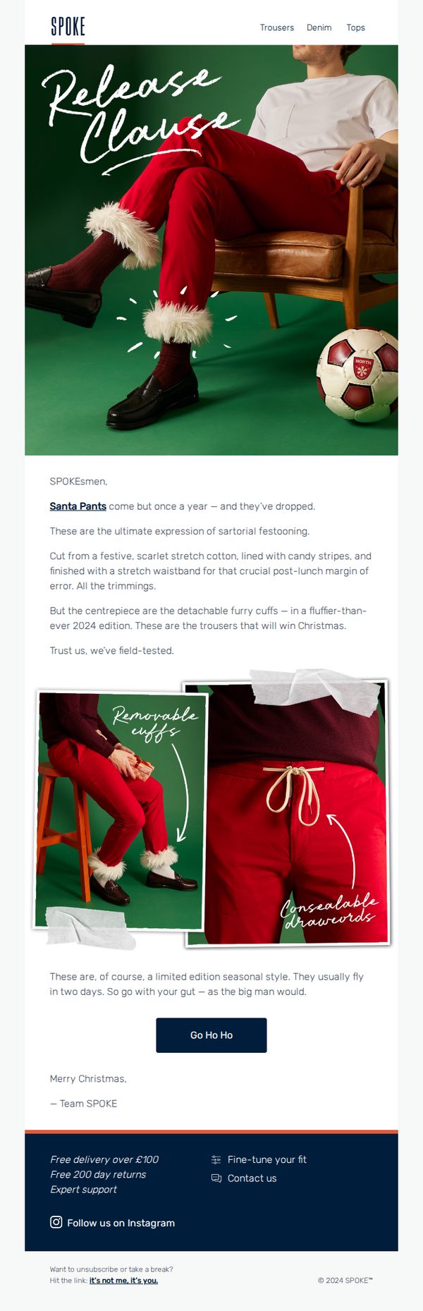
To create urgency and excitement around the limited-edition Santa Pants by framing them as a seasonal must-have that sells out quickly, encouraging immediate purchase through playful, festive messaging and a strong CTA.
Why this works
The email brilliantly leverages holiday nostalgia and humor by calling the product 'Santa Pants' and tying it to a fictional 'Release Clause,' making the purchase feel like a seasonal tradition rather than a transaction.
How to implement
By highlighting the detachable furry cuffs and concealable drawcords with annotated visuals, the campaign transforms functional features into playful selling points that resonate with the festive spirit and user experience.
Pro Tip
Add a visible countdown timer near the CTA to reinforce the 'limited edition' claim and create real-time urgency, especially since the email mentions items 'usually fly in two days.' • Include a customer testimonial or social proof snippet, even a short quote like 'Wore these to my office party, got 12 compliments', to validate the product’s festive appeal and boost conversion confidence.
2. Piqué Performance
Objective
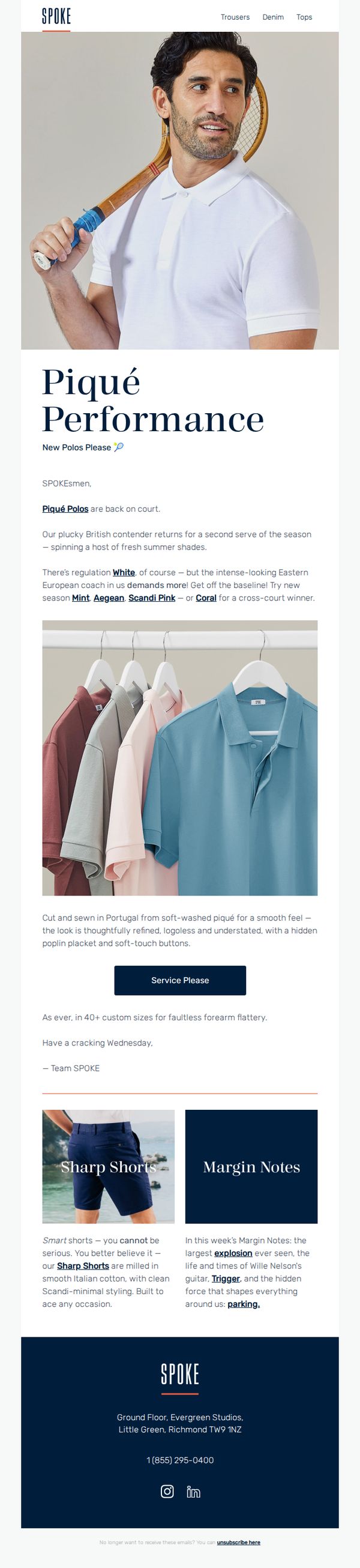
To reintroduce and promote the Piqué Performance polo collection by evoking a playful, sporty aesthetic that appeals to style-conscious men who value both heritage and modern versatility. The email aims to drive immediate engagement through a strong CTA and showcase seasonal colorways to encourage browsing and purchase.
Why this works
The email brilliantly merges athletic nostalgia with modern menswear by framing the polo as both a performance garment and a refined wardrobe staple, a duality that speaks to customers who want to look sharp without sacrificing comfort or movement.
How to implement
By naming colors like 'Mint,' 'Scandi Pink,' and 'Coral' with playful, evocative language, the campaign transforms a simple product update into a seasonal fashion moment, making color selection feel personal, expressive, and trend-aware rather than purely functional.
Pro Tip
Add a subtle countdown timer or limited-edition badge near the 'Service Please' CTA to create urgency, especially since the email references 'new season' colors and positions the polo as a timely, court-ready piece. • Include a customer testimonial or social proof element near the product grid, even a short quote like 'Best fit I’ve ever had', to reinforce the claim of '40+ custom sizes for faultless forearm flattery' with real-world validation.
3. Drop The Ball
Objective
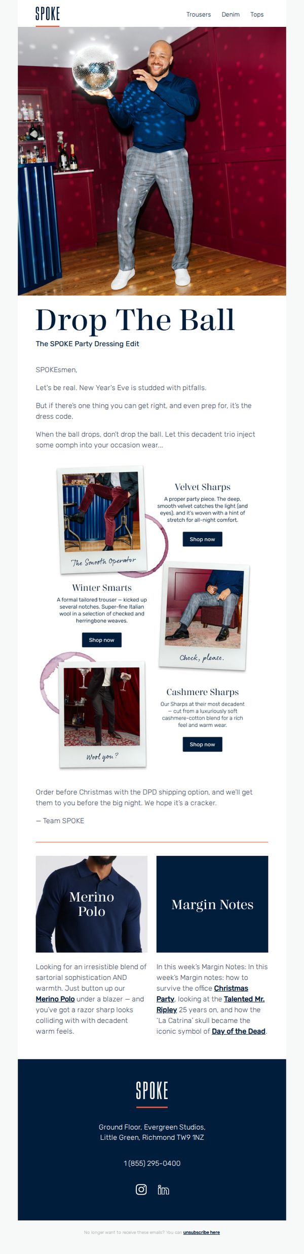
This email aims to inspire SPOKE’s audience to elevate their New Year’s Eve attire with curated, festive menswear while driving immediate purchases ahead of the holiday deadline. It positions the brand as a stylish, reliable guide for occasion dressing with a playful, confident tone.
Why this works
The email brilliantly reframes New Year’s Eve dressing as a strategic, confidence-boosting opportunity rather than a stressful chore, using witty copy and bold visuals to make the reader feel prepared and stylish before the night even begins.
How to implement
By naming each product collection with playful, personality-driven titles like 'The Smooth Operator' and 'Check, please.', the brand turns simple trousers into narrative-driven style moments, helping customers envision themselves in the look and emotionally connect with the purchase.
Pro Tip
Add a visual countdown timer or shipping deadline badge near the CTA to reinforce urgency, especially since the email mentions Christmas delivery, this would reduce cognitive load and increase conversion likelihood. • Integrate a small testimonial or customer photo near the product grid to build social proof; since the email focuses on confidence and occasion dressing, real customer validation would amplify trust and reduce purchase hesitation.
4. Full Stretch
Objective
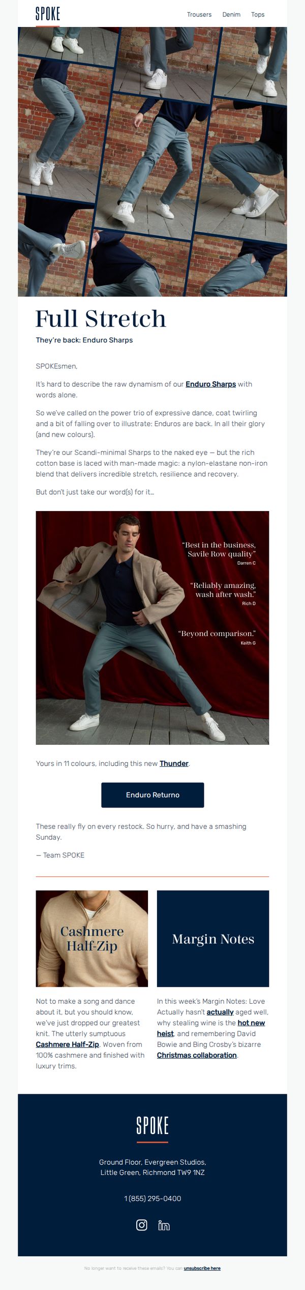
To re-engage customers by announcing the return of the popular Enduro Sharps trousers with a dynamic, movement-focused visual story that highlights their stretch and comfort, while subtly cross-promoting other premium products to drive urgency and conversion.
Why this works
The email brilliantly uses a cinematic grid of motion shots to convey the trousers’ flexibility and comfort without relying on technical jargon, turning product performance into an emotional, visual experience that resonates with active lifestyles.
How to implement
By embedding authentic customer quotes directly beside the hero image, the campaign builds instant credibility and social proof, making the product’s premium claims feel earned rather than self-promotional, which increases trust and reduces purchase hesitation.
Pro Tip
Add a subtle countdown timer or stock indicator near the ‘Enduro Returno’ CTA to amplify urgency, since the email mentions items ‘fly on every restock,’ visual scarcity cues would reinforce the call to act immediately. • Reposition the ‘Margin Notes’ section to appear before the cross-sell product grid, placing the brand storytelling element earlier would strengthen emotional connection before introducing secondary products, improving narrative flow and conversion alignment.
5. Dye Another Way
Objective
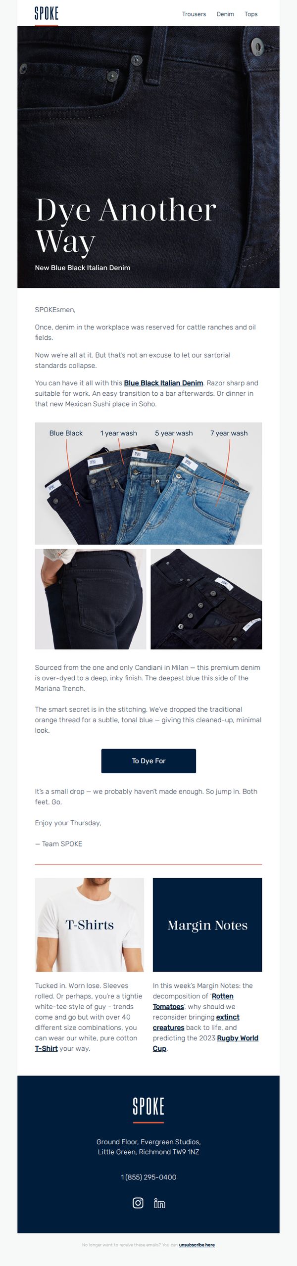
To introduce and drive immediate interest in SPOKE’s new Blue Black Italian Denim by positioning it as a versatile, premium work-to-evening staple that elevates professional style without sacrificing comfort or edge. The email aims to convert curiosity into action with a limited-availability urgency cue.
Why this works
The email brilliantly reframes denim as a professional wardrobe essential by contrasting its rugged past with modern versatility, making it feel both rebellious and refined, which appeals to style-conscious professionals who refuse to sacrifice edge for polish.
How to implement
By visually showcasing the denim’s evolution across washes, from deep Blue Black to 7-year fade, the campaign turns product education into a storytelling device, helping customers imagine long-term value and personalization through wear, not just purchase.
Pro Tip
Add a subtle countdown timer or stock indicator near the CTA to reinforce scarcity, since the email mentions limited availability but doesn’t visually pressure the reader to act before the drop sells out. • Include a short customer testimonial or influencer quote near the product grid to build social proof, the current ‘Team SPOKE’ sign-off feels internal and lacks third-party validation that could boost conversion confidence.
6. Fall In
Objective
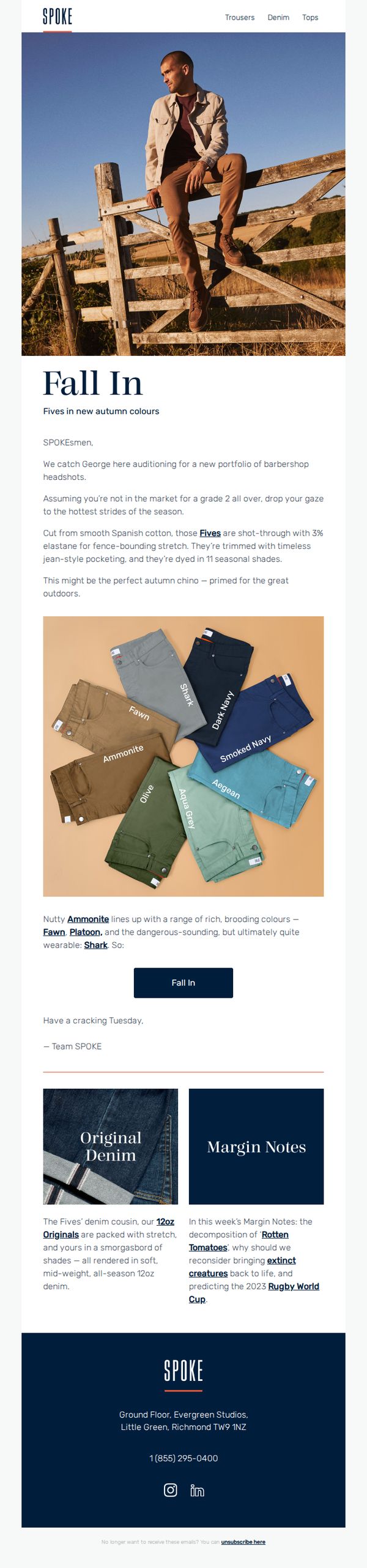
This email aims to introduce and drive interest in SPOKE’s new autumn-colored Fives chinos by framing them as stylish, versatile, and ideal for outdoor wear, while subtly reinforcing brand identity through storytelling and product context.
Why this works
The email opens with a cinematic hero image and witty copy that positions the product not just as clothing but as part of a lifestyle narrative, making the audience feel like insiders in a curated, stylish world.
How to implement
By naming each chino shade with evocative, nature-inspired names like 'Ammonite' and 'Shark,' the brand transforms a simple product grid into a storytelling device that invites exploration and emotional connection with the collection.
Pro Tip
The primary CTA 'Fall In' is clever but ambiguous, adding a micro-copy line like 'Shop the New Autumn Colors' directly beneath it would clarify intent and reduce friction for users unsure of the action. • The product grid lacks hover states or clickable shade names; making each labeled chino interactive would improve UX and allow users to jump directly to their preferred color without scrolling or searching.
7. Thighlight Zone
Objective
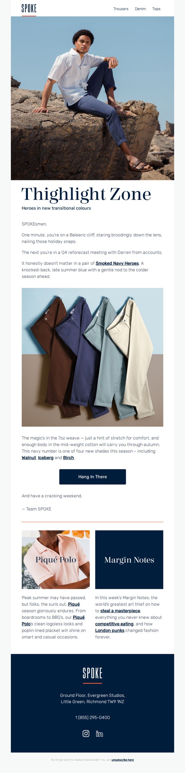
This email aims to introduce and promote SPOKE’s new transitional trouser collection, dubbed 'Thighlight Zone', by positioning them as versatile, season-spanning staples for modern men who shift between casual and professional settings. It seeks to drive engagement and conversions through storytelling, color variety, and a clear call to action.
Why this works
The email brilliantly frames the product as a lifestyle enabler, not just clothing, by painting a vivid scene of the customer transitioning from a cliffside photoshoot to a corporate meeting, making the trousers feel essential for dynamic, modern men.
How to implement
Instead of overwhelming with specs, the copy focuses on sensory and emotional appeal: describing the 7oz weave as having 'just a hint of stretch for comfort' and 'enough body to carry you through autumn' makes the fabric feel alive and purpose-built.
Pro Tip
The CTA 'Hang In There' is clever but ambiguous, consider adding a secondary, more action-oriented CTA like 'Shop the New Colors' near the product grid to reduce friction for users ready to buy. • The 'Margin Notes' section, while creative, distracts from the core product message; either integrate its content into the main narrative or move it below the primary CTA to preserve conversion focus without sacrificing brand voice.
8. Fives in Heavy Metal: now restocked

Objective
To notify subscribers of the early restock of the popular 'Fives' product line, specifically highlighting new colorways like 'Heavy Metal' to drive immediate purchases during the holiday season while reinforcing brand personality through casual, conversational tone.
Why this works
The email leverages holiday timing with a playful, insider tone, like mentioning 'Santa’s elves lines', to make the product drop feel urgent and festive without sounding salesy, which builds emotional connection while driving action.
How to implement
By naming the new color 'Heavy Metal' as the 'runaway hit of 2025,' the brand creates aspirational scarcity and forward-looking hype, turning a simple restock into a cultural moment that encourages immediate purchase to stay ahead of trends.
Pro Tip
Replace the generic 'click here' CTA with a benefit-driven, action-oriented phrase like 'Grab Heavy Metal Before It’s Gone' to better align with the urgency and product excitement described in the body. • Add a small visual element, even a single product image or color swatch, to break up the text-heavy layout and reinforce the product’s visual appeal, especially since color is a key selling point mentioned in the copy.
9. Working It
Objective
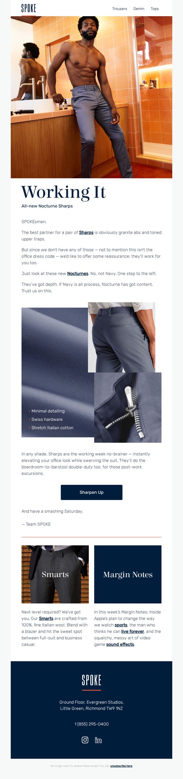
This email aims to introduce and drive interest in SPOKE’s new Nocturne Sharps pants by positioning them as versatile, stylish workwear that transitions seamlessly from office to after-hours settings, encouraging immediate engagement through a clear CTA.
Why this works
The email brilliantly reframes formal wear as lifestyle apparel by humorously acknowledging the absence of 'granite abs' while still positioning the pants as a confident, everyday essential that works for both boardrooms and barstools.
How to implement
By contrasting 'Navy' as 'all process' with 'Nocturne' as 'got content,' the copy creates a memorable, personality-driven distinction that elevates the product beyond fabric specs into a statement of modern, intentional style.
Pro Tip
Add a subtle countdown timer or limited-availability indicator near the 'Sharpen Up' CTA to create urgency, since the email currently lacks any time-sensitive incentive to act immediately. • Include a customer testimonial or social proof near the product grid to reinforce credibility, especially since the email positions the pants as versatile for both work and leisure, which benefits from real-user validation.
10. Try Hard
Objective
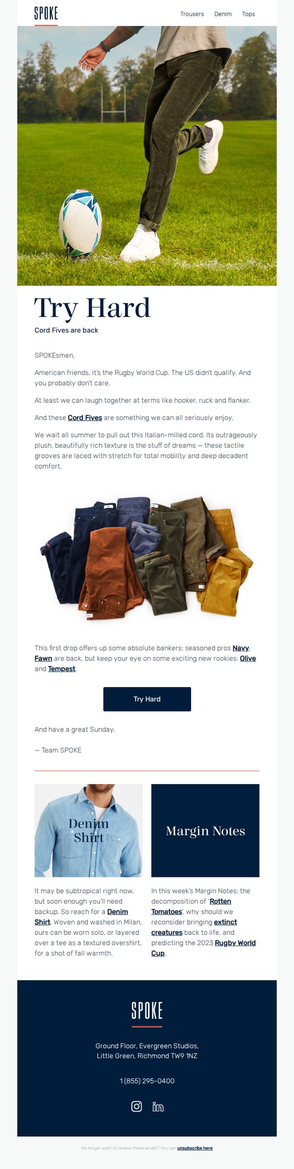
The email aims to re-engage customers by humorously tying the return of Cord Fives pants to the Rugby World Cup, creating a playful narrative that positions the product as a shared cultural moment worth celebrating. It encourages immediate exploration and purchase through a strong, action-oriented CTA.
Why this works
The email brilliantly leverages cultural context, the Rugby World Cup, to create emotional resonance, turning a product launch into a shared inside joke that makes customers feel part of an exclusive, witty community rather than just shoppers.
How to implement
By naming specific colorways like 'Navy Fawn' and 'Olive Tempest,' the brand adds personality and storytelling to product details, transforming mundane descriptors into evocative, memorable names that spark curiosity and emotional connection with the collection.
Pro Tip
Add a subtle countdown timer or limited-availability indicator near the 'Try Hard' CTA to create urgency, since the email references a seasonal drop and the Rugby World Cup context implies time sensitivity. • Include a small visual cue or icon next to the 'Denim Shirt' and 'Margin Notes' sections to signal interactivity, such as a 'Read More' arrow or hover effect, to guide users toward deeper engagement without cluttering the layout.